
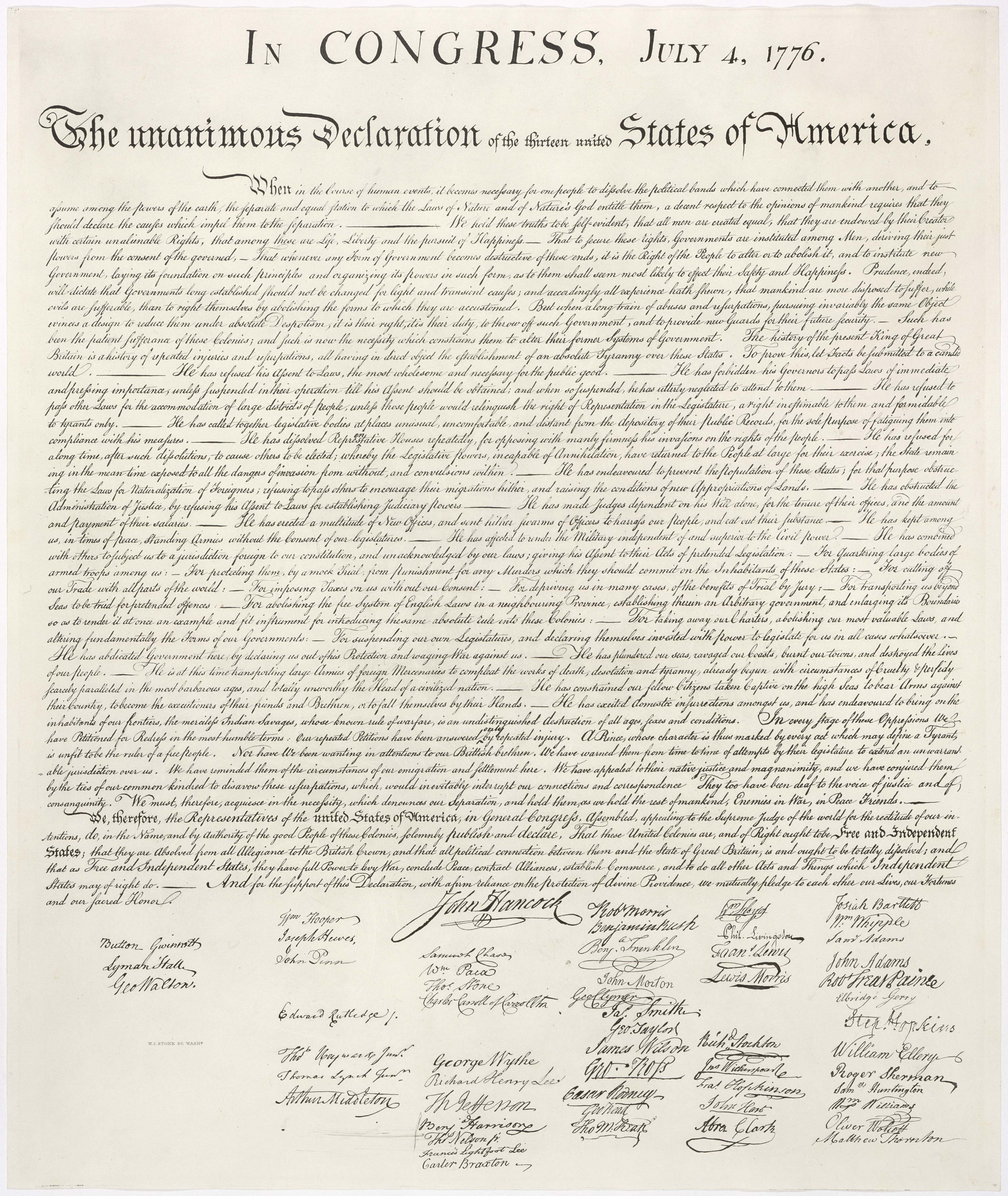
The Declaration of Independence that we know today is actually not a photograph of the original signed parchment document on display at the National Archives, which is so faded as to be nearly illegible. Instead, the familiar crisp clear cursive document that we all know is actually a nearly perfect copperplate replica engraved by William J. Stone and completed between 1820 and June 1823 at the direction of Secretary of State Adams to preserve the then-fading document for history. This copperplate was used to print 201 copies of the Declaration onto parchment for distribution to dignitaries and key institutions somewhere between June 1823 and May 1824. A decade later, in 1833, historian Peter Force commissioned Stone to print an additional 4,000 copies of his copperplate (with government permission) onto thin wove paper for inclusion in his book series, of which a few hundred are believed to survive today. (In 1975 the government actually considered but ultimately rejected an idea to print new copies from the Stone plate for general sale or gift to foreign dignitaries in honor of America's 200th). The Declaration copy hanging in the Oval Office is actually one of these paper Stones. While it is widely believed that the copperplate on display at NARA today is the same used to print both the original parchment and later paper copies of Stone's Declaration, any documentation definitively proving this has long been lost. How might Gemini help provide new evidence corroborating this link and how might such advanced visual AI tools be used in the future to perform at-scale autonomous fingerprinting of historic copperplate prints?
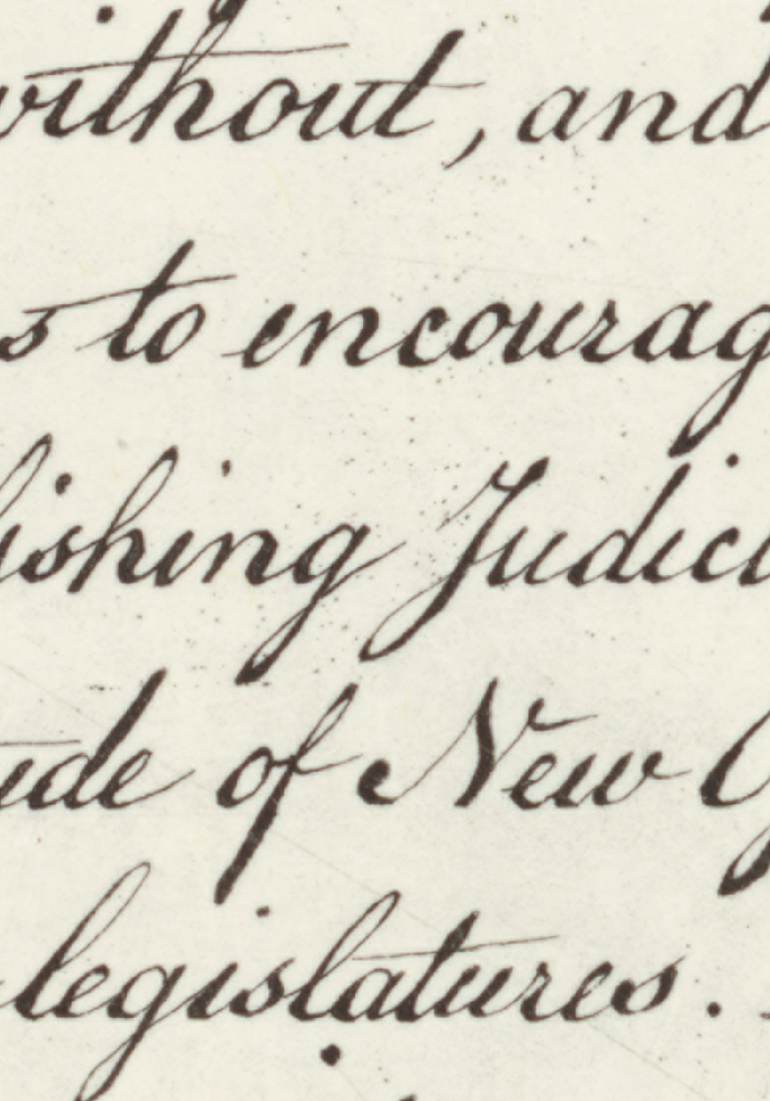
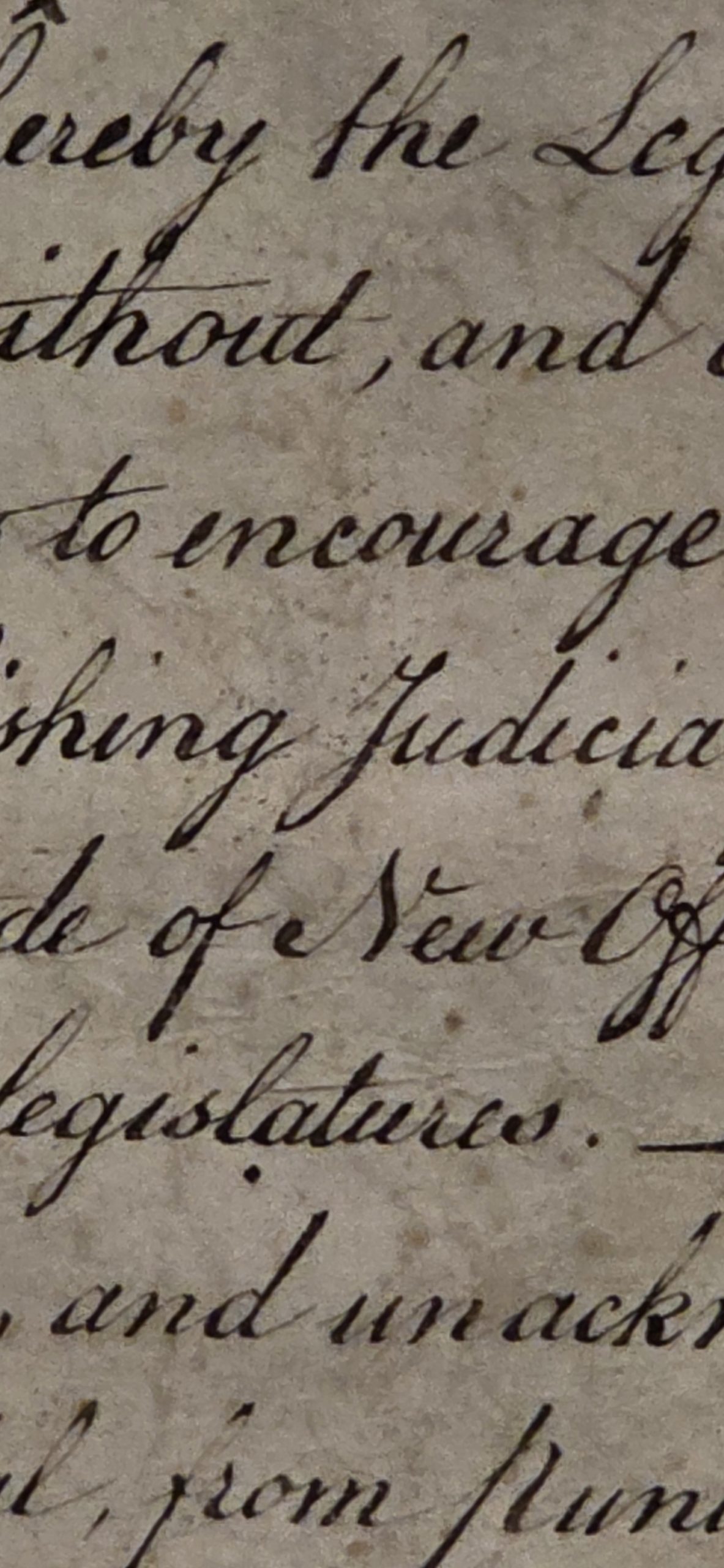
In honor of America's 250th we were recently performing a detailed accession assessment of an unusually crisp and clear paper Force/Stone printing when we noticed a fascinating printing artifact: a strange pattern of dots around the letter "J" in the phrase "establishing Judiciary powers" in the mid center of the document. This pattern is nearly imperceptible in many surviving Force prints due to their poor condition, but on this copy it was so vivid that it was initially flagged during condition inspection as potential damage. You can see the pattern below:
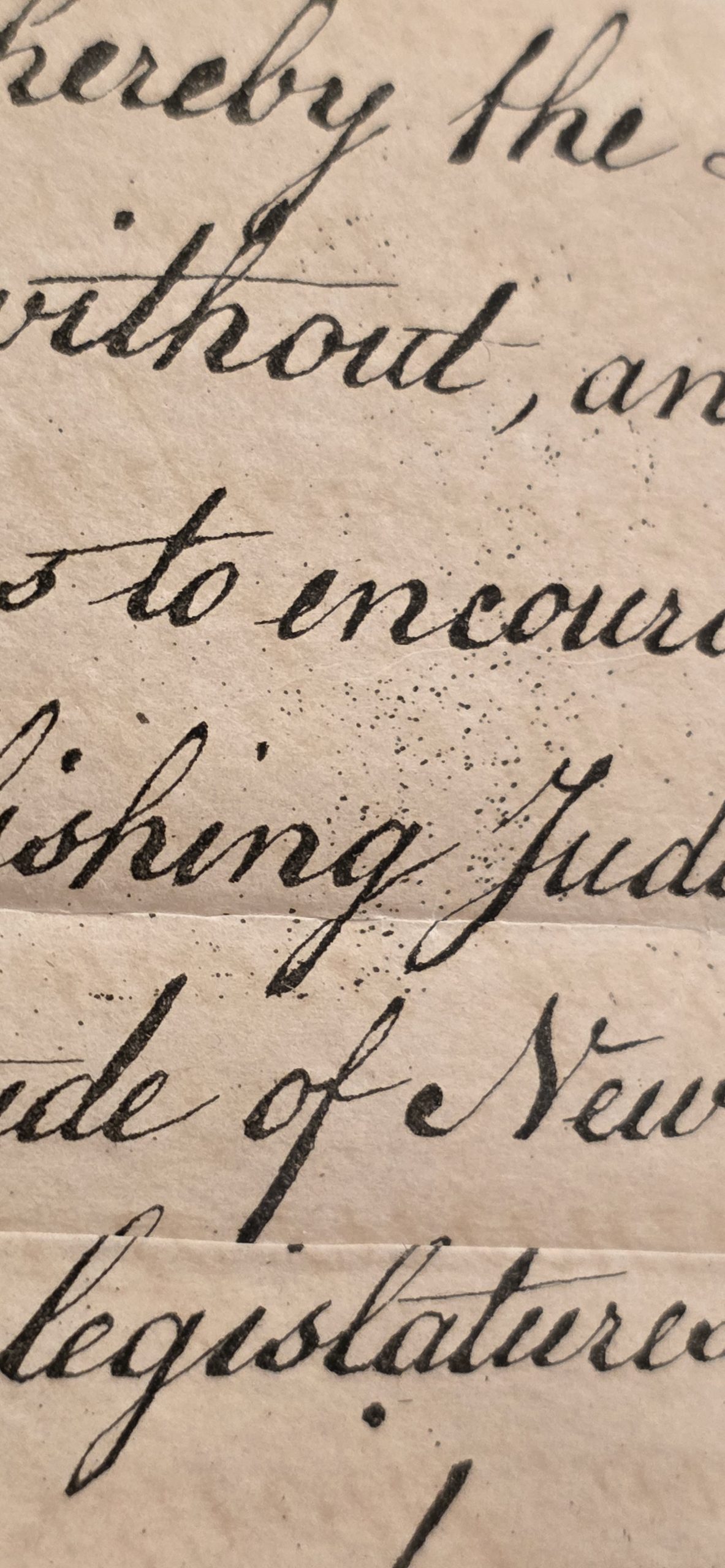
While initially flagged as potential environmental or handling damage, the speckling was quickly determined to be in the same ink as the printing itself, being the result of microscopic pitting in the original copperplate. This got us wondering if Gemini would be able to accurately identify this artifact for someone unfamiliar with intaglio printing. Indeed, Gemini correctly identifies the dots as pitting artifacts of the original copperplate:
Attached is a copperplate print from the early 1800s. What are the strange cloud of dots in the center of the print?
If we proceed with the knowledge that this is an authentic intaglio print (made from an engraved or etched copper plate) rather than an original handwritten document, those dots are the result of imperfections on the surface of the copper plate itself.
In printmaking, this is generally caused by one of two things:
1. Foul Biting (if etching acid was used)
While formal script was often entirely hand-engraved with a tool called a burin, printmakers sometimes used acid to help "bite" (etch) the initial lines into the copper. To do this, they coated the plate in an acid-resistant wax (the "ground"). If that ground was applied too thinly, became brittle, or had microscopic pores in it, the acid would seep through and eat tiny, accidental pits into the smooth surface of the copper. This is called "foul biting."
2. Plate Pitting or Corrosion
Copper is a soft, reactive metal. If the printing plate was stored in a humid environment or wasn't properly coated in a protective grease between printing runs, the surface could begin to oxidize and corrode. This corrosion creates microscopic pits in the metal.
How it transfers to the paper:
Copperplate printing is an intaglio process. Ink is smeared all over the plate and forced into the engraved grooves. Then, the surface of the plate is wiped completely clean, leaving ink only in the recessed areas.
However, if the plate has "foul biting" or corrosion pits, those accidental tiny holes act just like the engraved letters—they catch and hold the ink. When the damp paper is forced onto the plate under the immense pressure of the printing press, it pulls the ink out of the letters and out of those accidental pits, resulting in a cloud of tiny ink dots on the final print.
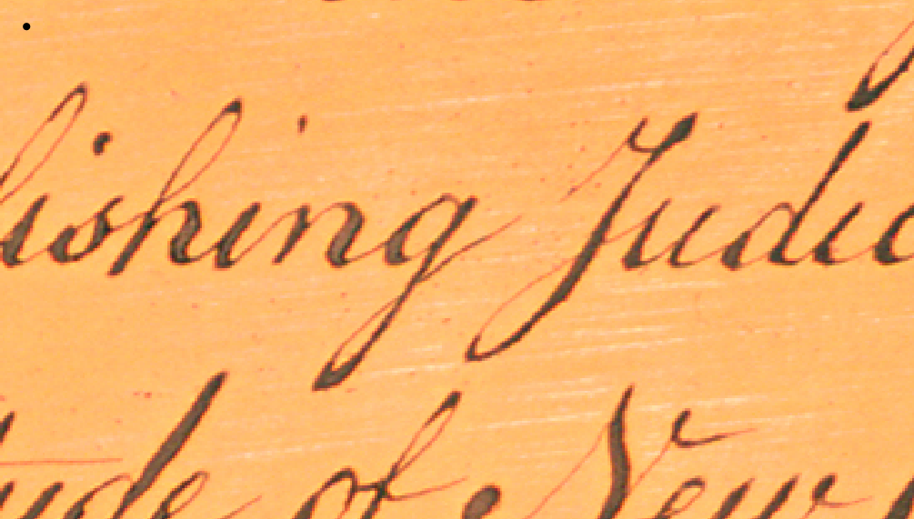
Were these dots just a one-off artifact in the copy we were investigating, or are they more widespread? A careful inspection of high resolution images of a number of surviving paper Stones in institutions and appearing at auction confirmed that the dots are present in all paper Stone copies, though, as noted before, they are almost invisible in many copies due to the poor condition of many surviving Stones. For example, in the American Antiquarian Society (AAS)'s copy, they are barely visible, lost in the ink bleedthrough from the print being folded into the original book:
Of course, this dot pattern is not visible in the original parchment itself, being an artifact of the engraving:
This exact pattern can be observed in NARA's high resolution scan of a paper printing made in 1976 from the copperplate on display at NARA, demonstrating that the NARA copperplate is almost certainly the one used to print these paper copies:
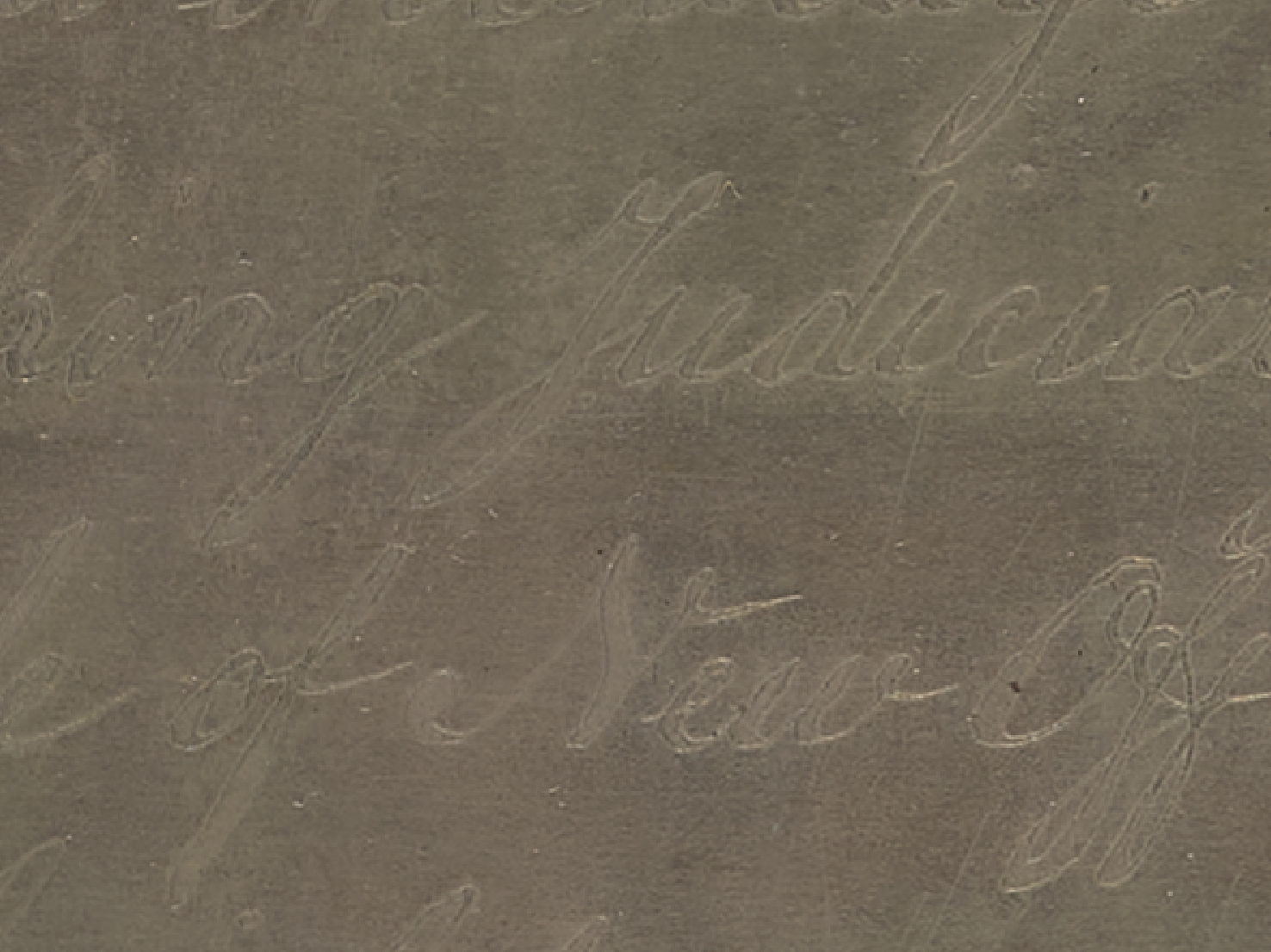
Indeed, if we zoom into NARA's high resolution scan of the copperplate itself, we can clearly see the underlying microscopic pitting:
This is extremely suggestive that the copperplate currently held by NARA is the one that printed the paper Stones, but what of the original 201 parchment copies? If we look at a high resolution scan of one of those original 1823 parchment prints from the original Stone copperplate, we see this exact same dot pattern. This lends extremely high confidence that the same copperplate was used to print both copies, rather than there being two different copperplates.
Indeed, this can be seen on the other parchment copies, such as the Gilder Lehrman Institute's:
And is also clearly visible in Stone's own personal "201st copy":
But what of the possibility that an exact copy was made of the original Stone copperplate that was so perfect that it preserved even this microscopic pitting? After all, copperplates have been routinely duplicated for centuries. The key here is the period in which the Stone prints were made: 1823-1833. A copperplate duplicate so perfect that it perfectly replicated this complete pitting pattern would be effectively unimaginable until the invention of electrotype duplication, which was not invented until 1838. Thus it is almost guaranteed that the same copperplate was used to print both the parchment and paper Stone prints, as it is unlikely that copperplate duplication technology of the era would have resulted in an absolutely flawless replication of the microscopic pitting that did not differ substantially.
In fact, in 1894 the U.S. Coastal and Geodetic Survey did exactly this: they created an electrotype duplicate of the Stone plate. While NARA's scan of this replica plate is not ideal, we do not observe any indications of this pitting, while instead there are substantial new artifacts throughout the plate not observable in prints from the original plate. Thus, given that perfect copperplate duplicating technology did not yet exist when the original parchment and paper Stones were printed, it is effectively guaranteed that the same copperplate was used for both prints, while the visible lack of this pitting in the 1894 electrotype duplicate makes it extremely likely that the copperplate on display at NARA today is the original used to print the parchment and paper copies, rather than a later duplicate like the 1894 plate. The lack of pitting in the 1894 copy further reinforces that electrotype technology even three quarters of a century later did not perfectly replicate microscopic artifacts like pitting.
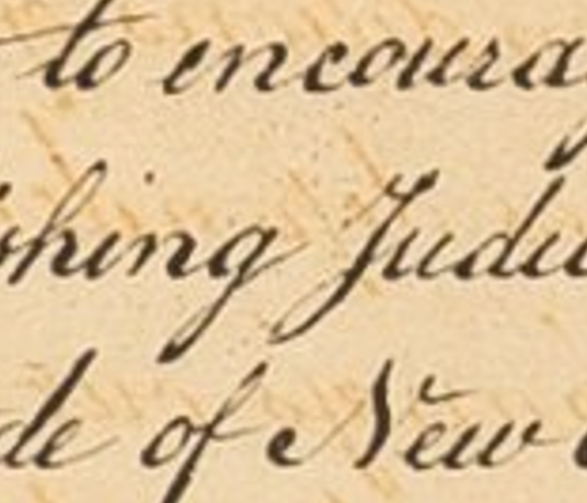
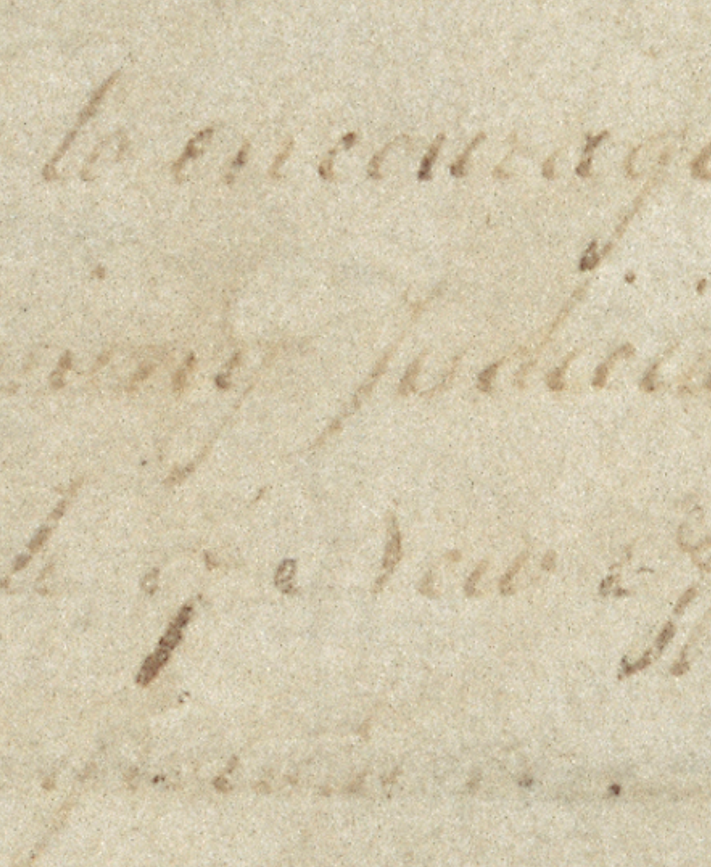
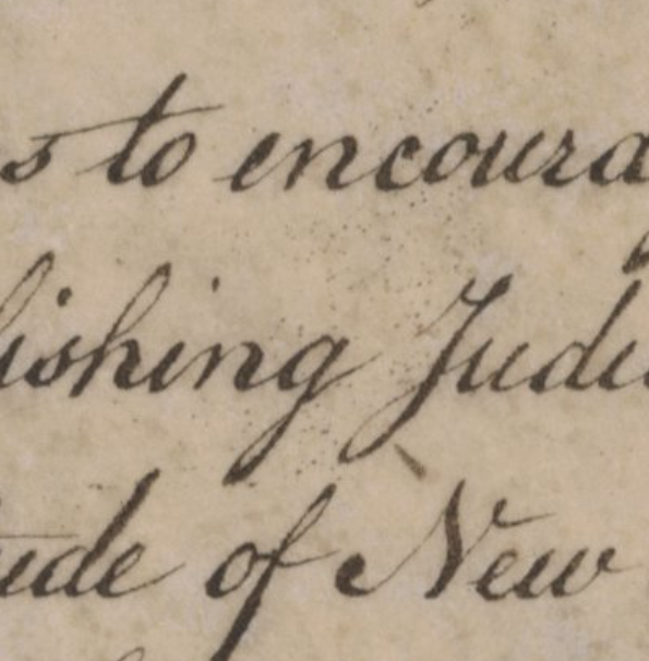
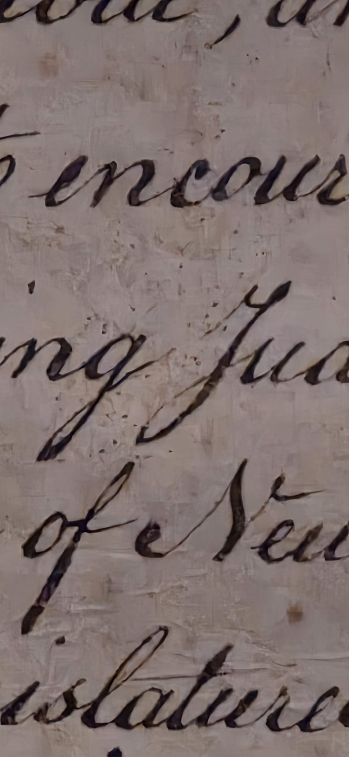
Let's go a step further and ask Gemini to examine this dot pattern across three of the images (a more advanced technique would involve manual comparison via semi-transparent overlays or using more advanced spatial analysis algorithms, but here we are interested in the ability of untuned advanced AI models to perform such comparisons at scale). The three images can be seen side-by-side below in order (crisp paper Stone, parchment Stone, 1976 Stone paper print from NARA copperplate):
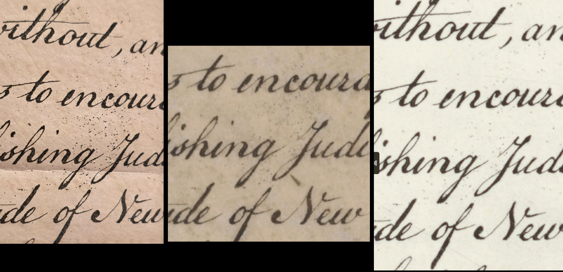
We want to answer TWO key questions. The first is whether the paper and parchment Stones were made from the same copperplate. Thus, we provide a zoom of the crisp clear paper Stone and the first of the parchment zooms from above. Second, we want to answer whether the copperplate on display at NARA today is the same used to make the paper and parchment Stones two centuries ago. For this we include the zoom of the 1976 paper print made from NARA's copperplate. Despite the images and underlying documents having different levels of clarity and quality, Gemini is able to abstract sufficiently to focus on their macro-level patterns and determine that they are indeed the same dot pattern:
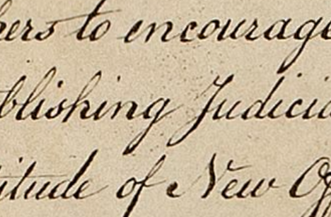
Attached are three prints from an 1820's copperplate engraving.
They differ slightly in what they were printed on (paper vs vellum)
and how faded the print is and/or how much ink was used in the original print,
so accept slight differences related to these factors.
Look EXTREMELY CAREFULLY at the cloud of tiny dots around the letter "J".
Does it appear to be the exact same pattern across the three prints, suggesting they are from the exact same copperplate?
Based on an extremely careful examination of the three images, yes, the dot patterns appear to be exactly the same across all three prints.
This strongly suggests that these prints were pulled from the exact same physical copperplate.
Here is the breakdown of why this conclusion is solid, despite the differences in ink weight, paper texture, and overall clarity:
The Method: "Constellation" Matching
When comparing random speckling to determine if it comes from a fixed source (like a pitted copperplate) rather than random paper artifacts (like foxing or ink spray during printing), you have to look for "constellations"—specific geometric arrangements of dots relative to one another and relative to fixed landmarks (the letters).
If you treat the area between "encour…" and "…ishing Jud…" as a map, several distinct constellations match perfectly across all three images:
1. The "Triangle" under the 'e' and 'n'
Look directly below the space between the 'e' and 'n' in the word "encourage" (and above the 'h' in 'lishing').
-
- In all three images, there is a distinct, relatively tight cluster of slightly darker dots forming a triangular or diamond shape. Its position relative to the descender of the 'g' to its right is identical in all three.
2. The "Arch" connecting the 'g' and 'J'
Look at the space between the tail of the 'g' (in 'lishing') and the top-left curve of the capital 'J'.
-
- There is a sweeping, curved line of scattered dots that follows the contour of that empty space. The spacing of the heavier dots within this "arch" is consistent across Image 1, 2, and 3.
3. The "Pair" in the lower gap
Look at the narrowest gap between the bottom loop of the 'g' and the lower left upstroke of the 'J'.
-
- In all three images, there are a couple of distinct dots sitting precisely in that channel.
4. The Upper Left Scatter
Look above the 's' and 'h' in 'lishing', below the word 'to'.
-
- There is a wider, looser scatter of dots here. Even though they are fainter in Image 2, the primary anchors of that scatter align perfectly with the heavier, darker spots in Images 1 and 3.
Why the differences don't matter
As you noted, Image 3 appears to have heavier ink application or sharper contrast, making the dots look slightly larger and darker. Image 2 is softer, so some of the microscopic dust-like specks drop out entirely.
However, the spatial geometry of the dots that are visible remains perfectly locked in place.
Conclusion
Random ink splatter from the press or random aging marks (foxing) on the paper would not replicate in the exact same complex spatial pattern across three different sheets. This specific "cloud" of dots is a permanent physical feature of the printing matrix—likely caused by "foul biting" (where acid slightly eats through the protective ground during etching) or pitting on the surface of the copperplate itself.
Therefore, these are definitively prints from the exact same engraved plate.
Of course, this entire analysis happened because a human spotted this printing artifact while performing an extremely detailed condition inspection during the accessioning process of a particularly crisp Stone. Could AI tools like Gemini be used to spot these kinds of fingerprinting artifacts at scale fully autonomously? To test this, we divided the original paper Stone that began this analysis into a grid and asked Gemini to inspect a few of the grid cells using the following prompt:
attached is a print from a copperplate engraving.
look carefully and describe all artifacts you observe that suggest defects in the original copperplate,
including scratches, pitting, etc.
look especially for incredibly subtle patterns that could be used to uniquely identify the copperplate
that made this print.
For the grid cells with no visible artifacts, Gemini assessed there were no printing artifacts and instead described characteristics of the engraver's style:
1. Extreme Tapering (Burin Entry/Exit Points)
If you look closely at the ends of strokes—such as the tops of the downstrokes on the "W", the bottoms of the "l"s, or the top of the "d"—they come to impossibly sharp, microscopic points.
-
- Why this happens: An engraving tool (a burin) is a v-shaped chisel. As the engraver pushes it into the metal, the line gets wider (thick downstroke). As they lift the tool out at the end of the stroke, the trench narrows to an absolute point. A pen nib cannot naturally create points this perfectly sharp and consistent.
2. Mechanically Crisp Edges (Lack of Feathering)
Notice the edges of the thickest dark strokes. They are razor-sharp.
-
- Why this happens: If this were fluid ink from a pen on paper, you would typically see microscopic "feathering" where the ink bleeds slightly along the paper fibers. Engraving ink is stiff and paste-like. It is forced into the etched grooves under massive pressure from a roller press, resulting in a perfectly crisp edge with no bleed.
3. Constructed Crossbars
Look closely at the horizontal lines crossing the "t"s in "eat out".
-
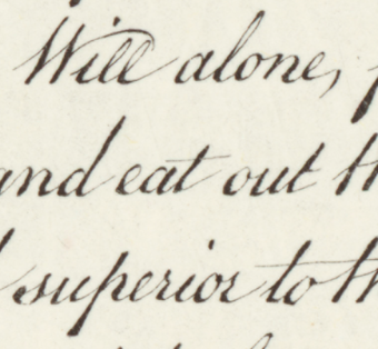
- Why this happens: A pen writer makes a quick horizontal dash. The engraver must cut a specific groove. Notice how the crossbars start extremely thin, thicken slightly in the middle, and taper to a sharp point at the end. They look like distinct, carefully constructed cuts laid over the vertical stems, rather than a fluid continuation of handwriting.
4. "Hairline" Consistency
Look at the sweeping upward entry stroke on the first "W", or the thin lines connecting letters (like between "n" and "d").
-
- Why this happens: These lines are incredibly thin but perfectly unbroken and consistent in width. A flexible pen nib often varies slightly in pressure or might skip. A shallow scratch made by an engraver's needle creates a perfect, microscopic trench that holds ink consistently.
5. Density in the Swells
While difficult to see without raking light, the thickest parts of the letters (the heavy downstrokes) are extremely dark and dense.
-
- Why this happens: In intaglio printing, thicker lines are actually deeper trenches cut into the metal. Because they hold a greater volume of ink, that ink is pulled out onto the paper during printing. If you were able to touch the original paper, these thick black lines would likely feel slightly raised (embossed) above the surface of the paper.
In summary, you aren't seeing mistakes (like ink blobs or smudges), but you are seeing the hallmarks of the burin tool—the extreme, needle-like points and perfectly consistent hairlines that prove this was cut into metal rather than written with a pen.
In contrast, for this grid cell of the 1976 print it identifies numerous printing artifacts, including a variety of new scratches acquired in the two centuries since the original prints were made:
Based on a careful examination of the image, there are several distinct artifacts present in the "whitespace" (the areas intended to be unprinted paper).
Because this is a print from a copperplate engraving (an intaglio process), any dark marks appearing in the background indicate areas where the smooth surface of the copperplate was damaged—either by scratching, pitting, or corrosion. These damaged areas act like the engraved letters, catching and holding ink that is then transferred to the paper.
These accidental marks act as a unique "fingerprint" for this specific physical plate.
Here is a breakdown of the artifacts observed that suggest defects in the original copperplate:
1. Prominent Scratches
The most defining and easily identifiable defect in this section of the plate is a long, continuous scratch.
-
- The Left Vertical Scratch: There is a distinct, thin, dark line curving vertically down the left side of the image.
- It becomes visible near the left edge, passing just to the left of the words "ng to pass".
- It continues downward, intersecting the word "laws".
- It passes directly through the tail of the letter 't' and the 'e' in "cted".
- It continues down and crosses over the capital 'C' and the 'o' in "Consent".
- It fades out slightly below the word "Consent."
- Significance: This is a classic tool scratch or handling mark on the plate. Because it spans multiple lines and crosses intentional engraving, it is an absolute identifier for prints pulled from this specific state of the plate.
- The Left Vertical Scratch: There is a distinct, thin, dark line curving vertically down the left side of the image.
2. Pitting and Corrosion (Distinct Dots)
Copperplates are highly susceptible to oxidation and corrosion if not perfectly protected. When slight corrosion occurs, it creates microscopic pits that hold ink, appearing as tiny black speckles on the print. There are several isolated, distinct examples here:
-
- Between "of" and "New": Look at the phrase "multitude of New Offices". Just below the baseline, almost exactly midway between the 'f' in "of" and the 'N' in "New", there is a very distinct, isolated black dot.
- Above "Offices": Just above the 'i' in "Offices," there is another distinct dot.
- Under "without": Look below the letters 'h' and 'o' in the word "without". There are two or three small, clear dots in the whitespace.
- Above "Judiciary": There is a noticeable dark speck located slightly above and between the 'i' and 'c' in "Judiciary".
- Above "constitution": There is a small dot hovering above the first 't' in "constitution".
3. Faint Linear Marks
Aside from the major scratch on the left, there are subtler, fainter lines that suggest minor surface abrasions on the plate:
-
- Under "mock": Look below the 'c' and 'k' in the word "mock" (bottom left). There is a very faint, curved, short line segment in the whitespace.
- Between "from" and "punishment": In the bottom line, look at the whitespace between these two words. There appears to be a very faint, almost horizontal scratch connecting the space between them.
4. The "Subtle Pattern": Overall Plate Texture
If you zoom in and look strictly at the blank background paper, it is not uniformly clean. There is an overall, microscopic "noise" or speckling across the entire image.
-
- While some of this can be attributed to "plate tone" (a micro-thin layer of ink left behind due to imperfect wiping during the printing process), an irregular, fixed pattern of micro-dots often suggests the grain or polish of the copperplate itself.
- If the copper was imperfectly polished before engraving, or if it suffered from widespread, microscopic surface oxidation, it will print with this slightly "dirty" background. If you were comparing this print to another suspected print from the same plate, matching the specific constellation of this background microscopic speckling—particularly near the major letters—would uniquely confirm they share the exact same matrix.
In fact, across the entire document, Gemini was able to visually assess each grid cell, determine whether it contained likely printing artifacts and describe them in detail and then compare those artifacts across multiple copies of differing quality to determine if they were print-specific or systemic fingerprints of the original copperplate, demonstrating that this workflow is successful at scale.