Using our massive new dataset of readability scores of worldwide English language news coverage of 2020, how might we evaluate the "readability" of Covid-19 news coverage compared with the baseline of all monitored news coverage over the course of this year? Is Covid-19 coverage becoming more or less understandable to the public in terms of the words and grammatical structures used?
The SQL query below in BigQuery computes the daily average Kincaid reading level score (grade level) of all monitored coverage each day mentioning "virus" (which includes "coronavirus"), "Covid-19" or "pandemic" somewhere in the title and compares it against the average Kincaid reading score of all coverage monitored each day:
select day, SUM(kincaid_covid) kincaid_covid, SUM(kincaid_all) kincaid_all from (
SELECT DATE(date) day, AVG(CAST(REGEXP_EXTRACT(readabilityScores, r'Kincaid: (.*)') AS FLOAT64)) kincaid_covid, 0 kincaid_all FROM `gdelt-bq.gdeltv2.readability` WHERE (LOWER(title) like '%virus%' or LOWER(title) like '%covid-19%' or LOWER(title) like '%pandemic%') and DATE(date) >= "2020-01-01" group by day
UNION ALL
SELECT DATE(date) day, 0 kincaid_covid, AVG(CAST(REGEXP_EXTRACT(readabilityScores, r'Kincaid: (.*)') AS FLOAT64)) kincaid_all FROM `gdelt-bq.gdeltv2.readability` WHERE DATE(date) >= "2020-01-01" group by day
) group by day order by day asc
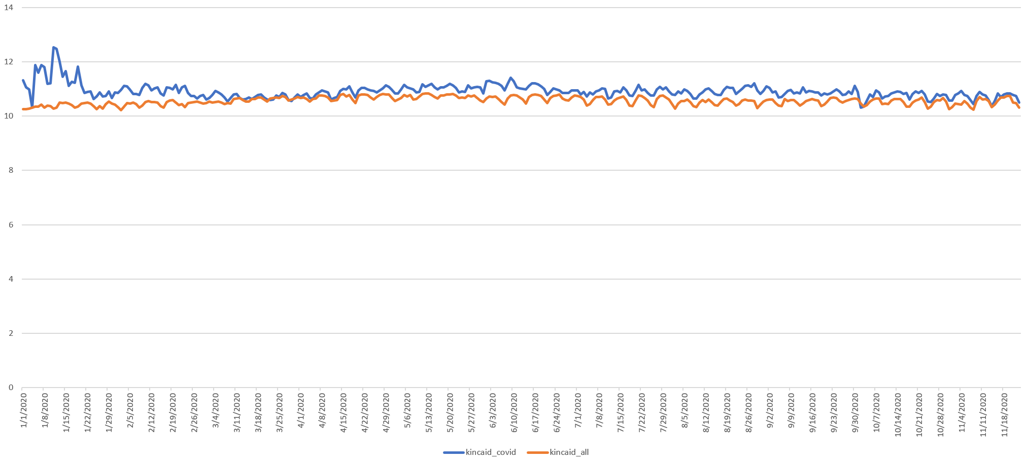
Plotting the two yields the graph below (higher numbers mean harder to read). We can see that early Covid-19 coverage had fairly high scores, likely because original coverage was more technical and focused on medical terminology to introduce a strange new disease to audiences. In March it dropped back to the baseline but has been just above it ever since. Remember that our definition of "Covid-19 coverage" here includes only those articles mentioning it in their title. it is notable that in March when the Covid-19 score equals the baseline, it is because Covid drops to the baseline, while the baseline is relatively unchanged, suggesting this is due to the changing nature of Covid coverage, rather than Covid coverage becoming so ubiquitous that the baseline simply becomes the Covid curve due to all coverage being about Covid.
The graph below plots the difference between the two and shows an interesting ebb and flow, with the complexity of initial coverage falling through mid-March, then ramping back up through early June, then falling through early July, then rising again through the end of August, then falling through present as the pandemic has become ever-present and coverage has become more colloquial.

Similarly, the SQL query below repeats this process for the Flesch score:
select day, SUM(flesch_covid) flesch_covid, SUM(flesch_all) flesch_all from (
SELECT DATE(date) day, AVG(CAST(REGEXP_EXTRACT(readabilityScores, r'Flesch Index: (.*?)/') AS FLOAT64)) flesch_covid, 0 flesch_all FROM `gdelt-bq.gdeltv2.readability` WHERE (LOWER(title) like '%virus%' or LOWER(title) like '%covid-19%' or LOWER(title) like '%pandemic%') and DATE(date) >= "2020-01-01" group by day
UNION ALL
SELECT DATE(date) day, 0 flesch_covid, AVG(CAST(REGEXP_EXTRACT(readabilityScores, r'Flesch Index: (.*?)/') AS FLOAT64)) flesch_all FROM `gdelt-bq.gdeltv2.readability` WHERE DATE(date) >= "2020-01-01" group by day
) group by day order by day asc
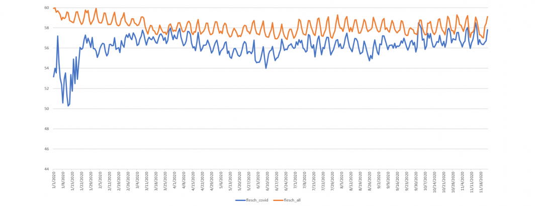
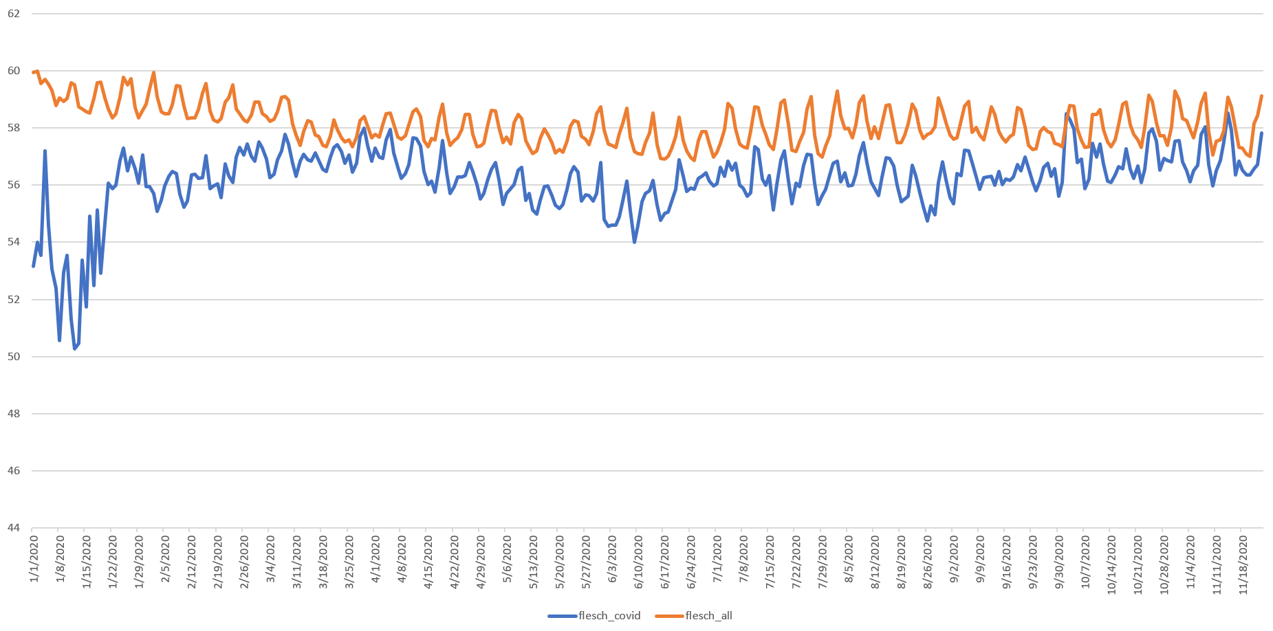
The timeline below compares the two scores (in this case lower numbers indicate more complex text that is harder to read). Once again early coverage is more complex with an increase towards mid-March, though here the baseline drops to become more complex in mid-March and remains stable since, with a similar ebb and flow of Covid coverage.
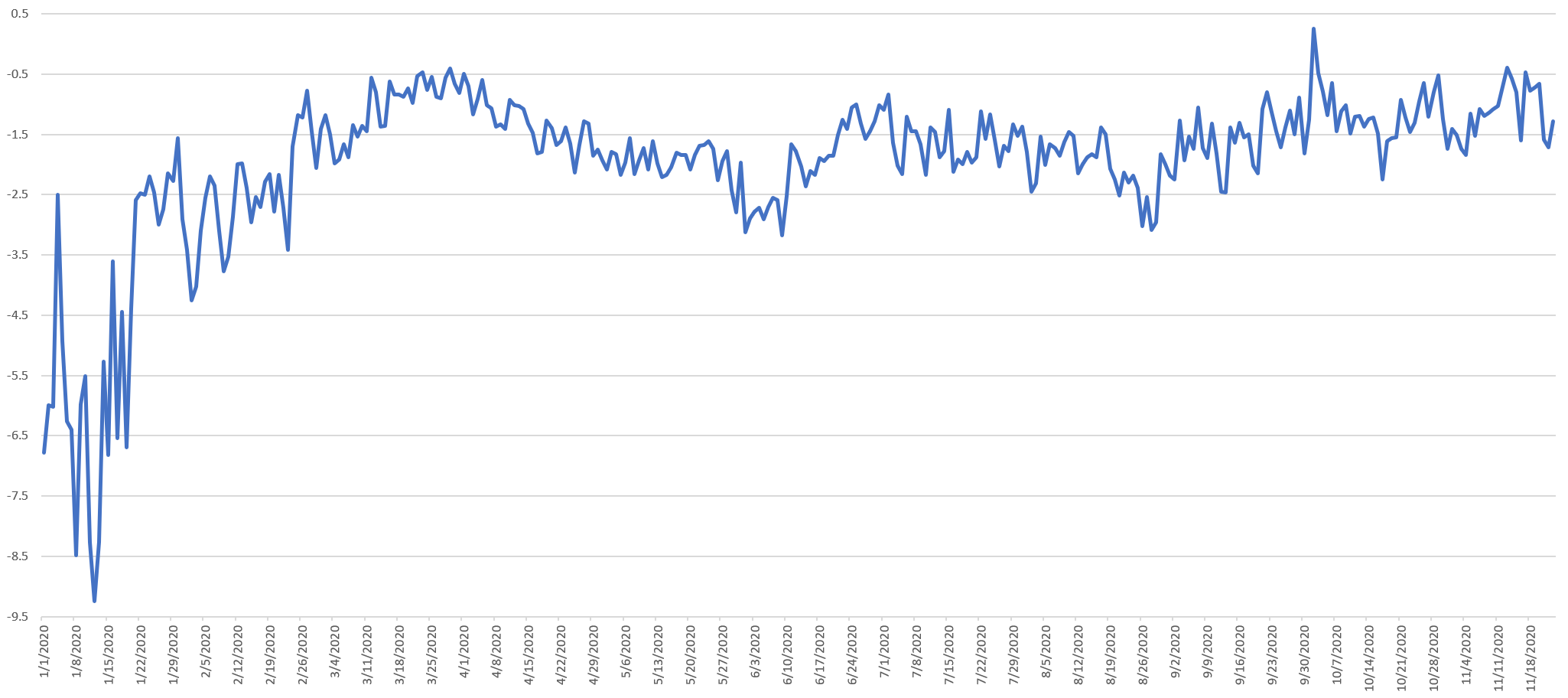
The graph below plots the difference between Covid-19 and all coverage Flesch scores, showing an ebb and flow similar to that seen in the Kincaid scores.
In the end, these examples are just scraping the surface of what's possible with the new reading scores but showcase just how much potential there is in this new dataset! Most importantly, by looking carefully at the ebbs and flows above and correlating them to the narrative at each moment in time, there are a number of lessons for science communicators in how the media has discussed the pandemic to date.