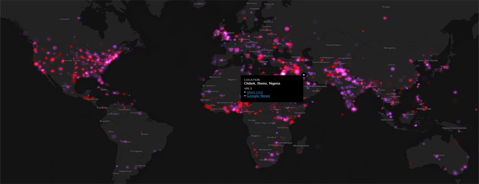
Imagine a map that uses computers to “read” news reports from across the entire world each day, identifying the events described within and their locations, and placing all of that into a single interactive map, zoomable and clickable down to the level of a city or hilltop across the globe, summarizing in at glance our world in motion. Add on top of that an animation of global events over the past six months, placing current events into context and illuminating macro-level global trends.
Ever since the debut of the GDELT Global Conflict Dashboard last July, created with the support of the US Institute of Peace, we've received an incredible amount of requests for the ability to create your own customized dashboard maps that display different kinds of events or filter the data differently. Today we've released the two PERL scripts that power the Global Conflict Dashboard so that you can use them as building blocks in creating your own global maps based on GDELT's data, along with a brief tutorial below. These scripts make use of the CartoDB API, but can easily be adapted to other online mapping systems. Note that the tutorial below and the PERL scripts assume basic familiarity with CartoDB, PERL, and GDELT. For more information on how to use CartoDB, refer to their online tutorials or SQL tutorial.
CREATING A CARTODB ACCOUNT
- The first step is to create a new CartoDB account for yourself at cartodb.com. They offer free starting accounts that should have enough quota to build a small starting map and offer a variety of paid options with more than enough storage quota to build even the largest global maps.
- Once you've created a new account and logged into CartoDB, click on the down arrow in the top-right of your console screen (next to your username) and click on "Your API Keys". This will display a new screen that shows you your API Key (the roughly 40 character hexadecimal code). Write this down, as you'll need it in a moment.
- Now go to the "Tables" view and create a new table called "gdeltanimated" (all lowercase) with fields "date" (in "Date" format) and "type" (number format). CartoDB will add the other necessary geometry fields automatically.
- Now create a new table called "gdeltlive" (all lowercase) with fields "type" (number), "count" (number), "location" (string) and "urls" (string). CartoDB will add the other necessary geometry fields automatically.
SETTING UP THE PERL SCRIPTS
- Now its time to set up the PERL scripts that will populate and update your new CartoDB tables. Download the two PERL scripts to your local computer (gdelt-cartodb-dashboard-mapper.pl and gdelt-cartodb-dashboard-mapper-animated.pl) and edit the variables at the top that pertain to the directory you are downloading the daily GDELT 1.0 files to, your CartoDB account username, and your CartoDB API Key (which you looked up above).
- Both scripts assume that you are using some other process to automatically download the GDELT 1.0 daily update files each morning to your local computer and unzip them (likely via a cronjob that runs around 6AM EST each morning). Ensure that you have at least the previous day's GDELT 1.0 Event and GKG files on your local computer for the next step. Make sure that you only use GDELT 1.0 files with the PERL scripts – they will need to be modified to use them with the forthcoming GDELT 2.0 format.
- Run the two PERL scripts directly from the command line. They should report their progress as they populate the CartoDB tables – if any errors occur, they will report them to the screen.
CREATING THE CARTODB VISUALIZATIONS
- Now log back into CartoDB.
- Create a new visualization from the "gdeltlive" table, calling it anything you'd like. Use the toggle at the top center of the screen to switch into "Map View".
- Using the layer controller on the right, create your first layer and call it "Protests". Use the "Visualization Wizard" button to make it a "Bubble" map, set Column to "count", Quantification to "Jenks", Radius Min to 5, Radius Max to 20, Bubble Fill color to "A53ED5" (pink) and Bubble Fill Opacity to 0.5, Bubble Stroke to 0, and Composite Operation to "lighten". At this point the screen should look something like the following (note that the screencap below was actually taken after the third layer was already created, so you won't see the animation bar in your screen yet):
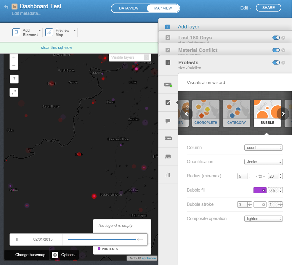
- Then click on the SQL tab and paste in "SELECT * FROM gdeltlive where type=1" as the Custom SQL Query for the layer. Also click on its Legends tab and add a Custom template and add an entry with "A53ED5" color titled "Protests"
- Now create a second layer and call it "Material Conflict". Repeat everything above, except for Bubble Fill color and Legends entry, set it to "FF0000" (red) and for the custom SQL query, set to "SELECT * FROM gdeltlive where type=2".
- Now create a third layer and call it "Last 180 Days". This time, when creating this layer, select the source table as "gdeltanimated" instead of "gdeltlive". This will tell CartoDB to use the animation table for this layer. Under the Wizard scroll all the way to the right and select "Torque Animated" map type. Then click on the CSS tab and paste the following custom code into the box and then click the "Apply Style" button at bottom right:
/** torque visualization */
Map {
-torque-frame-count:180;
-torque-animation-duration:12;
-torque-time-attribute:"date";
-torque-aggregation-function:"round(avg(type))";
-torque-resolution:1;
-torque-data-aggregation:linear;
}#gdeltanimated{
comp-op: lighter;
marker-fill-opacity: 0.5;
marker-line-color: #FFFFFF;
marker-line-width: 0;
marker-line-opacity: 1;
marker-type: ellipse;
marker-width: 3;
marker-fill: #A53ED5;
[value = 2] { marker-fill: #FF0000; }
}
#gdeltanimated[frame-offset=1] {
marker-width:5;
marker-fill-opacity:0.25;
}
#gdeltanimated[frame-offset=2] {
marker-width:7;
marker-fill-opacity:0.125;
}
#gdeltanimated[frame-offset=3] {
marker-width:9;
marker-fill-opacity:0.08333333333333333;
}
#gdeltanimated[frame-offset=4] {
marker-width:11;
marker-fill-opacity:0.0625;
} - Then click on the Share button in the very top-right of the screen and export this visualization to a URL. You should now see an online interactive clickable animated map that looks nearly identical to the GDELT Global Conflict Dashboard map. By modifying the various settings above you can change the appearance of the maps and by modifying the PERL scripts you can change the kinds of events reflected on the map.
AUTOMATIC UPDATING
- At this point you should have a basic map with a single day's worth of data on it. To update the map automatically each morning, set up a cronjob to run automatically each morning at 6AM EST to download the latest GDELT 1.0 files to your computer and unzip them, and then run the two PERL scripts above. That will update your map each morning with the latest data.