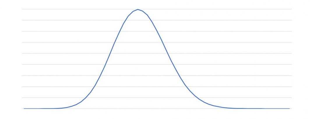
Operating internet-scale globally distributed crawler fleets offers fascinating insights into how massive complex software can operate almost like a living organism, reacting in unexpected ways, forming complex unanticipated behaviors and exhibiting theory-vs-reality disconnects. At the same time, it is remarkable to see how closely systems can perform to their original specifications and to see phenomenon like bell curves emerge out of immense streams of data.
The graph at the top of this post visualizes key distribution across one of our geographically distributed frontier cache clusters, reflecting the number of keys per shard, with the X axis being key count and Y axis being the number of shards having that key count. The result is a classic bell curve, showing that the majority of shards fall in a relatively smooth distribution around the theoretic shard size, but noticeably the curve is slightly skewed towards smaller shards with a slightly longer tail of larger shard outliers. These are the kinds of potentially "hot" outliers that can cause performance issues that can be caught through these kinds of visualizations, though in this case the impact is negligible since those outliers happen to be rarely accessed as well.