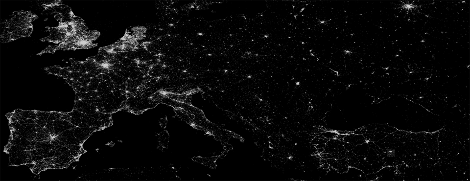
There wasn't room to include the map below in "Who's Doing the Talking on Twitter?", out in The Atlantic today, but we wanted to make it available for those of you who are interested in zooming deeply into a high resolution composite of all geotagged tweets published in the Twitter Streaming API January 1, 2012 through December 31, 2014, inclusive. Countries with high densities of geotagged Twitter penetration, such as the United States, Brazil, Western Europe, Turkey, Saudi Arabia, and Southeast Asia, capture exquisite detail of human activity and mobility, including the thin tendrils of roadways and transit corridors that connect nations. At the same time, other countries like India illustrate the sparseness of geotagged Twitter penetration outside that handful of nations. Reassuringly, this map aligns closely with Twitter’s own 2013 visualizations of 100% of its geotagged tweets, suggesting this map, while capturing slightly less fine detail, accurately reflects the contours of geotagged tweets.