Using the new Global Numeric Graph announced yesterday, which tracks global mentions of precise numeric counts in worldwide news coverage in 152 languages in realtime back to January 1, 2020, what does the Covid-19 pandemic look like in terms of how often disease-related numbers have appeared in the news?
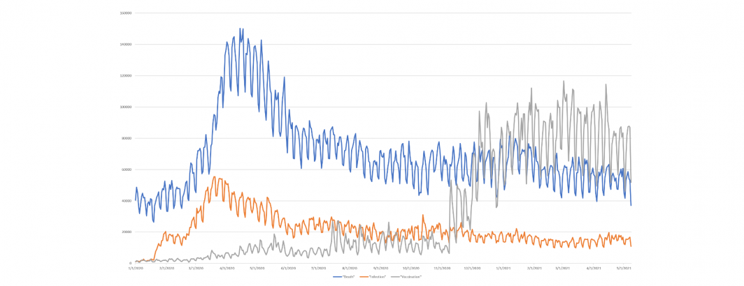
Using the simple queries below, we searched all appearances of numeric counts across English language news coverage monitored by GDELT from January 1, 2020 through May 9, 2021 and counted the total number of numeric statements per day that mentioned either "deaths/dead/died/dying" in context with the number, "infect*" or "vaccin*" to count how many numbers across the monitored English coverage each day were associated with these three topics. Note that this counts how many times per day a number was expressed in text alongside one of these three sets of keywords, not the actual death/infection/vaccination count itself. In other words, if an article states "more than 3,000 have died in the last 24 hours", we would record that the topic of death appeared alongside a number once in the article, not that 3,000 people died. In other words, we are looking at how prevalent death, infections and vaccinations were in global English language news coverage day by day over the course of the pandemic.
Note that we do not limit ourselves to only counts found in Covid-19-related coverage – these reflect any mention of death, infection or vaccination across any topic over the past year and a half.
SELECT DATE(date) day, count(1) count FROM `gdelt-bq.gdeltv2.gng` where lang='ENGLISH' and (LOWER(context) like '%deaths%' OR LOWER(context) like '%dead%' OR LOWER(context) like '%died%' OR LOWER(context) like '%dying%') group by day order by day
SELECT DATE(date) day, count(1) count FROM `gdelt-bq.gdeltv2.gng` where lang='ENGLISH' and (LOWER(context) like '%infect%') group by day order by day
SELECT DATE(date) day, count(1) count FROM `gdelt-bq.gdeltv2.gng` where lang='ENGLISH' and (LOWER(context) like '%vaccin%') group by day order by day
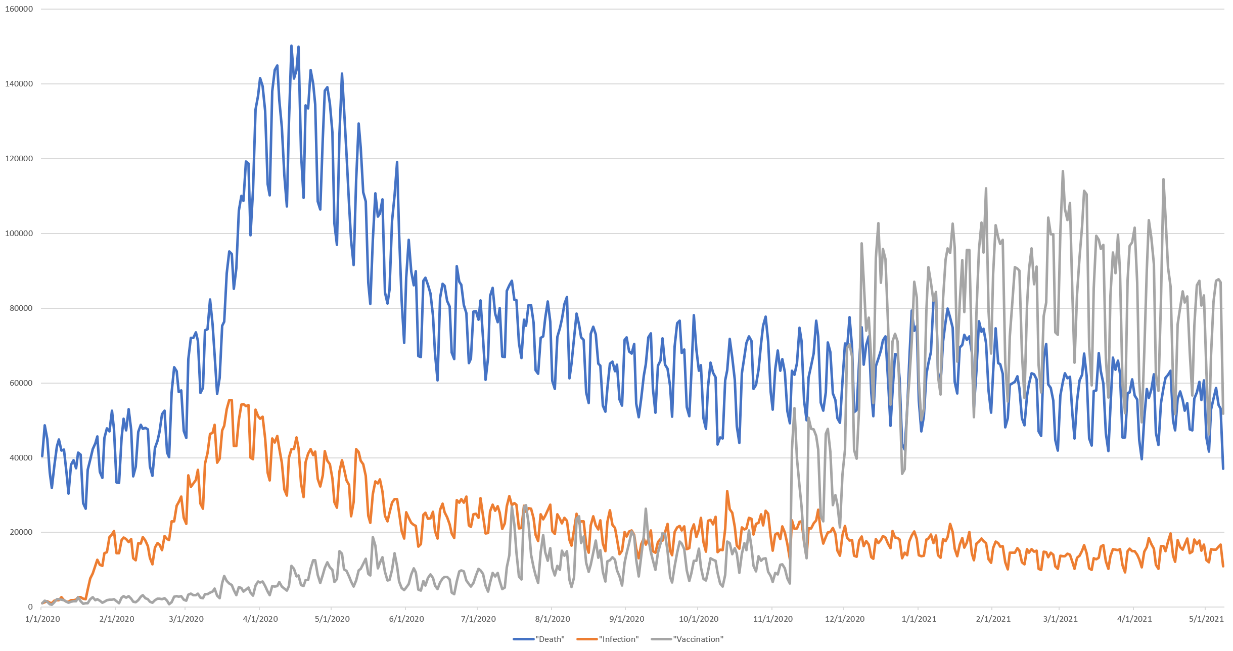
The end result is the graph below, showing that mentions of infections and vaccinations were relatively rare in the news leading up to the pandemic, with infections rising sharply at the start, with vaccination counts rising slowly and then sharply once they were approved. Mentions of death counts were much higher pre-pandemic, suggesting they are a routine fixture of daily news coverage and have always remained higher than infections throughout the course of the pandemic. Vaccination mentions overtook death mentions rapidly once they were approved.
The number of numeric mentions of death each day over this period is correlated at r=0.83 with infections and r=-0.22 with vaccinations, while infections and vaccinations are correlated at r=-0.36.
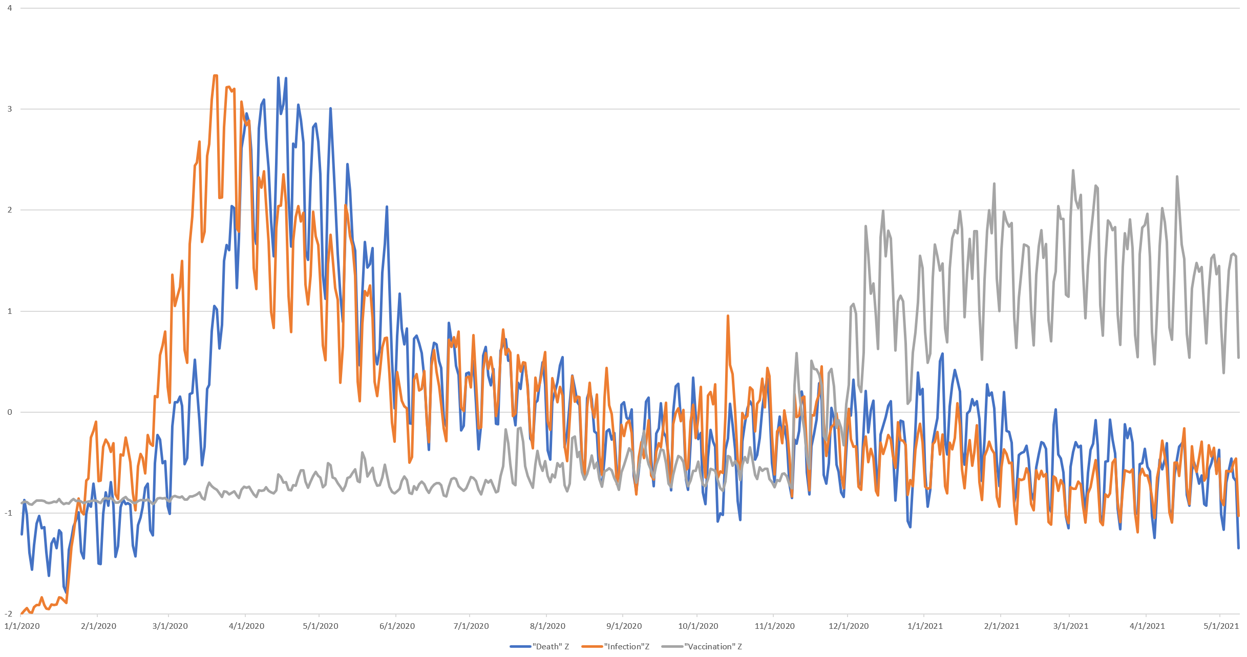
Since the three timelines have very different vertical scales, the timeline below converts them to Z-scores (standard deviations from mean), allowing their trajectories to be more directly compared. Here it can be seen that infections soared first, followed by an almost exactly 2-week lag of death counts rising. Infection mentions declined first and more sharply than death mentions until late June 2020, at which time they begin to align before death mentions increase again in late December 2020 and align again around the start of April 2021. Vaccine count mentions have remained fairly stable since mid-December 2020.
We hope this inspires you in thinking of creative ways of using the new Global Numeric Graph!