How are television news channels communicating the pandemic to their viewers? CNN's live Covid-19 tracking dashboard is perhaps the most iconic, appearing onscreen for up to 9 hours a day almost every day since March, but MSNBC and Fox News also incorporate various dashboard modalities.
CNN's tracker has remained largely unchanged since the start of the pandemic, with its distinctive white and yellow lettering over a purple background:

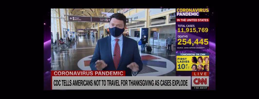
Compare the clip above from November 21 against this clip from March 28, showing how its visual iconography has changed little over the course of the year:
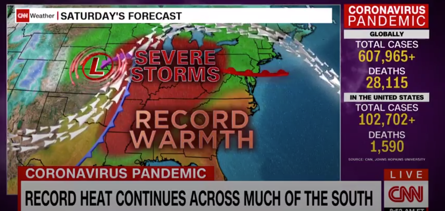
In fact, CNN's Covid-19 dashboard is so prevalent it occasionally makes appearances on other television channels as they play clips from CNN's coverage, such as this September 17 Fox News clip that in turn shows a clip from CNN:

Fox News has displayed counts in several ways, including its own dashboard that often also displays state-by-state breakdowns, such as from this September 17 clip:

Early in the pandemic, MSNBC developed its own dashboard very similar to CNN's in look-and-feel, such as from this May 9 clip:

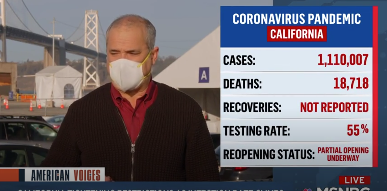
It has also used focused dashboards, such as this one on California from November 22:
It has a more regular mini dashboard that displays only a running tally of cases or deaths, such as this clip from October 24:

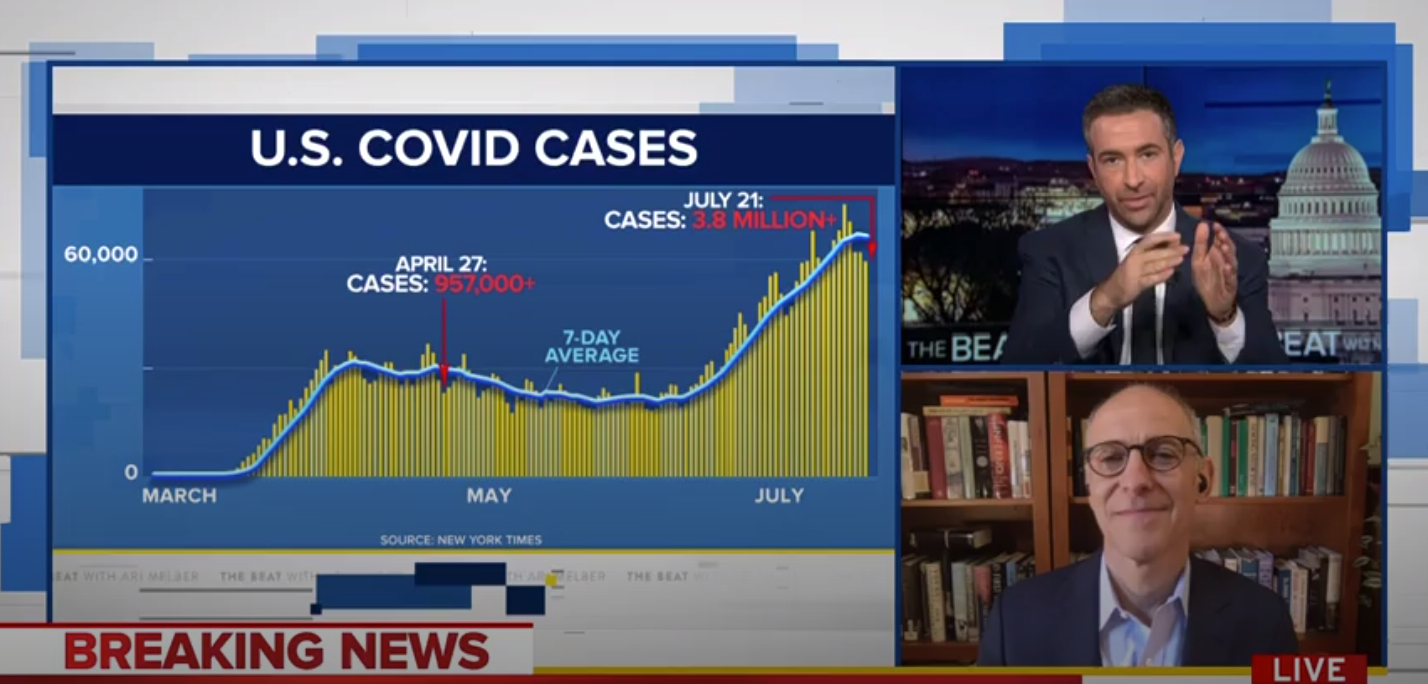
It has also on occasion displayed more complex visuals for specific commentary, such as this clip from July 21:
Much remains to be seen as to the relative effectiveness of these different approaches to summarizing the state of the pandemic to viewers and if such differences have contributed to public behaviors in meaningful ways.