CNN's COVID-19 dashboard has been an ever-present fixture of its pandemic reporting since March 20th. Did it do the same for the Ebola outbreak in 2014?
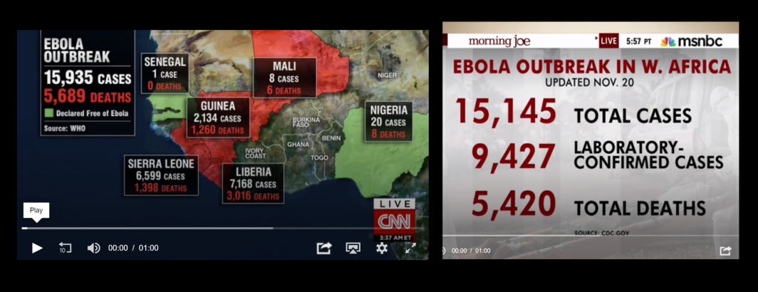
While not a comprehensive review of CNN's Ebola coverage, a quick keyword search for any moment of airtime in which "ebola", "cases", "deaths" and "source" were onscreen all at once (replicating the structure of its 2020 COVID-19 dashboard) yields examples like the one below. Unlike CNN's COVID-19 dashboard that is displayed up to 9 hours a day, its Ebola display only appeared a total of 49.3 minutes from 7/23/2014 to 11/30/2014 (the dates of primary television news coverage of the outbreak) and thus was more of a special infographic than an ever-present dashboard.
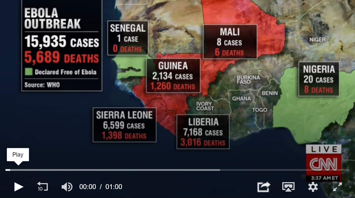
View Clip.
View Search Results.
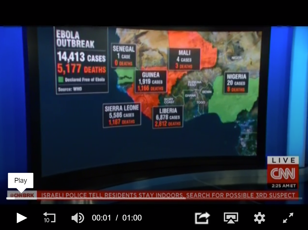
In fact, the OCR capabilities of Google's Cloud Vision AI API are so accurate that it was able to pick up examples like this one in which the image is a camera feed showing the dashboard displayed on a curved television screen in the studio at around a 45 degree angle to the screen:
MSNBC periodically featured this dashboard:
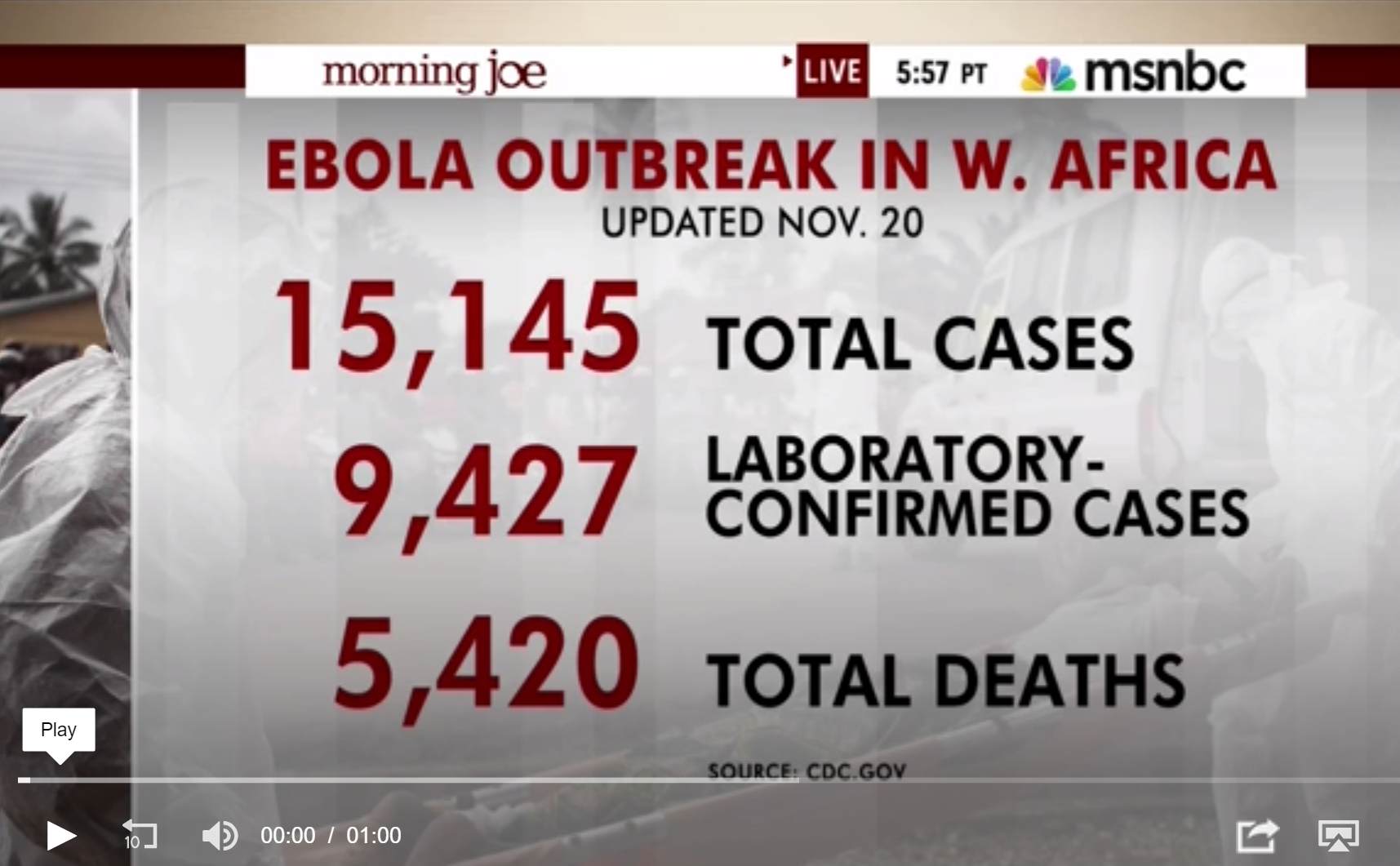
View Clip.
View Search Results.
While these are just examples of CNN and MSNBC's dashboard coverage of the Ebola outbreak, it showcases the incredible power of being able to search the onscreen text of television news coverage of disease outbreaks.
This work was made possible through the Media-Data Research Consortium (M-DRC)'s Google Cloud COVID-19 Research Grant to support “Quantifying the COVID-19 Public Health Media Narrative Through TV & Radio News Analysis.”