Having had Google's Cloud Natural Language API non-consumptively read through the transcripts of a decade of television news from the Internet Archive's Television News Archive and catalog all of the people, organizations, locations, events, publications, dates and other entities it saw, how might we use this data to visualize the most important connections of the past decade, as seen through television news? It turns out that with a single SQL query in BigQuery and Gephi we can visualize the relationships that defined the past decade.
All Stations
Looking across CNN, MSNBC, Fox News and the evening news broadcasts of ABC, CBS and NBC 2009-2019 and BBC News 2017-2019, what are the top 1,500 most commonly co-occurring pairs of entities? Here we define co-occurrence as the pair of names appearing in the same one-minute window and limit entities to those Google has assigned a unique identifier (MID code) to.
The final graph can be seen below.
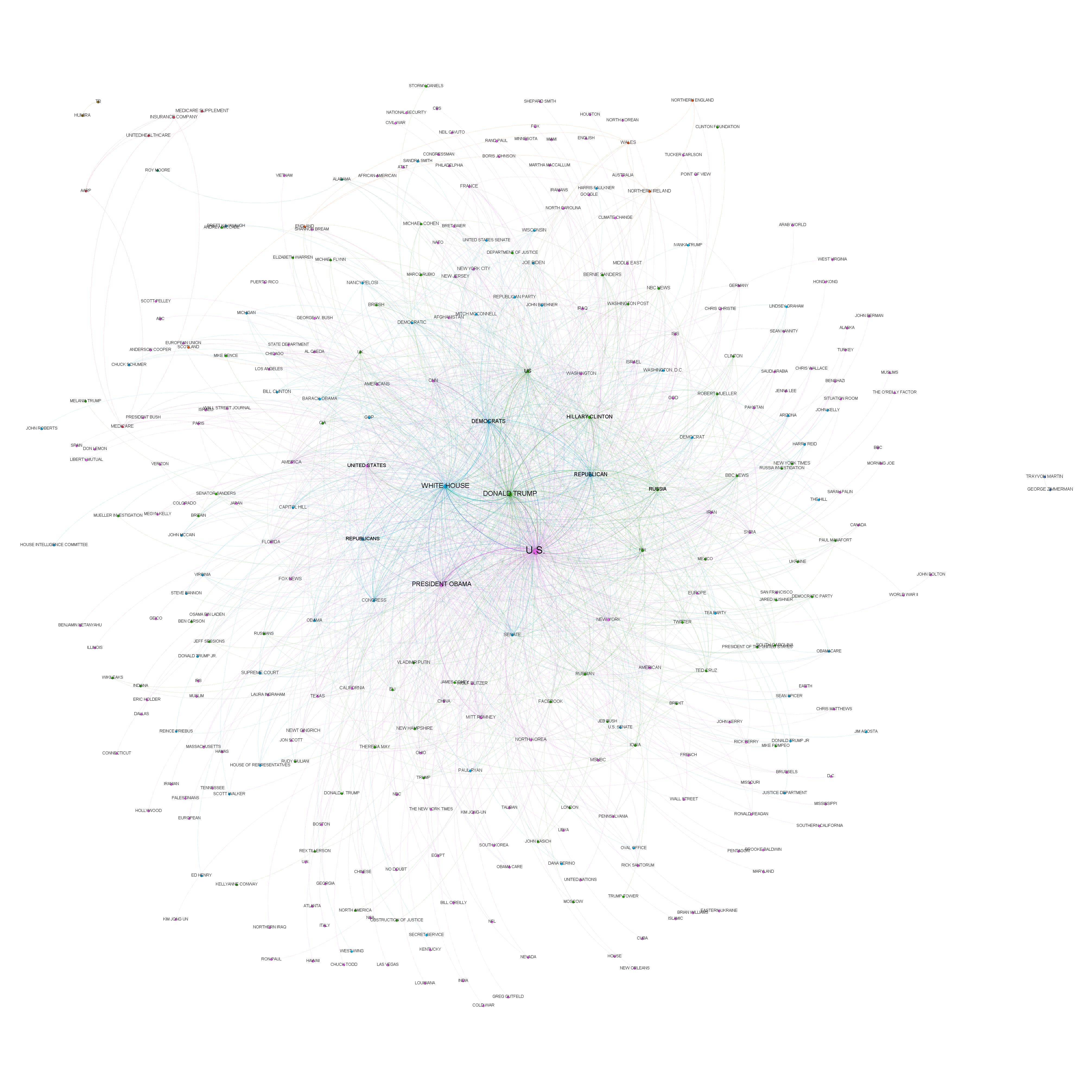
Constructing this graph required just a single query, modified from the original by Felipe Hoffa:
SELECT Source, Target, Count RawCount, "Undirected" Type, ( Count/SUM(Count) OVER () ) Weight FROM (
SELECT a.entity Source, b.entity Target, COUNT(*) as Count
FROM (
 (SELECT date, entities.name entity FROM `gdelt-bq.gdeltv2.geg_iatv`, unnest(entities) entities where entities.mid is not null)
) a
JOIN (
 (SELECT date, entities.name entity FROM `gdelt-bq.gdeltv2.geg_iatv`, unnest(entities) entities where entities.mid is not null)
) b
ON a.date=b.date
WHERE a.entity<b.entity
GROUP BY 1,2
ORDER BY 3 DESC
LIMIT 1500
)
order by Count Desc
What if we expanded the co-occurrence window to one hour? The result is below:

Using BigQuery's built-in timestamp truncation operator TIMESTAMP_TRUNC(), this is a cinch:
SELECT Source, Target, Count RawCount, "Undirected" Type, ( Count/SUM(Count) OVER () ) Weight FROM (
SELECT a.entity Source, b.entity Target, COUNT(*) as Count
FROM (
 (SELECT TIMESTAMP_TRUNC(date, HOUR) date, entities.name entity FROM `gdelt-bq.gdeltv2.geg_iatv`, unnest(entities) entities where entities.mid is not null)
) a
JOIN (
 (SELECT TIMESTAMP_TRUNC(date, HOUR) date, entities.name entity FROM `gdelt-bq.gdeltv2.geg_iatv`, unnest(entities) entities where entities.mid is not null)
) b
ON a.date=b.date
WHERE a.entity<b.entity
GROUP BY 1,2
ORDER BY 3 DESC
LIMIT 1500
)
order by Count Desc
CNN
What if we narrow our gaze just to those relationships captured through CNN's reporting of the past decade? Here once again we use a co-occurrence time interval of one minute to ensure maximum relatedness.
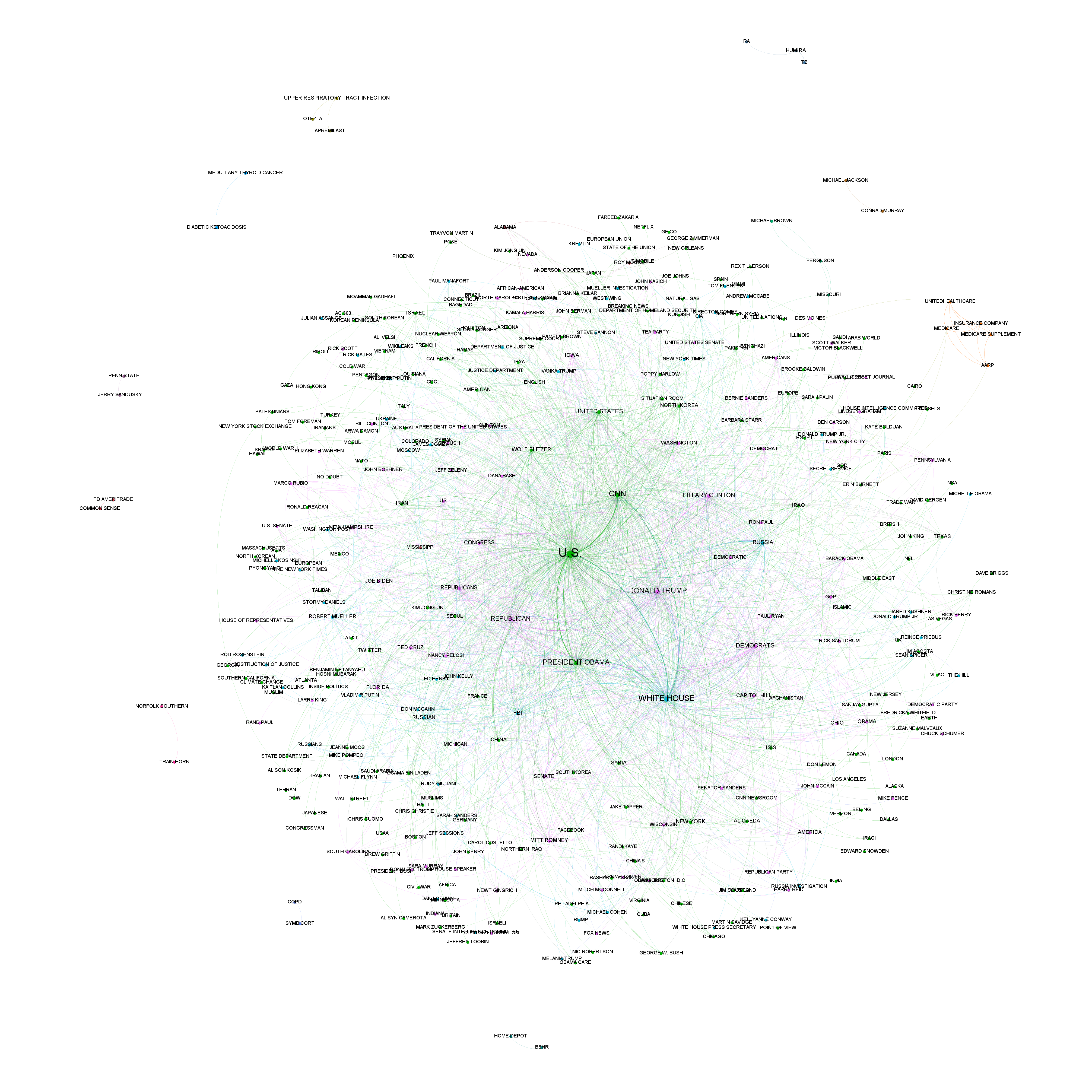
As before, the only change to our query was adding a station filter:
SELECT Source, Target, Count RawCount, "Undirected" Type, ( Count/SUM(Count) OVER () ) Weight FROM (
SELECT a.entity Source, b.entity Target, COUNT(*) as Count
FROM (
 (SELECT date, entities.name entity FROM `gdelt-bq.gdeltv2.geg_iatv`, unnest(entities) entities where entities.mid is not null and Station='CNN')
) a
JOIN (
 (SELECT date, entities.name entity FROM `gdelt-bq.gdeltv2.geg_iatv`, unnest(entities) entities where entities.mid is not null and Station='CNN')
) b
ON a.date=b.date
WHERE a.entity<b.entity
GROUP BY 1,2
ORDER BY 3 DESC
LIMIT 1500
)
order by Count Desc
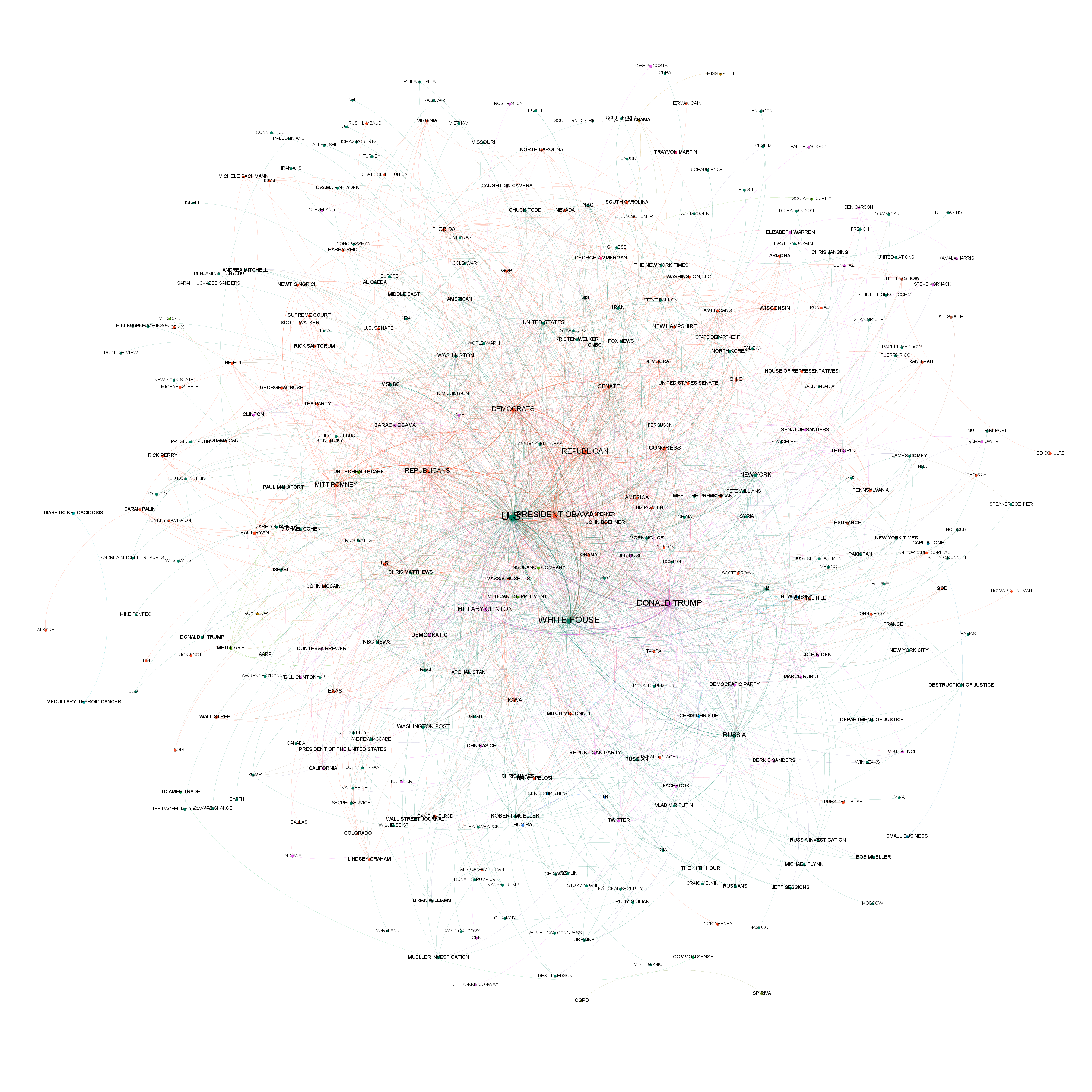
MSNBC
Here is the graph for MSNBC, using the same query:
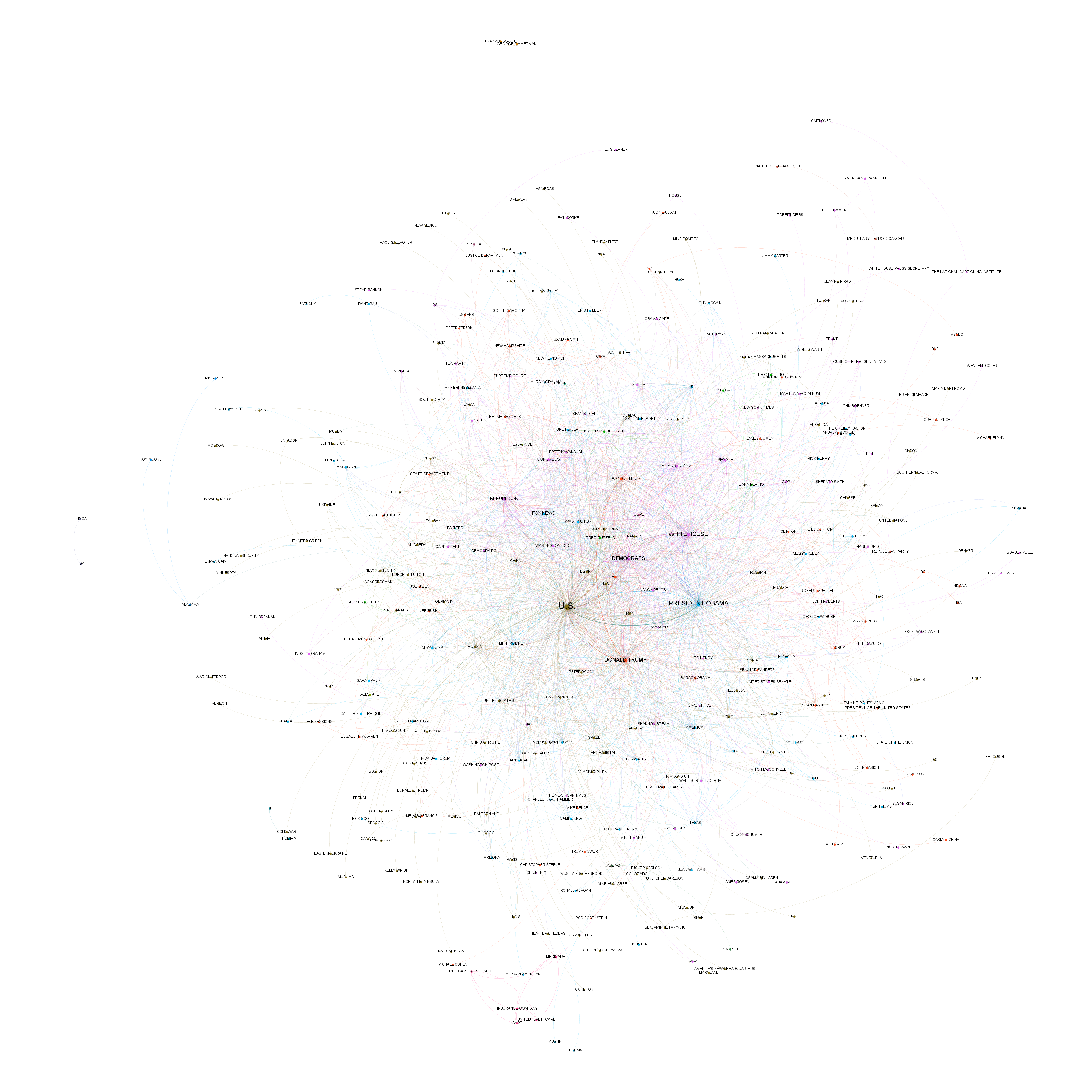
Fox News
And the same for Fox News:
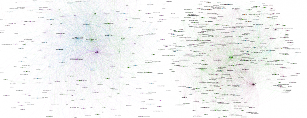
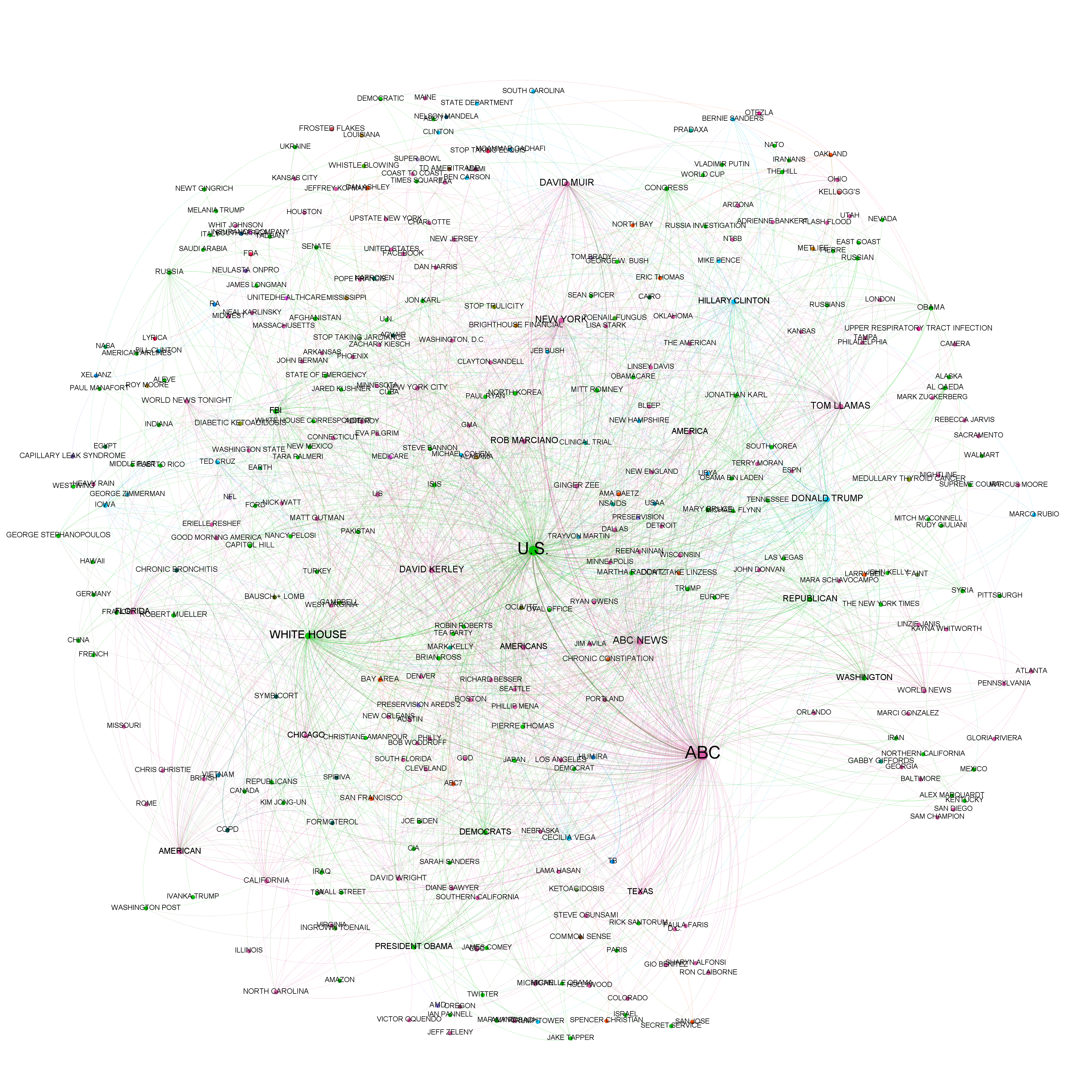
KGO (ABC)
What about the evening news broadcasts of ABC over the past decade? Here there is a much greater emphasis on the network's personalities.
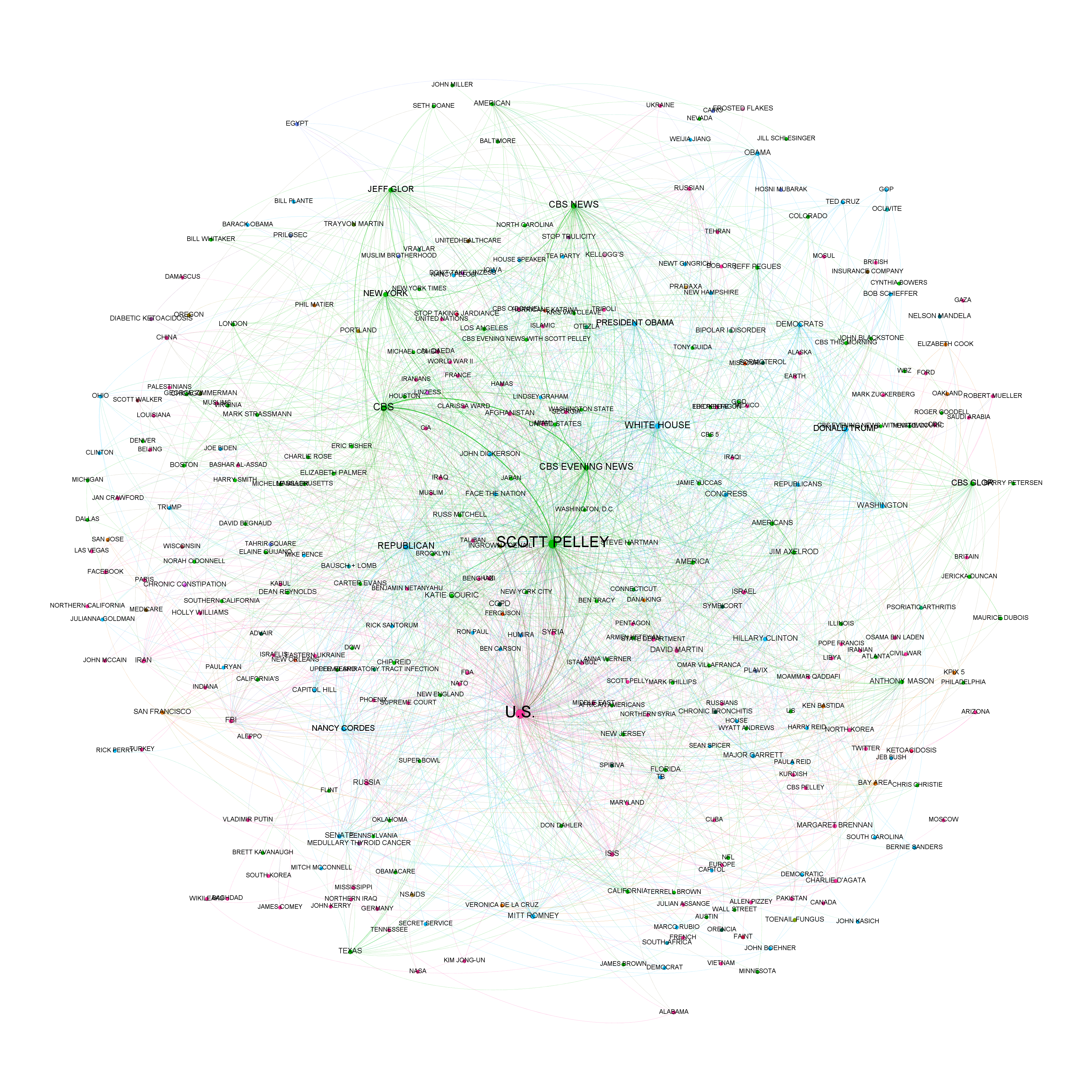
KPIX (CBS)
And similarly for CBS evening news:
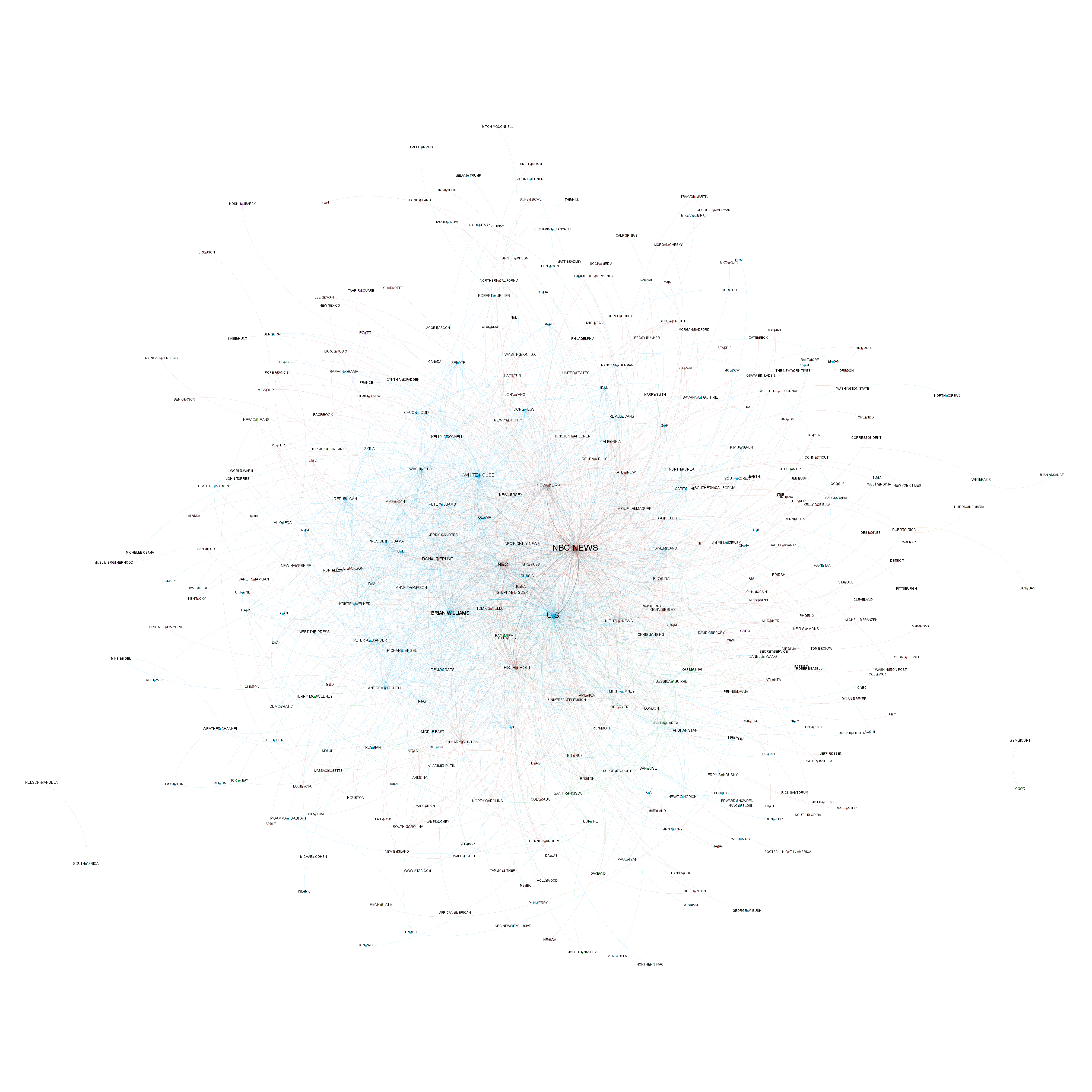
KNTV (NBC)
And for NBC:
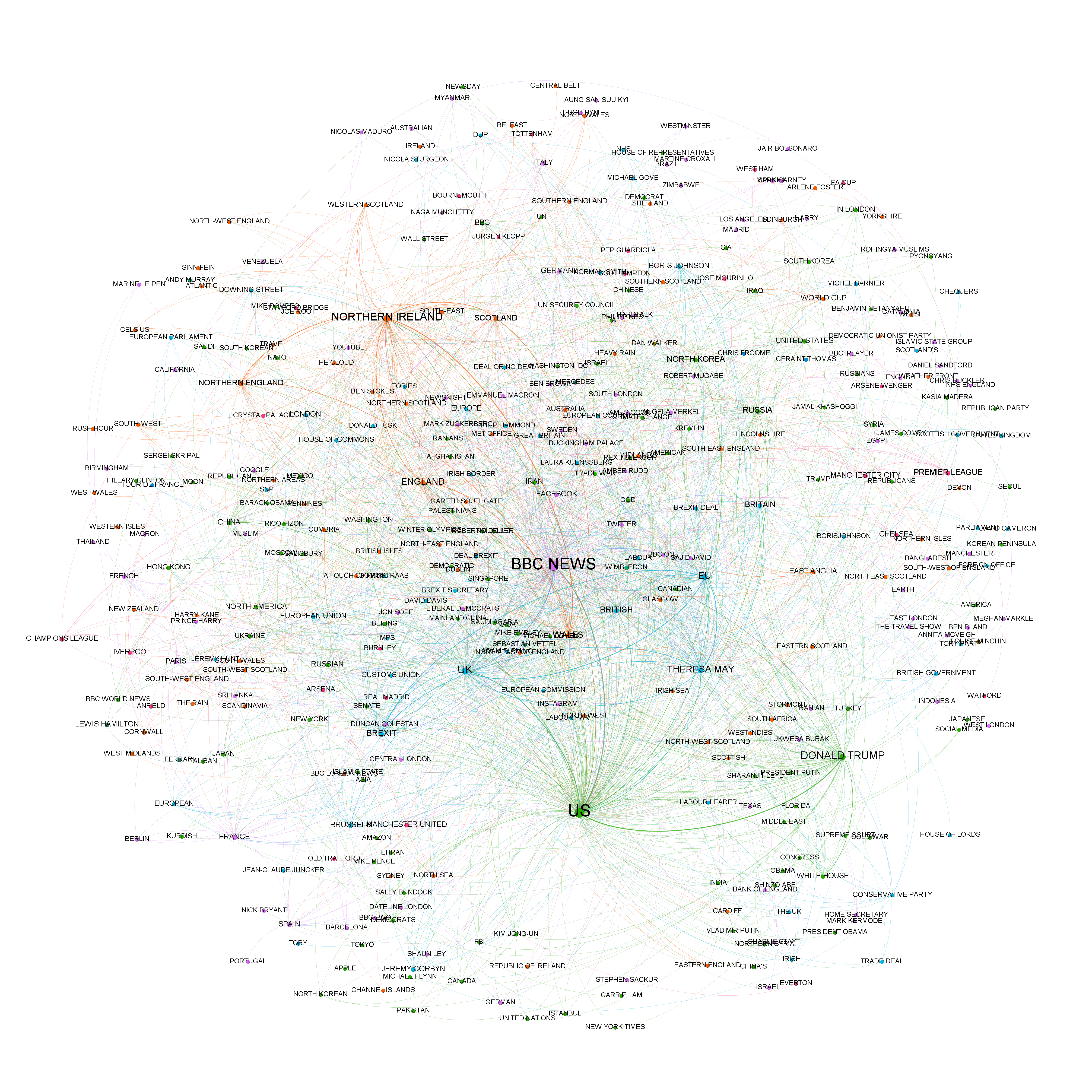
BBC News
Finally, BBC News offers a very different take on the most important relationships of the past 3 years, offering a reminder of just how geographically focused the news is.
Once again, the power of Cloud Natural Language API and BigQuery, with open source Gephi creating the visualizations, offers an incredibly powerful lens through which to explore the patterns of global society.