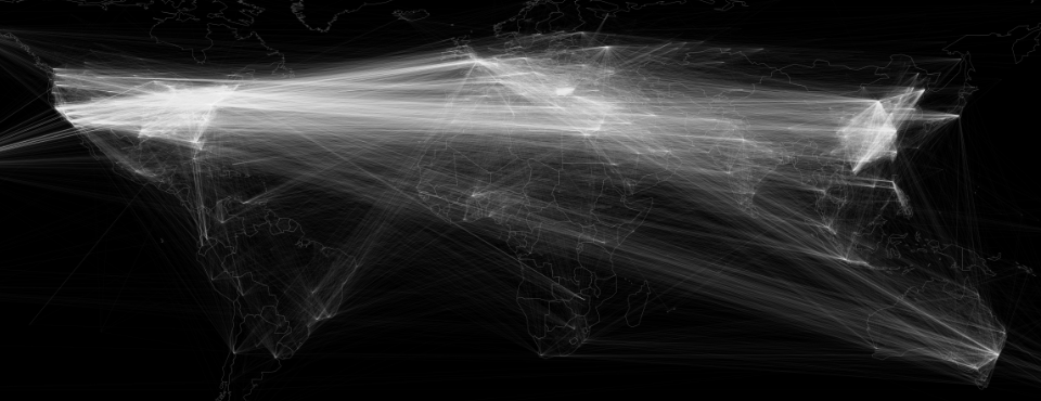
What would it look like to visualize how the world's cities are connected through worldwide news reporting in 2015? Looking across the nearly 200 million articles from across the entire world in 65 languages monitored by GDELT in 2015, we wanted to explore geographic correlation. The map below draws a line between every pair of locations mentioned together in the same article at least 100 times across the entire 200 million article archive. The end result is a visualization of how the world's locations are geographically contextualized.
What makes this visualization most striking is that it took just a single block of SQL and Google BigQuery just 67 seconds to create the final network diagram and just under half a minute to render it using GraphViz.
A special thanks to Felipe Hoffa for his help with the BigQuery analysis – see his Stack Overflow discussion of how he optimized the query to work at this scale.
Click on the image below to access the full-resolution version.
TECHNICAL DETAILS
Generating the network diagram above required just a single line of SQL and 67 seconds of compute time in Google BigQuery. The query below generates the cooccurence network over all of 2015, keeping only those pairs of locations that appeared at least 100 times together. Geographic matches that are only at the country level are excluded so that the network reflects only cities, administrative divisions, hilltops, major buildings, and other fine-resolution entities.
select Source, Target, Count from (
SELECT a.name Source, b.name Target, COUNT(*) as Count
FROM (FLATTEN(
SELECT GKGRECORDID, CONCAT( STRING(ROUND(FLOAT(IFNULL(REGEXP_EXTRACT(SPLIT(V2Locations,';'),r'^[2-5]#.*?#.*?#.*?#.*?#(.*?)#'), '0')), 3)), '#', STRING(ROUND(FLOAT(IFNULL(REGEXP_EXTRACT(SPLIT(V2Locations,';'),r'^[2-5]#.*?#.*?#.*?#.*?#.*?#(.*?)#'), '0')), 3)) ) AS name
FROM [gdelt-bq:gdeltv2.gkg]
WHERE DATE>20150100000000 and DATE<20151299999999
HAVING name != '0.000000#0.000000'
,name)) a
JOIN EACH (
SELECT GKGRECORDID, CONCAT( STRING(ROUND(FLOAT(IFNULL(REGEXP_EXTRACT(SPLIT(V2Locations,';'),r'^[2-5]#.*?#.*?#.*?#.*?#(.*?)#'), '0')), 3)), '#', STRING(ROUND(FLOAT(IFNULL(REGEXP_EXTRACT(SPLIT(V2Locations,';'),r'^[2-5]#.*?#.*?#.*?#.*?#.*?#(.*?)#'), '0')), 3)) ) as name
FROM [gdelt-bq:gdeltv2.gkg]
WHERE DATE>20150100000000  and DATE<20151299999999
HAVING name != '0.000000#0.000000'
) b
ON a.GKGRECORDID=b.GKGRECORDID
WHERE a.name<b.name
GROUP EACH BY 1,2
HAVING Count > 100
ORDER BY 3 DESC
)
Download the resulting CSV file to your local computer. Then install the open-source GraphViz package. To visualize the network we are going to project it into GraphViz's coordinate space and use its highly optimized and scalable rasterization tools.
Now download the "networkvisualizer.pl" PERL script and the three basemap images that are used to draw the country borders (BASEMAP.png, BASEMAP-WHITE.png, and BASEMAP-WHITE-3X.png). Now run the PERL script as "./networkvisualizer.pl ./YOURCSVFILEFROMABOVE.CSV" and after a minute or two it will output the final map file as "NETMAP-COUNTRY.png" in the local directory. You can adjust various parameters by editing the source of the script. NOTE that this can require several GB of RAM for larger and more complex networks.
Congratulations, you've just mapped the network of 2015!
