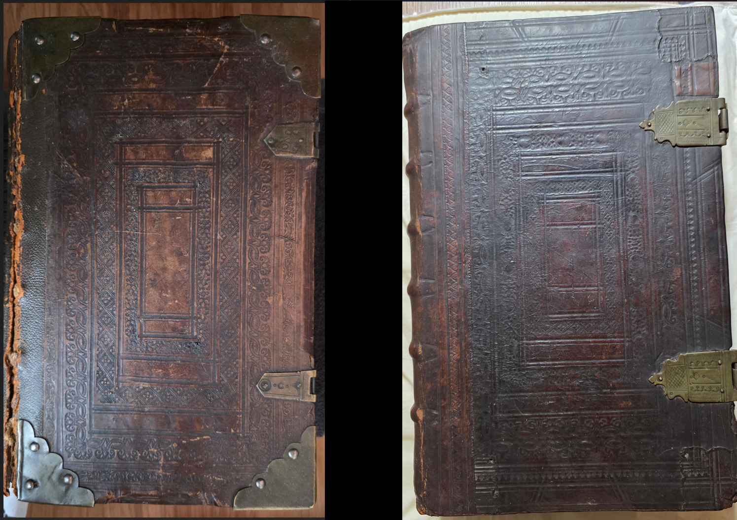
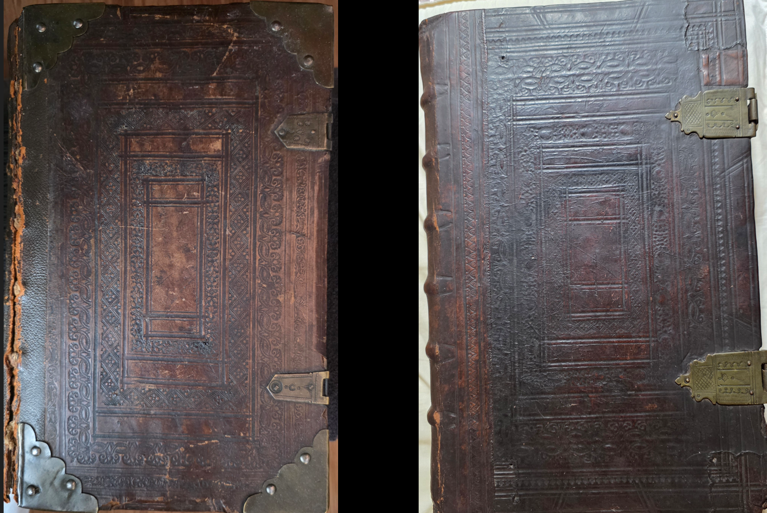
Last month we previewed some of the work we're doing in collection-scale binding analysis, using a combination of Gemini and visual embedding clustering to understand the binding landscape of our 500 years of bound books. Here is another fascinating pairing that Gemini spotted: two Dutch-origin Bibles, one a 1657 Van Sichem Bible / Paets Bible and the other a 1702 Lindenberg Bible / Romeyn de Hooghe Bible. Unlike the far more common vellum and leather Dutch bindings, these two look unlike any of our other Dutch Bibles. What can Gemini tell us about them?
Tell me in detail about these two highly similar bindings.
What is their likely time period and geographic origin.
What kind of book are they most likely to contain?
Explain in rich detail about their design and construction and especially the patterns in the leather and on the clasps.
Based on the visual evidence in the provided images, these two books represent a classic and robust style of bookbinding. Here is a detailed breakdown of their likely origins, contents, and physical characteristics.
Time Period and Geographic Origin The bindings shown in "image1.jpg" and "image2.jpg" are highly characteristic of Northern European bookbinding, most likely originating from Germany, the Netherlands, or Switzerland. Stylistically, they date to the 16th or 17th century. During this era, German and Dutch binderies frequently produced these heavy, durable bindings featuring dark brown calfskin or pigskin over thick wooden boards, heavily decorated with blind tooling and brass hardware.
Likely Contents Because of the immense labor and cost required to produce bindings with this level of structural integrity and decorative metalwork, they were reserved for large, important, and frequently referenced texts. These bindings most likely contain large folio Bibles (such as a Luther Bible), missals, significant theological treatises, or legal codes. Given that both books feature nearly identical tooling patterns, they are almost certainly part of a matched multi-volume set (such as the Old and New Testaments or an encyclopedic work).
Design and Construction
These books were built for supreme durability, designed to withstand centuries of use.
-
-
Boards and Covering: The dark brown leather is stretched tightly over thick, rigid boards. In this era and style, these boards were almost certainly made of wood (commonly oak or beech) rather than the pasteboard used in later centuries, which provided a sturdy anchor for the metal rivets.
-
Spine Structure: Both bindings feature prominent horizontal ridges across the spine, known as "raised bands". These bands indicate that the text block was sewn onto heavy hemp cords or leather thongs, which were then laced directly into the wooden boards for maximum strength. In "image1.jpg", the leather has worn away along the front hinge, revealing the underlying structural cords that attach the cover to the book block.
-
Protective Hardware: In "image1.jpg", the corners of the boards are fitted with heavy brass corner bosses. These bosses feature scalloped inner edges and are secured with three metal rivets each. Their primary purpose was functional: they lifted the leather off the surface of a table to prevent the cover from rubbing and wearing out when laid flat.
-
Patterns in the Leather The covers of both "image1.jpg" and "image2.jpg" are decorated using a technique called "blind tooling," where heated metal tools are pressed into the dampened leather to create dark, debossed impressions without the use of gold leaf.
-
-
The binders used "roll tools" (engraved metal wheels) to quickly press continuous, repeating patterns into the leather.
-
The design is laid out in concentric rectangular panels nested within one another.
-
The outermost prominent frame consists of a flowing, stylized foliate or vine pattern.
-
Moving inward, the subsequent frames feature tighter, repeating geometric and floral motifs, enclosing a central rectangular panel that is relatively unadorned but framed by narrower lines. The near-identical nature of these impressions confirms they were bound in the same workshop using the exact same tools.
-
Patterns on the Clasps Heavy books of this era, especially those printed on parchment or thick rag paper, had a tendency to absorb moisture and warp. The metal clasps were designed to keep the boards firmly shut under pressure, preventing this warping.
-
-
"image2.jpg": This volume retains its complete brass clasps, consisting of the hinged strap stretching from the back board and the catchplate on the front board. The clasps have beautifully shaped, scalloped tips that resemble a flattened fleur-de-lis. The surface of the brass is intricately decorated with incised patterns: a central rectangular border houses a tightly engraved cross-hatching or diamond pattern. This central pattern is surrounded by decorative stippling (small, punched dots).
-
"image1.jpg": While this volume is missing the hinged straps, the brass catchplates remain firmly riveted to the front edge. The top catchplate displays similar stippled dot decorations.
-
What is the meaning of those stars on the catchplates and the overall design?
Look at the smaller bottom clasp of the image and see the three horizontal stars and then see that same pattern occurs in both clasps of the second?
What is the meaning of these stars?
What is the meaning and signficance of the rectangular border-like tooling of both?
Is that style indicative of a particular place or time?
The three horizontal stars on the bottom catchplate of the first binding and across the hinged straps of both clasps on the second binding are stamped decorative motifs, commonly known as rosettes or asterisks. In 16th- and 17th-century metalworking, these punched marks were primarily aesthetic rather than deeply symbolic. Brass workers used these small stamps to add texture, fill negative space symmetrically, and establish a cohesive visual theme across the hardware of a matched set. While a specific arrangement of punches could occasionally serve as an informal hallmark for a regional metal workshop, they largely functioned as standard, traditional flourishes of the craft.
The concentric rectangular tooling on the leather covers, known as a "panel design," carries important historical significance regarding the evolution of bookbinding.
-
-
Technological Efficiency: Following the widespread adoption of the printing press, the volume of books requiring binding skyrocketed. Binders needed a faster method to decorate large covers than laboriously pressing individual, single-impression hand stamps. The solution was the "roll tool" (or roulette), an engraved metal wheel that allowed binders to quickly press continuous strips of repeating foliage, vines, and geometric patterns into the dampened leather.
-
Aesthetic Function: The nested, rectangular frames provided a structured, architectural layout that could be easily adapted to fit massive folio dimensions. The concentric borders naturally frame the cover and draw the viewer's eye inward toward the central panel.
-
This specific tooling style—dark leather heavily blind-stamped with nested, rectangular roll tools—is the defining hallmark of 16th- and 17th-century Northern European bookbinding. It is most strongly associated with Germany, where it is often categorized simply as the "German style." It was also the dominant binding style in the Netherlands, Switzerland, and Scandinavia during the same period. This robust, heavily bordered aesthetic was overwhelmingly favored for housing heavy Protestant theology texts, legal volumes, and large vernacular Bibles during and immediately following the Reformation.
So when were these bindings used compared with the two other versions we have that we see far more often?
Compare the use of this binding from the arabesque vellum and leather bindings more commonly seen in Dutch Bibles.
What is the meaning of the three?
Do they represent different periods of time or influences?
Comparing the heavily bordered, blind-tooled bindings from the previous images with the arabesque bindings shown in "image_96c0a4.jpg" and "image_96c0e1.jpg" reveals a distinct shift in bookbinding aesthetics, materials, and cultural influences.
Here is a comparison of these three distinct styles and what they represent in terms of time periods and influences:
1. The "Panel Style" Roll-Tooled Leather (Previous Images)
-
-
Aesthetic & Construction: As seen previously, these bindings cover the entire board with dense, concentric, rectangular frames created using roll tools, accompanied by heavy, protective brass corner bosses.
- Time & Influence: This represents the typical 16th- to early 17th-century "German" or Northern European style. The influence is rooted in the late Gothic and early Renaissance periods, where heavy wooden boards and defensive metalwork were necessary to protect large, heavy books. The tooling was a pragmatic way to quickly decorate massive covers.
-
2. The Vellum Arabesque Binding
-
-
Aesthetic & Construction: The larger book in this image demonstrates a stark contrast to the first bindings; instead of filling the cover with borders, the design relies on empty (negative) space to highlight a single, prominent, diamond-shaped "arabesque" centerpiece. It is bound in vellum (specially prepared calf or sheep skin that is creamy white and highly durable).
- Time & Influence: This style is the quintessential hallmark of the 17th- and 18th-century Dutch Republic (the Dutch Golden Age). Vellum was incredibly popular in the Netherlands for Bibles, atlases, and university prize books. The "arabesque" centerpiece itself represents a major shift in influence: the interlacing, flowing geometric and foliate lines are directly derived from Islamic and Moorish decorative arts. This Middle Eastern design influence entered Europe via Venetian and Spanish trade routes during the Renaissance and was enthusiastically adopted by European binders.
-
3. The Leather Arabesque Binding
-
-
Aesthetic & Construction: This binding acts as a stylistic bridge. It uses the traditional dark brown leather and prominent raised spine bands of the older styles. However, it adopts the newer aesthetic layout by featuring the large Moorish-influenced arabesque centerpiece stamp surrounded by a much simpler border, leaving plenty of unadorned leather. The brass hardware has also evolved; instead of heavy, domed protective bosses, it features flatter, pierced brass corner pieces and clasps decorated with delicate heart or fleur-de-lis motifs.
-
Time & Influence: This likely dates to the 17th century. It represents a transitional period where binders maintained the traditional luxury of leather and brass but discarded the dense, heavy Gothic roll-tooling in favor of the more elegant, centralized, and balanced Renaissance aesthetic. The lighter, pierced metalwork indicates that books were becoming slightly lighter and were increasingly stored upright on shelves rather than lying flat on lecterns, reducing the need for massive, defensive metal knobs.
-
For comparison, here is ChatGPT's analysis:
Compare these three Dutch Bible bindings.
Tell me about their respective time periods and whether they reflect an evolution in Dutch binding.
They show three distinct strands of Dutch binding practice, and together they give a surprisingly good picture of the transition from the Renaissance into the Dutch Golden Age and then the early eighteenth century. The important qualification is that Bible bindings were unusually conservative: massive folio Bibles continued to use wooden boards, raised cords, clasps, and metal corner furniture long after ordinary Dutch books had moved toward lighter constructions. So this is an evolution in style and preference, not a clean technological succession. Nederlandse Boekgeschiedenis
| Binding | Likely stylistic period | What I see | Historical character |
|---|---|---|---|
| 1. Brown calf, brass corners and clasps | c. 1680–1725, especially around 1700 | Smooth polished calf; raised spine bands; restrained rectangular blind rules; relatively small central ornament; shaped brass corners and clasps | Mature late-17th/early-18th-century Dutch Bible binding |
| 2. White vellum with central ornament | c. 1620–1680, broadly 17th century | Pale vellum/parchment; very sparse ruled borders; ornamental centrepiece; little surface decoration | Classic Dutch Golden Age vellum tradition |
| 3. Dark, densely blind-tooled leather | stylistically c. 1590–1650, although such Bible bindings continued later | Heavy leather over substantial boards; multiple nested ornamental rolls; dense blind tooling; large brass clasps | Renaissance/early-Baroque tradition, closest to the older binding vocabulary |
1. The first binding: around 1700
This is the most recognizably late seventeenth- to early eighteenth-century Dutch States-Bible type of the three.
The structure is still extremely traditional: substantial boards, probably wood; full brown calf; pronounced raised sewing supports; two clasps; and brass cornerpieces. But compare the decoration with the third binding. It has become much more orderly and restrained. Instead of filling the boards with ornamental rolls, the binder uses simple concentric fillet frames surrounding one central stamped ornament.
That combination is extremely characteristic of Dutch Bibles around 1700. A documented Pieter Keur Statenbijbel of 1716, for example, is described almost exactly this way: original calf, a blind-stamped medallion within ruled frames, spine sewn on six raised cords, and complete brass cornerpieces and clasps. Haffman Santiek
So I would put the visual vocabulary of your first binding at approximately 1690–1720.
Notice also how refined the hardware has become. The cornerpieces and clasp plates are relatively delicate, shaped ornaments rather than massive protective blocks. By this period the metal furniture is doing two jobs: protecting an enormous Bible, but also announcing that this is an important household object.
2. The white vellum binding: quintessential seventeenth-century Dutch
The second is a different branch rather than simply an intermediate stage.
Its whitened vellum or parchment surface, sparse parallel rules and large central arabesque/cartouche are very characteristic of the Dutch Golden Age preference for vellum bindings. The Dutch bookbinding handbook specifically notes that vellum bindings flourished in the seventeenth century; larger books could have tight backs and raised bands, while the covers could be undecorated, blind-tooled or occasionally gold-tooled. Vellum was durable, relatively economical and extraordinarily popular in the Netherlands. Nederlandse Boekgeschiedenis
Stylistically I would place this one most naturally around 1630–1680, though vellum of this general appearance continued later.
What is striking is the change in aesthetic:
third binding: surface almost completely articulated by ornament
→ vellum binding: large areas of untouched material, a border and a single centrepiece.
That sparseness is not evidence that the book was cheap. Large Dutch vellum folios could be very handsome and expensive objects. It reflects a particularly Dutch seventeenth-century taste for architectural clarity and material surface.
This kind of binding is one reason you should not think of Dutch binding history as simply:
leather → vellum → leather.
Calf and vellum existed simultaneously. A purchaser could choose between them according to cost, use, appearance and local custom.
3. The dark blind-tooled binding: the oldest-looking tradition
Of the three, this one has by far the most archaic decorative vocabulary.
The board is built up from successive rectangular compartments, apparently using several different rolls: narrow repeating borders, floral or foliate rolls and geometrical bands. Everything is impressed blind, without gold. The large brass clasp plates and very substantial board construction reinforce the impression of an object descended directly from sixteenth-century binding practice.
This is closely related to the Dutch binding style that developed in the later sixteenth century. Roll tooling became increasingly important from the early sixteenth century, and by about 1590–1630 Dutch bindings characteristically combined ruled frames, corner or centre elements and compositions of ornamental tools. Nederlandse Boekgeschiedenis
There are excellent surviving Dutch Bible parallels. A 1599 Dutch Vulgate Bible is preserved in contemporary richly blind-tooled calf over wooden boards with brass catchplates, cornerpieces and other metal furniture. Forum Rare Books And a Dutch Bible of 1648 is likewise recorded in contemporary blind-tooled leather over wooden boards with brass clasps and corners. Reiss & Sohn
So from the binding alone I would describe your third as belonging to a c. 1590–1650 decorative tradition.
There is an important caveat, though: this style survived remarkably long on large Bibles. If the text inside is a Statenbijbel printed after 1637, I would have no difficulty dating the actual binding into c. 1640–1680. Dutch pulpit Bibles specifically continued to be bound in heavy leather over bevelled wooden boards with blind stamping, copper clasps and cornerpieces. DBNL
So do they show an evolution?
Yes—very strongly, aesthetically. If I arrange them by their stylistic ancestry, I would put them:
3 → 2 → 1
with substantial overlap.
The third still speaks the language of the sixteenth-century Renaissance binder: wood, heavy leather, dense roll tooling, strong geometric compartments and conspicuous functional hardware.
The second represents one of the great innovations/tastes of seventeenth-century Dutch book culture: the extraordinarily successful plain or lightly decorated vellum binding. Ornament is reduced and the material itself becomes visually important. The Dutch historical survey explicitly identifies the seventeenth century as the great period of vellum binding. Nederlandse Boekgeschiedenis
The first then represents the polished late Golden Age/early-eighteenth-century Bible binding: back to brown calf, but now with a more disciplined Baroque-classical arrangement—clean frames, one central medallion, regular raised spine compartments and more elegant metal furniture.
The fascinating part is that the underlying technology changes much less than the appearance. A huge Bible of 1700 could still be made with wooden boards + raised cords + full leather + clasps, a construction that would have been entirely intelligible to a binder a century earlier. Dutch bookbinding in general was moving toward cardboard boards and away from clasps, but monumental Bibles were a conspicuous exception. The DBNL study notes that folio pulpit Bibles normally retained heavy wooden boards, leather, blind stamping, copper clasps and corner fittings because these enormous books needed the strength. DBNL
So I would characterize the three as:
No. 3 — Renaissance structural richness
No. 2 — Dutch Golden Age restraint
No. 1 — late Golden Age / early-18th-century refinement
And of the three, No. 3 is the most historically archaic-looking, while No. 1 is the clearest expression of the classic monumental Dutch Bible binding around 1700.
You can see the original covers below: