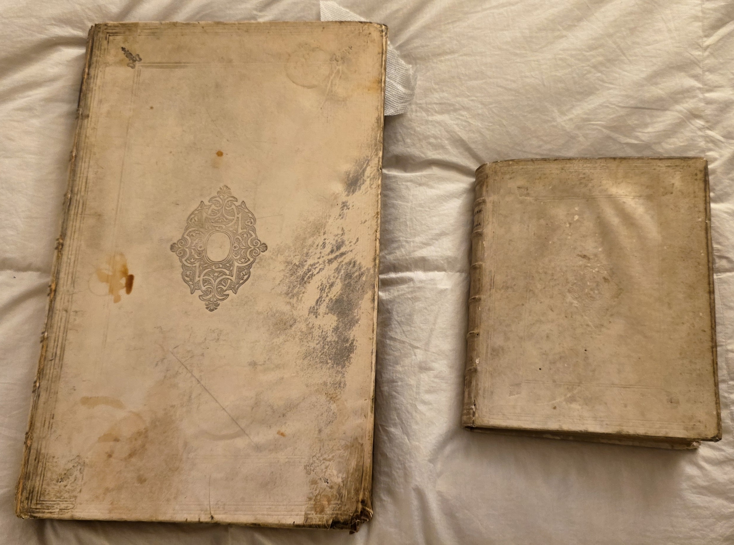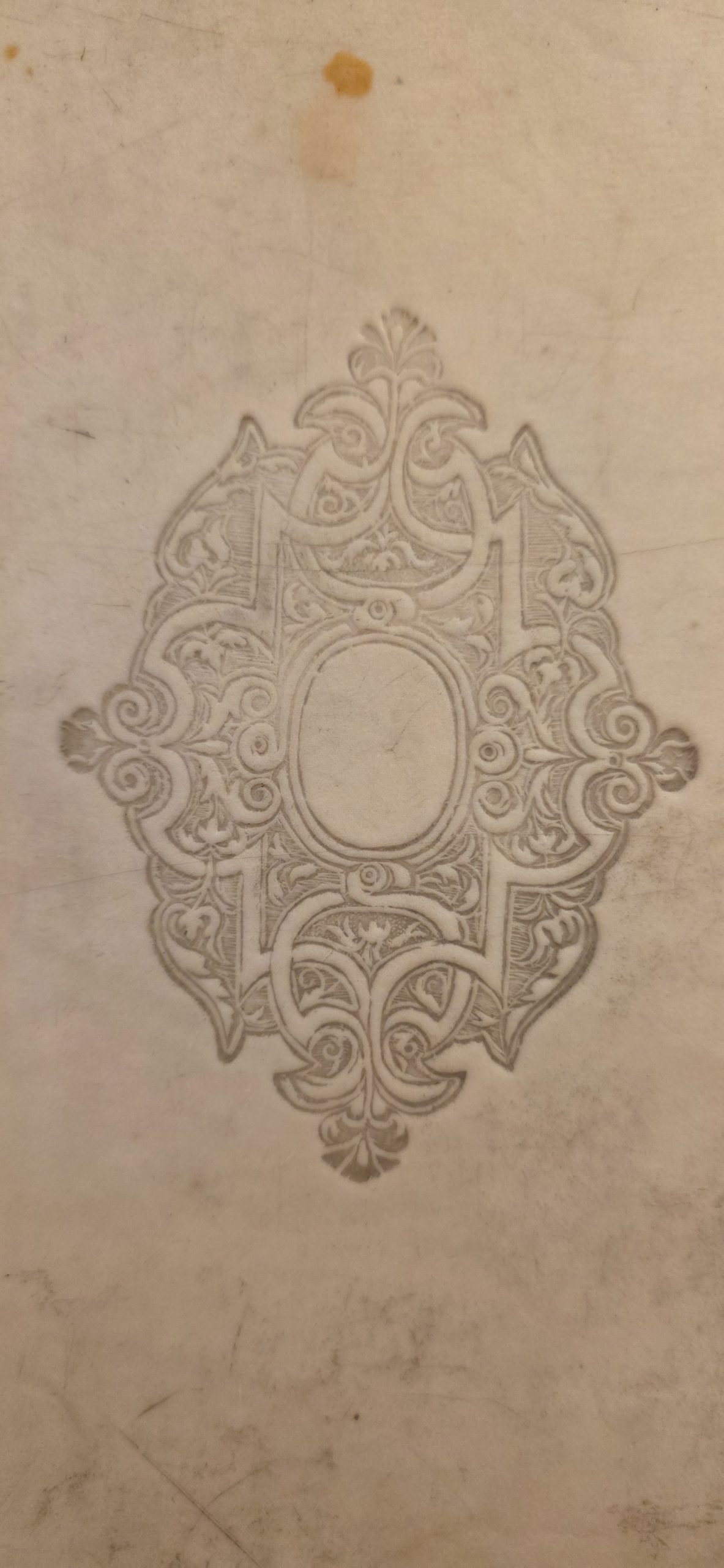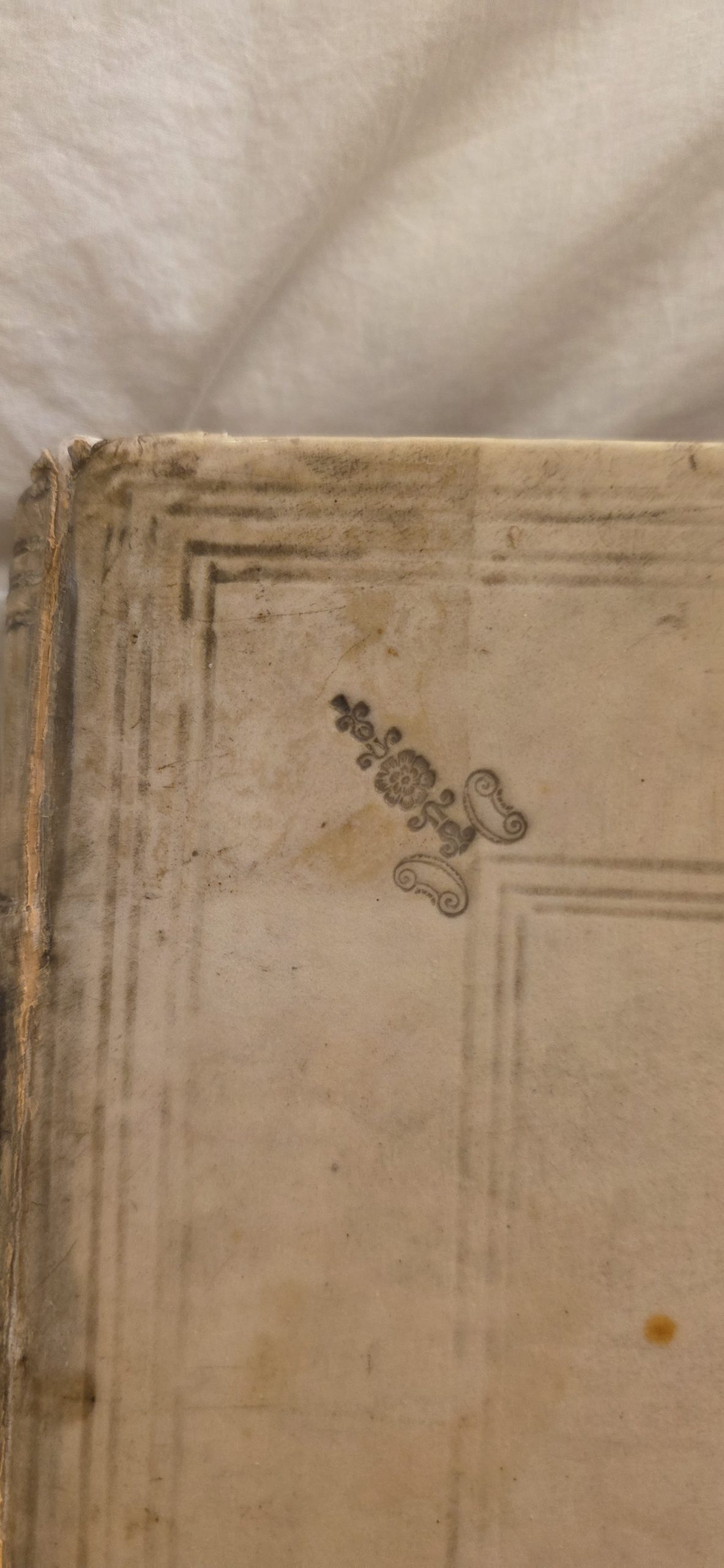
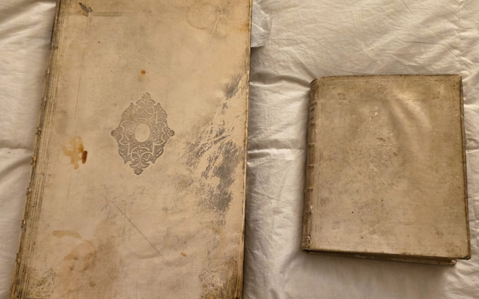
We've been starting to explore how Gemini can help perform collection-scale assessments, leveraging AI's ability to look across vast volumes of material simultaneously. One way we've begun to explore this is to ask Gemini to find books in our collection with similar bindings, giving it piles of photographs of the covers of our works and asking it to find those that appear to be highly similar, either based on appearance or specific binding style. In each case the photographs are simply numbered and Gemini is not given any information about the contents of each work. One of the first findings from this analysis was that Gemini grouped these two panel-and-centerpiece Dutch books (From 1729 and 1730) together based only on photographs of their covers and offered a fascinating historical analysis explaining their various visual features. As we continue to scale these experiments, these early results already suggest tremendous potential for cultural institutions looking to begin performing collection-scale assessments of the physical characteristics of their works like their bindings.
These two volumes are classic examples of 18th-century Dutch blind-tooled stiff-board vellum bindings (perkamenten banden). Their identical stylistic language reflects one of the most standardized and recognizable traditions in European bookbinding history.
1. Key Similarities Between the Two Bindings
-
- The Classical "Panel-and-Centerpiece" Layout:
- Concentric Frames: Both covers feature concentric rectangular frames ruled in blind (multiple thin lines or fillets pressed into the vellum).
- Corner Fleurons (hoekstempels): At the corners of the inner frame, both books have diagonal foliate ornaments (fleurons) pointing inward toward the center or bridging the corner angles.
- Central Arabesque Medallion (middenstempel): Both feature a prominent diamond/oval centerpiece stamped in the middle of the board. The designs are composed of symmetrical Renaissance/Mannerist strapwork, foliate acanthus scrolls, and a central blank oval medallion.
- Technique (Blind Tooling / Blindstempeling):
- Neither cover uses gold leaf. Instead, the brass finishing tools (stempels) were heated and pressed into slightly dampened vellum. Over centuries, the indented impressions have gathered dirt and natural patina, creating the dark, etched contrast visible today.
- Binding Material & Structure:
- Both use pale calf or pigskin vellum stretched over rigid pasteboard (stijf perkament), characterized by clean, square edges and sewing onto raised sewing supports (visible as raised horizontal bands on the spine of the smaller volume).
- The Classical "Panel-and-Centerpiece" Layout:
2. Why Are They So Similar?
-
- The Dutch Printing Hegemony (The Dutch Golden Age):
During the 17th and early 18th centuries, the Dutch Republic (centered around Amsterdam, Leiden, Utrecht, and The Hague) was the publishing capital of Europe. Printing houses like the Elzevirs, Blaeus, and Wetsteins produced vast quantities of scholarly, legal, theological, and classical texts for domestic use and export across Europe. - Standardized Commercial "Trade" Bindings:
Unlike modern publishers, early modern publishers often sold books as loose folded sheets. However, Dutch binderies developed a highly efficient, semi-bespoke commercial binding trade. Binders purchased standard sets of brass finishing tools from tool-cutters who copied standard pattern books. A library or scholar ordering books would routinely receive this exact "house style." - Calvinist Restraint and Utilitarian Durability:
While contemporary French and Italian fine bindings favored lavish, ostentatious gold-tooled morocco leather, the Dutch intellectual and religious climate favored restraint, neatness, and utility. Vellum was tough, resistant to dampness and wear, and naturally elegant without requiring expensive gilding.
- The Dutch Printing Hegemony (The Dutch Golden Age):
3. How They Are Recognizable Specifically as Dutch
To a bibliographer or rare book dealer, this combination of features is an immediate giveaway of Dutch origin:
-
- The Characteristic Strapwork Centerpiece with Blank Cartouche:
- The specific strapwork ornament (rolwerk)—derived from 16th-century Netherlandish ornament prints by artists such as Cornelis Floris and Hans Vredeman de Vries—is distinctly Low Countries in origin.
- The blank central oval inside the centerpiece was a hallmark of Dutch trade binderies: it gave the centerpiece balance, but could also be left plain for private collectors.
- Close Kinship with Dutch School Prize Bindings (Prijsbanden):
- This exact tripartite framework (triple-line concentric fillets + corner fleurons + central oval) is the identical design template used for Dutch Latin School prize bindings (prijsbanden).
- In a prize binding, the binder simply swapped out the generic arabesque stamp for the brass armorial stamp of a Dutch city (such as the crossed keys of Leiden, the three St. Andrew's crosses of Amsterdam, or the stork of The Hague). Seeing this framing instantly evokes the Dutch Latin School aesthetic.
- The Treatment of the Vellum:
- Dutch binders were celebrated for the quality of their white vellum, which was bleached and scraped to an exceptionally smooth, uniform finish compared to the yellower, oilier pigskin bindings common in Germany or the limp/semi-limp vellum styles common in Italy and Spain.
- The Characteristic Strapwork Centerpiece with Blank Cartouche: