
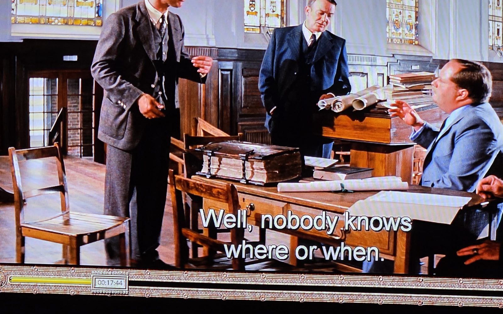
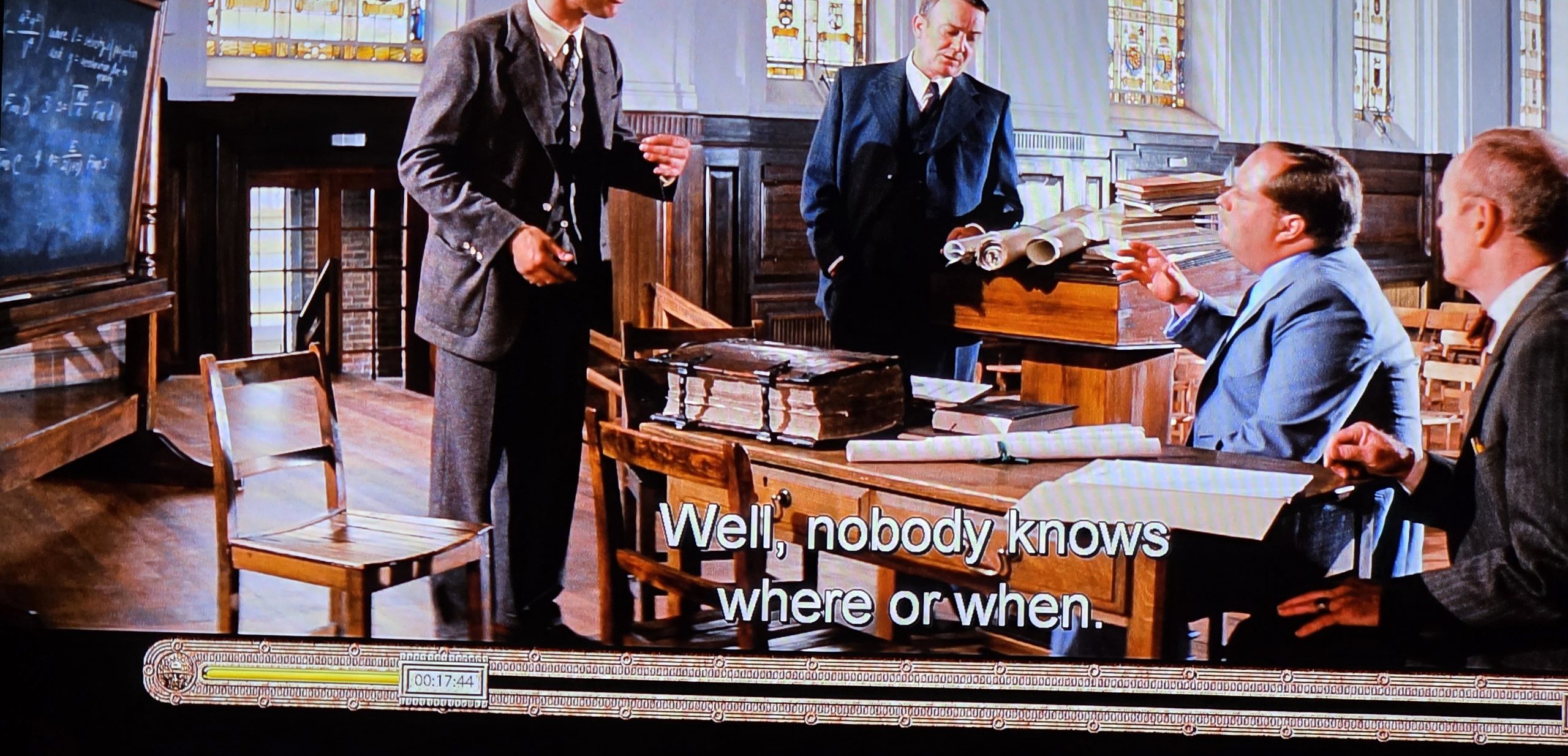
An experienced antiquarian book dealer or scholar can tell much about a book from a single glance at its covers, especially when it comes to the ornate styles of historical Bibles. In 1981's Raiders Of The Lost Ark, Indiana Jones references a massive Bible in a pivotal scene. The movie is known to have used an antique Dutch Statenbijbel and its Dutch origins are instantly clear from its incredibly distinctive cover and furniture. This kind of intimate knowledge of binding practices typically takes years to accumulate and the handling of countless Bibles to learn all the myriad cues and how to distinguish from similarly decorated books, such as early Germanic heritage Bibles that share some of the same kinds of decorative elements. Has Gemini reached a point where it encodes this kind of extensive knowledge of the history of bookbinding to the point that it could identify this Bible from a single image and justify its argument? It turns out that it passes with flying colors and even narrows down the edition from a brief glance at a small slit of text!
Let's start with the following prompt and the following two still frames from the movie.
Identify this Bible. Ignore everything else in the image and do NOT use any knowledge about the movie it is from.
Explain your reasoning as to why you believe it is that specific Bible, based on a visual analysis.
Cite all of the features about the Bible that you can see that support your conclusion and explain why they are so distinctive and supportive of your conclusion.
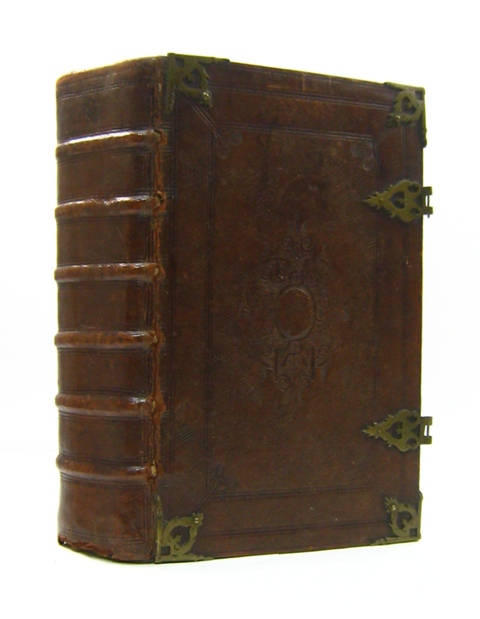
For reference, this is a typical late 1600s – early 1700s Dutch Statenbijbel that confirms the movie's copy:
Incredibly, Gemini not only correctly identifies the Bible, but cites exactly the combination of visual evidence that a human expert would focus on to distinguish this from other monumental dog="Pulpit Bibles" of the era:
Based on the visual evidence, this volume is an authentic 17th- to 18th-century Dutch States Bible (Statenbijbel / Statenvertaling), printed in a Dutch publishing hub such as Dordrecht, Amsterdam, or Leiden (most commonly dating between the 1640s and 1730s).
Distinctive Visual Features Identifying it as a Dutch Statenbijbel
1. Characteristic Pierced Brass Corner Mounts (Hoekstukken)
-
- Visual Feature: In the close-up view, the upper-right corner features a prominent, cast-brass corner piece attached with pins directly over the leather.
- Why it is Distinctive to Dutch Bibles:
- The openwork / pierced scrollwork design (incorporating intertwined acanthus leaves, stylized strapwork, and Baroque floral motifs) is the signature pattern cast by Dutch brass founders specifically for church and family Statenbijbels.
- Dutch Bibles were designed to sit flat on tables or rest on slanted wooden lecterns (bijbelstandaards). These raised corner mounts acted as protective bumpers (stootranden) that elevated the leather off the surface, preventing the heavy volume's binding from abrading when moved.
2. Arabesque / Lozenge-Shaped Centerpiece (Middenstuk)
-
- Visual Feature: In the center of the board (discernible in the close-up), there is the prominent relief of a central ornament—a classic lozenge- or diamond-shaped arabesque centerpiece.
- Why it is Distinctive to Dutch Bibles:
- Dutch Golden Age folio bindings typically featured a balanced layout of hardware and tooling: four matching corner mounts paired with a large central medallion (middenstuk), either cast in pierced brass to match the corner mounts or deeply impressed into the leather with blind-tooled arabesque floral stamps.
- The symmetrical lozenge/rhomboid form with flanking scrollwork flourished across Dutch Reformed Bibles as a signifier of prestige and religious gravitas.
3. Solid Metal Hinged Fore-Edge Strap-Clasps (Metalen Sluitingen en Klampen)
-
- Visual Feature: Spanning across the open fore-edge of the book block are two heavy, articulated all-metal strap-clasps rather than flexible leather bands.
- Why it is Distinctive to Dutch Bibles:
- Dutch Statenbijbels utilized stout, fully cast-brass hinged straps consisting of an anchor plate, an articulated hinge, and an engraved catch plate (overslag).
- Closing Direction: The solid metal straps are hinged permanently to the lower (back) board and wrap across the fore-edge to latch firmly into anchor catches on the upper (front) board, pulling the thick leaf gatherings tightly shut to prevent air and humidity from warping the rag-paper pages.
4. Beveled Oak Boards Under Heavy Dark Calfskin (Houten Platten)
-
- Visual Feature: The edges of the covers show a sharp, pronounced bevel (chamfer) sloping toward the page block.
- Why it is Distinctive to Dutch Bibles:
- To support the immense weight of the solid brass corner furniture, centerpieces, and clasps without bowing, Dutch binders built covers from quarter-sawn oak boards (eikenhouten platten).
- The boards were carefully beveled around their perimeter before being wrapped in thick, blind-tooled calfskin (or occasionally sharkskin/shagreen). The deep, dark, aged patina and texture visible here reflect centuries of natural handling and oxidation typical of 17th/18th-century Dutch leather.
5. Colossal dog="Statenvertaling" Textblock Dimensions
-
- Visual Feature: In the wide desk shot, the book is a massive folio—measuring roughly 18 inches tall, 11–12 inches wide, and 5 to 6 inches thick.
- Why it is Distinctive to Dutch Bibles:
- Authorized by the Synod of Dort (1618–1619) and first issued in 1637, a standard folio Statenbijbel contained the Old Testament, the Apocrypha, the New Testament, and extensive parallel columns of official marginal annotations (kanttekeningen), along with multi-page folding engraved maps (e.g., by Nicolaes Visscher, Pieter Mortier, or Daniel Stoopendaal).
- This comprehensive compilation on heavy, handmade linen rag paper created the monumental, brick-like proportions that are virtually unique to Dutch pulpit and family folio Bibles of this period.
6. Prominent Raised Spine Ribs (Ribben)
-
- Visual Feature: The spine edge reveals heavy, raised transversal ridges across the leather covering.
- Why it is Distinctive to Dutch Bibles:
- Because of the immense weight of the textblock, Dutch artisans hand-sewed the gatherings onto five or six thick split-leather or double-hemp cords. When drawn over the spine, these cords formed the prominent raised ribs (ribben) that provided the necessary structural skeleton to keep the hundreds of folio leaves aligned and bound securely for centuries.
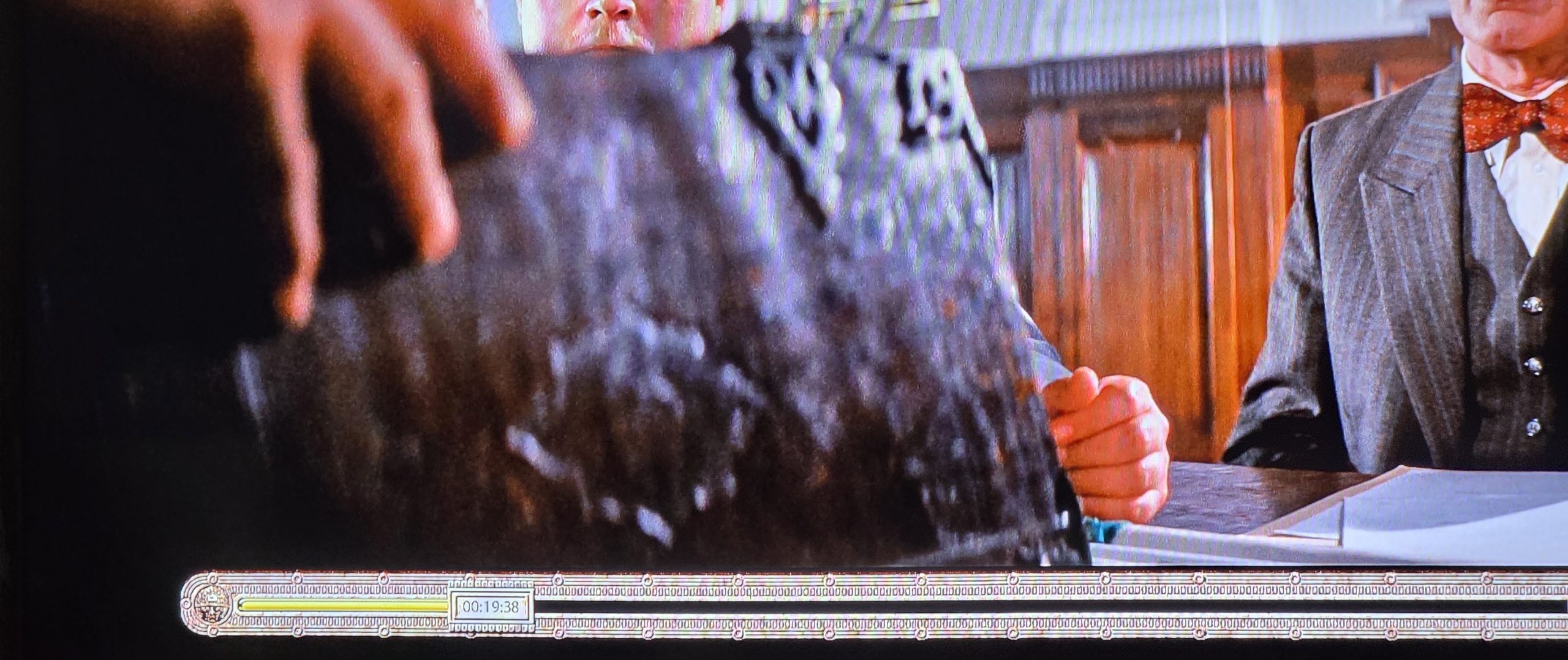
The cover only tells us that it is a Dutch Bible, but not the specific edition. What can Gemini tell us from reading the brief glimpse of the text that is shown?
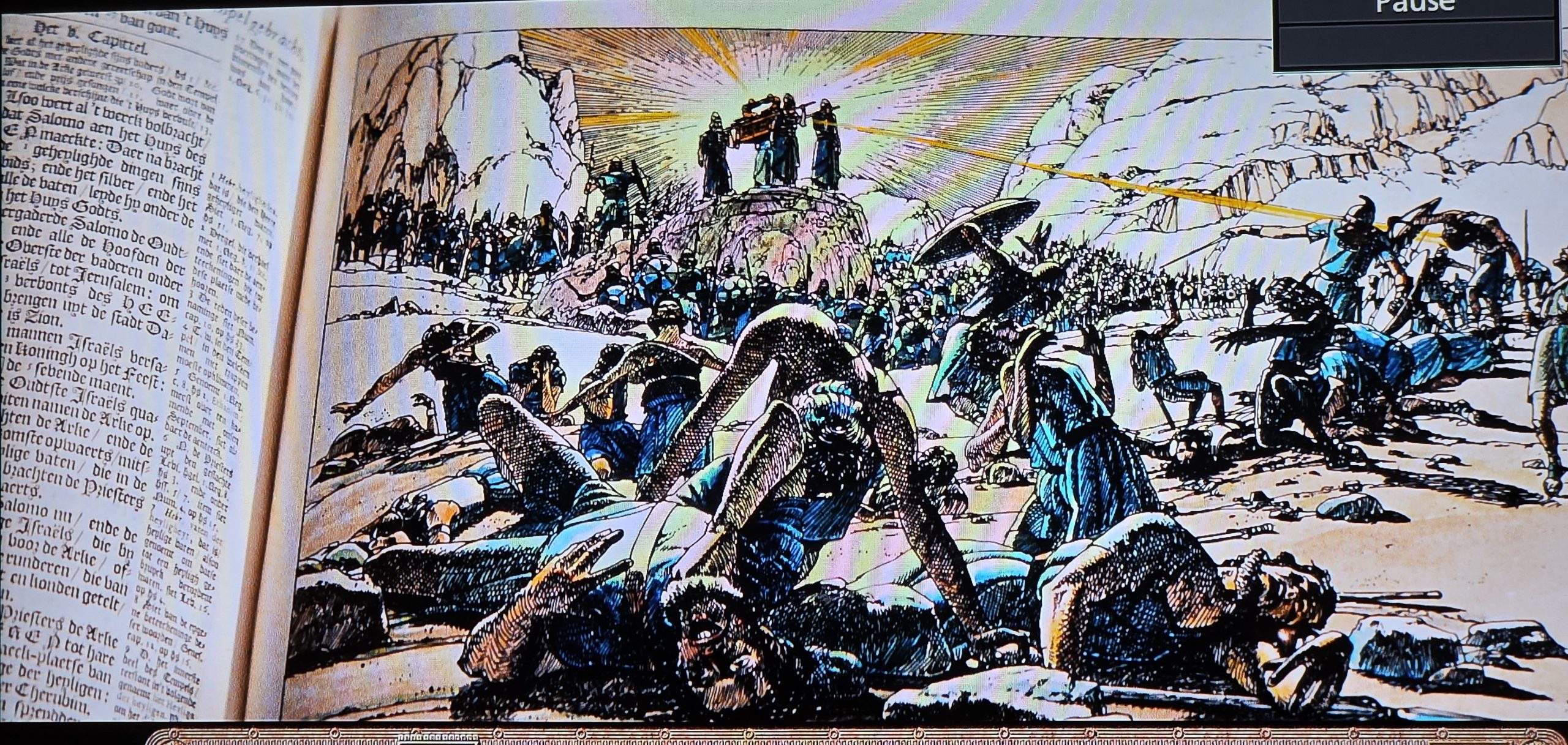
ignore what movie this is from. what is the language you see in the text on the left.
transcribe and translate and identify which edition this is from specifically.
What about the annotations in the right margin?
What language and do they help narrow down even further the specific edition?
Can you estimate the exact edition of this Bible?
Once again, Gemini nails it!
Language and Edition
The text on the left page is written in Early Modern Dutch.
Specifically, this text is taken verbatim from the Statenvertaling (States Translation), the landmark and highly influential Dutch translation of the Bible that was first published in 1637.
The visible header reads "Het 8. Capittel." (The 8th Chapter), and the text perfectly matches 1 Kings 8 (starting from the very end of 1 Kings 7:51). The layout, complete with Blackletter (Fraktur) typeface and side margin notes, mimics standard large-folio 17th-century editions of this Bible.
Transcription
Here is a transcription of the primary, most legible column of text on the left, reading from top to bottom:
"…soo weert al 't werck volbracht dat Salomo aen het Huys des HEEREN maeckte: Daer na bracht [Salo]mo de geheylighde dingen sijns [Va]ders; ende het silver / ende het [go]udt / ende de vaten leyde hy onder de schatten van het Huys Godts. Doe vergaderde Salomo de Oudtsten van Israel / ende alle de Hooftden der stammen / de Overste der vaderen onder de kinderen Israels / tot Jerusalem: om de Arke des Verbonts des HEEREN op te brengen uyt de stadt Davids / dewelcke is Zion. Ende alle de mannen Israels versamelden sich tot den Koningh op het Feest: 't welck was in de sevende maent. Ende alle de Oudtste Israels quamen / ende de Priesteren namen de Arke op. Ende sy brachten de Arke / ende de Tente der tsamenkomste opwaerts / mitsgaders alle de heylige vaten / die in de Tente waren: dese brachten de Priesters ende de Leviten opwaerts. Ende de Koningh Salomo / ende de gantsche vergaderinge Israels / die by hem vergadert waren voor de Arke / offerden schapen ende runderen / die van menigte niet en konden getelt nochte gerekent worden. Alsoo brachten de Priesters de Arke des Verbonts des HEEREN tot hare plaetse / in de Aenspraeck-plaetse van den Huyse / in het Heylige der Heyligen : tot onder de vleugelen der Cherubim."
Translation
Here is the English translation of that passage. As an AI translating historical text, I have aligned this closely with standard English biblical phrasing (akin to the King James Version, which is from the same era) to preserve the tone of the original Dutch text:
"…thus all the work that Solomon made for the House of the LORD was finished: and Solomon brought in the things which his father had dedicated; even the silver, and the gold, and the vessels, did he put among the treasures of the House of God. Then Solomon assembled the elders of Israel, and all the heads of the tribes, the chief of the fathers of the children of Israel, unto Jerusalem: to bring up the Ark of the Covenant of the LORD out of the city of David, which is Zion. And all the men of Israel assembled themselves unto the king at the feast: which was in the seventh month. And all the elders of Israel came, and the priests took up the Ark. And they brought up the Ark, and the Tabernacle of the congregation, and all the holy vessels that were in the Tabernacle: these did the priests and the Levites bring up. And King Solomon, and all the congregation of Israel, that were assembled unto him, were with him before the Ark, sacrificing sheep and oxen, that could not be told nor numbered for multitude. And the priests brought in the Ark of the Covenant of the LORD unto its place, into the oracle of the House, to the Most Holy Place: even under the wings of the cherubims."
The Marginal Annotations
-
- What they are: The text in the narrow right margin consists of standard biblical cross-references pointing the reader to related historical events or laws in other books of the Bible.
b 2 Sam. 6.12.(Linked to 1 Kings 8:1, referencing David moving the Ark)c 2 Sam. 5.7.(Linked to 1 Kings 8:1, referencing the city of Zion)d Lev. 23.34.(Linked to 1 Kings 8:2, referencing the Feast of Tabernacles)e Num. 4.15.(Linked to 1 Kings 8:4, referencing how the Levites must carry holy objects)
- Language and Typography: The abbreviations (Sam., Lev., Num.) use standard Latinized naming conventions. More importantly, they reveal a specific typographic choice: the main scripture is printed in a Dutch Blackletter typeface (often called Textura or Gotisch), while the marginal abbreviations are printed in a contrasting Roman typeface. This visual separation was standard practice in early modern Dutch printing.
- What they are: The text in the narrow right margin consists of standard biblical cross-references pointing the reader to related historical events or laws in other books of the Bible.
Estimating the Exact Edition
-
- The Translation: The specific alphabetic sequencing of these notes (b, c, d, e) corresponding perfectly to this specific wording of 1 Kings 8 confirms this text block belongs to the authorized Dutch Statenvertaling (States Bible), which was first published in 1637.
- The Exact Edition: It is impossible to identify the exact printing year or specific publisher from this single column of text.
- Why it cannot be narrowed further: Throughout the 17th and early 18th centuries, authorized printers of the large-folio Statenvertaling (such as Paulus Aertsz van Ravesteyn or the later Keur brothers) strictly adhered to identical, line-for-line and page-for-page layouts. They copied the typesetting verbatim to ensure absolute consistency in authorized study Bibles across decades. Therefore, while this is definitively a 17th-century (or early 18th-century) Statenvertaling folio text block, a bibliographer would need to see the title page, colophon, or unique woodcut printer's ornaments to determine the exact year of publication.