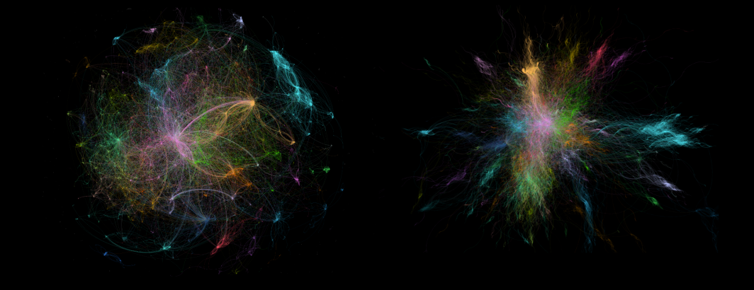
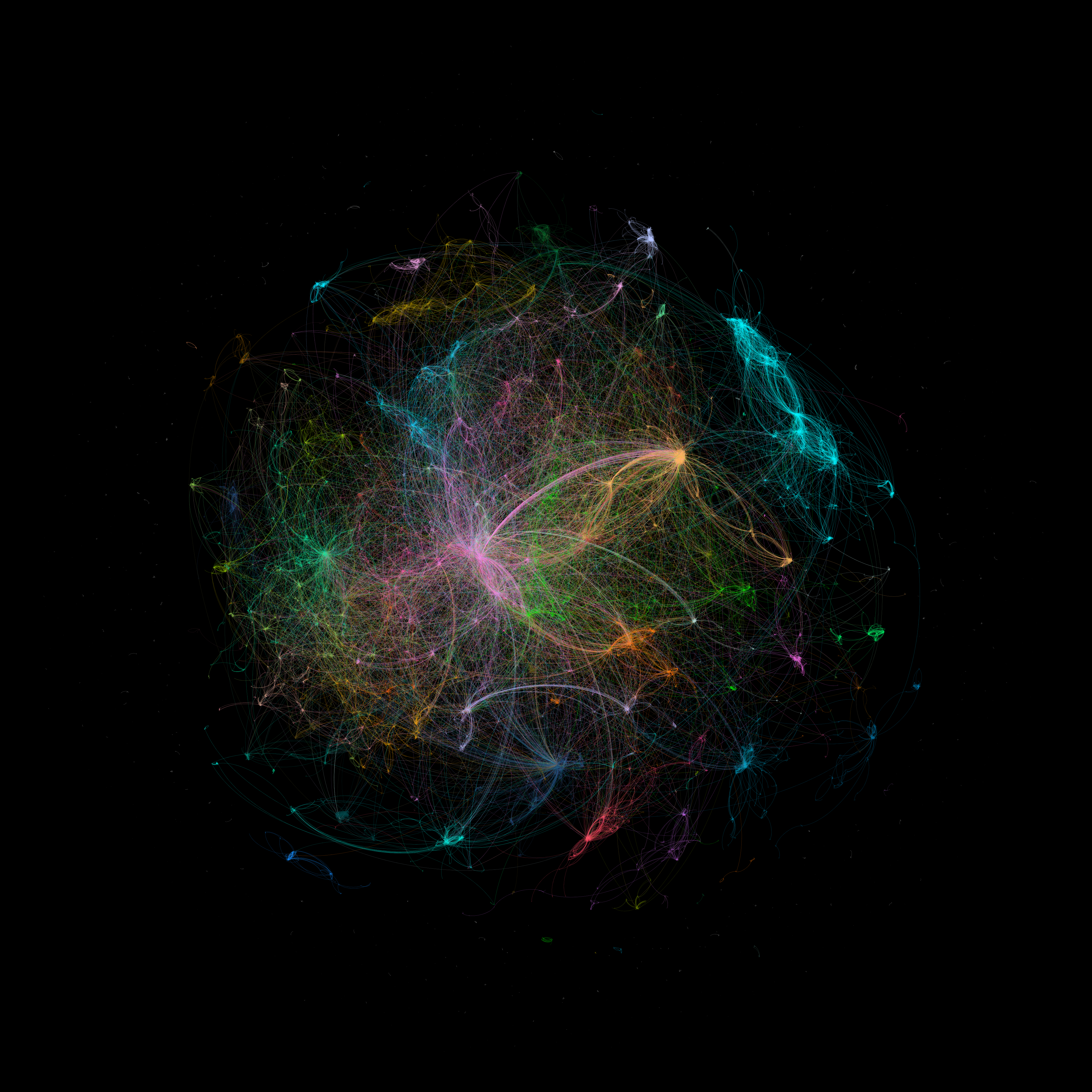
For this visualization of our GKG 2016-2018 Outlink Dataset, we compute the top 5 inlink domains by news outlet and display the top 50,000 strongest connections. Coloration is by modularity. Rendered in Gephi.
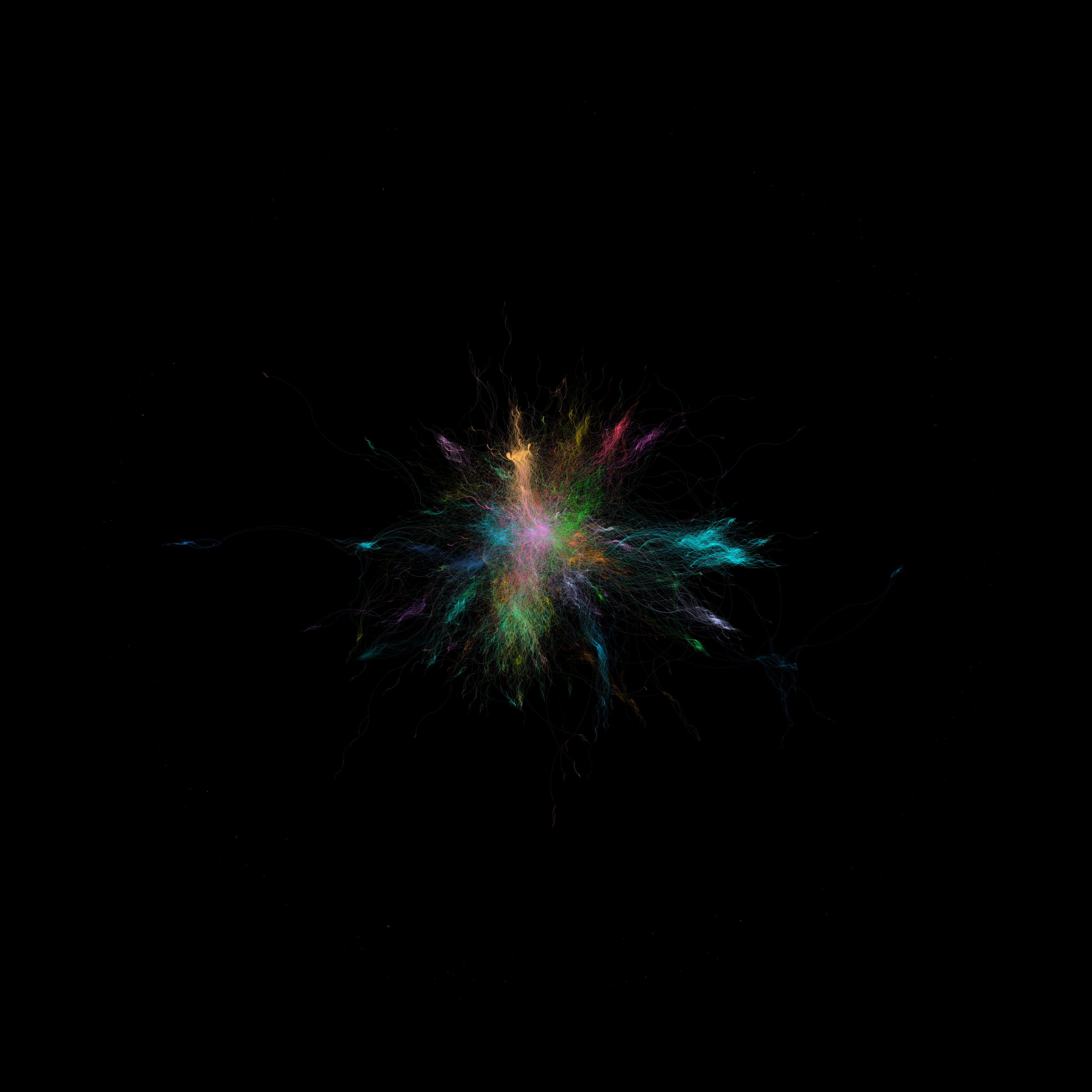
For this visualization of our GKG 2016-2018 Outlink Dataset, we compute the top 5 inlink domains by news outlet and display the top 50,000 strongest connections. Coloration is by modularity. Rendered in Gephi.