Yesterday we visualized one day in the life of more than 47 global television news channels using Gemini 3 Pro and Nano Banana Pro, while the day before we explored one day of six Russian television news channels, along with a variety of comparative analyses. What about the inverse? What would it look like to visualize one channel over multiple days? Here we use Gemini 3 Pro and Nano Banana Pro to create infographics representing the complete coverage of Russia Today (RT) from December 6-12, 2025, with an infographic visualizing each day's coverage and a series of infographics attempting to visualize the entire week as a single infographic, along with multiple analysis visualizations exploring Gemini-powered deep comparative media analytics to understand how RT's coverage changed throughout the week and how its storylines evolved and why.
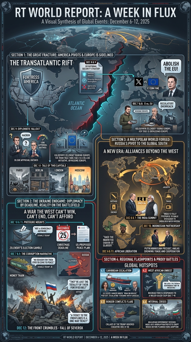
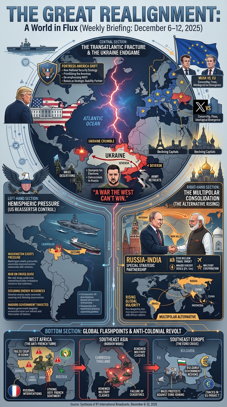
COMBINED DEC 6-12, 2025
Create a prompt for a large illustrated explainer poster designed to be printed on a large-format poster printer and hung up on the wall that narrates the attached per-day posters as a single large poster that can be printed and hung on a wall that outlines all of the core details. Focus on the combined story of the world told through all of them. Only cover news-related portions of the broadcast, ignore advertisements, sports and entertainment. The poster should be entirely in English.
 And a themes and trends analysis:
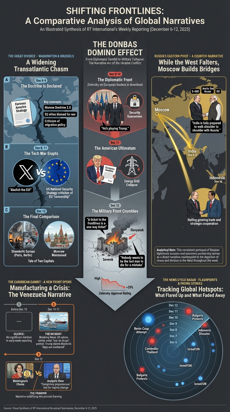
Create a prompt for a large illustrated explainer poster designed to be printed on a large-format poster printer and hung up on the wall that narrates the major themes and trends of the attached posters as a single large poster that can be printed and hung on a wall that outlines all of the major themes and trends. Focus on the combined story of the world told through all of them. Only cover news-related portions of the broadcast, ignore advertisements, sports and entertainment. Only focus on major themes and trends. The poster should be entirely in English.
How about a differences comparison:
Create a prompt for a large illustrated explainer poster designed to be printed on a large-format poster printer and hung up on the wall that narrates the major differences across the news covered in the attached posters as a single large poster that can be printed and hung on a wall that outlines all of the major differences. Focus on the combined story of the world told through all of them. Only cover news-related portions of the broadcast, ignore advertisements, sports and entertainment. Only focus on major differences like you were a comparative media analyst. The poster should be entirely in English.
And a time and geographic-based comparison:
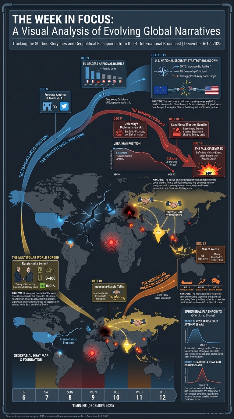
Create a prompt for a large illustrated explainer poster designed to be printed on a large-format poster printer and hung up on the wall that narrates the major differences across the news covered in the attached posters as a single large poster that can be printed and hung on a wall that outlines all of the major differences. Focus on the combined story of the world told through all of them. Only cover news-related portions of the broadcast, ignore advertisements, sports and entertainment. Only focus on major differences like you were a comparative media analyst. The poster should be entirely in English. Make it a time-based visualization that shows how the coverage varied by day and also geographically and thematically.
Strictly time-based comparison:
Create a prompt for a large illustrated explainer poster designed to be printed on a large-format poster printer and hung up on the wall that narrates the major differences across the news covered in the attached posters as a single large poster that can be printed and hung on a wall that outlines all of the major differences. Focus on the combined story of the world told through all of them. Only cover news-related portions of the broadcast, ignore advertisements, sports and entertainment. Only focus on major differences like you were a comparative media analyst. The poster should be entirely in English. Make it a timeline-based visualization that shows how the coverage varied by day.
The infographic above ended up being a powerful streamgraph visualization – can we request this directly?
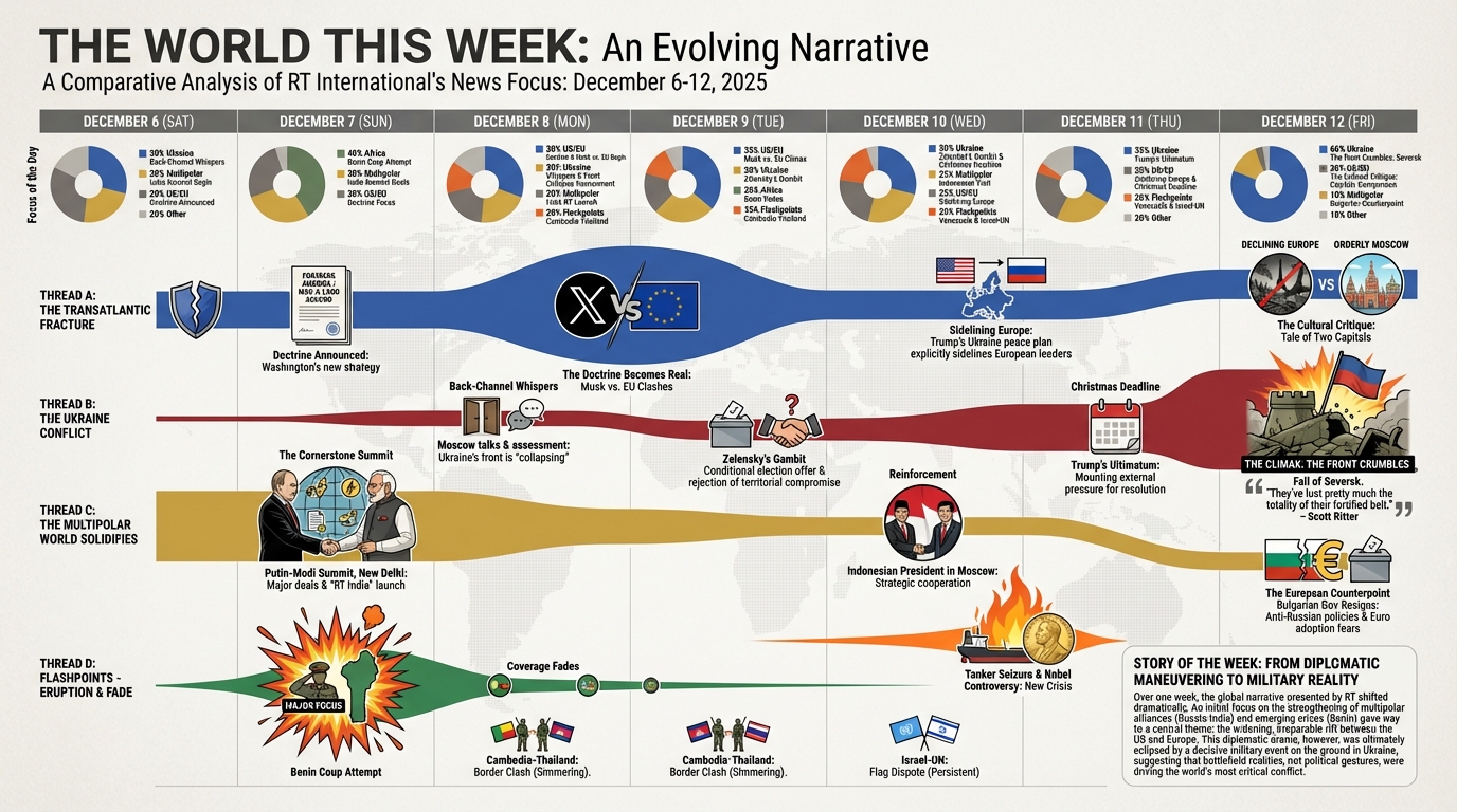
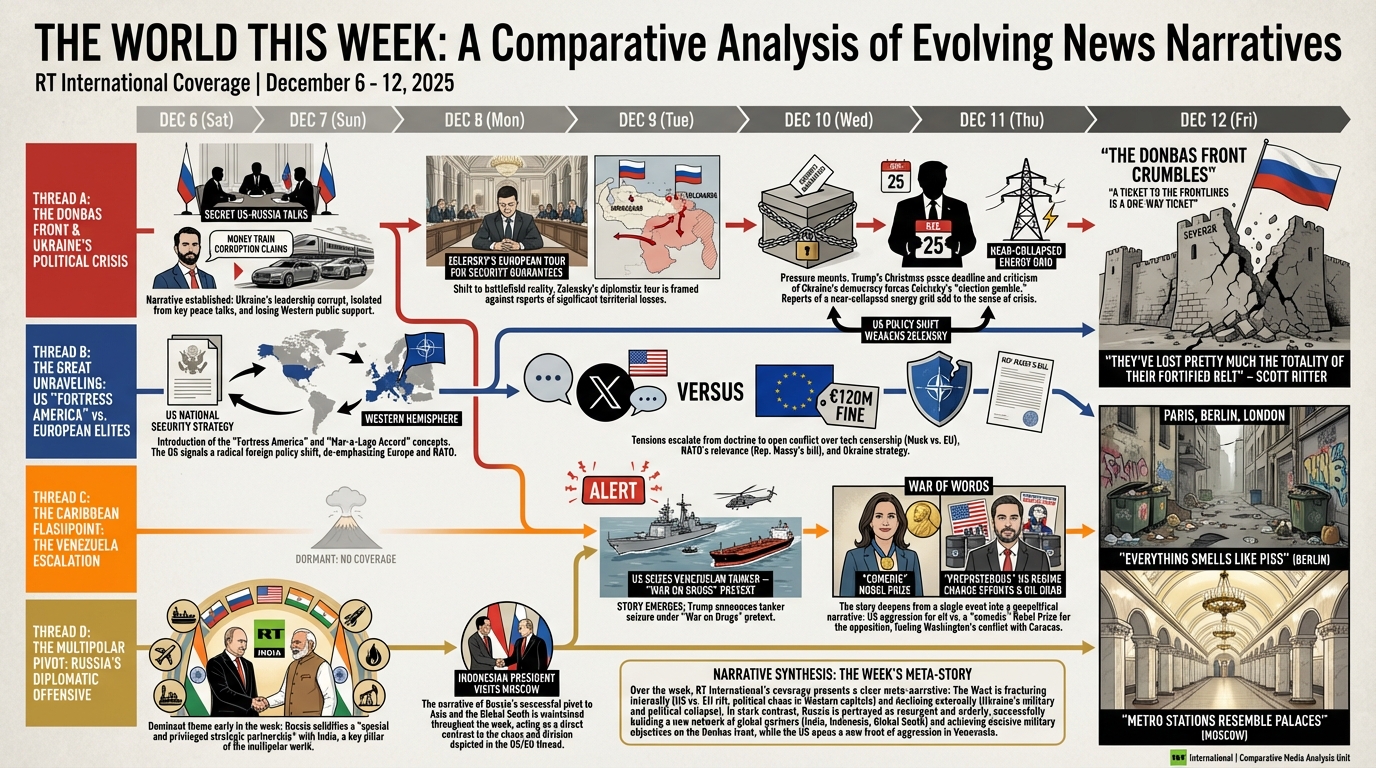
Create a prompt for a large illustrated explainer poster designed to be printed on a large-format poster printer and hung up on the wall that narrates the major differences across the news covered in the attached posters as a single large poster that can be printed and hung on a wall that outlines all of the major differences. Focus on the combined story of the world told through all of them. Only cover news-related portions of the broadcast, ignore advertisements, sports and entertainment. Only focus on major differences like you were a comparative media analyst. The poster should be entirely in English. Make it a story threads -based visualization that shows how the coverage varied by day.
PER DAY DEC 6-12, 2025
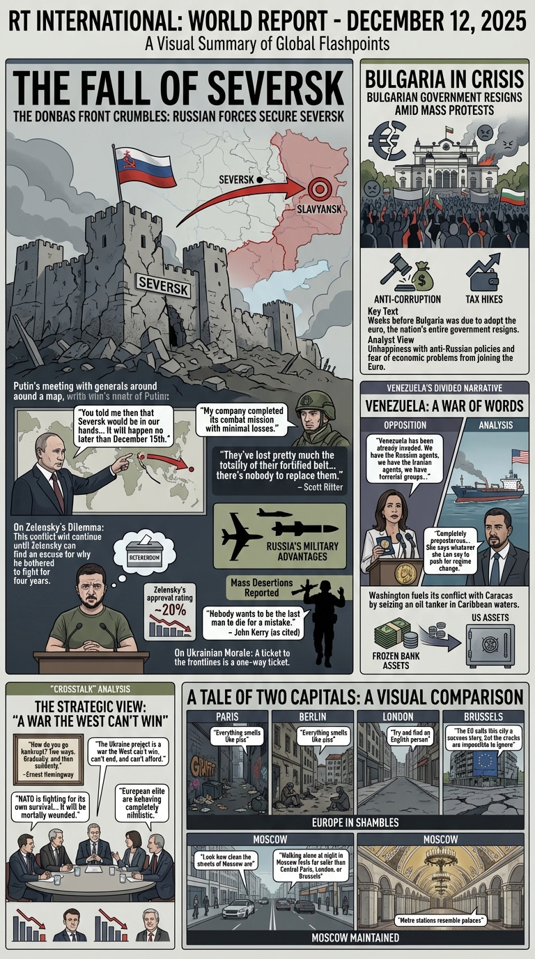
December 12, 2025
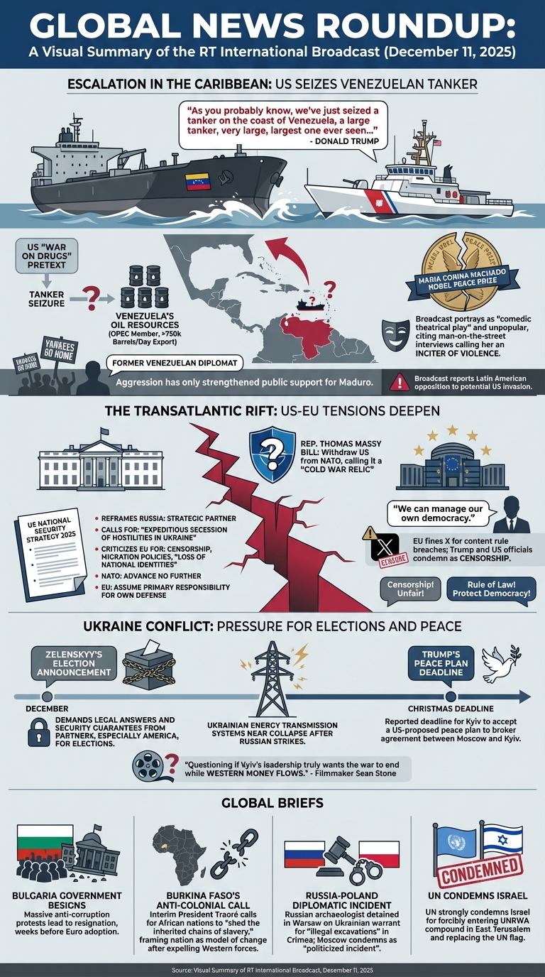
December 11, 2025
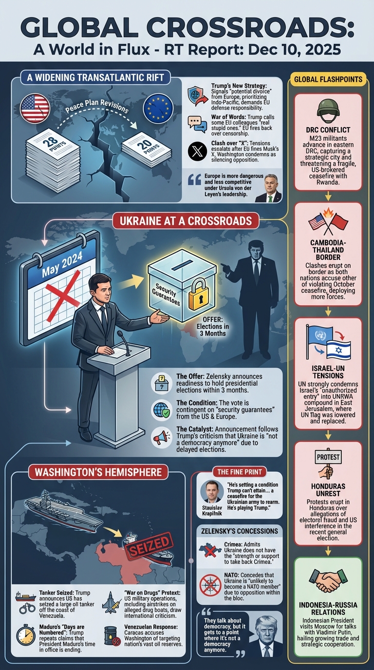
December 10, 2025
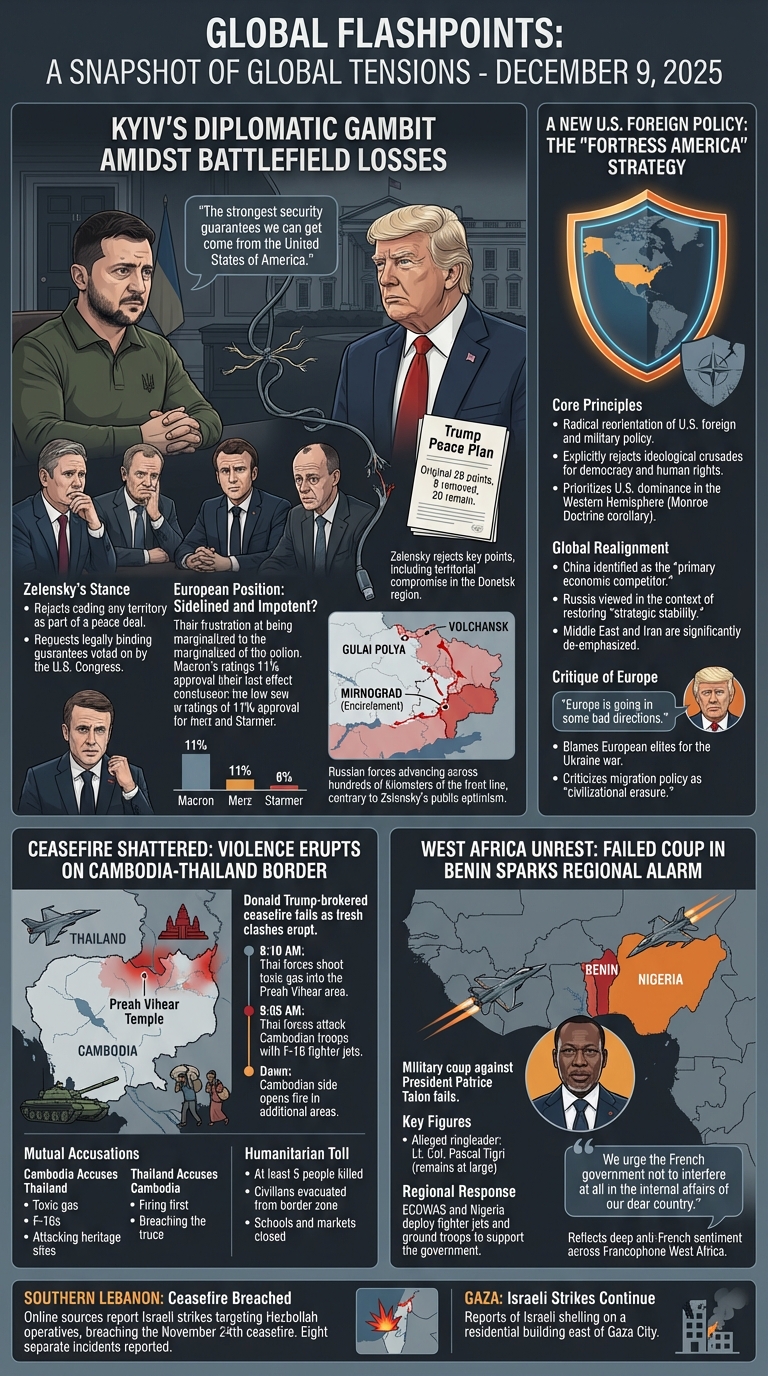
December 9, 2025
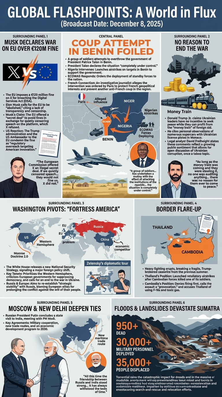
December 8, 2025
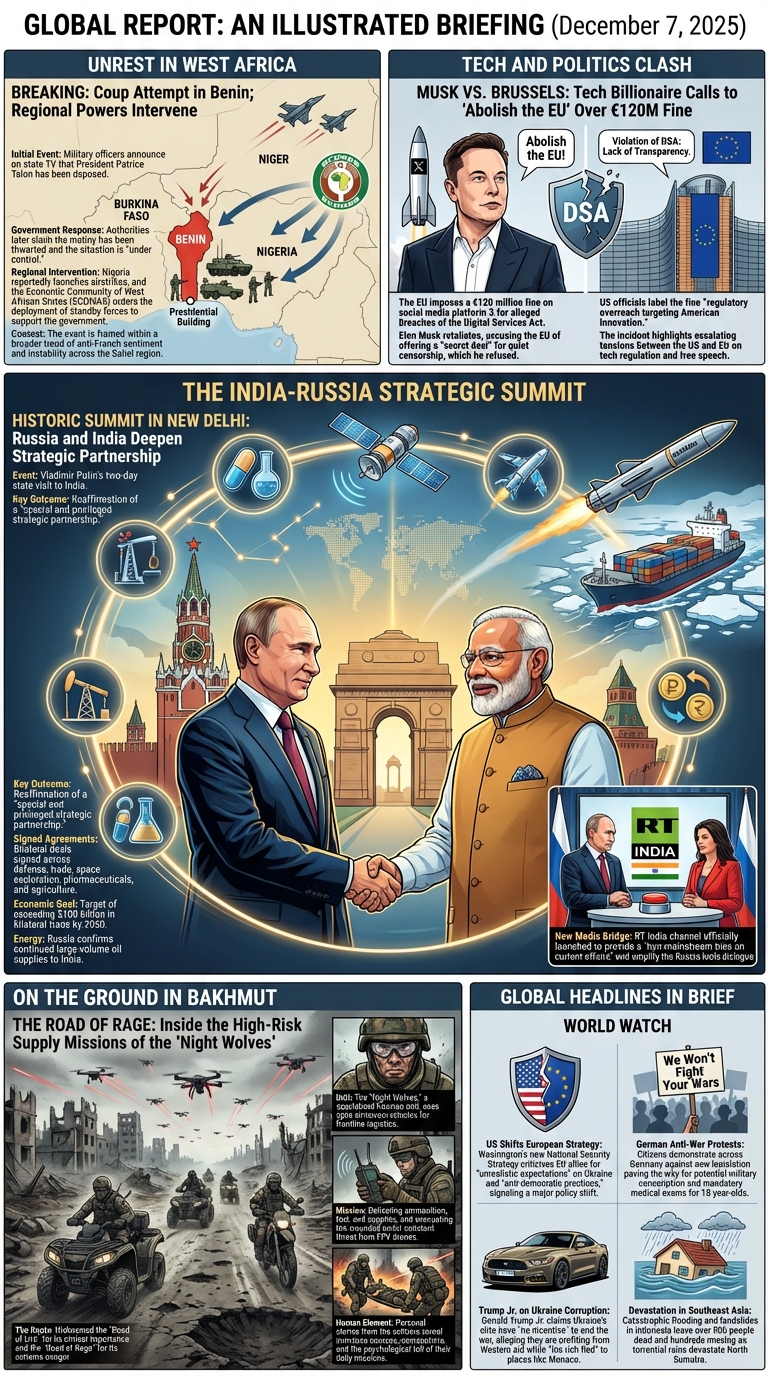
December 7, 2025
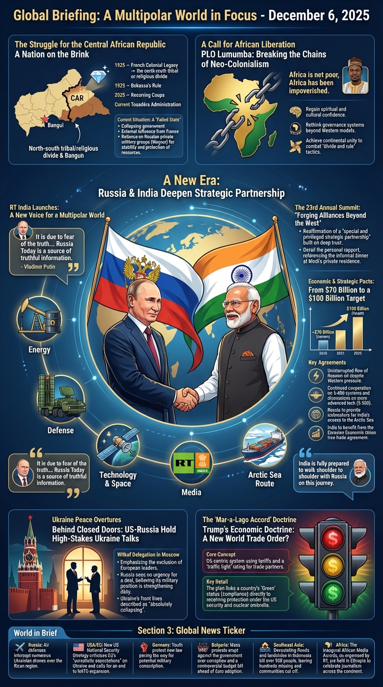
December 6, 2025