
The Global Geographic Graph now spans more than 1.7 billion location mentions in worldwide English language news coverage back to 2017, making it possible to map the geography of the global news narrative. Creating a map from the Global Geographic Graph traditionally involved running a BigQuery SQL query to compile the results, downloading them as a CSV file and then importing that file into Carto to create the actual map. However, Carto actually has a built-in BigQuery connector, meaning you can simply paste your SQL query directly into Carto, which runs the query on BigQuery and downloads the results into your map completely seamlessly and can even rerun the query on a fixed internal to keep the map constantly synced!
Let's say we want to create a map of locations mentioned in English language news coverage in the context of Covid-19 during the month of May. Just log into your Carto account and select "New Dataset" and click on "BigQuery" as your data source and then click on the "Connect" button. You'll get the dialog below:
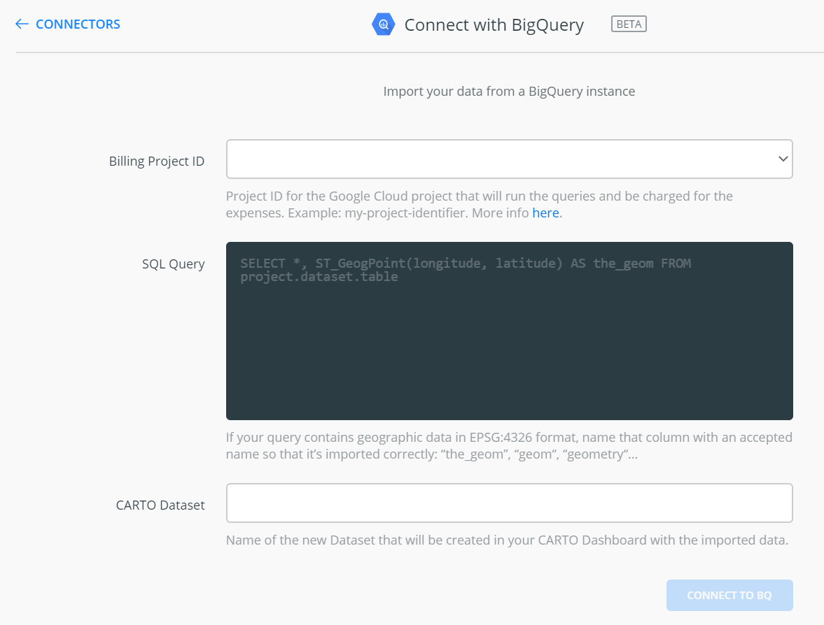
The "Billing Project ID" dropdown will automatically populate with the list of your Google Cloud projects (this is the project against whose quota the BigQuery query will be billed). You then paste your query in the SQL Query box and pick a name for the new Carto dataset and then click "Connect to BQ"! That's quite literally all there is to it! Carto will then send your query to BigQuery to be executed and within a few moments the results will be streamed back to Carto and populate your new dataset!
Here's the actual query we're going to run (we use "GeoType > 1" to include country-level matches):
SELECT ST_GeogPoint(Lon, Lat) as the_geom, count(1) Cnt FROM `gdelt-bq.gdeltv2.ggg` where (ContextualText like '%covid%' and ContextualText like '%coronavirus%')and GeoType>1 and DATE(DateTime) >= "2020-05-01" AND DATE(DateTime) <= "2020-05-31" group by Lat,Lon order by Cnt desc limit 10000
The "ST_GeogPoint(Lon, Lat) as the_geom" at the beginning of the query takes our latitude and longitude coordinates and converts them into a Geography "Point" type.
Alternatively, since the Global Geographic Graph actually already has a GEOGRAPHY column called "the_geom" you could also use:
SELECT ANY_VALUE(the_geom) as the_geom, count(1) Cnt FROM `gdelt-bq.gdeltv2.ggg` where (ContextualText like '%covid%' and ContextualText like '%coronavirus%') and GeoType>1 and DATE(DateTime) >= "2020-05-01" AND DATE(DateTime) <= "2020-05-31" group by TO_JSON_STRING(the_geom) order by Cnt desc limit 10000
It is important to remember that grouping by a geography column like we're doing here is extremely bad practice for observed datasets due to the imprecise nature of most observed/sampled geographic data. When collecting GPS points, a stationary object can appear to constantly move in a small radius around its actual location due to GPS jitter, while sampling imprecision and error can yield clusters of points all slightly different from each other. Simply snapping to a grid doesn't solve this issue, since regardless of the grid resolution, a cluster of points will be split across the rounded coordinates. In the case of the Global Geographic Graph, all locations are drawn from a set of centroid-based gazeteers in which every reference to Paris, France will always yield precisely the same coordinate and thus here we can safely group by our coordinates, but for other kinds of data we strongly recommend against it. With observed GIS to perform this kind of "Top N" grouping you would need to cluster your points first.
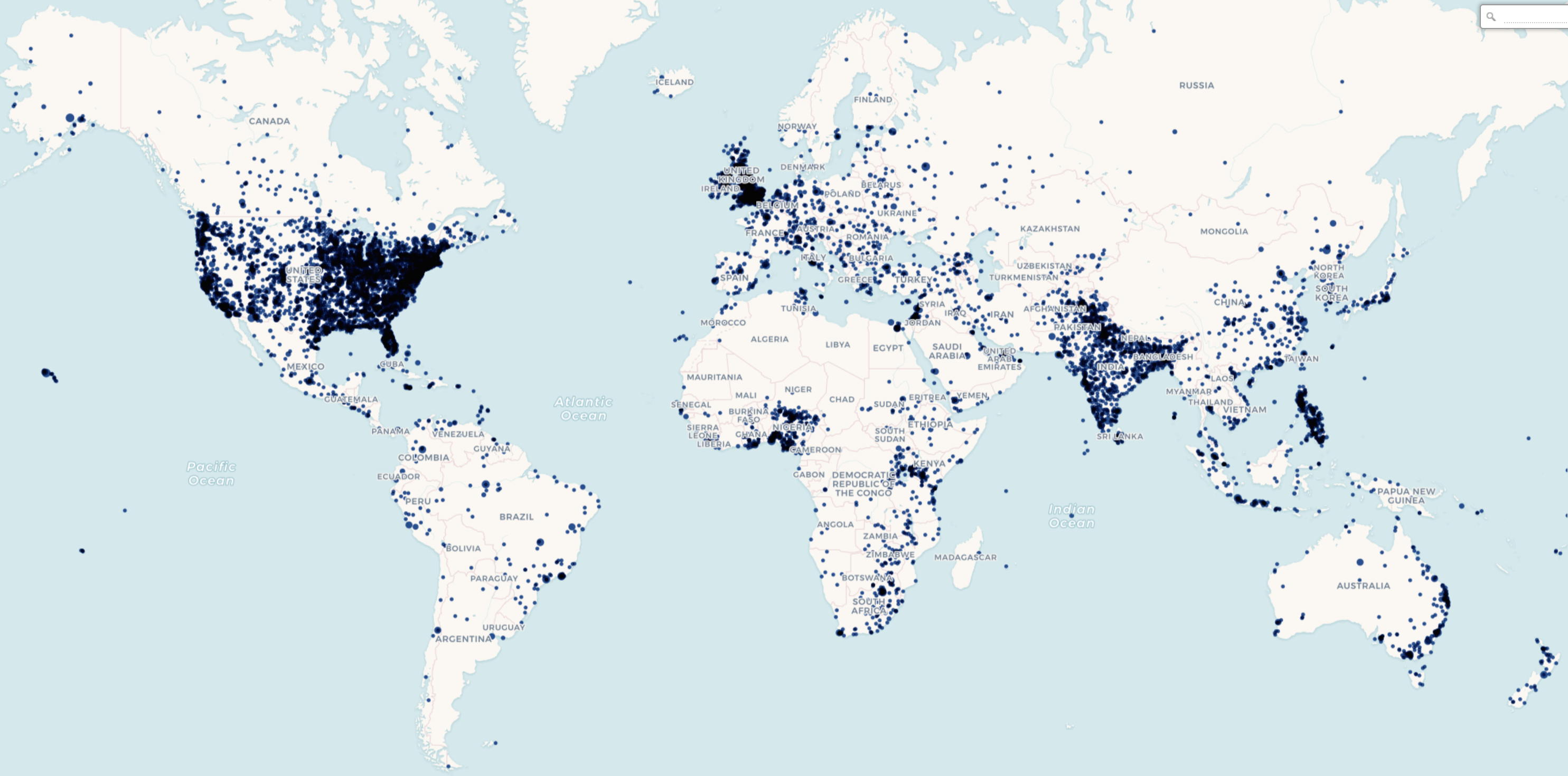
Within a few moments the data appears as a standard Carto table and you can instantly map it:
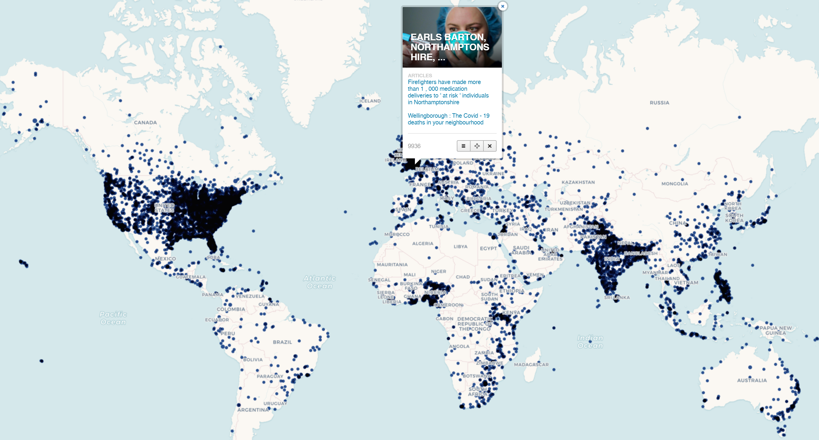
But what if we want to make an interactive clickable map that displays the top 5 articles mentioning each location?
The query below selects the top 5 articles per location and concatenates their titles and URLs into a block of HTML and selects one of their social media images as the header image.
select ST_GeogPoint(Lon, Lat) as the_geom, ARRAY_TO_STRING(ARRAY_AGG(Art ORDER BY cnt DESC LIMIT 5), '<BR><BR>') Articles, max(SharingImage) SharingImage, APPROX_TOP_COUNT(Loc, 1)[OFFSET(0)].value LocationName, Count(1) NumMentions from (
select CONCAT('<a href="', min(URL), '" target="blank">',max(Title),'</a>') Art, Lat, Lon, max(SharingImage) SharingImage, APPROX_TOP_COUNT(Location, 1)[OFFSET(0)].value Loc, count(1) cnt FROM `gdelt-bq.gdeltv2.ggg` WHERE (ContextualText like '%covid%' and ContextualText like '%coronavirus%') and GeoType>1 and DATE(DateTime) >= "2020-05-01" AND DATE(DateTime) <= "2020-05-31" group by LOWER(Title), Lat, Lon
) group by Lat, Lon order by NumMentions desc limit 10000
Once again the data is imported into a Carto dataset within moments. Following the same instructions as we used in April (but this time skipping the part about saving the data out of BigQuery as a CSV and loading back into Carto since we don't have to do that anymore!), we get the map below, showing what it looks like to click on a location in the UK (to see what this map experience looks like interactively see the Covid-19 map from April):
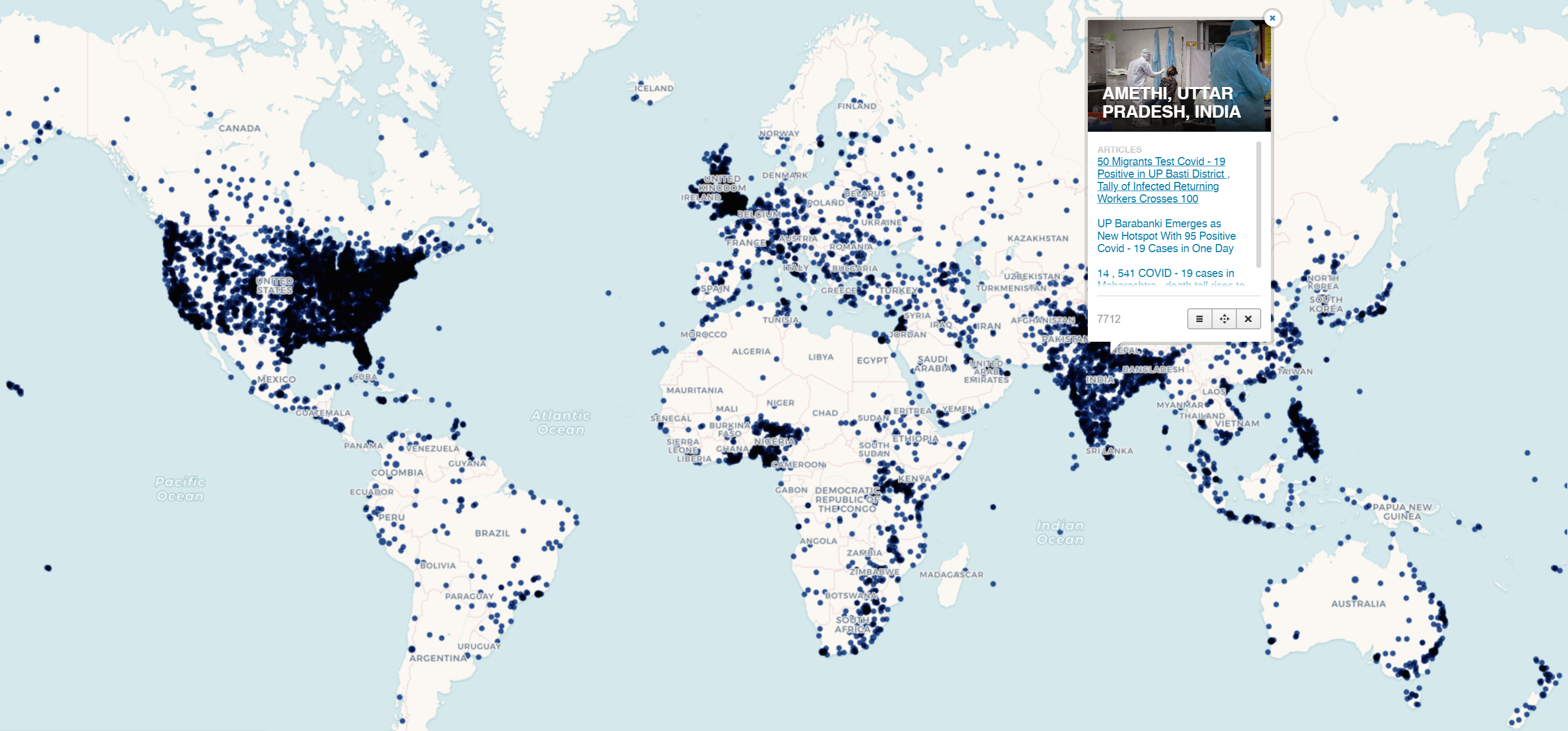
And another example, this time of clicking a location in India:
We hope these examples showcase just how powerful Carto + BigQuery are together!