An opinion piece in yesterday's Washington Post by Helaine Olen raised the fascinating question of whether television news outlets should be displaying unemployment numbers onscreen continually throughout the day like they do with infection and death counts.
Just how much screentime are infection and death counts getting compared with unemployment numbers?
Since January 25th of this year in collaboration with the Internet Archive's Television News Archive we've been using Google's Cloud Video API to non-consumptively analyze CNN, including OCR'ing all of the text onscreen every second of the day.
Using the Television Explorer AI, we can search this OCR'd text and determine just how many seconds of airtime since the start of February have featured either unemployment or infection and death counts.
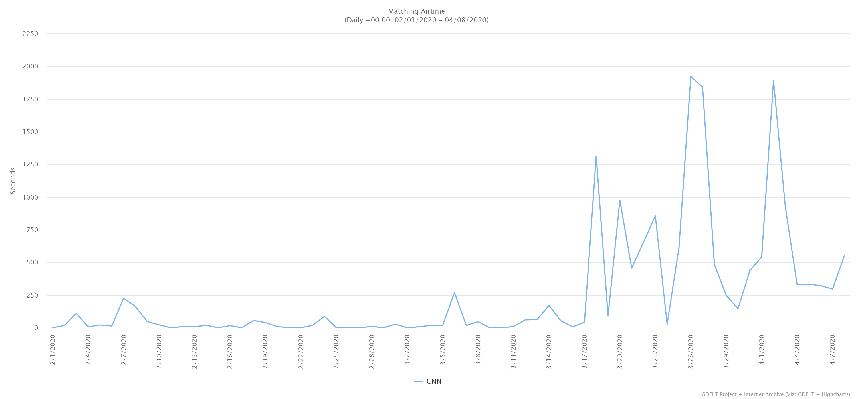
The timeline below shows the total number of seconds of airtime each day since Feb. 1 in which the words "unemployed" or "unemployment" were displayed somewhere onscreen on CNN. In total just 282 minutes of airtime (4.7 hours) contained either word.
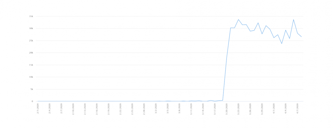
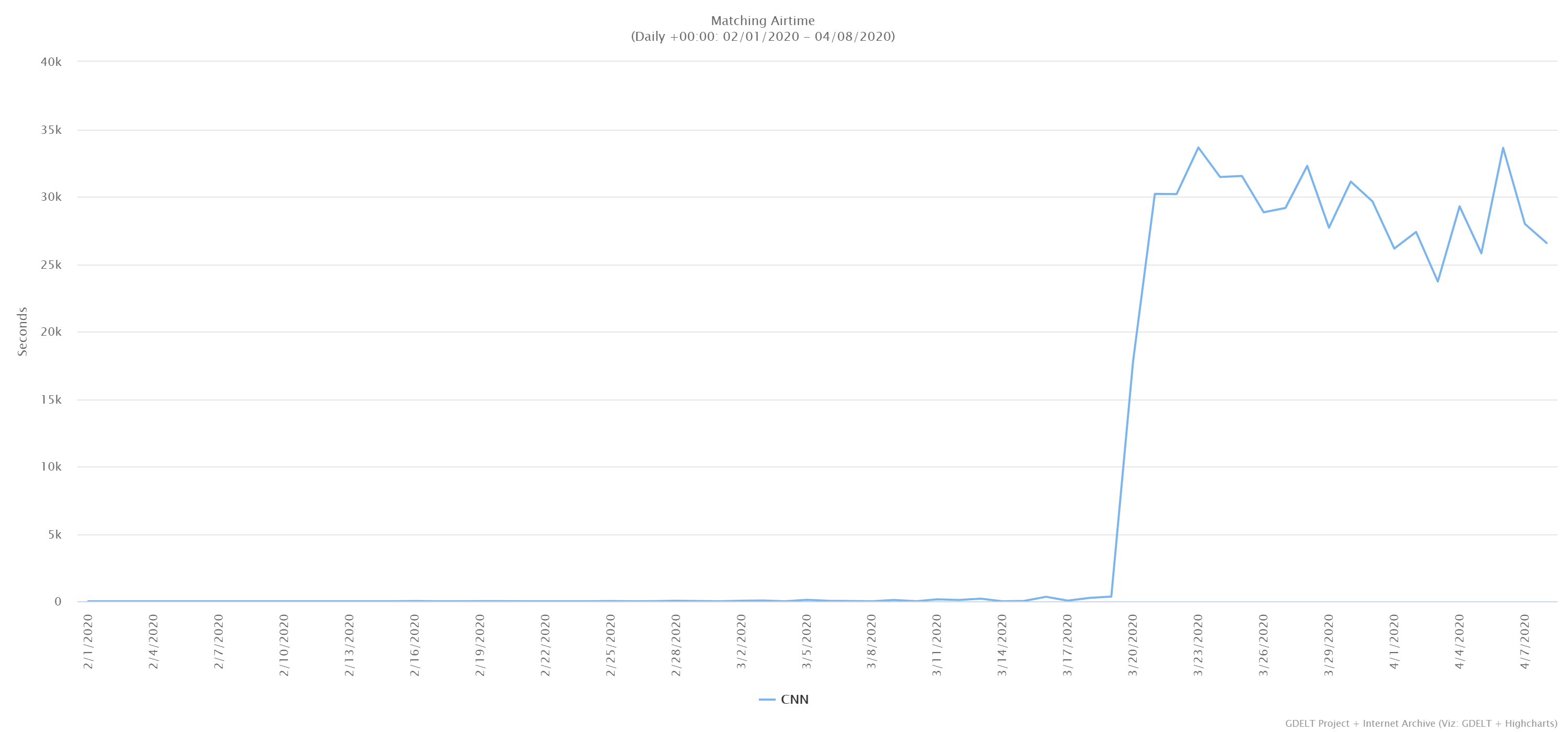
In contrast, the timeline below shows the total airtime per day in which "Johns Hopkins" was displayed onscreen. While the institution's name also appears onscreen when CNN is interviewing Johns Hopkins researchers, the majority of appearances are as the source credit for the latest infection and death counts.
The phrase first appears on CNN on March 20th and has been steady since March 21st, appearing around 8.3 hours per day – around a third of the total daily airtime. In all, it has appeared onscreen 160 hours since March 20th.
Thus, since the start of February, unemployment has appeared 4.7 hours to 160 hours of infection and death counts.

