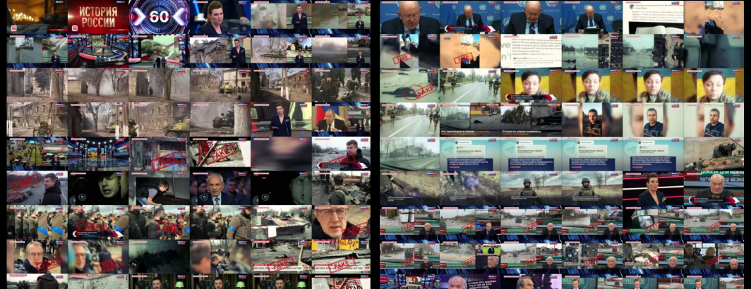
Instead of displaying a single isolated frame as the thumbnail for each television news broadcast in the Visual Explorer, what if we used the algorithmic thumbnail selection we've been exploring these last few days to create montage thumbnails for each broadcast? Instead of a single frame that may or may not meaningfully reflect the contents of a broadcast, a thumbnail montage would offer at least a glimpse of its overall visual narrative that might provide a more robust gallery interface.
For example, here are the existing thumbnail images used by the Archive today to represent each of the CNN news broadcasts appearing on September 3, 2024. Immediately clear is that 4 of the 23 images are of commercial breaks, while the others make it difficult to assess the overall mix of stories and visual narratives in that broadcast.
What about our 9-frame algorithmic thumbnail montage at 200 pixels? Note there is one additional broadcast here for which the Archive-provided thumbnail is not presently available due to server errors and thus there are 24 broadcasts show here vs 23 above.
And the 12-frame montage?
And the 16-frame montage?
Given the space constraints of the Visual Explorer homepage, what about the 150-pixel versions?
And the 100-pixel versions?


