Continuing our series on algorithmic thumbnail generation for television news, what about a few examples drawn from evening news broadcasts, which typically cover up to six stories in a single 30 minute broadcast, interspersed with commercial breaks and often fast-paced cuts between footage? Here the results are less persuasive than our earlier experiments, especially for older lower-resolution broadcasts, though the algorithmic summaries still have a significant edge over their fixed counterparts.
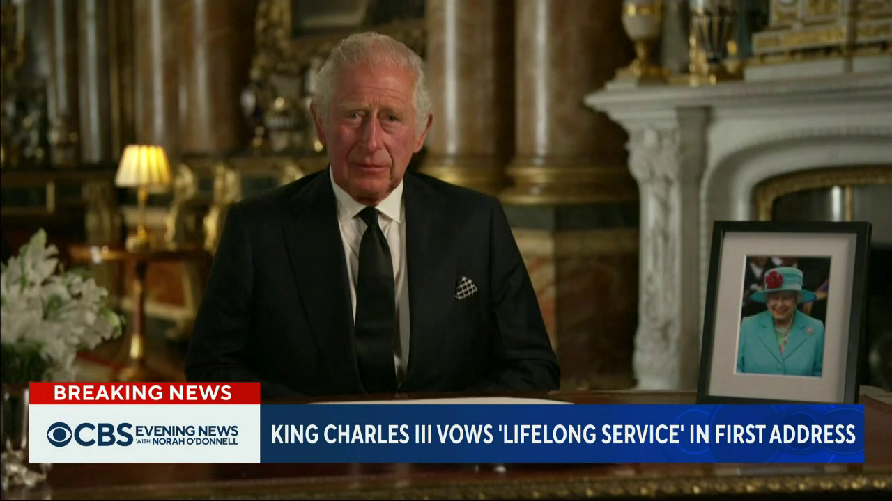
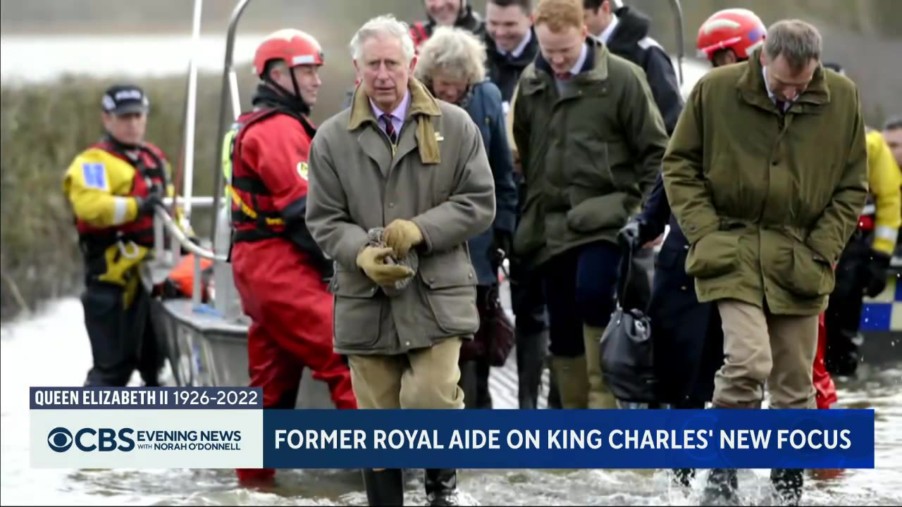
Take this broadcast that focuses on the death of Queen Elizabeth II.
Here are the 5-frame summaries, first using fixed sampling and second using algorithmic. Notice how vastly more informative the algorithmic selection is:
And the 10-frame summaries, using fixed and algorithmic sampling:
In terms of a single-image representative thumbnail, here is the result for the first 100 frames:
And based on the entire broadcast:
For reference, this is what the current one-minute thumbnail sampling produced. It does a quite decent job of capturing the overall gist of the broadcast:
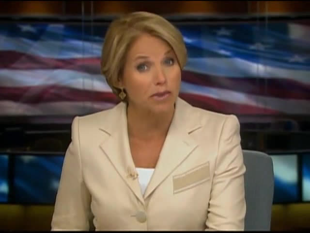
What about an example from the Archive's first preserved evening news broadcasts, from July 16, 2010? These are lower resolution and feature deeper color saturation and a more muted palette that test the ability of ffmpeg's thumbnail filter to work across different content vintages:
The fixed and algorithmic 5-image summaries. This time neither is ideal:
The fixed and algorithmic 10-image summaries. These are vastly better, though again with no clear winner:
The 100-frame and full-broadcast algorithmic single-image summaries:
For reference, this is what the current one-minute thumbnail sampling produced. It offers little insight into the broadcast:
How about this 2010 evening news broadcast that is a blend of visual styles?
Fixed and algorithmic 5-frame:
Fixed and algorithmic 10-frame:
And 100- and full-broadcast single-image:
And the existing thumbnail:


