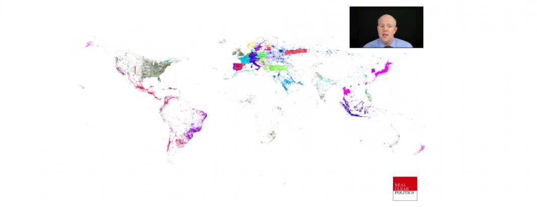
Is the era of mapping Twitter coming to an end? We've all seen maps like this, showing the world as seen through the eyes of precise GPS-tagged tweets, capturing equisite detail of the world, down to small roads and interstate rest areas. Yet, it turns out this era of "mappable Twitter" was a mistake and the ability to generate such precision maps is fading. While Twitter itself does not publish daily statistics about its service, we can construct an estimate of the platform's mappable size and characteristics using its "Spritzer" data stream – a 1% random sample of all tweets that correlates nearly perfectly with the full Twitter dataset, allowing us to trace Twitter's evolution over the past decade.