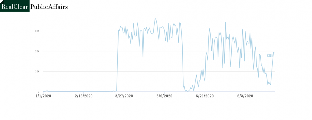
This timeline shows the total seconds of airtime on CNN each day since the start of this year in which CNN displayed its COVID-19 infections and death dashboard. Starting March 20th the dashboard was a constant fixture around 9 hours a day until being largely halted during the George Floyd protests. CNN brought the dashboard back after a week, but has run it less than pre-protests. Since around August 11th it has slowly phased out the dashboard, running it less and less each day, but starting August 31 it has rapidly brought it back.