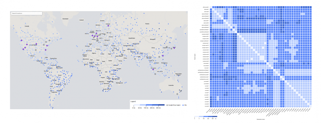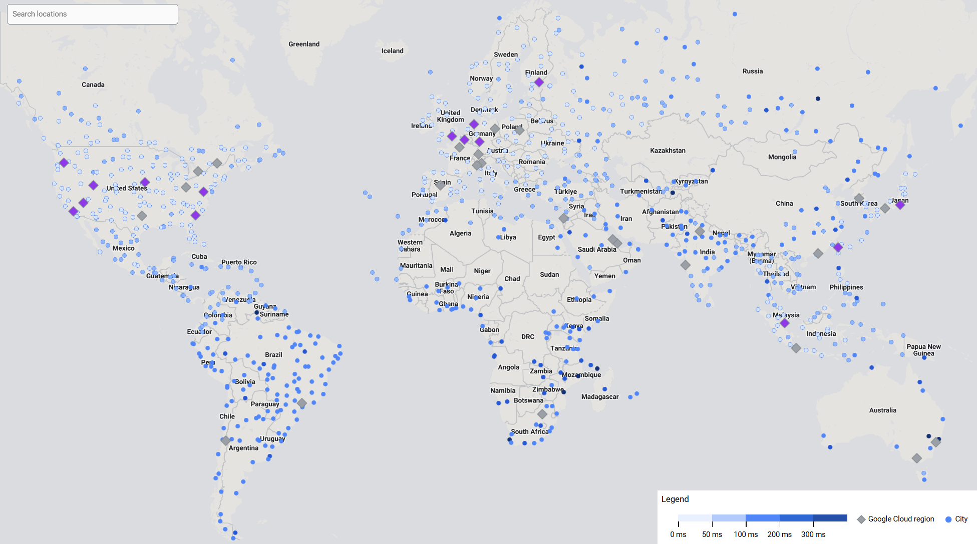
The sheer massiveness of GCP's core service offerings is such that there are a wealth of hidden gems buried within its myriad consoles. One particularly powerful tool is the Network Intelligence Performance Dashboard that offers both realtime and historical looks at GCP-wide geographic latency. For example, the map below captures average latency (RTT) to the public internet across all of GCP over a one hour period. Even more powerfully, with a click of a button, this map can be generated at the project level, reporting the actual real-world average latencies
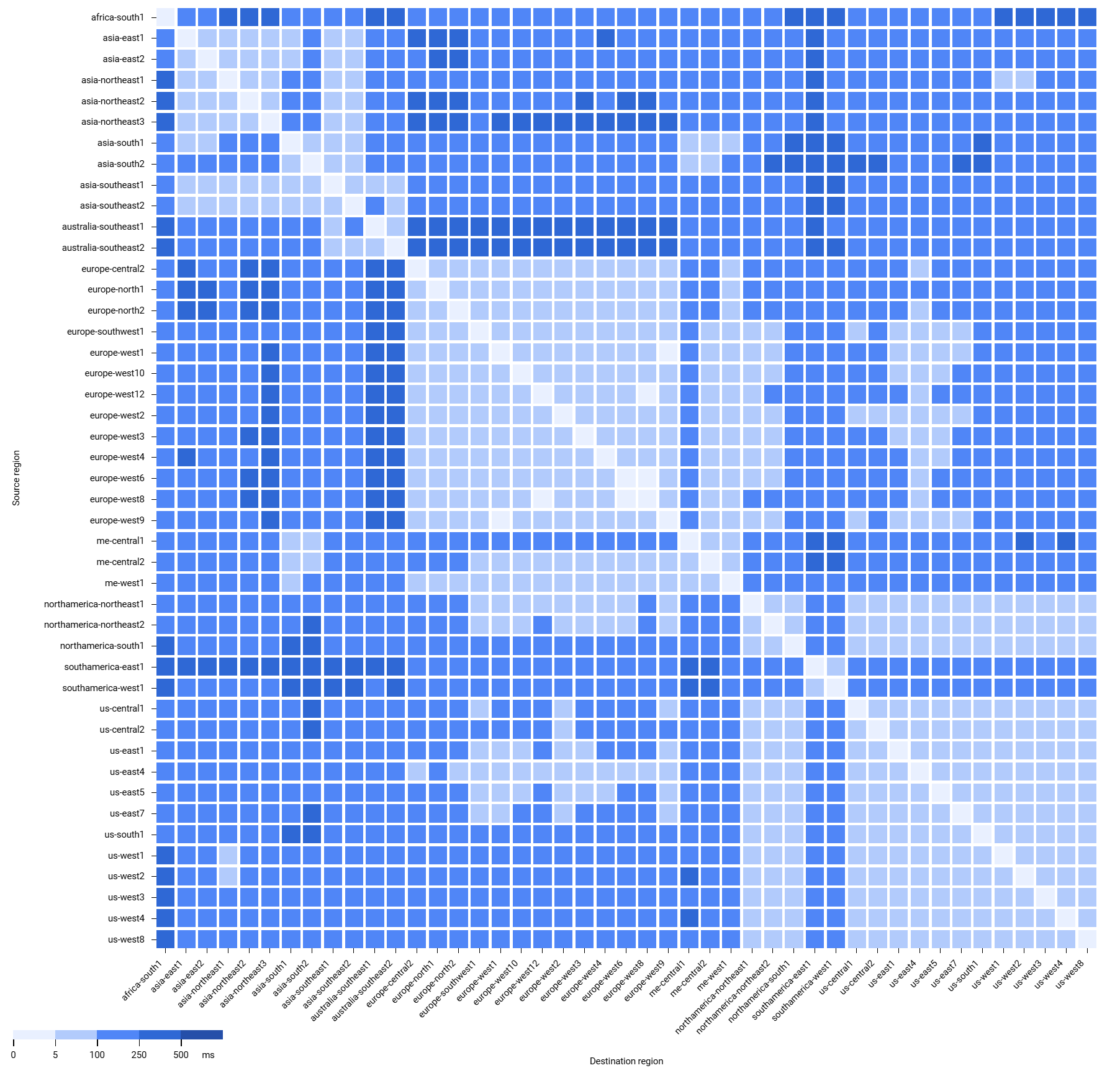
You can also view inter-region latencies at both the GCP-wide and project-specific levels to better diagnose and understand cross-region application performance and for infrastructure planning to better serve new geographic customer communities.

