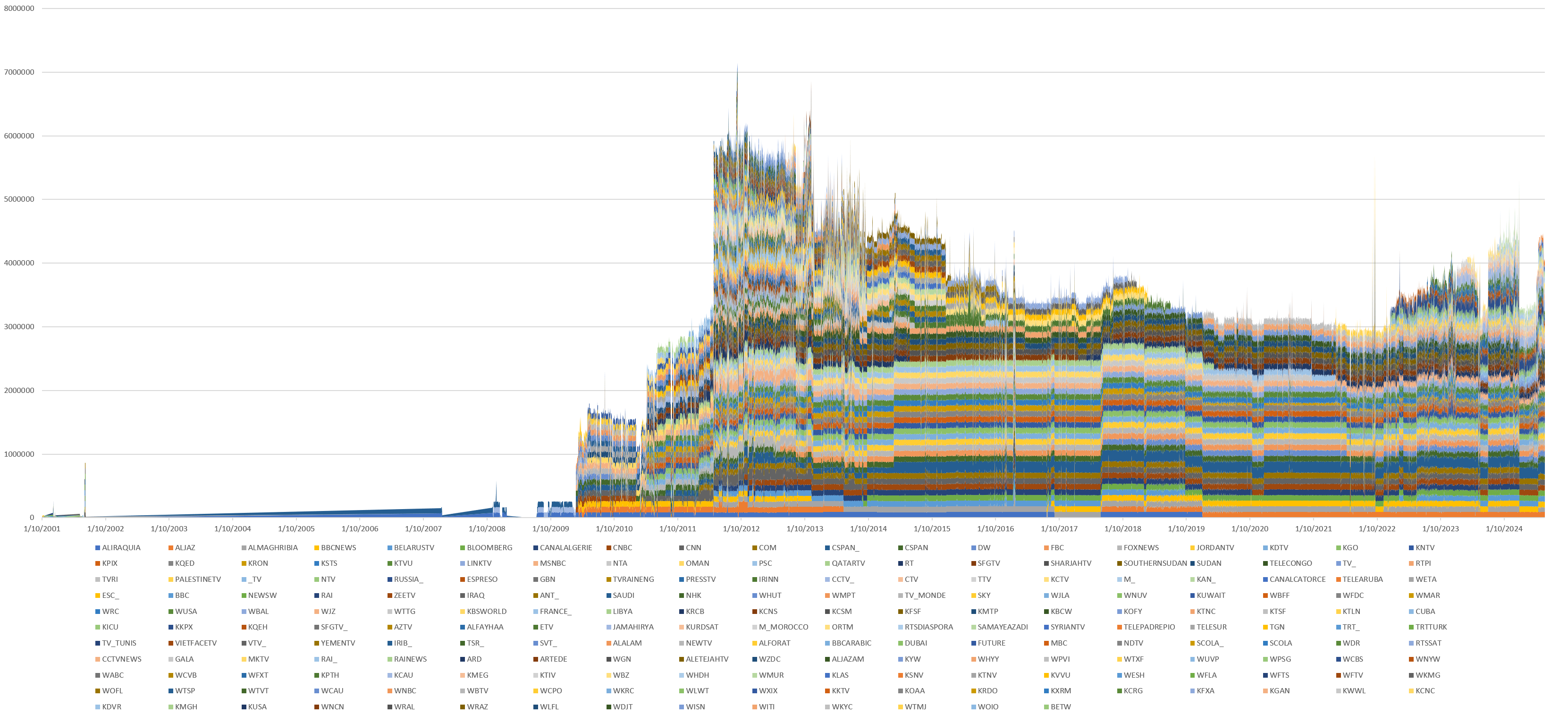
Earlier this week we made a table tallying the total number of broadcasts and seconds of airtime preserved by the Internet Archive's TV News Archive from each of the 214 channels it has monitored over the past quarter-century. The more interesting question is how those numbers have changed over time and where the major transition points are in the Archive's coverage where it has added and dropped channels over time. To explore this, we'll use BigQuery + Bigtable to examine our digital twin and construct a pivot table that charts each of the 214 channels over the full time period and plot as a stacked area graph timeline, which can be seen below. The underlying SQL query can be seen at the end of this post.
BigQuery + Bigtable digital twin query:
DECLARE CHANS ARRAY;
SET CHANS = (
select ARRAY_AGG(DISTINCT REGEXP_REPLACE(  JSON_EXTRACT_SCALAR(DOWN, '$.chan')  , r'[^A-Za-z]+', '_') IGNORE NULLS) chan FROM (
  SELECT
    rowkey,
    ( select array(select value from unnest(cell))[OFFSET(0)]  from unnest(cf.column) where name in ('DOWN') ) DOWN
  FROM `[PROJECTID].bigtableconnections.digtwin` where  CAST(substr(rowkey, 0, 8) as NUMERIC) > 20000000
 )
);

CREATE TEMP TABLE TIMELINE AS (
  SELECT DATE, chan, ROUND(sum(sec)) sec
from (
select FORMAT_DATE('%m/%d/%Y', PARSE_DATE('%Y%m%d', substr(rowkey, 0, 8) )) AS DATE,
  CAST(substr(rowkey, 0, 8) as NUMERIC) DATESQL,
  REGEXP_REPLACE(  JSON_EXTRACT_SCALAR(DOWN, '$.chan')  , r'[^A-Za-z]+', '_') chan,
  CAST(JSON_EXTRACT_SCALAR(DOWN, '$.durSec') AS FLOAT64) sec,
   FROM (
  SELECT
    rowkey,
    ( select array(select value from unnest(cell))[OFFSET(0)]  from unnest(cf.column) where name in ('DOWN') ) DOWN,
  FROM `[PROJECTID].bigtableconnections.digtwin` where  CAST(substr(rowkey, 0, 8) as NUMERIC) > 20000000
 )
) group by DATE,chan order by MIN(DATESQL)
);

EXECUTE IMMEDIATE FORMAT("""
  SELECT * FROM TIMELINE
  PIVOT (SUM(sec) FOR chan IN %s);
""", (SELECT CONCAT("(", STRING_AGG(DISTINCT CONCAT("'", chan, "'"), ','), ")") FROM UNNEST(CHANS) AS chan ))
