Much of the conversation about AI and journalism centers on the potential conflicts between the two fields, while the reality is that there is much AI can offer the field of journalism to help journalists cover a world that is moving ever faster and in a distribution landscape that prioritizes visuals ever more. Given all of our success this week transforming a vast range of material into beautiful and easy-to-understand infographics using Nano Banana Pro, we got to thinking how journalists might be able to use these same approaches. Obviously our work visualizing legislation and government reports has immediate application to journalism, but what about a much broader array of content? Could news outlets even use this workflow to create infographics of their own articles to distill their key concepts into a beautiful visual overview that could be used to promote the article on social media and make it more accessible within the outlet's digital archives? Here we explore visualizing everything from speeches to blog posts, entire books and even news articles using Nano Banana Pro, with impressive results. Importantly, these results show that we are at the point where, with minor editing, news outlets can already use these infographics to illustrate their articles and to create eye-catching visual representations of each article they publish.
For these experiments we used only the public enterprise Gemini and Nano Banana APIs and no data was used to train or tune any model.
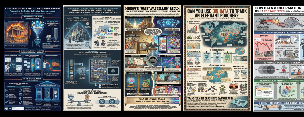
How about the IIPC Report edition of my keynote address opening the 2012 General Assembly of the International Internet Preservation Consortium (IIPC) at the Library of Congress on my vision of the future of web archives?
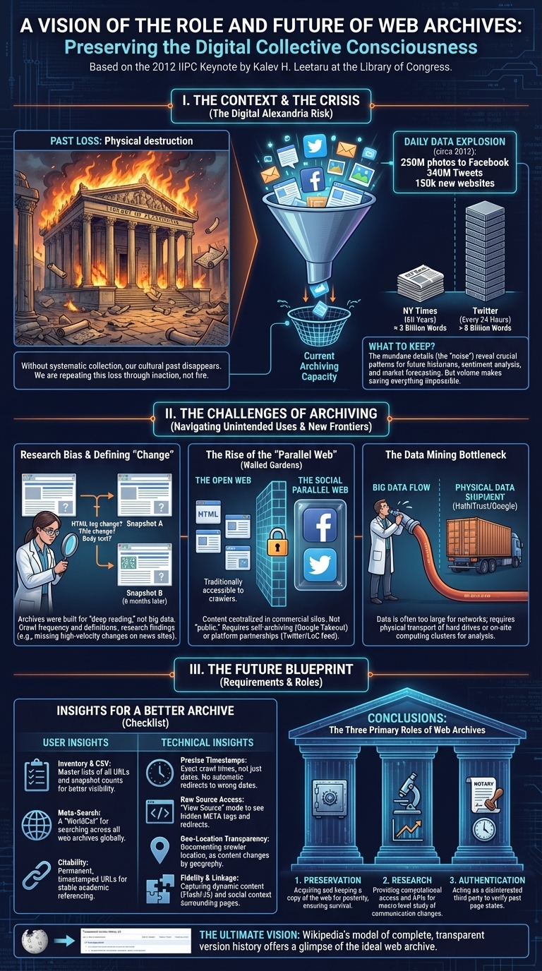
How about this Internet Archive blog post from 2022 unveiling the Visual Explorer titled "A New Approach To Understanding War Through Television News: Introducing The TV News Visual Explorer & The Belarusian, Russian & Ukrainian TV News Archive"?
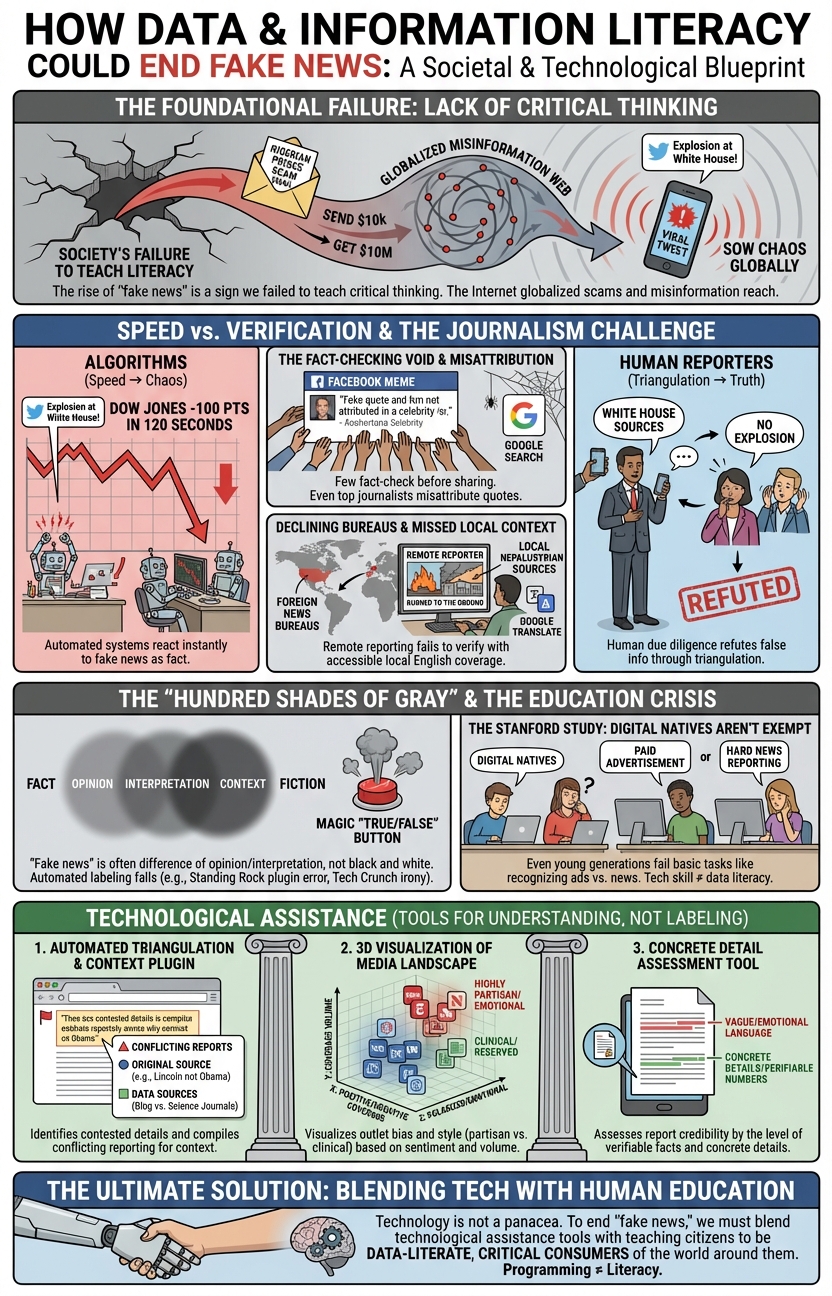
How about this Forbes thought-piece "How Data And Information Literacy Could End Fake News"?
Or this 2014 Wired piece "How to Teach Heartless Computers to Really Get What We're Feeling"? Surprisingly, it gets my profile picture wrong in the lower-left.

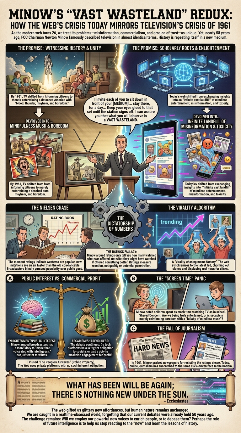
What about this 2019 piece "Minow's 'Wasteland': How The Web's Problems Are Those Of Television Half A Century Ago"?
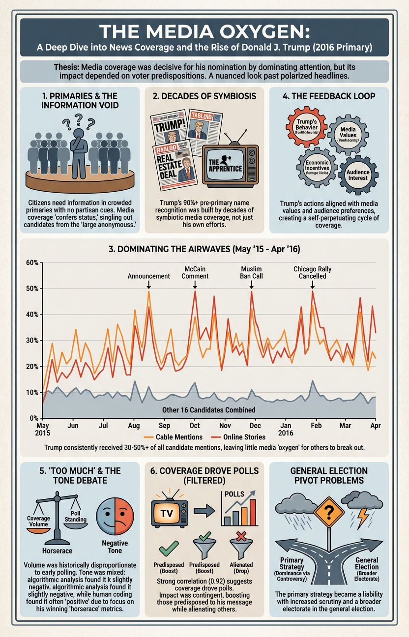
And this media analysis with John Sides in the Washington Post from 2016 "A deep dive into the news media’s role in the rise of Donald J. Trump":
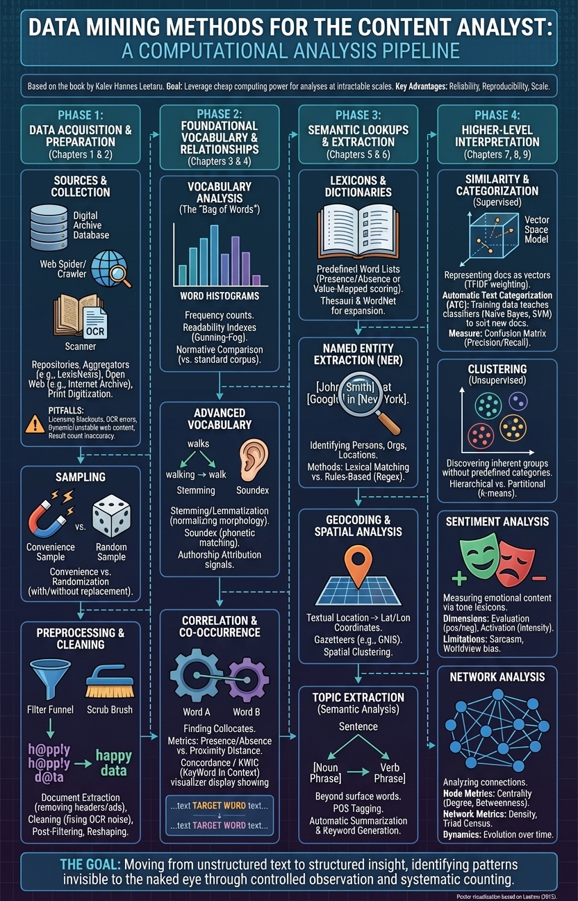
What about my 2011 book "Data Mining Methods for the Content Analyst An Introduction to the Computational Analysis of Content" by Routledge? Can we transform an entire 120-page book into a single infographic?
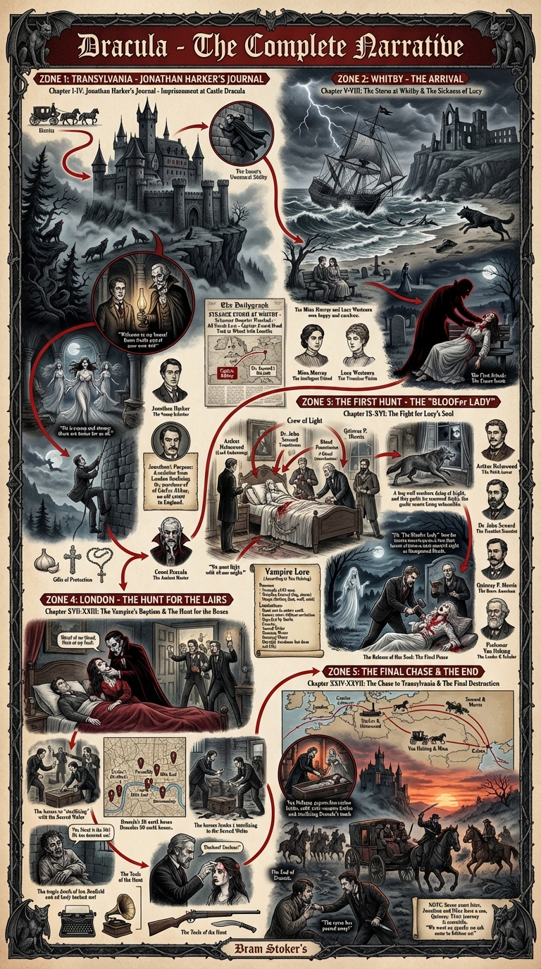
Or the Bram Stoker's famous Dracula, which is now in the public domain?
How about my 2015 Foreign Policy magazine piece "Can You Use Big Data to Track an Elephant Poacher? Voice Why looking at a map of news headlines could help us see critical patterns and trends in wildlife crime."

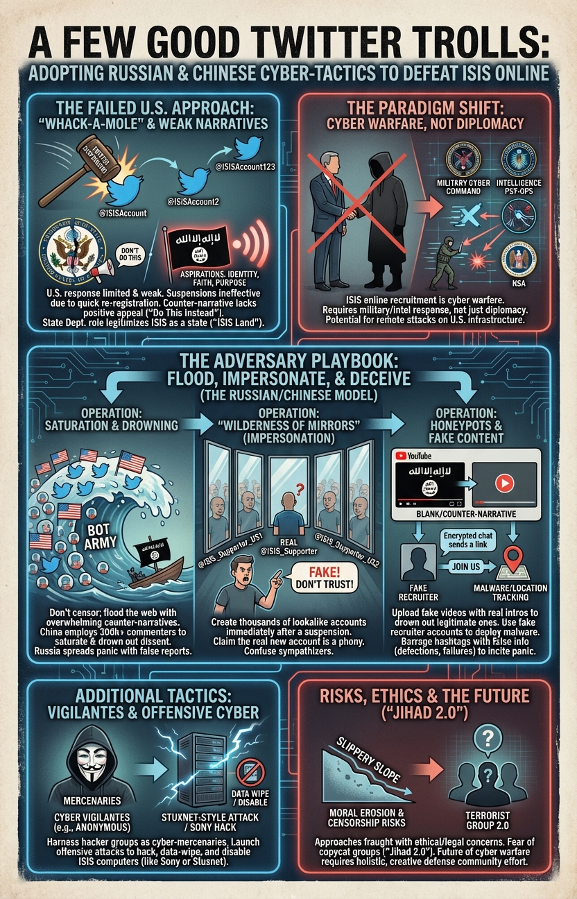
Or this 2015 Foreign Policy magazine piece "A Few Good Twitter Trolls Why the United States needs to take a page from the Chinese and Russian playbooks when it comes to combating the Islamic State online."
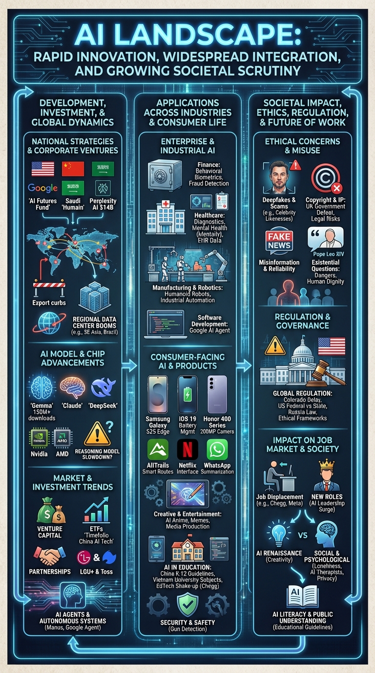
Finally, what about this "persona-based news recommendation overview" on a day of global AI trends?
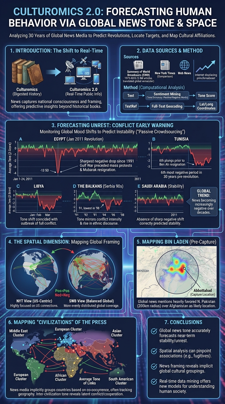
And finally, what about my 2011 "Culturomics 2.0: Forecasting large-scale human behavior using global news media tone in time and space" paper that was named by the Economist as one of the five most important science stories of the year?