GDELT isn't just about understanding global news – it is about understanding and contextualizing our global society. From academic literature to human rights archives, GDELT has been interested in how we can bring the world's open information together and explore it in new ways. Just over eight and a half years ago Kalev was brought into the project that powers Google Constitute, tasked with completely reimagining the way it collected, codified, and managed the data it was collecting and creating. Over a little more than half a decade he established the mass acquisition and digitization workflows, data management processes, and built the entire infrastructure from realtime network diagrams and readouts on coding progress and communications, to novel indicators and evaluation metrics, to the coding system itself (all of which still power the project today) that ultimately supported the transfer of the analog print world of constitutions to the digital world of Google Constitute.
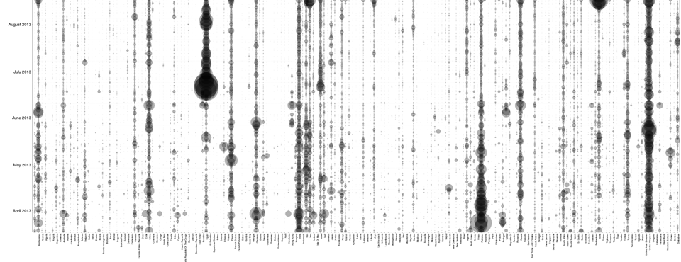
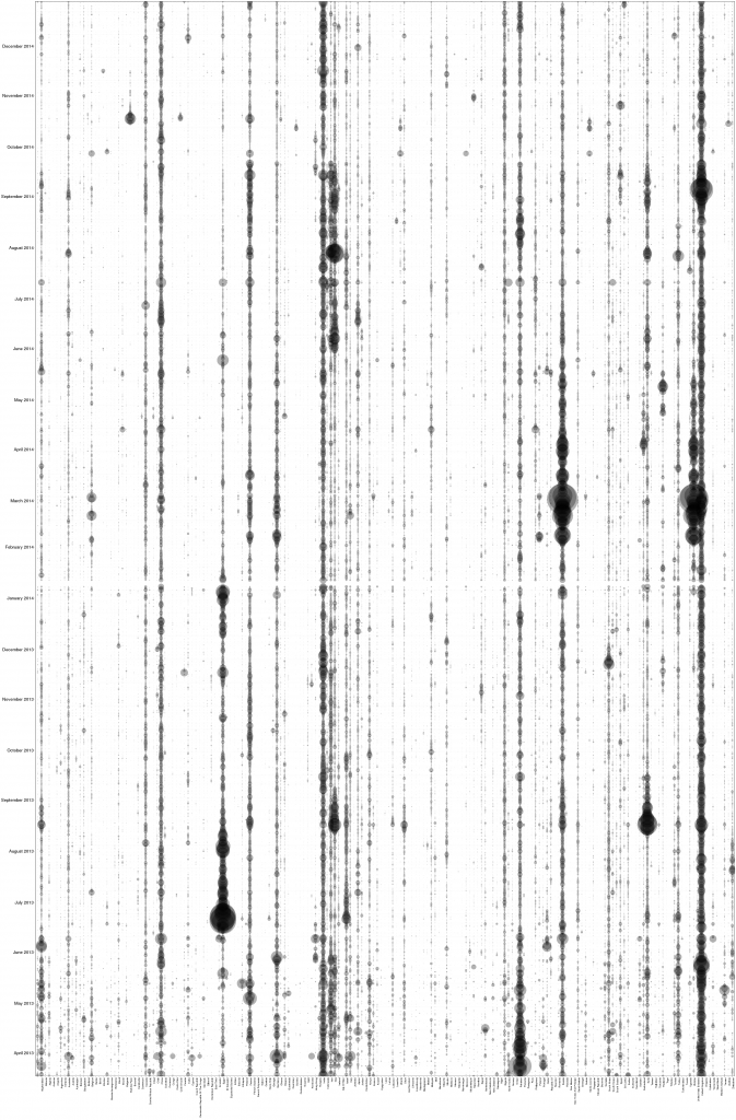
Thus, we've long been interested in constitutions in their role as bedrocks of the legal fabric that guides human society in many countries. With all of the recent activity around constitutions around the world over the last two years, we thought it would be interesting to create a timeline that mapped the intensity of constitutional discourse by country. The timeline below uses the GKG Country Timeline Visualizer (learn more), part of the GDELT Analysis Service, to visualize the percentage of all mentions of constitutionalism that also mentioned each of the world's countries (the US is excluded due to its higher steady-state intensity). In this visualization the X axis represents each country of the world, while the Y axis represents each day of the data from April 2013 to January 2015. Thus, rows represent each day and columns represent a given country's mentions across days. At each grid cell a semi-transparent dot is displayed, sized based on the percentage of all GKG records from that date mentioning constitutionalism that also mentioned that country (thus these timelines are normalized against GDELT's exponential growth over time). The compact nature of this visualization allows you to spot temporal patterns at the daily level, whereas with a traditional barchart or line graph timeline, the individual bars or line points would be too small with this many points to see anything.
What makes this visualization so fascinating is its ability to instantly compare every country in the world side-by-side and day-by-day, tracking subtle correlations and interrelationships among countries. For example, take a look at where Russia and Ukraine track each other and where they do not.
We're incredibly excited by the potential of such visualizations to redefine scholars' ability to peer into the massive and richly detailed portrait of the world that GDELT creates. Check out the GKG Country Timeline tool on the GDELT Analysis Service and make your own timelines!
