Looking at the map of global protests in 2013 as captured in GDELT that John Beieler created, I was struck by how much protest activity there has been in India compared with the surrounding region and how much it and several other areas stood out. This made me concerned that this might simply be an artifact of the greater prevalence of English-language media in those areas, rather than an actual reflection of greater protest activity there.
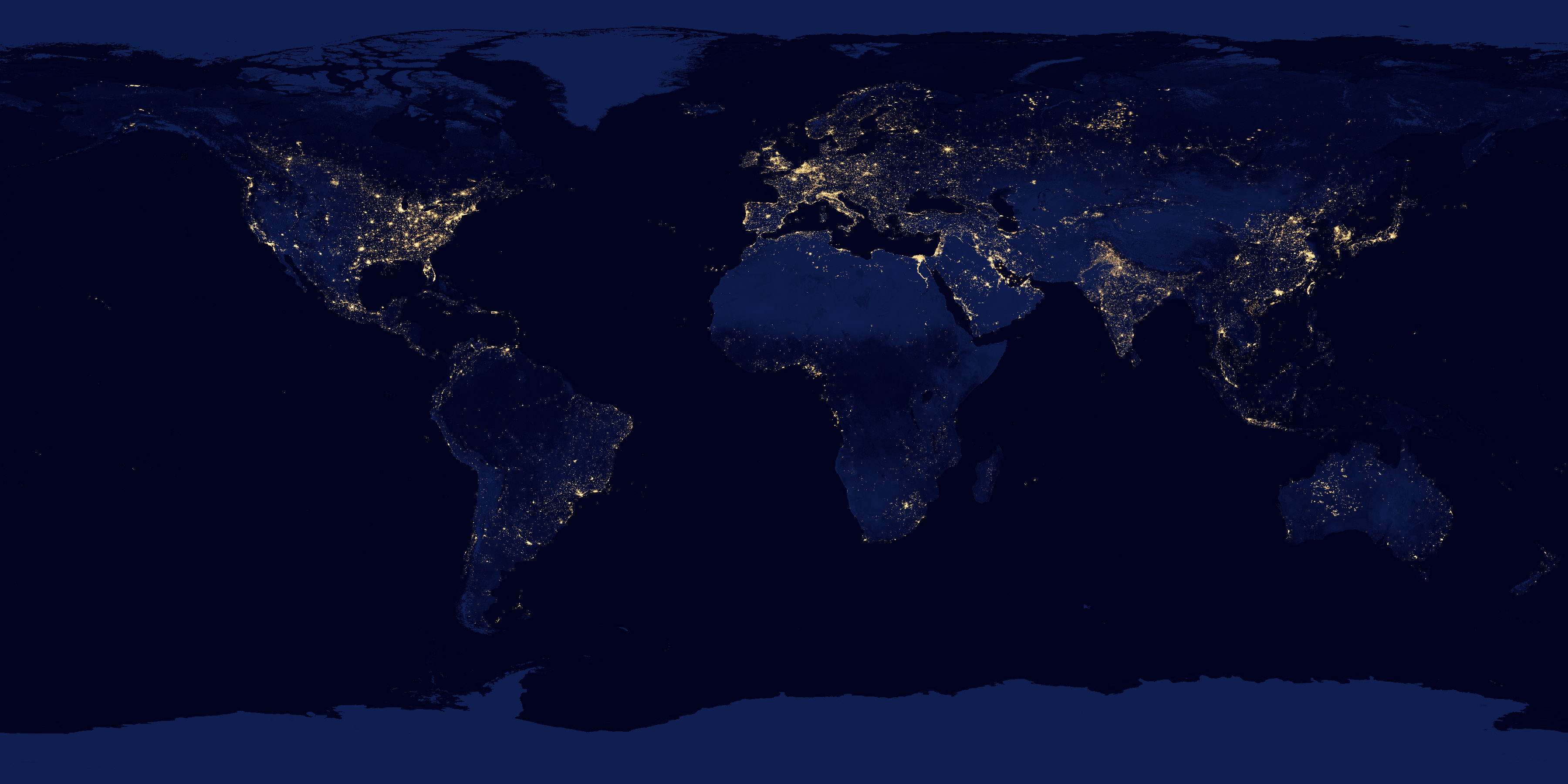
A few days later I was watching the NOVA special “Earth from Space” (link) that showed a number of images of the earth at night from the NASA Night Lights series (link), especially their breathtaking image of the entire earth as it is seen at night, showing the presence of electric lighting across the globe (link) – see the main image here. Looking closely at this imagery, India stands out in similar stark contrast to its neighbors, with large amounts of lighting spread across the country and abruptly ending at its borders, looking very similar to John’s protests map.
Where there is power there is Twitter. Where there are people there is GDELT.
In turn, this reminded me of the comparison I had done between GPS-tagged tweets and the NASA sequence for a paper earlier this year that found tweets and power to be highly correlated to the point that isolated pockets of power in remote regions will have tweets, suggesting “where there is electricity there are tweets” (paper). So, I decided to repeat this visualization, but compare GDELT’s global geographic footprint 1979-2013 against the existence of electricity as of 2012 according to the NASA imagery.
Using Google’s Big Query service, I wrote a simple SQL statement that generated a histogram of every single location that an event of any kind has ever been reported at in GDELT 1979-present. Big Query’s massive parallelism meant this query, which essentially performed a table scan on nearly a quarter-billion records, returned in just around six seconds flat, allowing interactive ad-hoc complex queries across GDELT with no indexes, which we are beginning to experiment with to allow far more rapid interaction with GDELT.
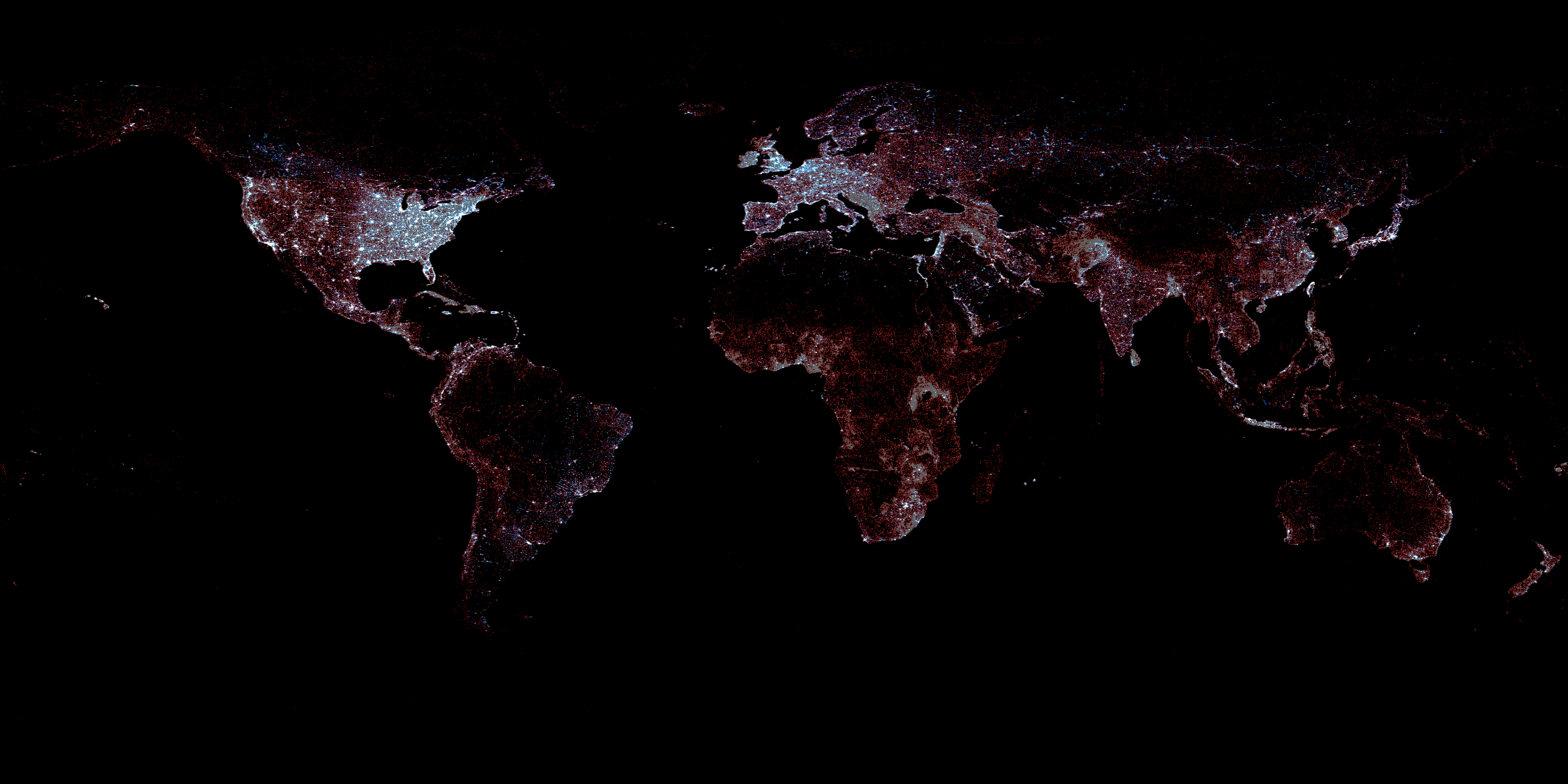
I imported this histogram into the same visualization script I used for my Twitter visual, which uses Graphviz for the rasterization (using GraphViz allows for a wide range of spatial network visuals). Similar to the Twitter visual, I displayed a red dot at each location containing one or more events, but did not attempt to size those dots by the number of events at that location. Thus, a given point could represent a single event over the entire 1979-2013 period, or millions of events at that location. The purpose of this visualization is to set aside the number of events at each location and focus instead on the spatial extent of GDELT and the correlation between power and events and just how far into the rural regions of the world GDELT extends.
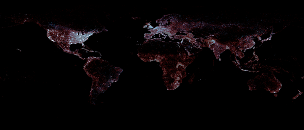
I then overlaid the GDELT visualization (displaying a dot for all locations worldwide containing one or more GDELT events of any type or actor between 1979-2013 (in red) on top of the NASA Night Lights Imagery (in blue) to explore the spatial overlap between areas with widespread availability of electricity (population areas most likely to have substantial news coverage) and the geography of GDELT’s global coverage.
It is clear from this map that GDELT has very strong global coverage, covering far beyond the areas of greatest electrical availability and reaching deep into surrounding regions. GDELT’s emphasis on Africa and Latin America are also clearly visible, as is the fact that the only regions with low GDELT representation are those with little electricity or human habitation. Even with the long tendril of population in Russia that connects east with west, you can see a dense scattering of GDELT events all around it, stretching far out into the rural areas.
Thus, as this visualization demonstrates, where there is power or likely civilization GDELT captures events there.