Perhaps one of the GDELT Analysis Service’s most eagerly-awaited new visualizations is its Global Knowledge Graph Network Visualizer, which allows you to rapidly construct network visualizations of the people, organizations, locations, and themes undergirding global society. Delivered to your inbox is an interactive browser-based network visualization, a spreadsheet of “centrality” and “influencer” rankings, and even a .GEXF file that can be imported directly into the open source Gephi network package for further visualization and analysis. Imagine being able to visualize the influencer network around a head of state, thought leaders on a given policy, or the structure of a particular industry. All of these are possible with the Network Visualizer.
(Click the image above to view the interactive network visualization or see the centrality spreadsheet).
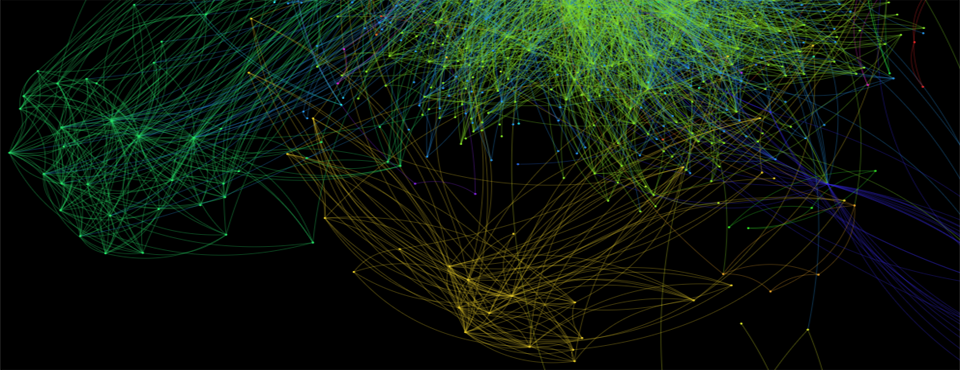
The network above explores the Nigerian Oil and Gas industry using “NIGERIA” and “ENV_OIL” and the Global Knowledge Graph themes “ENV_NATURALGAS” as its inputs, demonstrating the ability to rapidly drill into the structure of a particular industry anywhere in the world.
Behind the scenes a number of powerful tools are brought to bear to create your results. Using a script from Josh Melville of the Oxford Internet Institute, the Gephi Toolkit is used to perform Force Atlas 2 layout and modularity finding on the graph to deliver a fully colorized visual that has undergone sophisticated layout designed specifically for the kinds of high-density complex graphs that come from real-world data. A sigma.js visualization, also provided by Josh and OII, allows you to interactively explore your network visualization directly in your browser, with no external software required. The R “igraph” package is used to compute a wide array of centrality measures for each of the nodes in the network, allowing you to rapidly obtain quantitative rankings of the “importance” and “influence” of each node in the network.
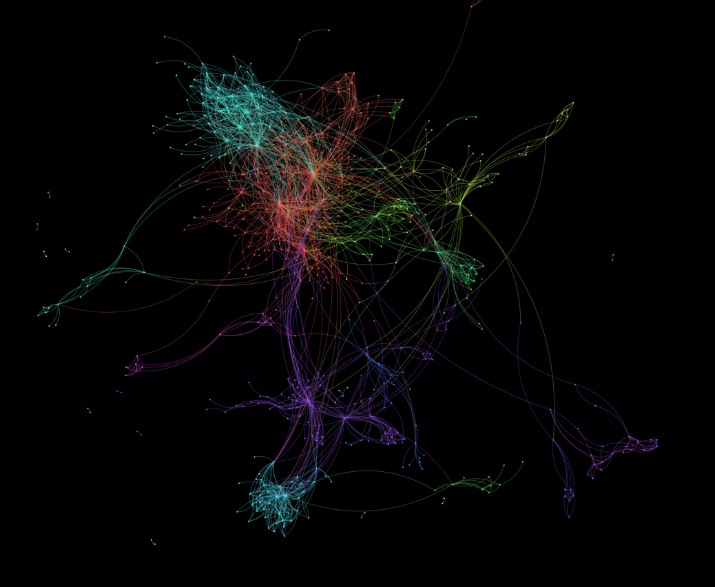
Two Foreign Policy columns have used early versions of this network visualization system to explore King Snowden and the Fall of Wikileaks and The Tehran Connection. You can also see a global network created by an expanded version of this tool for the December 2013 print edition of Foreign Policy Magazine, which visualizes the top 25,000 newsmakers and the 100,000 connections among them during the first half of 2013.
Try the Global Knowledge Graph Network Visualizer for yourself on the new GDELT Analysis Service!
Happy Networking!