This tutorial describes how to create your first maps in CartoDB using the GDELT GKG GeoJSON feeds.
NOTE – this tutorial is only for highly advanced users with very large CartoDB accounts. The vast majority of users will want to check out our new "Instant News Maps Using CartoDB + GKG API" tutorial instead!
NOTE that at this time the tutorials below require at minimum a "John Snow" CartoDB account to have access to the "syncronized tables" feature and likely require a "Coronelli" or a "Mercator" account to incorporate the animated map layer due to its enormous size (combined they can use 500MB of disk and at times may require up to 600MB of disk). However, we hope to have a version of this tutorial available soon that can work with any CartoDB account. For John Snow account CartoDB users, skip the animated map examples below, as those will be too large for your account, as they frequently require up to 400MB of disk. Free and Magellan accounts can use the "Minimized Non-US Hourly URL GeoJSON" file, which is designed to fit within 50MB of disk, but since those accounts do not support "syncronized tables", the resulting maps will not automatically update – they will be static snapshots.
Creating a Basic Map
Make sure you are in the "Your daasets" view of your dashboard and click on the big green "New Dataset" button at top right. If you have a smaller CartoDB account (Free or Magellan), add the "Minimized Non-US Hourly URL GeoJSON" file. Since your account does not support "syncronized tables", this table will not update automatically, but allows you to create a one-time map snapshot of GDELT. If you have a John Snow or above account, add the "Hourly URL GeoJSON" file. When CartoDB adds the table it will ask you if you want to automatically syncronize the table- tell it to syncronize hourly. If you have a Coronelli or above account, you may also add the "24 Hour Animation GeoJSON" file. Note that this may require a Mercator account depending on what other datasets you have in your account, since it can consume up to 600MB at peak. Make sure to select hourly syncronization.
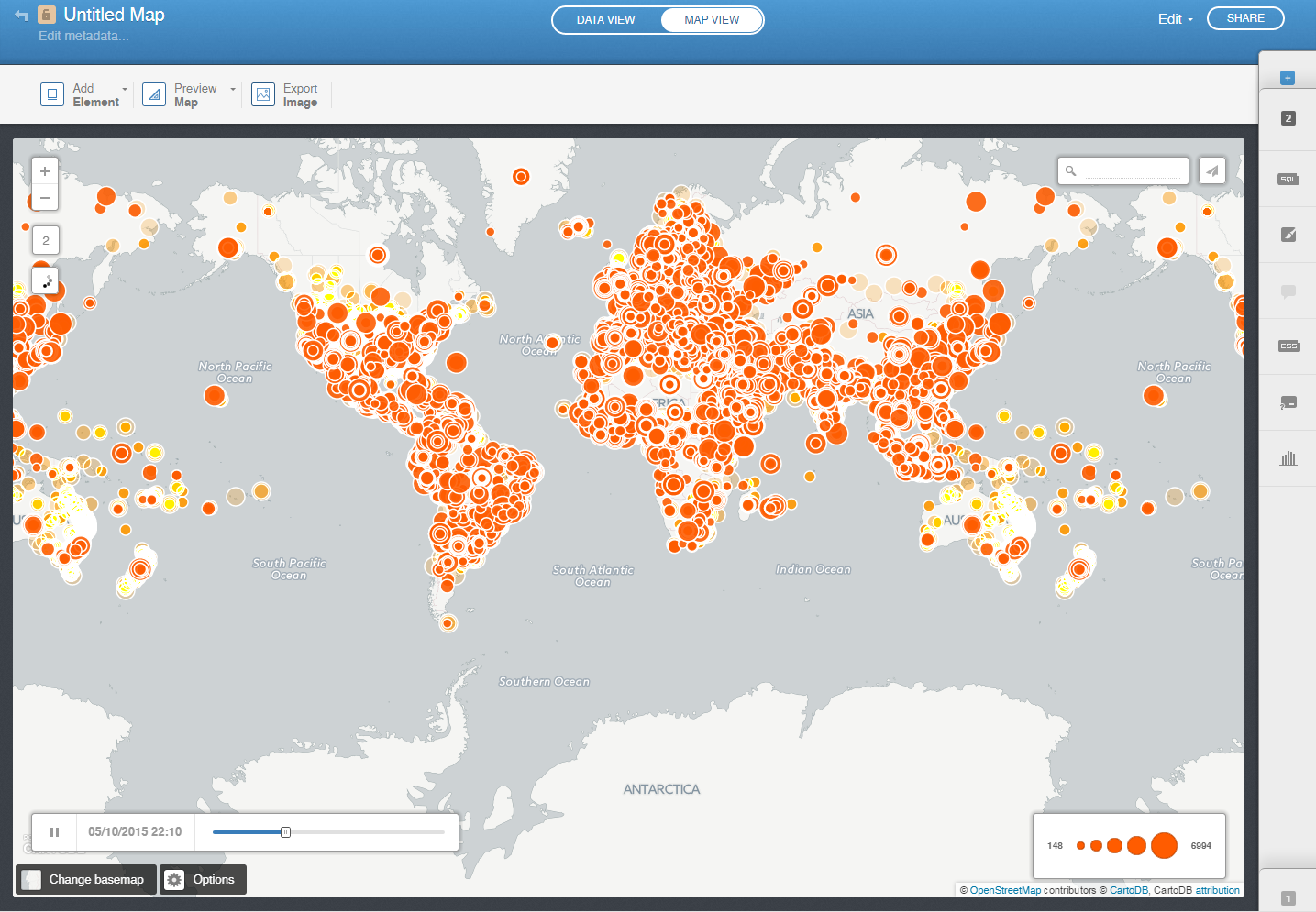
Now switch to the “Your maps” view of your dashboard and click on the big green “New Map” button at top right, then click on the green “Create New Map” button. Now, click on the “Data library” tab and you should see a huge list of all of the common datasets available in CartoDB. Click on the “GDELT Hourly” and “GDELT 24 Hour Animation” datasets (you might have to scroll for them) and click on the green “Create Map” button at the bottom of the page. You should now see a map that looks something like the following:
Along the right side of the screen you’ll notice the layer toolbar. Click on the “1” button at the bottom right of the screen to expand the toolbar to be able to configure that layer. When you click on it, the toolbar will slide out from the right side of the screen to display all of the layer configuration options.
Your screen should now look something like this:
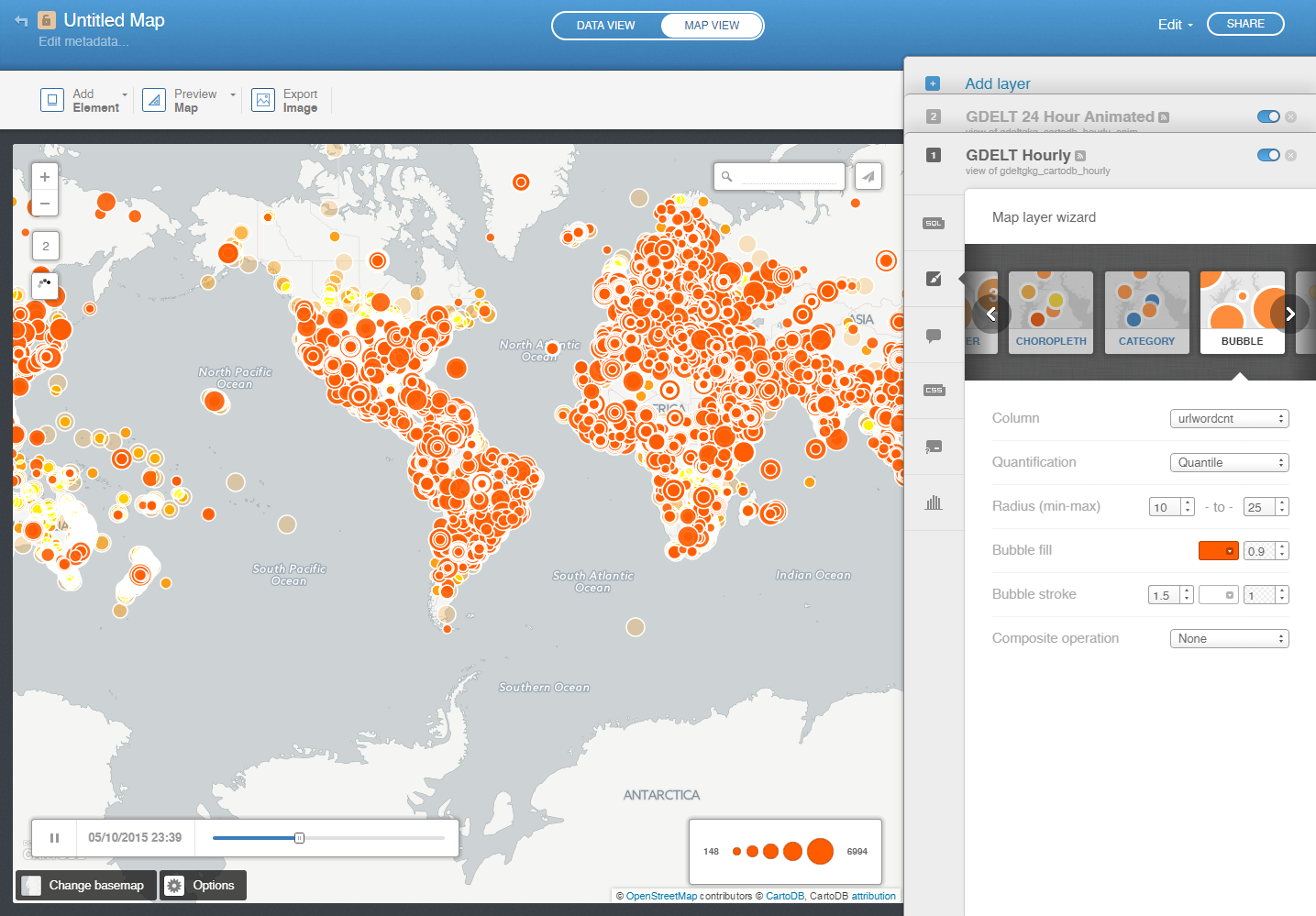
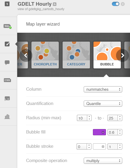
It will default to the “Map layer wizard” view that allows you to change the visual look and feel for your layers. We’ll come back to this in a moment. First, click on the “SQL” button running along the left side of the tab. The layer toolbar should now look like (the table name may be different in your view):

This is where you specify the SQL that filters the GDELT database to display only what you want to show on your map. Paste the following SQL code into the box and then click on the “Apply query” button at the bottom of the screen. The SQL below may look a bit complex, but don’t worry, you’ll only have to edit a tiny piece of it to filter your maps.
SELECT min(cartodb_id) as cartodb_id, the_geom_webmercator, name, concat('<a href="', string_agg(url, '" target="blank">Article Link</a><br><a href="'),'" target="blank">Article Link</a>') as urllist,min(urlpubtimedate) as urlpubtimedate, max(urlsocialimage) as urlsocialimage, count(1) as nummatches FROM gdeltgkg_cartodb_hourly group by the_geom_webmercator, name
Now, click on the paintbrush-in-a-box icon just below the SQL icon to go back to the Map Layer Wizard. Double click on the “GDELT Hourly” title at the top of the tab and change to a title you like, such as “GDELT Visual News Map”, make sure that “Bubble” is selected as the map type, change “Column” to “nummatches”, change “Bubble fill” to whatever color you like, and change the alpha layer selector to its right to “0.6”, change “Bubble stroke” to “0” and change “Composite operation” to “Multiply”. The wizard should now something like:
Now click on the icon on the left side of the layer toolbox under the paintbrush icon that looks like a popup quote. Click on the “Hover” tab at the top of the screen. Turn on the “Name” field so it looks like this:
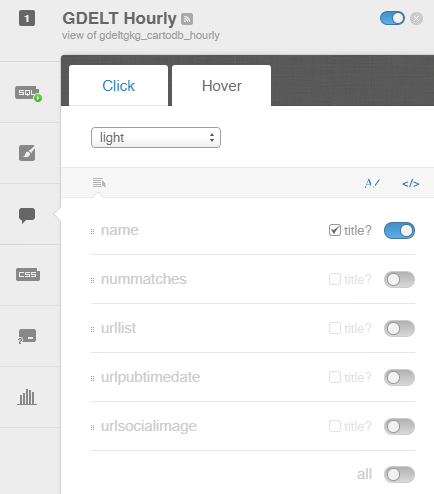
This will configure your map so that when users mouse over a location a brief popup will tell them the name of the city under their mouse, to make it easier to navigate dense maps or to identify particular cities of interest.
Now, click on the “Click” tab at the top. Change the dropdown at top to “Image Header” (it’s the last option in the dropdown and you may have to scroll down to it).Turn on the “urlsocialimage” field and make sure that “title” is unchecked beside it. Click and drag it to the top of the list of fields. Turn on the “name” field, make sure that “title” is unchecked beside it, and drag it to be second on the list. Finally, turn on “urllist”, make sure that “title” is CHECKED, and drag it to be third on the list. The screen should now look like:
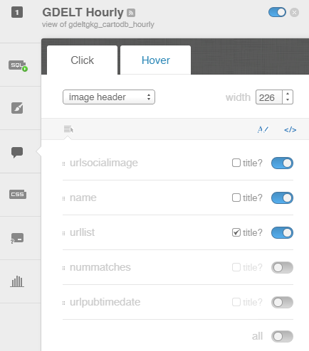
This configures your map so that when a user clicks on a location a popup will appear that displays the list of coverage found in the last hour mentioning that location and will display the “social sharing image” from the first article at the top of the popup if one is available. Locations for which no article had a social sharing image will result in a blank grey popup header, while those with images will display the image, adding additional context.
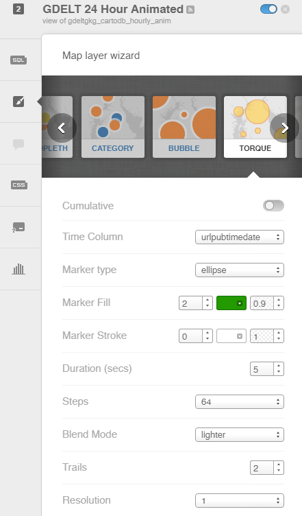
Now, let’s configure the animated map layer. Click on the “2” tab (it should say something like “GDELT 24 Hour Animated” or equivalent). Make sure the map type is set to “Torque” and that “Time Column” is set to “urlpubtimedate”, then set “Marker Fill” to 4 and change the color to something of your choosing. Set “Marker Stroke” to 0, “Duration” to “5”, “Steps” to “64”, “Blend Mode” to “lighter”, “Trails” to 2, and “Resolution” to “1”. It should now look something like:
In this case we do not need to modify the SQL and animated layers do not have popups, so the “infowindow” pane is disabled for this layer, so there is nothing further for us to do.
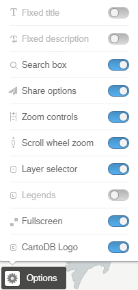
Now click on the “Options” button at the bottom left of the browser window. From the popup that appears, disable “Legends” and enable “Scroll wheel zoom” and “Layer selector” and “Fullscreen”. It should look like:
Your map should now look something like this:
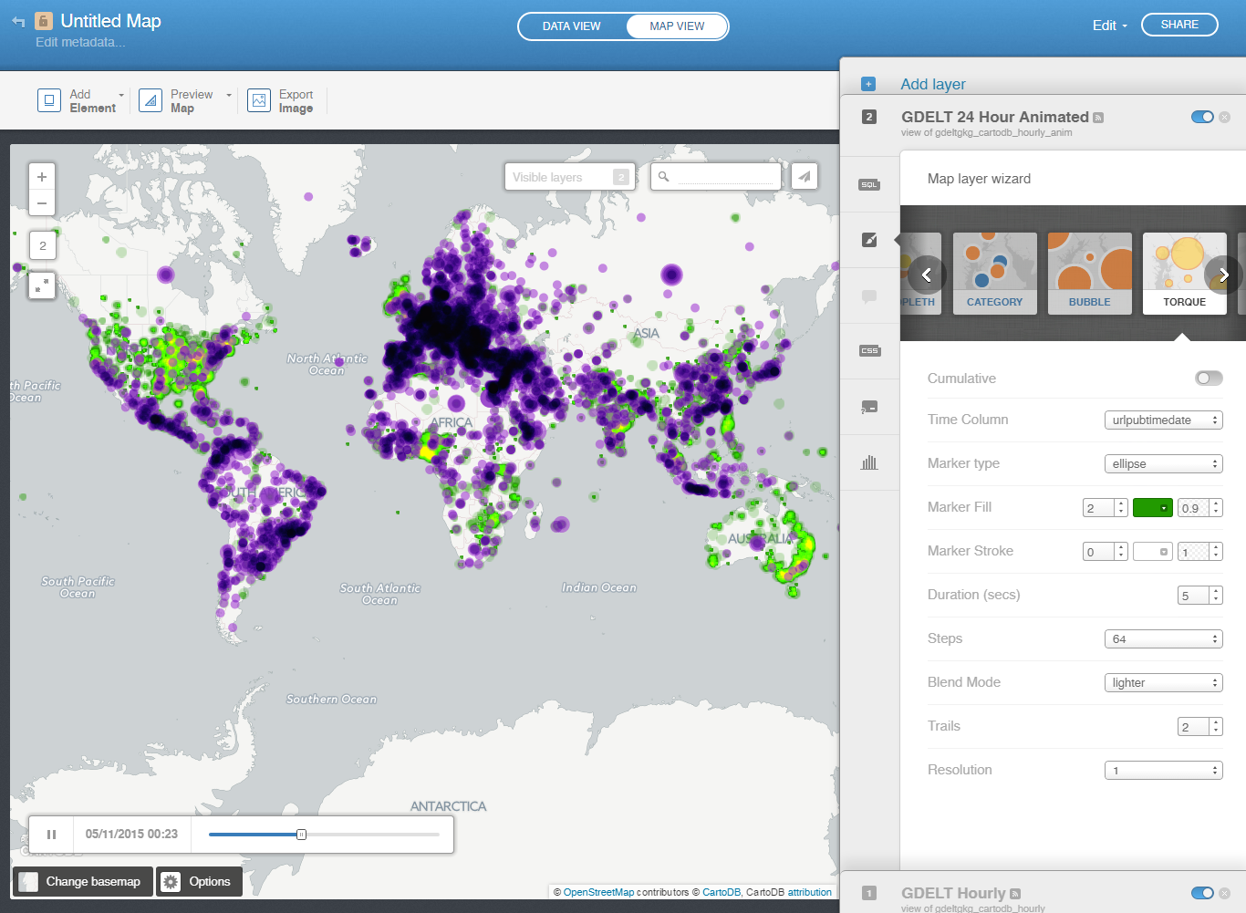
In this case we made the hourly clickable layer purple and the animated layer green for maximal clarity for this tutorial (for a real map you would probably want to pick a more aesthetically pleasing combination of colors).
Congratulations. You’ve just made a live map of all global news coverage monitored by GDELT across 65 languages that automatically updates every hour. Click on the blue “Share” button in the top-right of the browser window and a popup will appear with various sharing options. Click on the “Get a simple URL” link under the “Embed it” option and a new browser tab should open for you showing your map. You can copy-paste that URL and send it to all of your friends and share widely on social media! You can see the tutorial map here to compare yours with:
Try moving your mouse around the map and hovering over various locations. A brief popup should appear showing you the name of that location. (Note that this only works for the clickable map layer, not the animated layer). Try clicking on a location from the clickable layer (the purple points in our tutorial example) that look interesting. A popup should appear listing all of the coverage monitored by GDELT that mentioned that location in the last hour. If one of the articles had a social sharing image affiliated with it, then you should also see its image appear as part of the popup’s header, providing visual context for the location.
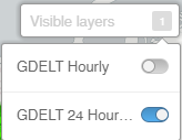
You can toggle the two layers on/off using the “Visible Layers” dropdown that appears at the top right of the map:
At this point, you’re probably noticing that there is so much information on this map that it is really difficult to make sense of any geographic patterns. After all, you are looking at a map of literally all global news coverage that GDELT could monitor over the last hour (for the clickable layer) and 24 hours (for the animated layer). Remember that this map is fully zoomable, so you can zoom into an area of interest to drill in on a much smaller geographic area.
Adding Filters to the Map
Of course, in real life, you’re more likely to create a map focused on a particular topic of interest to make it more relevant, which will vastly reduce the total number of points shown on the map. Let’s see what it takes to add a filter to this map that only displays coverage relating to Food Security.
There are several GDELT Themes relating to Food Security, including “WB_435_AGRICULTURE_AND_FOOD_SECURITY”, “WB_199_FOOD_SECURITY”, and “FOOD_SECURITY”. In this case, the first theme (“WB_435_AGRICULTURE_AND_FOOD_SECURITY”) is extremely broad and will likely return many articles that an average person might not associate with Food Security. So, we’ll focus our map on the second two.
Go back to the “SQL” tab of the “GDELT Hourly” layer and change the SQL to be the following and then click the “Apply query” button at the bottom of the tab:
SELECT min(cartodb_id) as cartodb_id, the_geom_webmercator, name, concat('<a href="', string_agg(url, '" target="blank">Article Link</a><br><a href="'),'" target="blank">Article Link</a>') as urllist,min(urlpubtimedate) as urlpubtimedate, max(urlsocialimage) as urlsocialimage, count(1) as nummatches FROM gdeltgkg_cartodb_hourly where mentionedthemes like '%;FOOD_SECURITY%' or mentionedthemes like '%WB_199_FOOD_SECURITY%' group by the_geom_webmercator, name
This is identical to the original SQL, but we’ve added the “where mentionedthemes like '%;FOOD_SECURITY%' or mentionedthemes like '%WB_199_FOOD_SECURITY%'” towards the end. This tells the database to filter GDELT to display only those locations mentioned with respect to Food Security. The “%” characters act as wildcards telling the database to return all rows where “FOOD_SECURITY” or “WB_199_FOOD_SECURITY” appears anywhere in the “mentionedthemes” column. Note that we put a semicolon in front of the first theme so that it will only match “FOOD_SECURITY”, not themes that contain “FOOD_SECURITY” as part of their name like “WB_435_AGRICULTURE_AND_FOOD_SECURITY”.
Next, let’s modify the SQL for the animation layer. Recall that we did not modify its SQL at all last time. Browse to its SQL tab and change it to the following and then click on the “Apply query” button at the bottom of the tab:
SELECT * FROM gdeltgkg_cartodb_hourly_anim where allmentionedthemes like '%;FOOD_SECURITY%' or allmentionedthemes like '%WB_199_FOOD_SECURITY%'
Notice that for the animated layer the SQL is simpler and notice that we have to use “allmentionedthemes” instead of “mentionedthemes”, since the animated layer has a different set of columns. If the timeline slider displays sequential numbers instead of timestamps after applying this SQL, then go back to the Map Layer Wizard for the animation layer and make sure that the “Time Column” is set to “urlpubtimedate”.
Congratulations, now you’ve created a map of global Food Security coverage! It should look like this map:
Change the query from “FOOD_SECURITY” to “TAX_DISEASE” and you’ll get the following map:
Different Layer Visuals
You can also try different layer visuals. For the animated map, instead of animated points, you can have an animated heatmap. Go to the animated map layer and instead of “Torque”, choose “Heatmap”, set “Animated” to on, and configure it as follows:
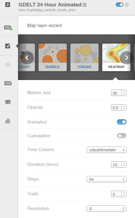
This will yield a map that looks like (this is for "TRANSPORT"):
Advanced Example
Now, finally, let’s try a more complicated example. This time we’re going to display two queries on the same map, including an animation layer that includes two different queries in it. We’re also going to make use the emotional variable to classify each article as either “happy” or “sad”.
First, let’s add an additional third layer to our map. Click on the “Add Layer” button at the top of the layers toolbox. Then click on the “Data File” option on the popup that appears and click on “Looking for example datasets” in the lower-right, then click on “GDELT Hourly” and click on “Connect Dataset” in the top right of the window. Now set the options for this layer the same as you did for the Very Sad layer, but change its color to green and set the following as its SQL query:
SELECT min(cartodb_id) as cartodb_id, the_geom_webmercator, name, concat('<a href="', string_agg(url, '" target="blank">Article Link</a><br><a href="'),'" target="blank">Article Link</a>') as urllist,min(urlpubtimedate) as urlpubtimedate, max(urlsocialimage) as urlsocialimage, count(1) as nummatches FROM gdeltgkg_cartodb_hourly where urltone > 5 group by the_geom_webmercator, name
Next, go back to our original clickable hour layer (layer 1) and we’re going to convert it into a layer of just “Very Sad” news. Rename it to “Very Sad News” and change its SQL to the following (we’re going to have it display only very negative news):
SELECT min(cartodb_id) as cartodb_id, the_geom_webmercator, name, concat('<a href="', string_agg(url, '" target="blank">Article Link</a><br><a href="'),'" target="blank">Article Link</a>') as urllist,min(urlpubtimedate) as urlpubtimedate, max(urlsocialimage) as urlsocialimage, count(1) as nummatches FROM gdeltgkg_cartodb_hourly where urltone < -5 group by the_geom_webmercator, name
Under its Map Layer Wizard pane, change its color to dark red.
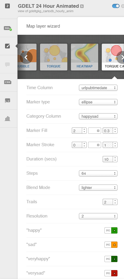
Finally, let’s modify the animation layer. Change the SQL for the animation layer to the following and click the “Apply query” button:
SELECT cartodb_id, the_geom_webmercator,urlpubtimedate, avgurltone, CASE
WHEN avgurltone <= 0 and avgurltone >= -5 THEN 'sad'
WHEN avgurltone < -5 THEN 'verysad'
WHEN avgurltone > 0 and avgurltone <= 5 THEN 'happy'
WHEN avgurltone > 5 THEN 'veryhappy'
ELSE 'neutral' END AS happysad
FROM gdeltgkg_cartodb_hourly_anim
Now in the Map Layer Wizard, change the map type to “Torque Cat” (it is two options to the right of Torque) and set its options as follows:
Your map should now look something like the following:
Congratulations! You’ve just created a live interactive map of the emotion of global news coverage across 65 languages and updated every 15 minutes! Now, keep in mind that emotion is extremely difficult to assess accurately, especially across the enormous variety of topics that GDELT monitors and there is conflicting literature on the ability of emotion to accurately survive translation. Most importantly, while GDELT assesses more than 4,500 emotions and themes, the tone variable here is one of GDELT’s most basic indicators. Thus, take the results with a grain of salt in terms of conclusions about the actual emotional state of the world’s news at any moment, but it does offer a rough approximation that is highly usable.