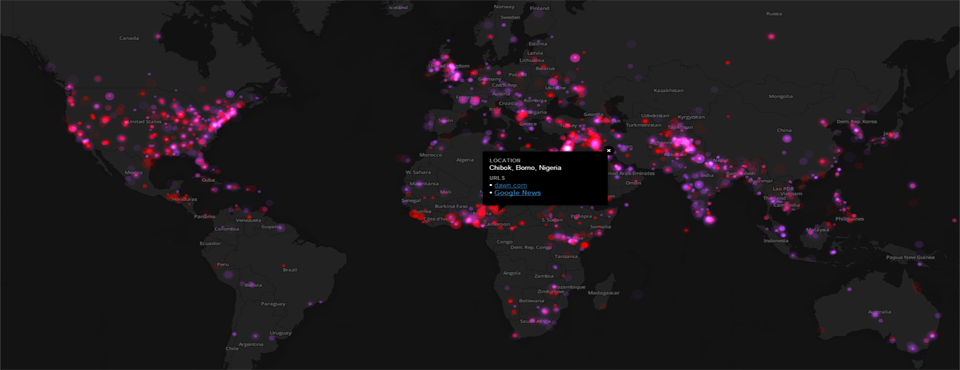

(CLICK TO OPEN MAP)
Since GDELT first debuted just over one year ago, the single most-requested capability has been the creation of precisely such a map – a global dashboard summarizing everything happening around the world each day in a single visualization. It is therefore with enormous excitement that we announce the debut of an incredible new addition to the GDELT family, a prototype live global dashboard that offers an at-a-glance interactive map of global protests and conflict, drawn from GDELT’s quarter-billion-record archive of global human society and updated each morning, visualizing our collective world as captured through the eyes of the world’s news media monitored by GDELT.
Provided through the support of the United States Institute of Peace, this highly experimental prototype dashboard offers an overview of global protests (pink) and conflict (red) across the entire world, as monitored by the GDELT Project from the world’s news media, combining a rolling animated map of the past 180 days (visualizing macro-level spatial patterns) with a clickable map of major events monitored over the past 24 hours, updated each morning by 6AM EST (over the coming weeks it will begin to update every 15 minutes). Here, protests refer to any gathering identified by the news media as a "protest" or "demonstration", while conflict events include military mobilizations, halting/reduction of aid or diplomatic relations, embargoes, boycotts and sanctions, coercion such as curfews, mass detaining and other forms of involuntary restrictions, and physical attacks.
In a single map you are seeing an overview of major global activity each day, as captured by the world's news media and monitored by the GDELT Project. All protest and conflict events are grouped together by city/location. For the animated map layer, if a location has both protest and conflict events, it is colored by whichever there are more of. All dots on the animated map are the same size, regardless of the number of events at that location, due to current limitations of the animation system. For the daily map layers, dots are displayed separately at each location for protests and conflict and are sized based on the total volume of coverage devoted to that type of event at that location. Thus, locations with more "important" events will be displayed using a larger dot to indicate major evolving situations. Since some events may not have recognizable geographic markers or may occur at the country level, such events are displayed at the centroid of the country, except for the United States, where only events recorded at the state or finer resolution are shown.
Click on the "Visible Layers" dropdown at the top-right of the map to turn off the animated layer to see only those events occurring yesterday. You can click on any of these locations to view a popup displaying a few sample articles covering events at that location, as well as a link to Google News to display other coverage of that location. NOTE that the article selection algorithm attempts to pick the three "best" articles to capture the "overall" situation in a location, but is currently under heavy development and still makes many mistakes as it is being further refined, periodically selecting articles unrelated to the major events there. Usually the combination of those selected links and the Google News link will offer a useful overview of the major developments at a given location.
To minimize false positives and surface the most "important" events of the day, this map aggressively filters the GDELT Event Database using the GDELT Global Knowledge Graph, but still likely contains many errors due to the difficulties encountered when attempting to codify the entire world's news media each day. In addition, significant world events frequently yield wildly diverging narratives and interpretations, even days or weeks later, which GDELT necessarily encodes given that it observes news coverage from all countries, rather than just American media. Over time we will be adding more event types and additional filtering options to make more of the GDELT Event Database available through this map interface and allow more sophisticated filtering of it.
If you think about it, this map represents an entirely new way of thinking about, visualizing, understanding, analyzing, and interacting with our world’s news. News is intrinsically rooted in space: events happen or are announced or discussed at particular locations and involve people, organizations and actors situated and moving through their own array of locations. Yet, in an era where one cannot spend more than a few minutes without encountering a map of some kind, the world’s news media is still presented as a pile of words and images completely detached from space. Despite a typical news report averaging one location every 200-300 words, today we still interact with the news through the humble keyword search box or selecting by country. Yet, retrieving 1,000,000 matching articles for Iraq does little to shed light upon the “big picture” of how unrest is moving through the country and region.
From the first map to geocode a quarter-century of the world’s news media at scale, to the first complete map of Wikipedia’s view of world history, to the first focused study of the geography of social media that set off today’s social geocoding arms race, to the first global maps of American diplomatic communication, to the first map of American television news, our work has demonstrated the centrality of location to the “big data” revolution and profoundly reshaped the role of space in how information is understood, consumed, and interacted with. The new GDELT Global Dashboard represents a fundamentally new interface to global events and as we continue to refine and evolve it over the coming year, we are incredibly excited to see how people make use of it.
We'd like to thank the United States Institute of Peace for making this map possible and Google Ideas for their support of the GDELT Project. Please get in touch with any suggestions or recommendations as we continue to improve this exciting new mapping platform and move forward with an array of new tools and visualizations to help translate GDELT’s global database into a platform that transforms how we understand our global world.