In collaboration with IRIN News, on the three-month anniversary of the Nepal Earthquake, we wanted to explore what it looks like when the world's media suddenly pivot to cover a major disaster and how quickly that coverage fades away. In particular, how long does the attention last and how uniform is the resulting "media fatigue" falloff across the world's presses? See IRIN's article about this analysis.
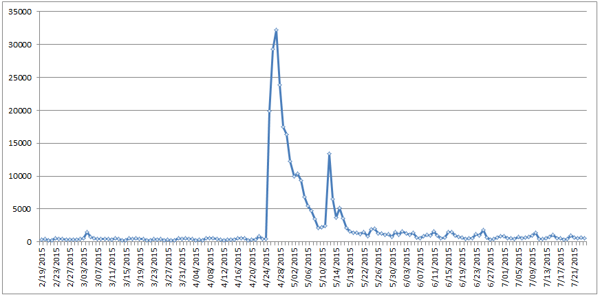
The timeline below displays the total number of worldwide news media articles about Nepal, by day, monitored by GDELT across all 65 languages it live-translates. Only articles that mentioned Nepal at least twice are counted (this is used as a simple filter to eliminate casual mentions). Overall, the world’s media has very little to say about Nepal until the April 24th earthquake, with a vertical surge of coverage on the 24th, followed by even more coverage on the 25th and 26th. After this initial 72 hour focal period, coverage immediately begins to ramp down exponentially through May 9th. Overall, this initial period of focus on Nepal lasted approximately two weeks. On May 12th a magnitude 7.3 aftershock, coupled with the first potential major loss of life of first responders (a military helicopter which vanished and was presumed downed) caused another significant surge in coverage. Coverage quickly faded over the subsequent 72 hours, with a small uptick on May 15th representing the discovery of the wreckage of the missing helicopter and confirmation that all aboard had perished. While still elevated from pre-earthquake coverage volume, the world’s news media appears to have largely moved on from Nepal, finding it no longer “newsworthy” enough to devote significant attention to. Even the subsequent crash of a Doctors Without Borders helicopter on June 2nd does not register as even a small blip on the timeline.
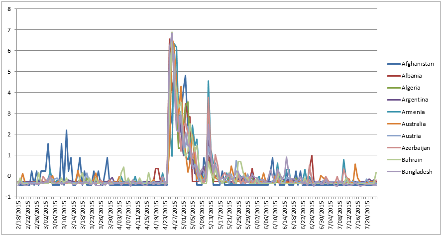
Remarkably, this timeline appears to be consistent across nearly every country of the world, as can be seen in the graph below, which breaks it down by country for a selection of countries. The timeline below converts the raw per-day article counts to “Z-Scores” which report how many standard deviations away from the mean each day’s article count is. Put more simply, a Z-Score normalizes the different country timelines, which have very different scales, given that the total daily media output of Russia is obviously considerably larger than that of, say, Myanmar.
To make the alignment clearer, the graph below shows just Australia, China, Russia, and the United States. The timelines for all four countries are nearly identical.
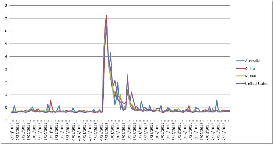
There is a long history in media and journalism studies of recognizing the inherent “media fatigue” that accompanies long-running stories, whereby the initial sudden-onset surge of coverage is replaced by a rapid fall-off as the limited journalistic capacity of news outlets turns to other stories. What is most striking about the graphs above is that the impact of media fatigue appears to be so perfectly consistent across the world’s media systems, with a nearly lockstep 72 hour surge, followed by an exponential falloff that yields an approximately two-week window of coverage even for a natural disaster the scale of what hit Nepal. You can experiment yourself by downloading the underlying spreadsheets, either the Raw Article Counts or Normalized Z-Score values.
How Many Nepalis Equal One Everest Climber?
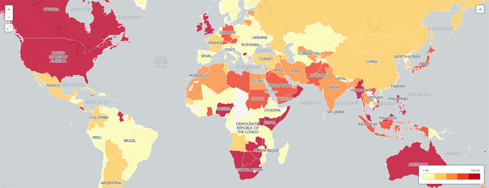
IRIN previously used GDELT to show that 23% of coverage about Nepal from April 25 to April 26 focused on Mt. Everest, reflecting an emphasis on the impact of the earthquake on foreign tourists, rather than the domestic population. Expanding this to the following month (April 24th through May 24th), a total of 42,511 out of 250,973 monitored articles (17%) focused on Everest, reflecting the gradual shift towards coverage of the domestic population as the majority of foreigners had been successfully evacuated from the country. It is still remarkable to note that 17% of all worldwide news coverage about Nepal, as monitored by GDELT, across 65 languages, over the entire month following the earthquake emphasized the plight of foreign tourists on Mt. Everest.
The map below breaks this down further by country. Mouse over each country to see what percentage of its coverage of Nepal from April 24 to May 24, 2015 also mentioned Mt. Everest. Note that GDELT cannot possibly monitor all news coverage within each country and so missing articles, translation error, and other artifacts mean this is not a perfect representation of the media in each country, but offers a rough estimate of the variation across the world. Most striking is the difference between Western countries like the United States, the UK, and Australia in their extremely high focus on the Mt. Everest aspect of the disaster, compared with other nations.
Read IRIN's article about this analysis for more context into the implications of these findings in the humanitarian space:
Technical Details
To start off with, we use the copy of GDELT GKG 2.0 housed in Google BigQuery and use the following query to return all of the articles monitored by GDELT that mentioned Nepal at least twice:
SELECT substr(string(DATE), 0, 8) as daydate, SourceCommonName, count(1) FROM [gdelt-bq:gdeltv2.gkg] WHERE V2Locations like '%Nepal%Nepal%' group by daydate, SourceCommonName order by daydate asc
Save the results as their own CSV file on your computer (call it "NEPAL.CSV") for this example. Now, download the DOMAINSBYCOUNTRY-ALLLANGUAGES.TXT lookup file from our previous Multilingual Source-Country Crossreferencing Dataset post and save it to the same directory. Now, install the PERL module "Statistics::Zscore" (on a Linux system you should be able to type "perl -MCPAN -e shell" and then "install Statistics::Zscore" and follow the instructions). Then download the "parsebqcsvtogeojson_countrytimeline.pl" PERL script to the same directory. Finally, run the PERL script as "./parsebqcsvtogeojson_countrytimeline.pl ./NEPAL.CSV". This script will process the results and generate a timeline in spreadsheet format, with each column being a country and each row being a date. Only countries with at least 50 matching articles are counted to ensure an adequate timeline (you can adjust this in the PERL script). Two timelines are produced – "TIMELINE-RAW.CSV" returns the actual raw number of articles per country per day, while "TIMELINE-ZSCORE.CSV" converts each country timeseries into Z-Scores, making it easier to directly compare countries. Load either of these into Microsoft Excel, R, or a similar graphing application.
To create the Everest map above, we use a modified version of the approach used for the Greece map (here we are just going to create a density map without a clickable list of articles, so we use a PERL script modified for this). First, rerun the BigQuery query from above, but limited to the month immediately following the earthquake:
SELECT SourceCommonName , count(1) FROM [gdelt-bq:gdeltv2.gkg] WHERE DATE>201504245000000 AND DATE<201505245000000 and V2Locations like '%Nepal%Nepal%'
Save the results as "NEPAL1MONTH.CSV". Then run the following query, which filters the above coverage to only that coverage that also mentions Everest:
SELECT SourceCommonName , count(1) FROM [gdelt-bq:gdeltv2.gkg] WHERE DATE>=20150424000000 AND DATE<=20150524000000 and V2Locations like '%Nepal%Nepal%' and V2Locations like '%Everest%' group by SourceCommonName
Save the results as "NEPAL1MONTHEVEREST.CSV". Then download the PERL script "parsebqcsvtogeo_countrydensitymap.pl" and run it as "./parsebqcsvtogeo_countrydensitymap.pl ./NEPAL1MONTH.CSV ./NEPAL1MONTHEVEREST.CSV". A few seconds later you should have a file called "./NEPAL1MONTH.CSV.CARTODB.CSV".
Upload this file to your CartoDB account. CartoDB should automatically georeference the country labels into their respective polygons and create a polygonal layer in the resulting map. Once the map has loaded into CartoDB, use the Wizard and set the map type to "Choropleth" and you should get a map that looks very much like the one above.
Note that you will invariably see errors in the map above, either from incorrect document extraction, translation errors, or errors in the estimation of the geographic location of a news outlet (which is an extraordinarily difficult task to perform at a global scale).
You can also filter for coverage from a particular country directly in your BigQuery query:
SELECT count(1) FROM [gdelt-bq:gdeltv2.gkg] WHERE V2Locations like '%Nepal%Nepal%' and SourceCommonName in (SELECT Domain FROM [gdelt-bq:gdeltv2.domainsbycountry_alllangs_april2015] where CountryHumanName='Brazil')
Congratulations! You now have the tools to begin exploring media fatigue and bias across the global media system!