Four recent explorations showcase how GDELT, the largest open dataset ever created capturing the life of the world's media ecosystem, can be used to understand how the world's media functions and what it tells us of the world around us. They were even mentioned in the March 1st issue of the O'Reilly Data Newsletter!
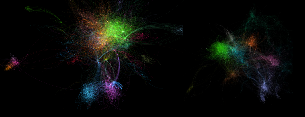
Creating A Massive Network Visualization Of The Global News Landscape: Who Links To Whom?
What 121 million news articles and three quarters of a billion hyperlinks tell us about how the world’s news media is connected and the role of language, geography, culture and economic ties on what we see about the world around us. This study leverages GDELT's visual document extraction to compile three quarters of a billion outlinks from 121 million articles over the last 10 months and uses that link graph to explore how global media outlets link to each other. What makes this particular analysis distinct is both the global scope (crossing all countries and 65 languages) and the use of the article link graph rather than the page link graph as is traditionally done (ie looking at only the links in the article text itself, rather than the myriad links found in the rest of the surrounding page, such as headers/footers/
What Does Artificial Intelligence See In A Quarter Billion Global News Photographs?
What deep learning algorithms can tell us about the visual narratives of the world’s news imagery, from depictions of violence to the importance of people to visual context – a look inside what we see about the world around us. This study performs semantic visual clustering over the world's online news imagery from last year, utilizing deep learning-assigned object and activity labels to cluster visually dissimilar images that depict similar events.
Visual Geocoding A Quarter Billion Global News Photographs Using Google's Deep Learning API
Traditionally we’ve focused on mapping the geography of text, but through deep learning we now have algorithms that can visually geocode images, recognizing where they were taken and placing them on a map – here’s what it looks like to map a quarter billion worldwide news images. This study explores the emerging world of "visual geocoding" and just how far we've come towards integrating the visual dimension to our analyses.
Mapping Global Happiness In 2016 Through A Quarter Billion News Articles
How the power of the cloud makes it possible to sentiment mine, machine translate, geocode and map a quarter billion news articles to map global happiness in 2016 as seen through the eyes of the world’s press. This study explores what it looks like to combine multilingual textual geocoding and sentiment analysis (both covering 65 languages) to process a quarter billion news articles and 2.2 billion location mentions to map "global happiness" as seen through the eyes of the world's online news media.