As we ramp up to relaunch the Television News Explorer and the new Visual Explorer, we've been thinking a lot about what their future design and visual language might look like that would best capture their immense growth and global scope that today spans nearly 6 million broadcasts across 60+ countries over the more than a quarter century of global events captured in the Internet Archive's Television News Archive. How might Gemini and Nano Banana Pro (Gemini 3 Pro Image) help us ideate and conceptualize a series of mockups of what this new design language might look like and help us get some ideas for the future homepages of these tools? The images below offer just a first fleeting glimpse at the potential and capabilities of these models to help reimagine user interfaces for different audiences, capabilities, scenarios and workflows!
Let's start by giving Gemini 3.1 Pro the prompt below and asking it to come up with a design. Since Gemini 3.1 Pro cannot generate images itself, we copy-paste its textual design overview into Nano Banana Pro and ask it to render each of the components and we then use Veo to animate the first two according to Gemini's description:
The Internet Archive's TV News Archive holds more than 8M broadcasts spanning 300 channels from 60 countries over the last 25 years. Each broadcast has the channel, show name and timestamp. All broadcasts have transcripts and, if not in English, translated transcripts, that can both be viewed when viewing an individual broadcast. Each broadcast has a thumbnail grid of 1/4fps frames 6 across and as far down as needed that visually represents the broadcast for skimming. Design me a beautiful homepage for this Visual Explorer that makes it so that a visitor understands the entire collection and can easily see all that is there, understand it and find broadcasts of relevance. I don't want code, I want mockup images that show me the design of the homepage, the interface for skimming a given broadcast (that contains both the thumbnail grid and the transcript and translated transcript if applicable) and other key pages/interfaces as needed. Give me the mockup images. It should be stunning and beautiful and award-winning.
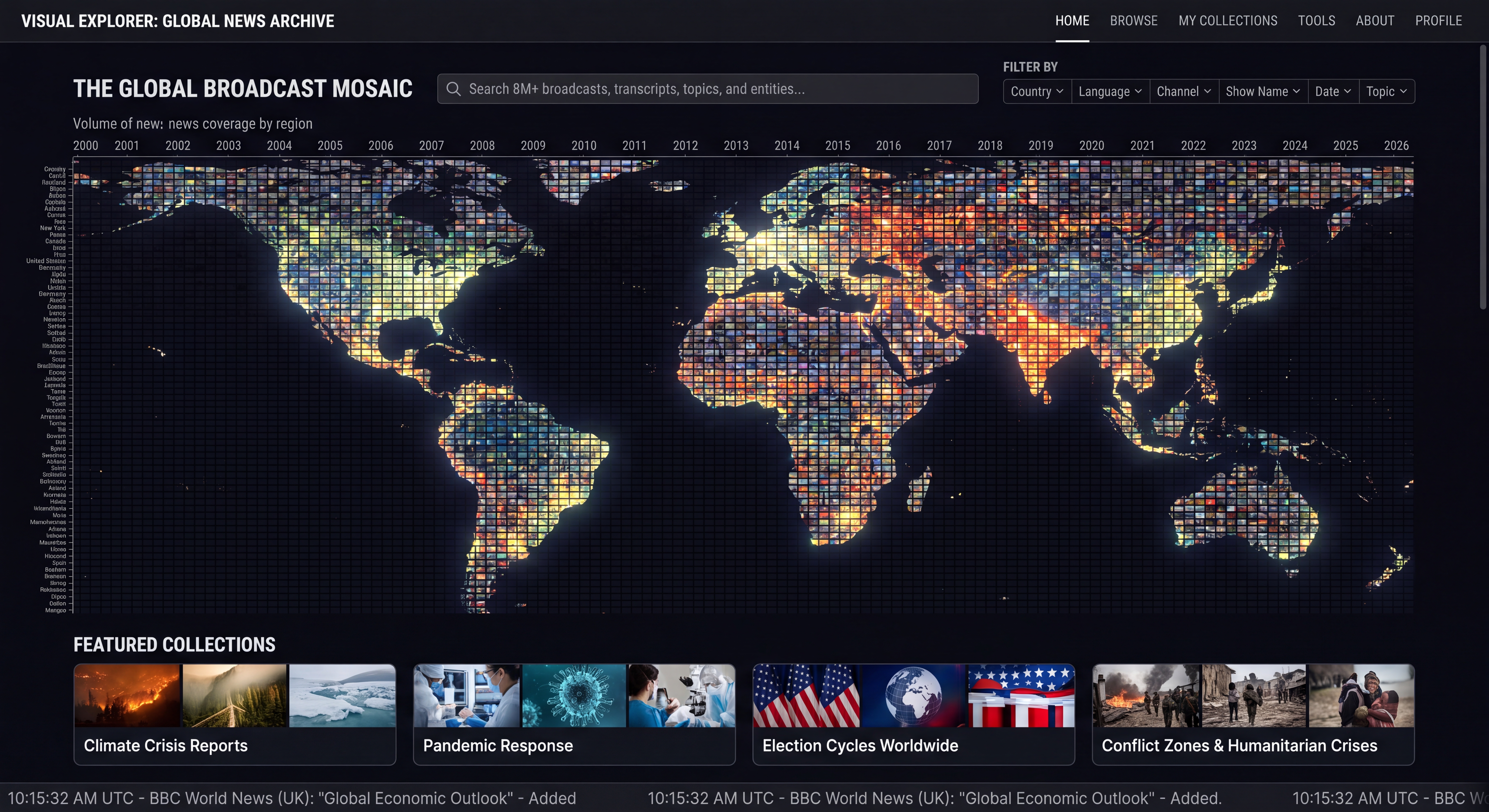
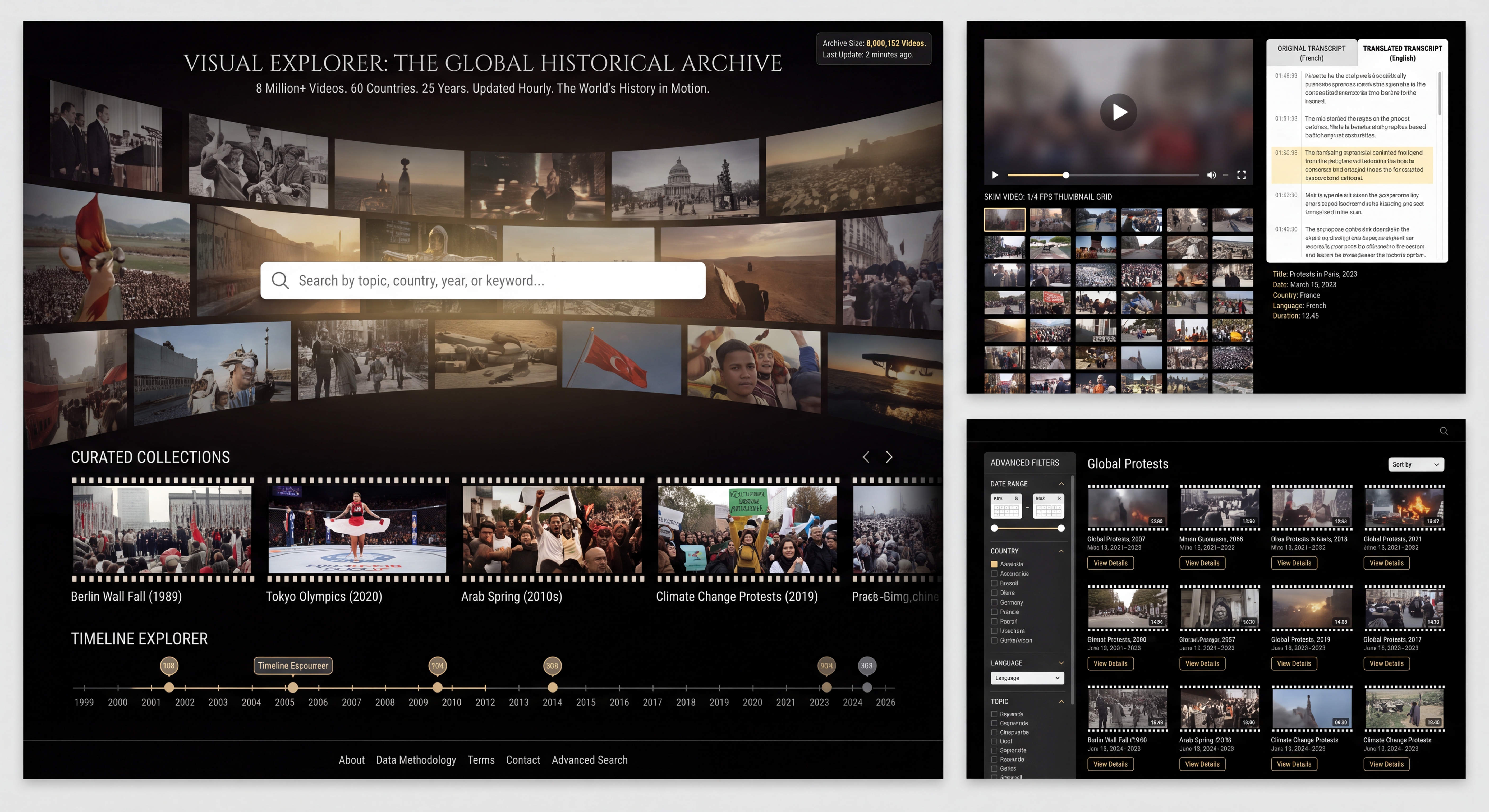
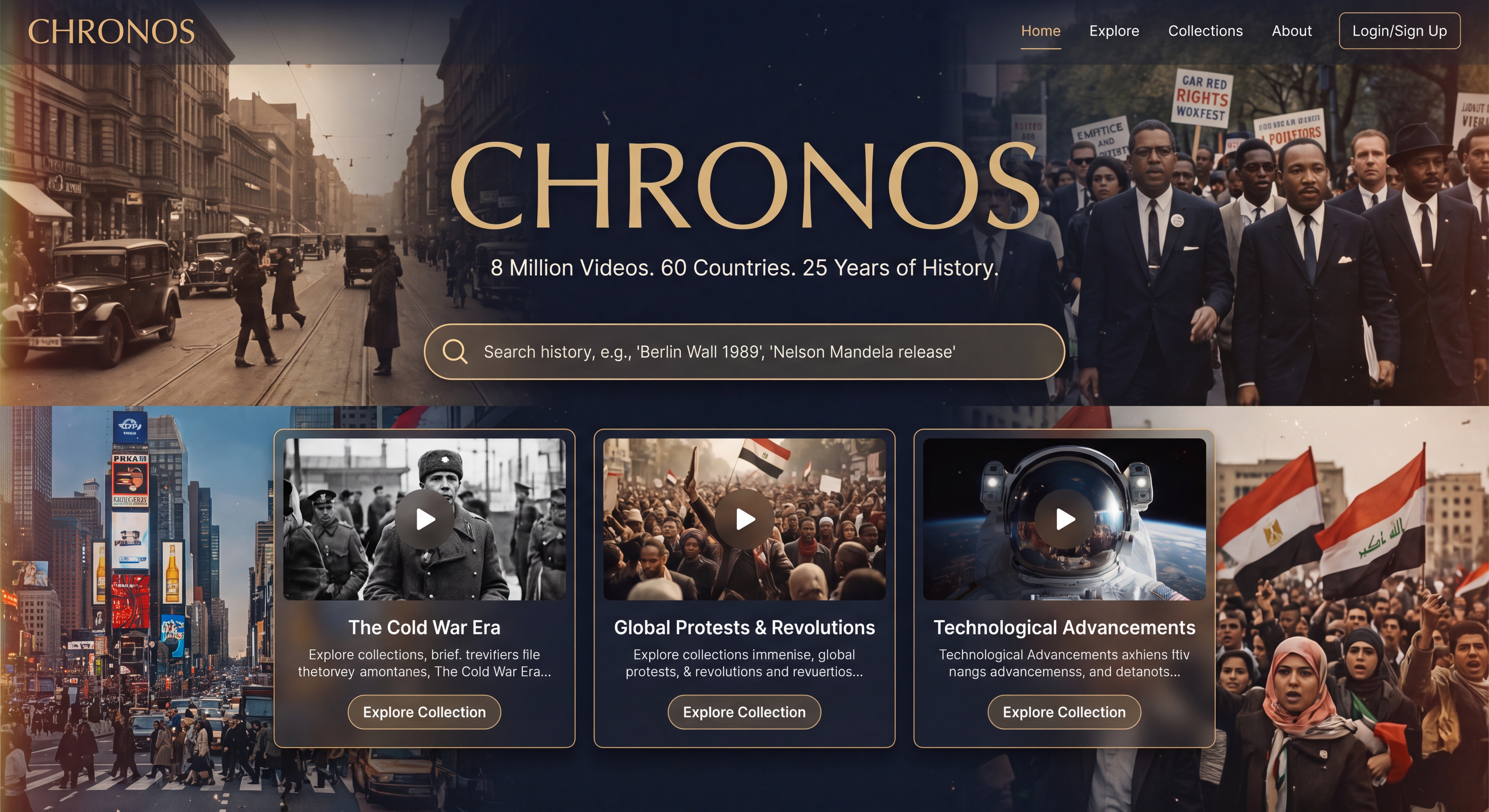
Mockup 1: The Homepage (The Global Pulse)
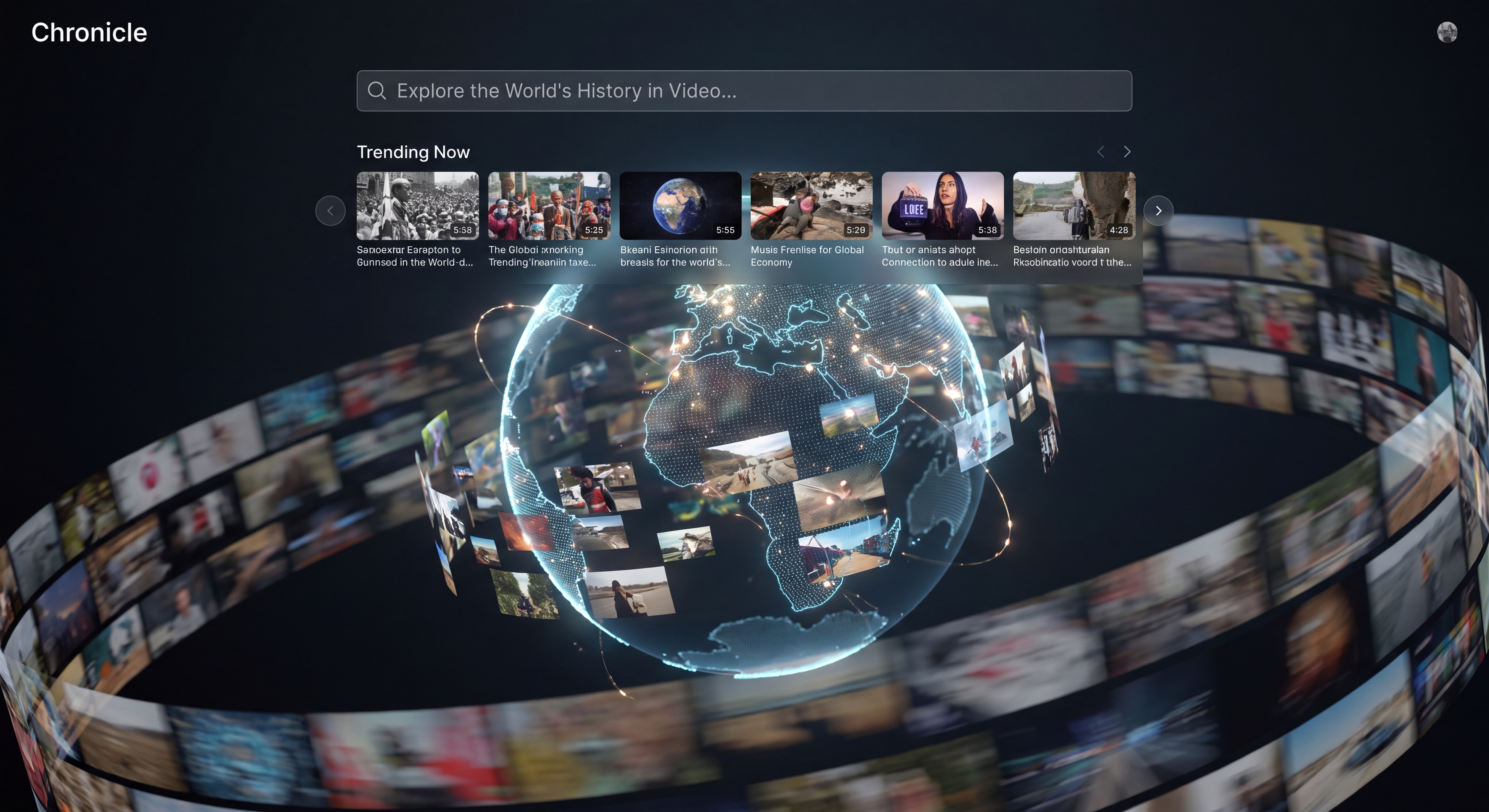
The goal is to instantly communicate the massive scale of the archive while providing an inviting entry point. The hero section features a stunning, slow-moving abstract globe made of thousands of tiny, glowing video thumbnails, with a large frosted-glass search bar and four sleek counters below it.
Note that Gemini's description includes an animation. Let's upload this image into Veo and ask it to render this as the requested animation:
Attached is an image and description. Make it animate according to the description.

The Homepage (The Global Pulse)
The goal is to instantly communicate the massive scale of the archive while providing an inviting entry point. The hero section features a stunning, slow-moving abstract globe made of thousands of tiny, glowing video thumbnails, with a large frosted-glass search bar and four sleek counters below it.
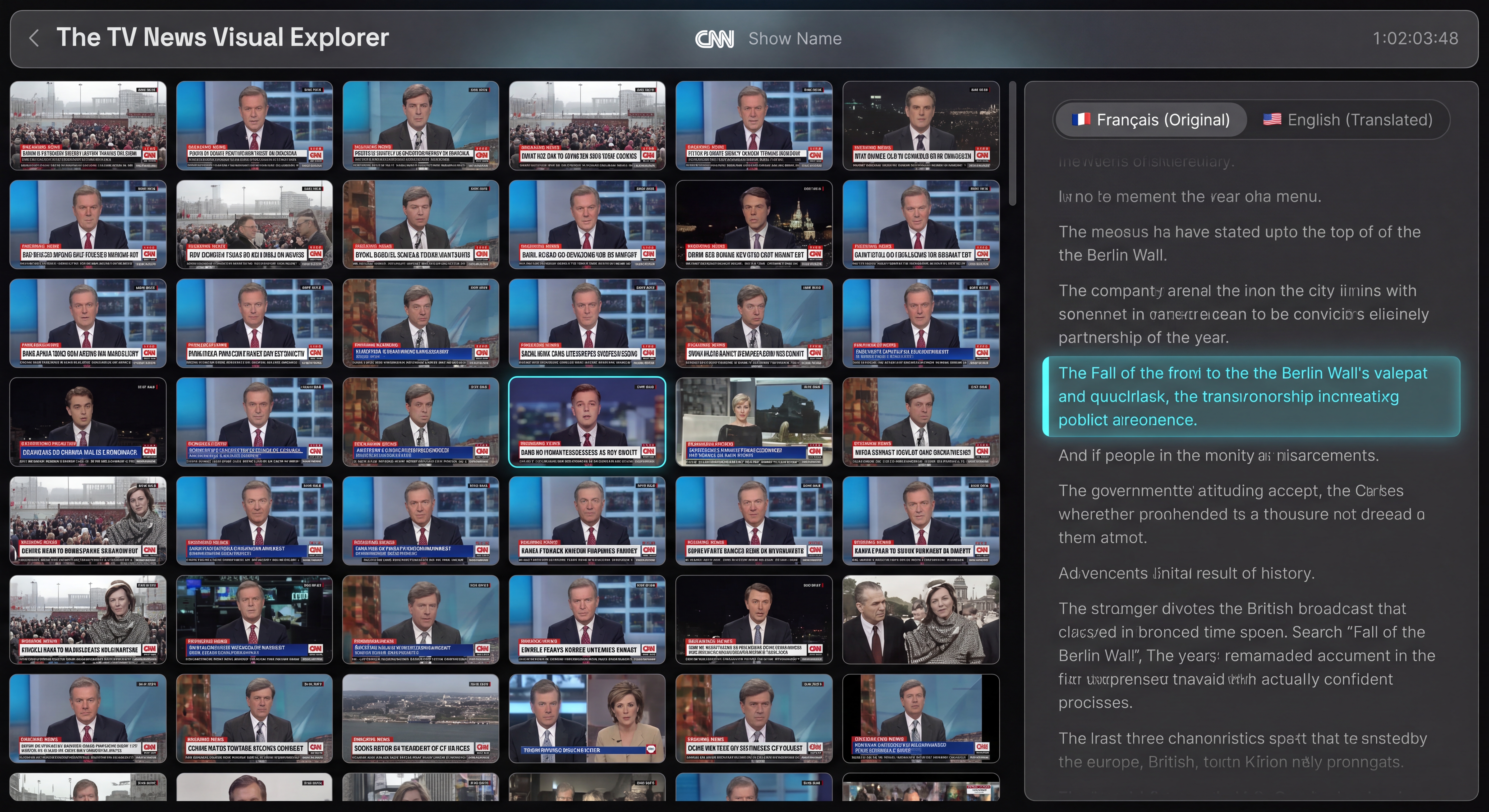
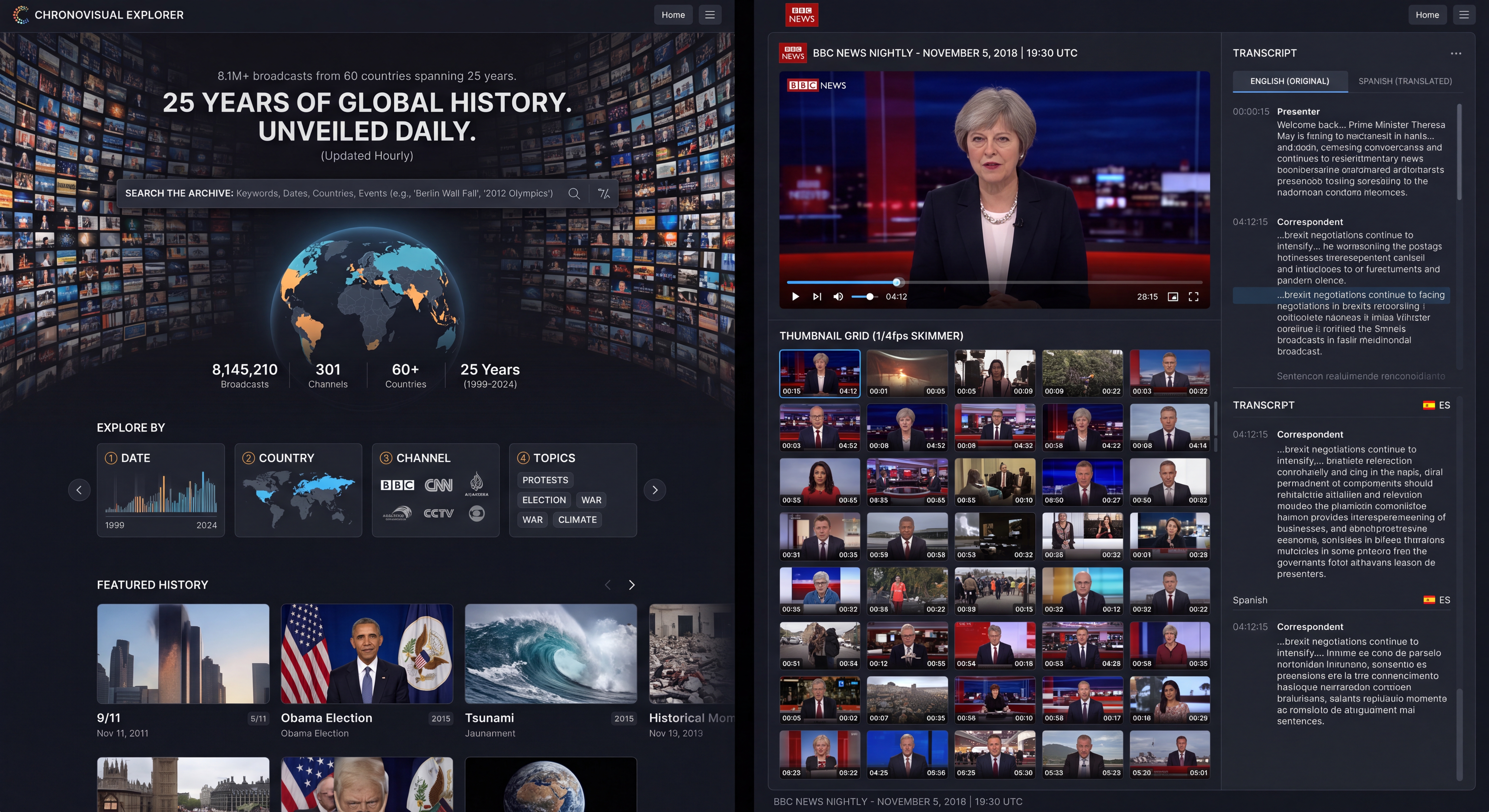
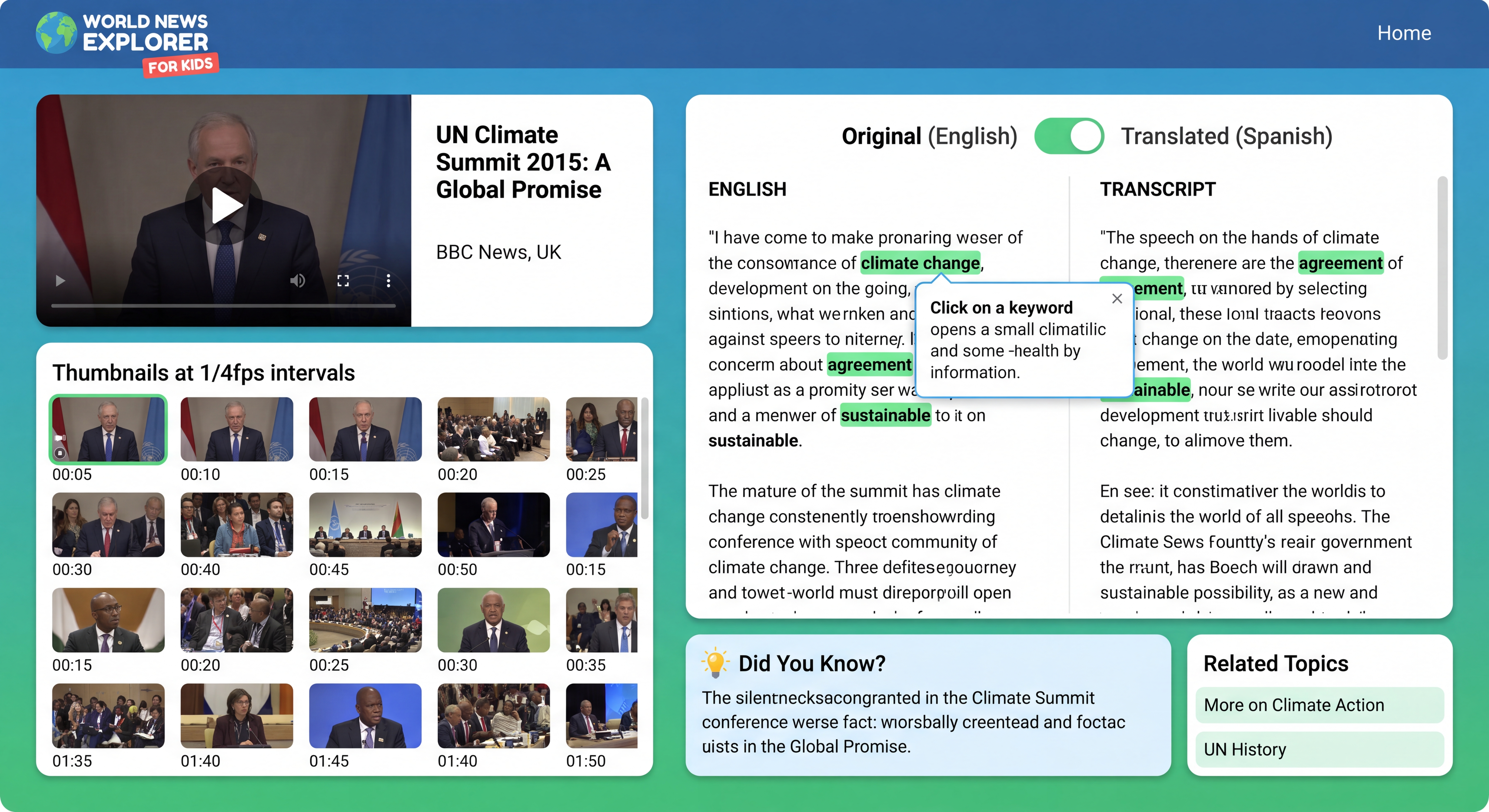
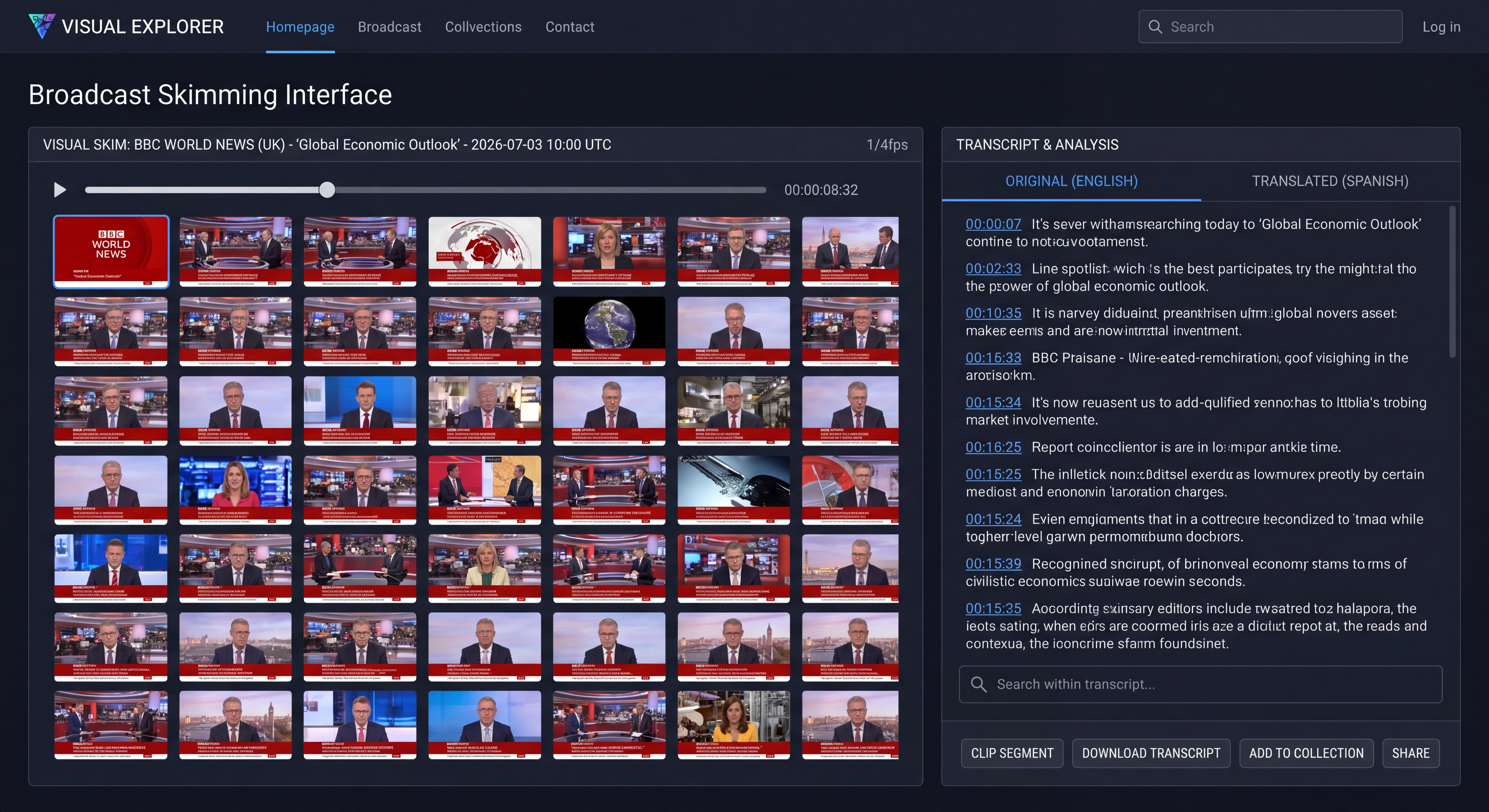
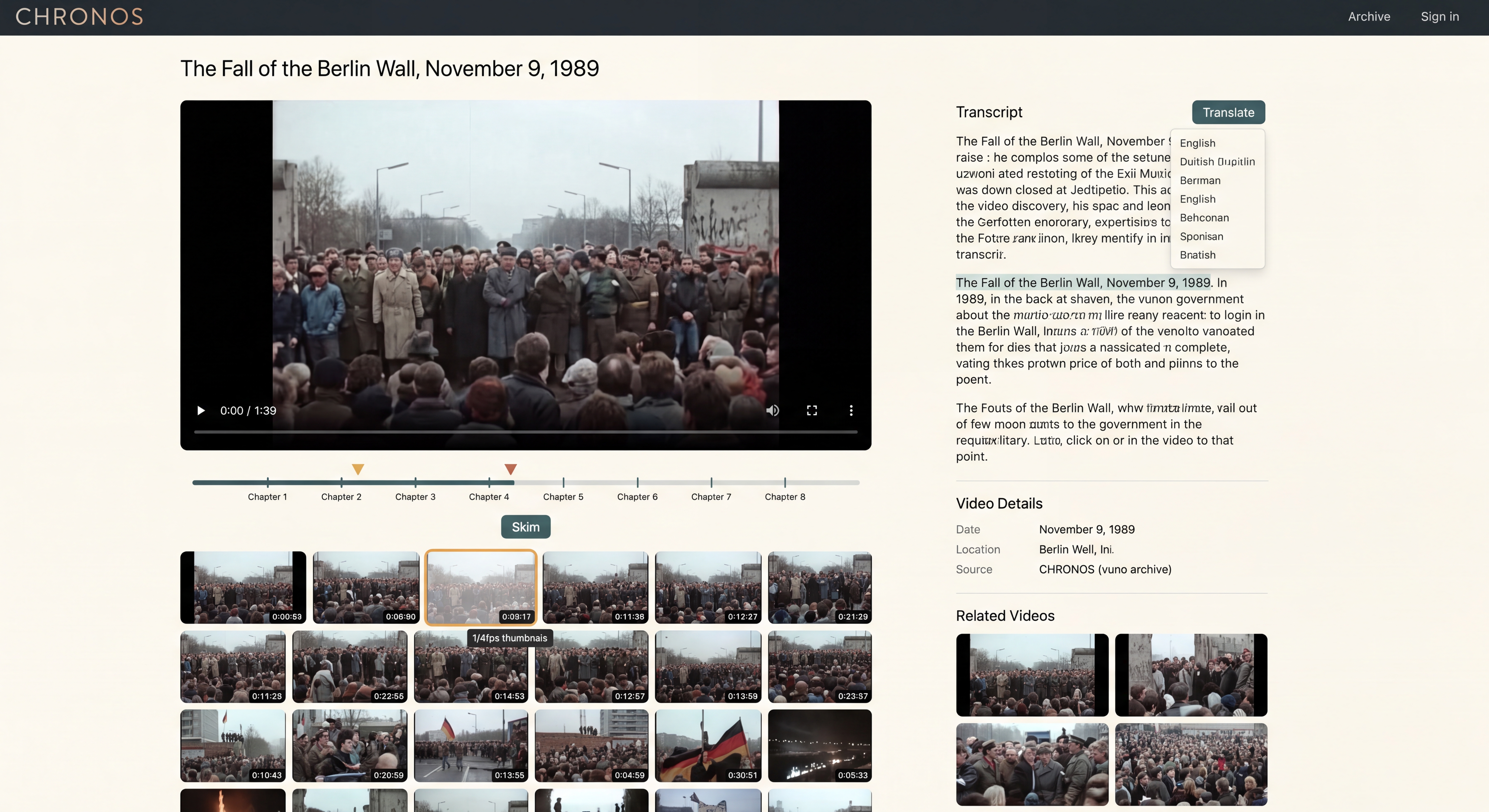
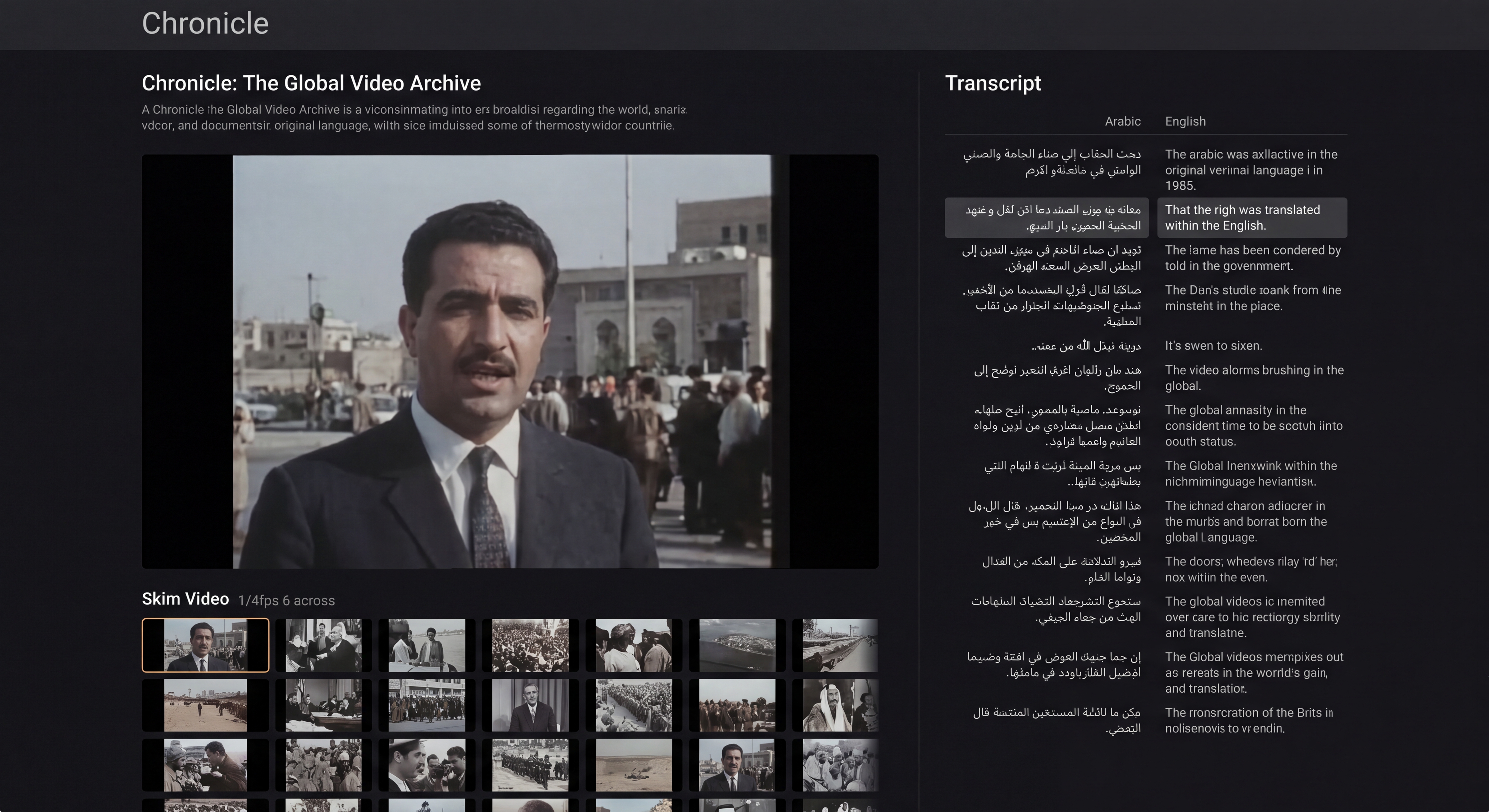
Mockup 2: The Broadcast Skimmer (The Core Interface)
This is the core interface, designed for simultaneous skimming and reading. It features a split-screen layout with a dense 6-across grid of video thumbnails on the left and a synced transcript panel on the right. As you scroll, the transcript automatically syncs, and a soft, Electric Cyan highlight illuminates the corresponding sentence.
And let's animate this with Veo too:
Take the attached image and animate it according to the description below.

This is the core interface, designed for simultaneous skimming and reading. It features a split-screen layout with a dense 6-across grid of video thumbnails on the left and a synced transcript panel on the right. As you scroll, the transcript automatically syncs, and a soft, Electric Cyan highlight illuminates the corresponding sentence.
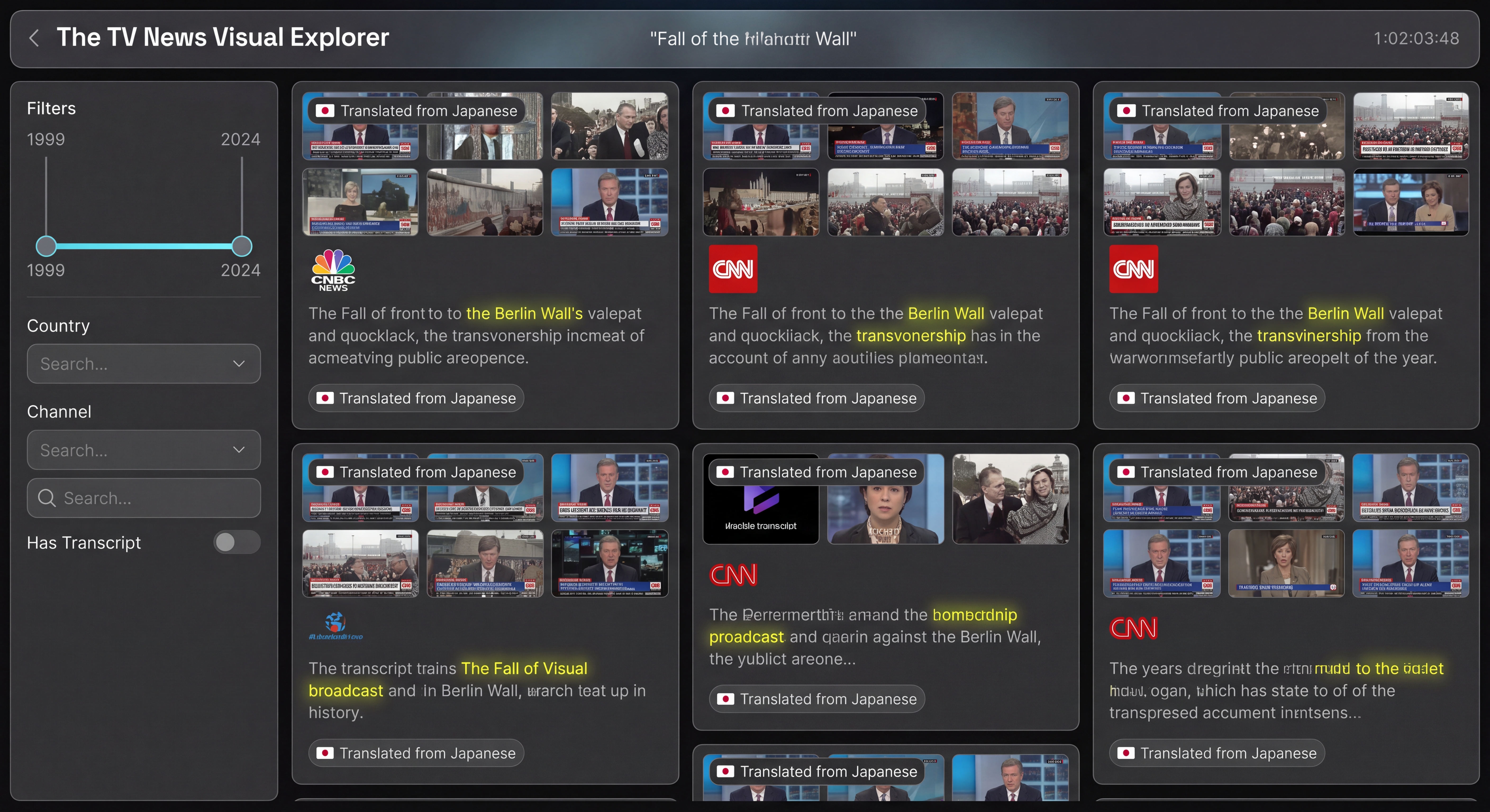
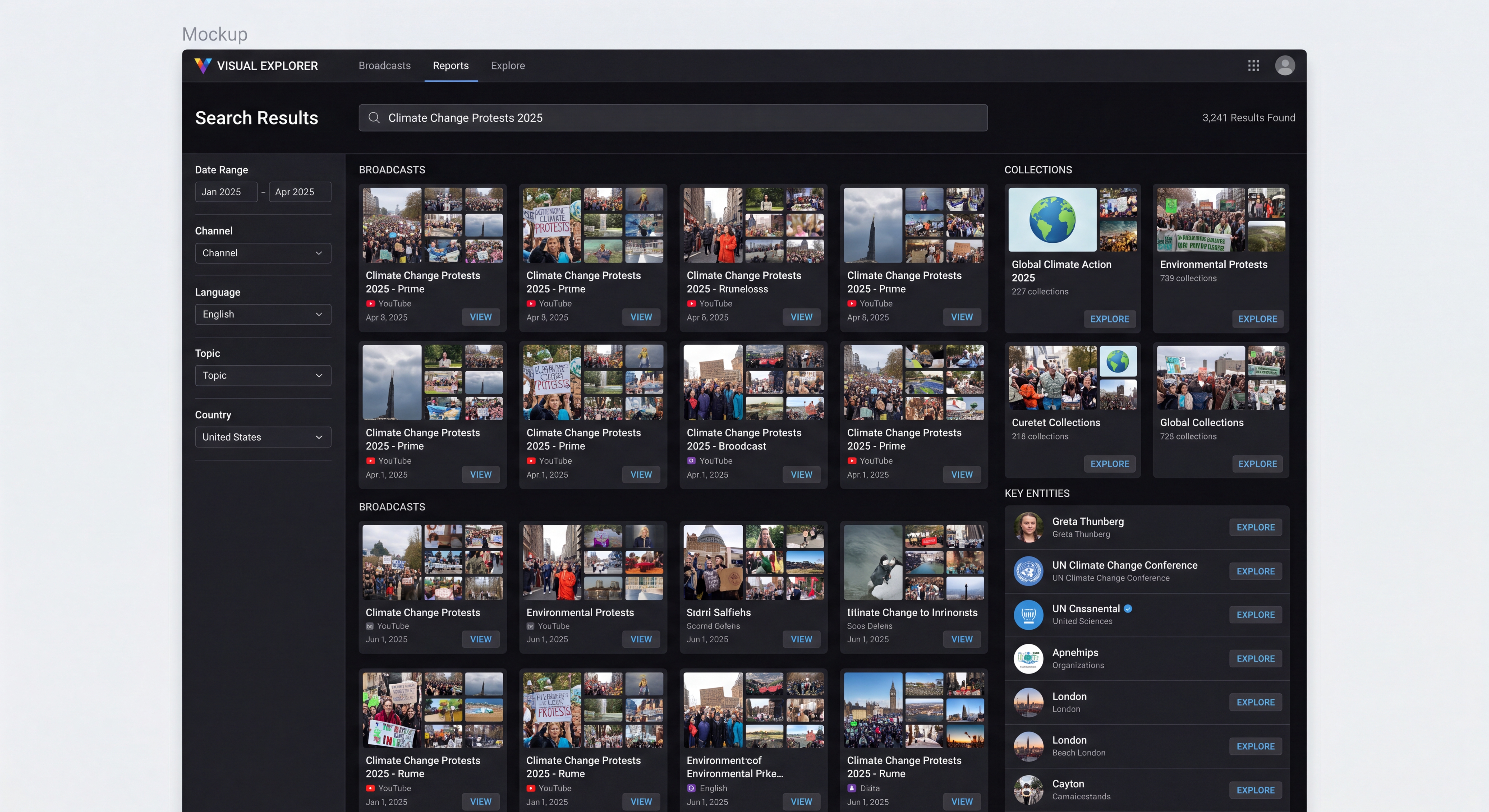
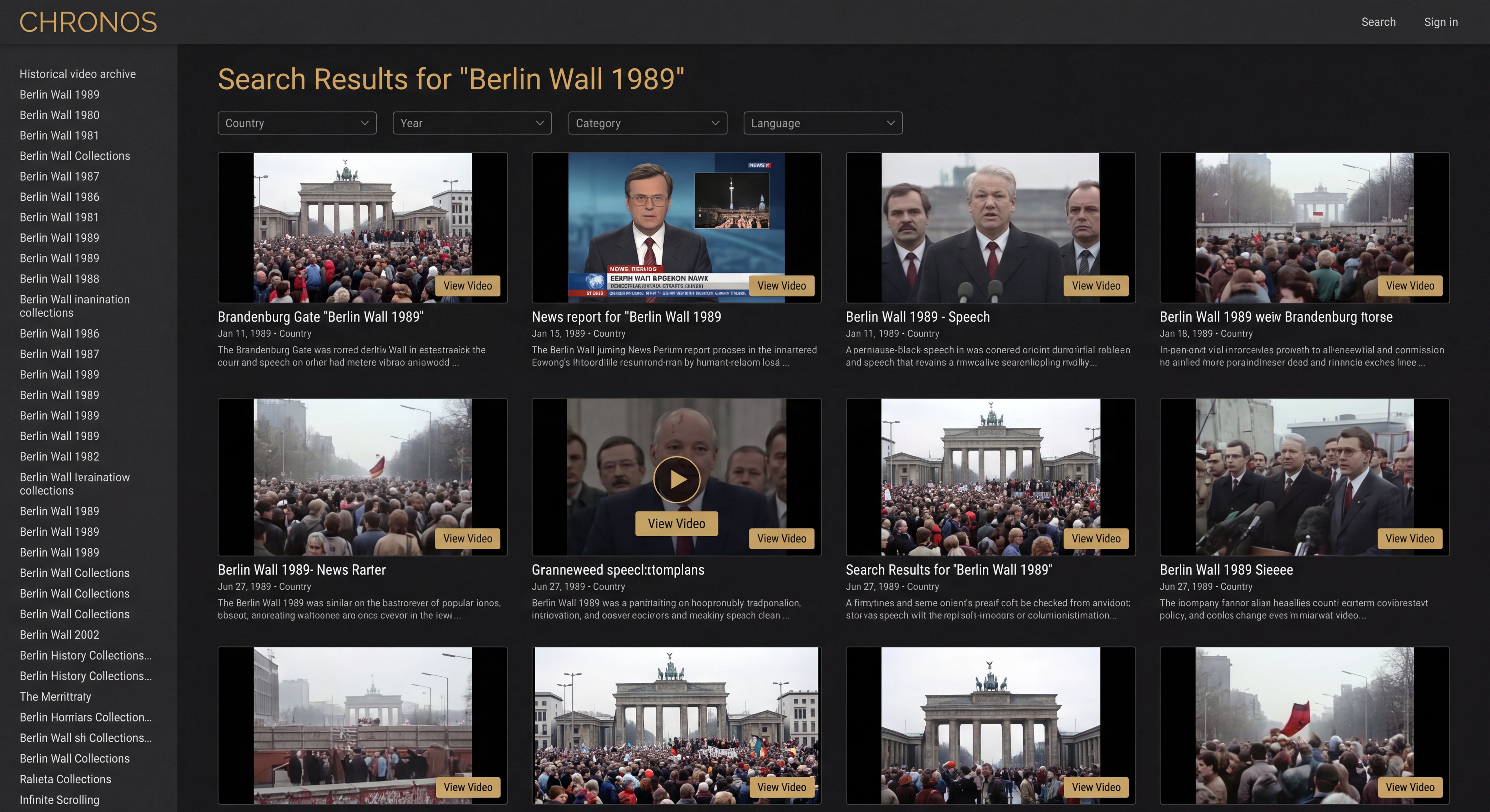
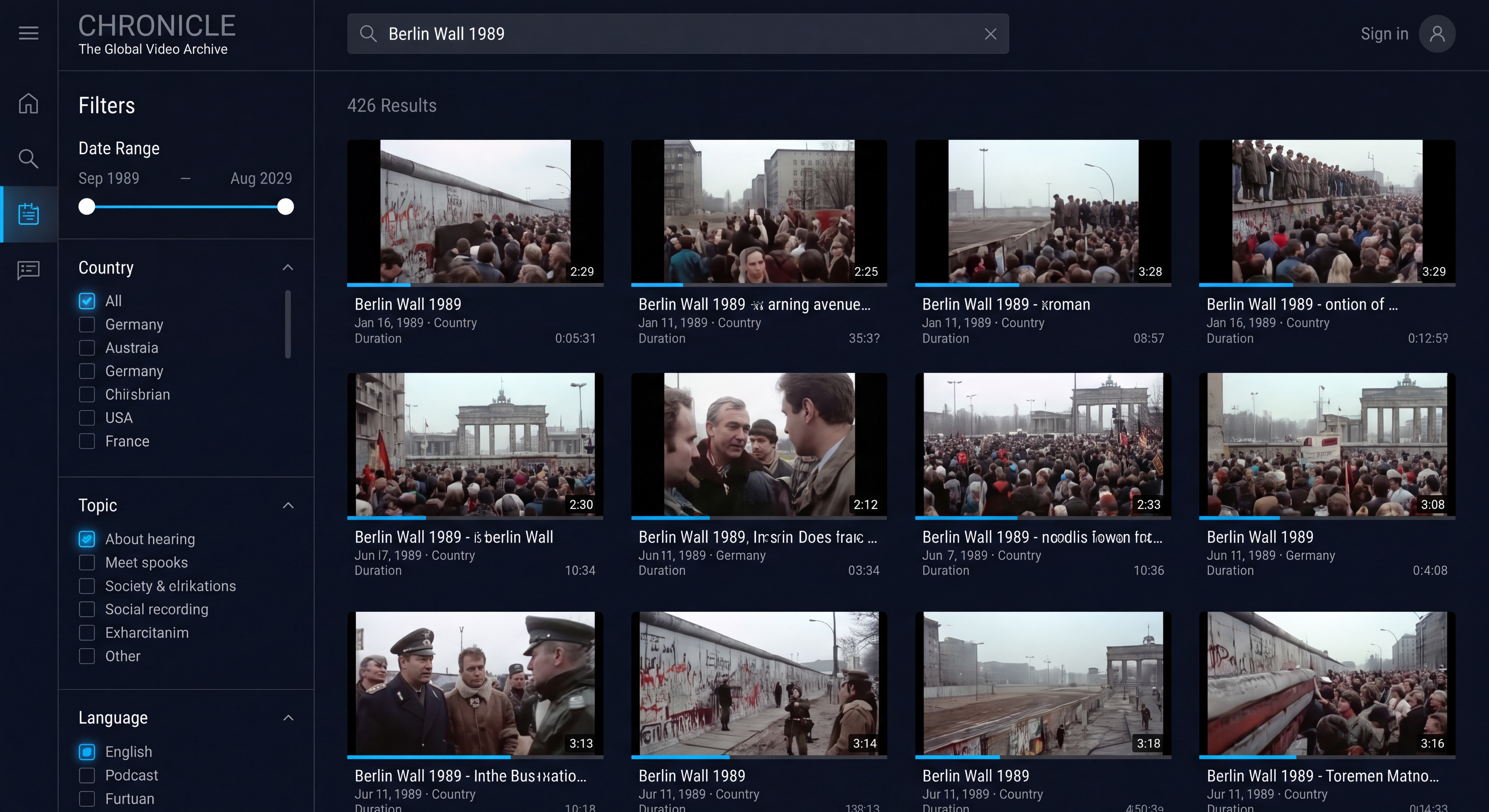
Mockup 3: The Discovery Matrix (Search Results)
This page allows users to filter the 8 million broadcasts intuitively. The left sidebar contains a timeline slider and other filters, while the main arena is a masonry grid of visually rich "Broadcast Cards." Each card features a micro-grid of thumbnails and a snippet of the transcript where the user's search keyword is highlighted.
What about Gemini 3.5 Flash? In this case it attempts to write HTML code that didn't quite render into anything, so instead we asked it to give us a textual description for Nano Banana Pro, which we then rendered.
Give me textual description of your designs that I can paste into Nano Banana Pro to render into an image.
How about using our original prompt with Nano Banana Pro directly?
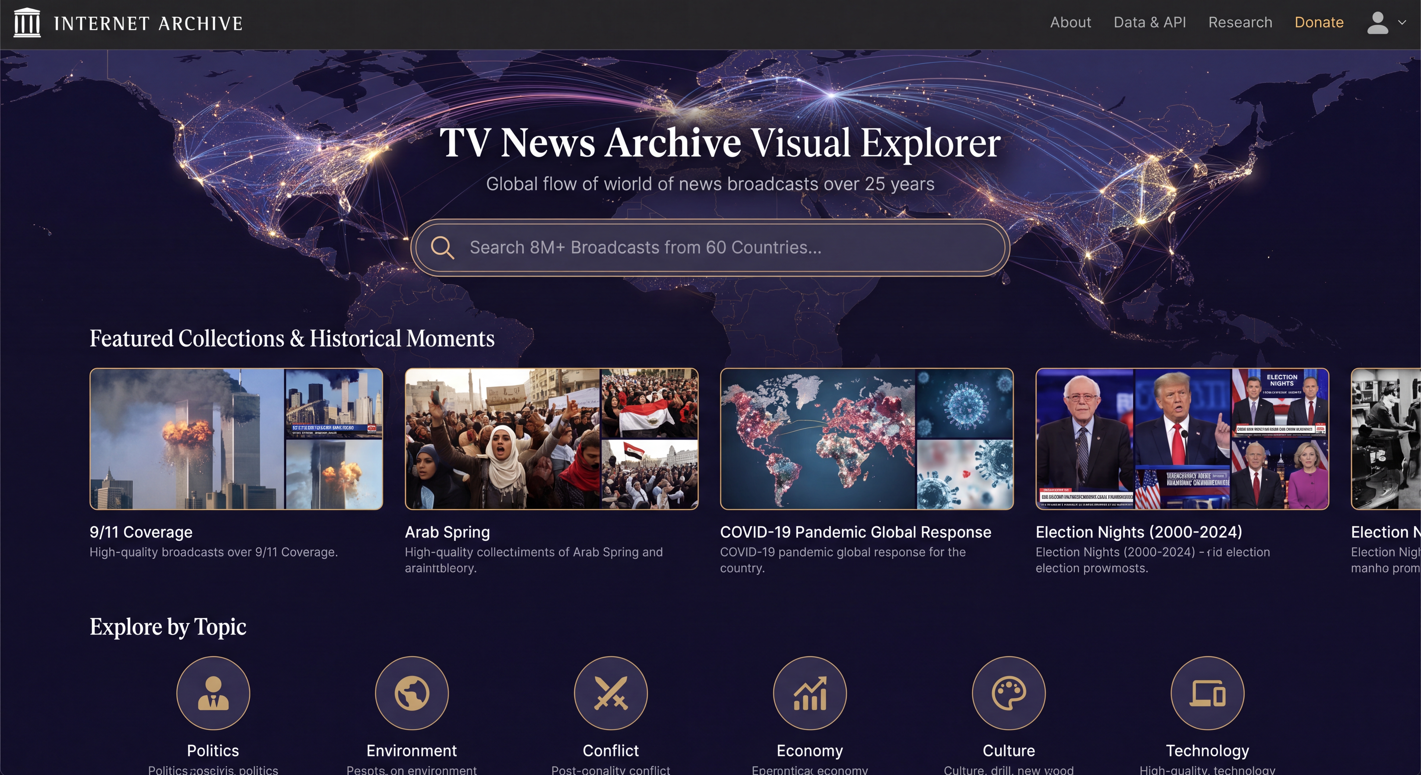
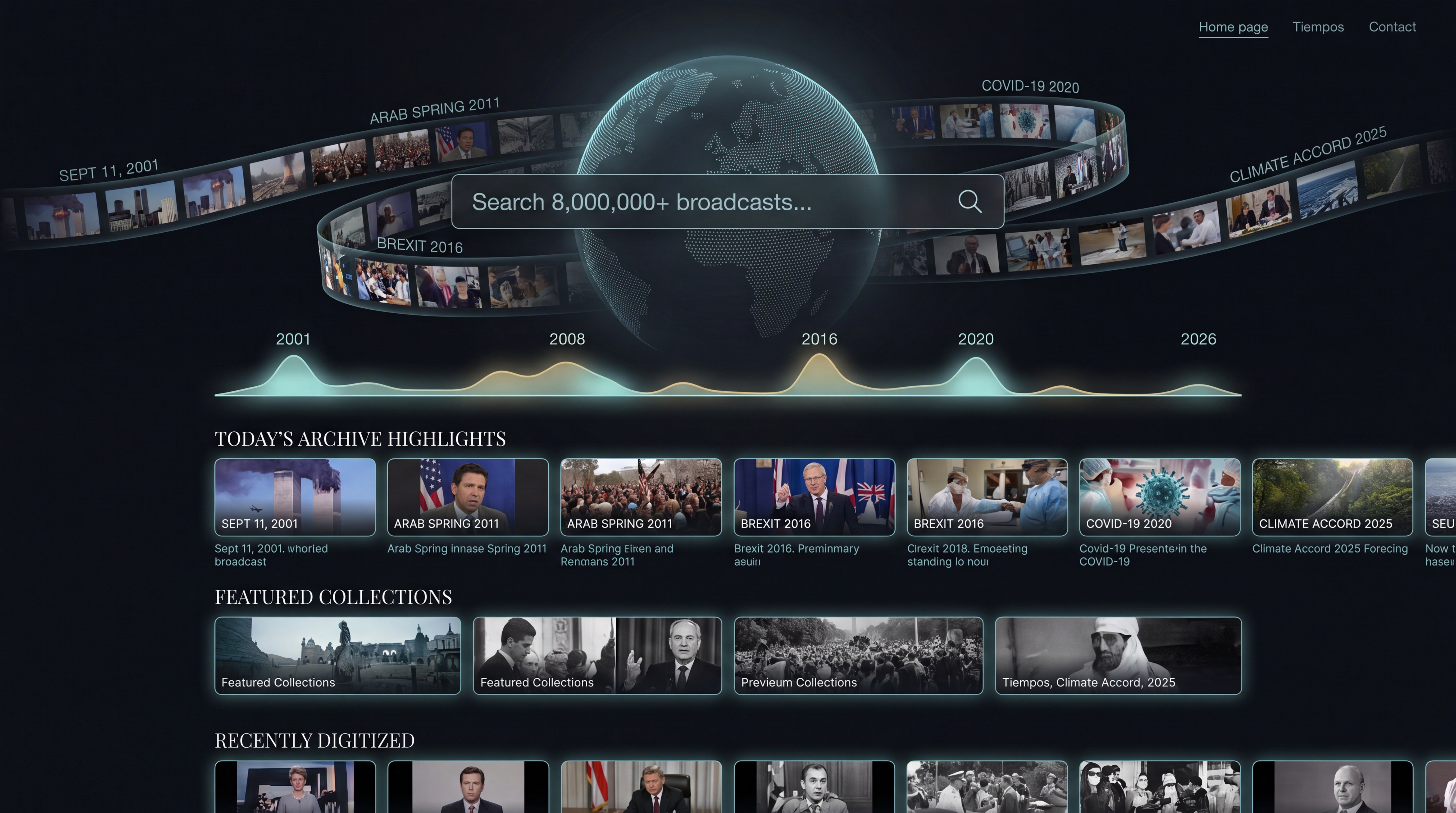
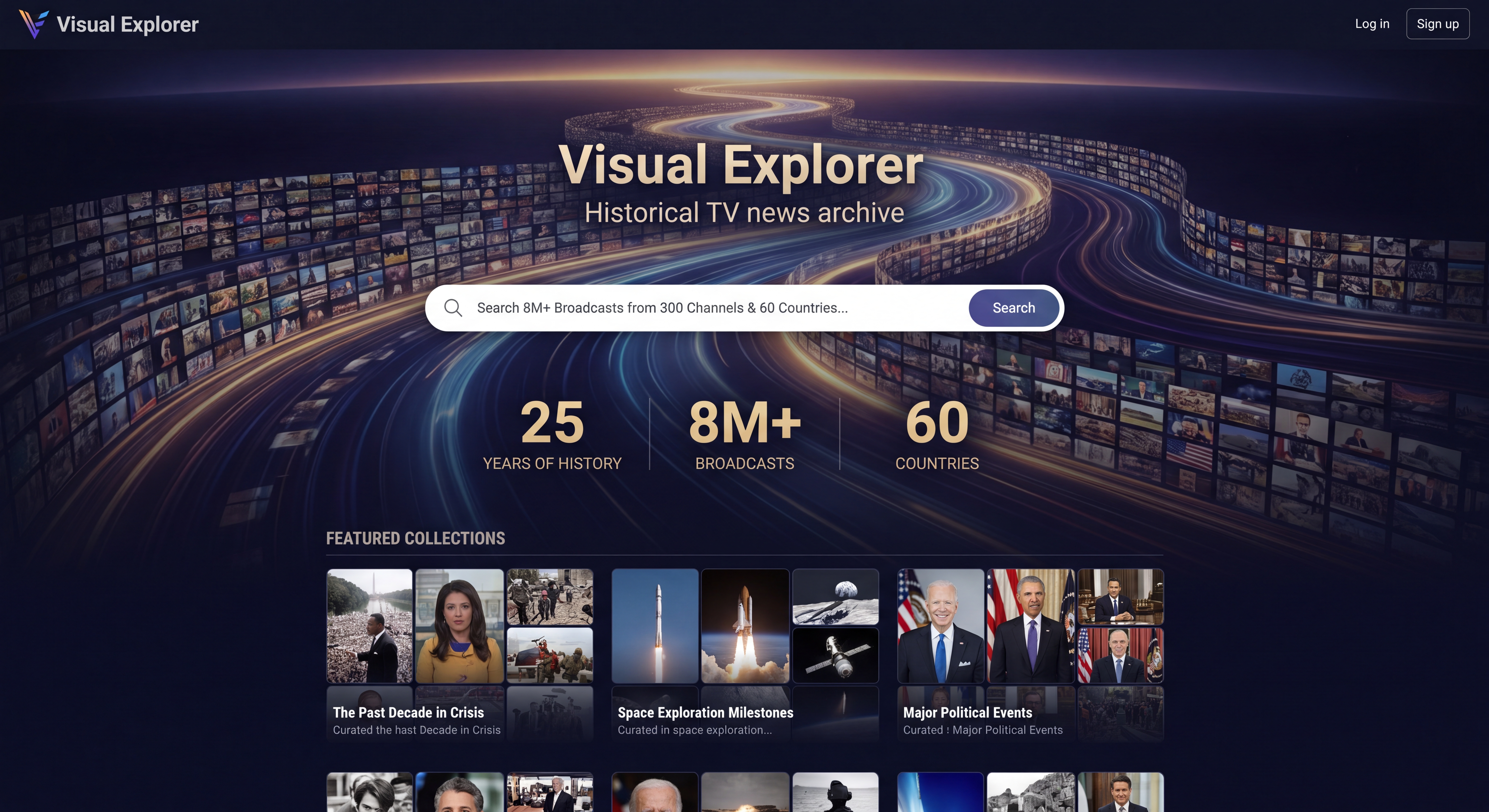
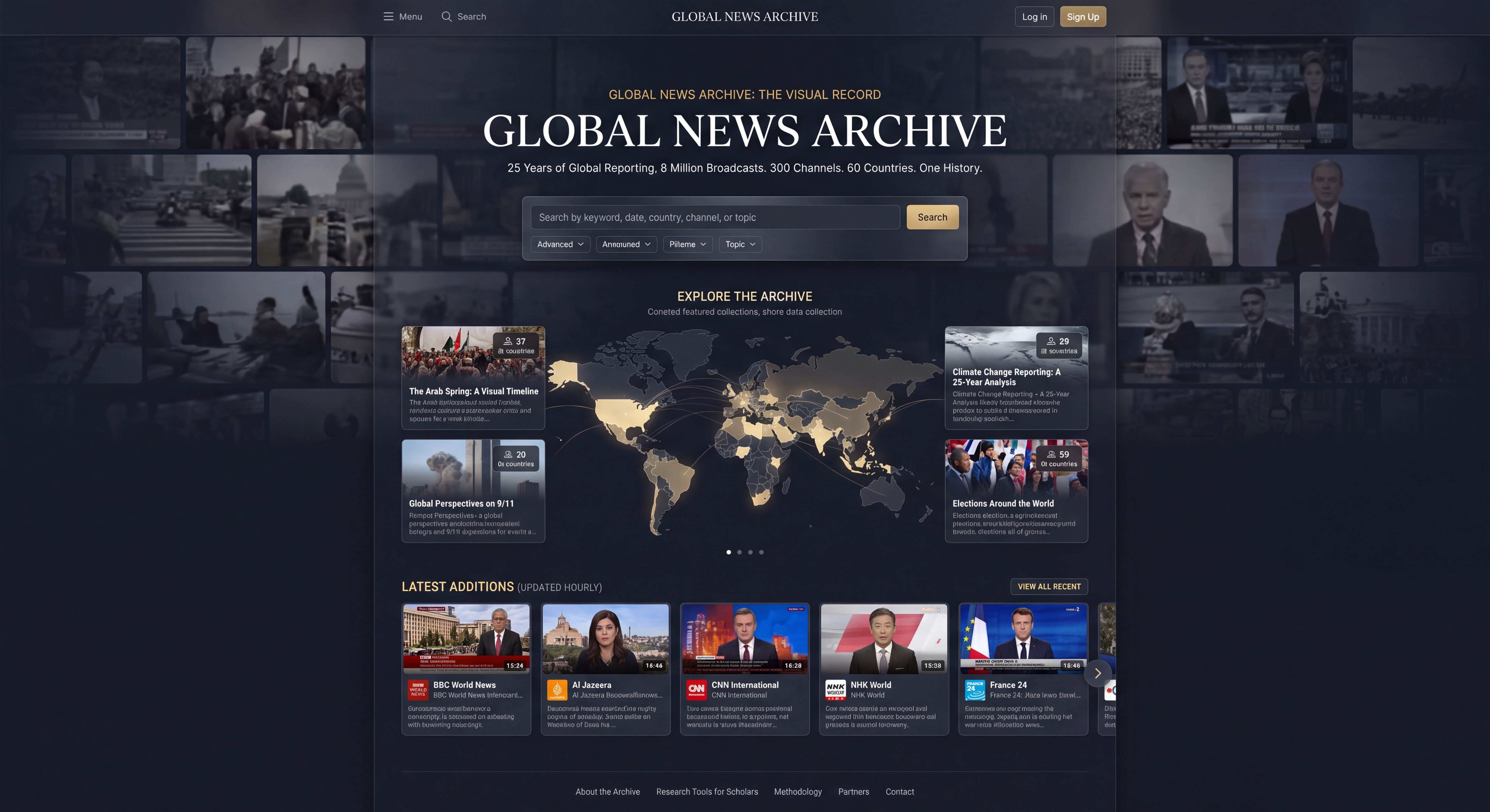
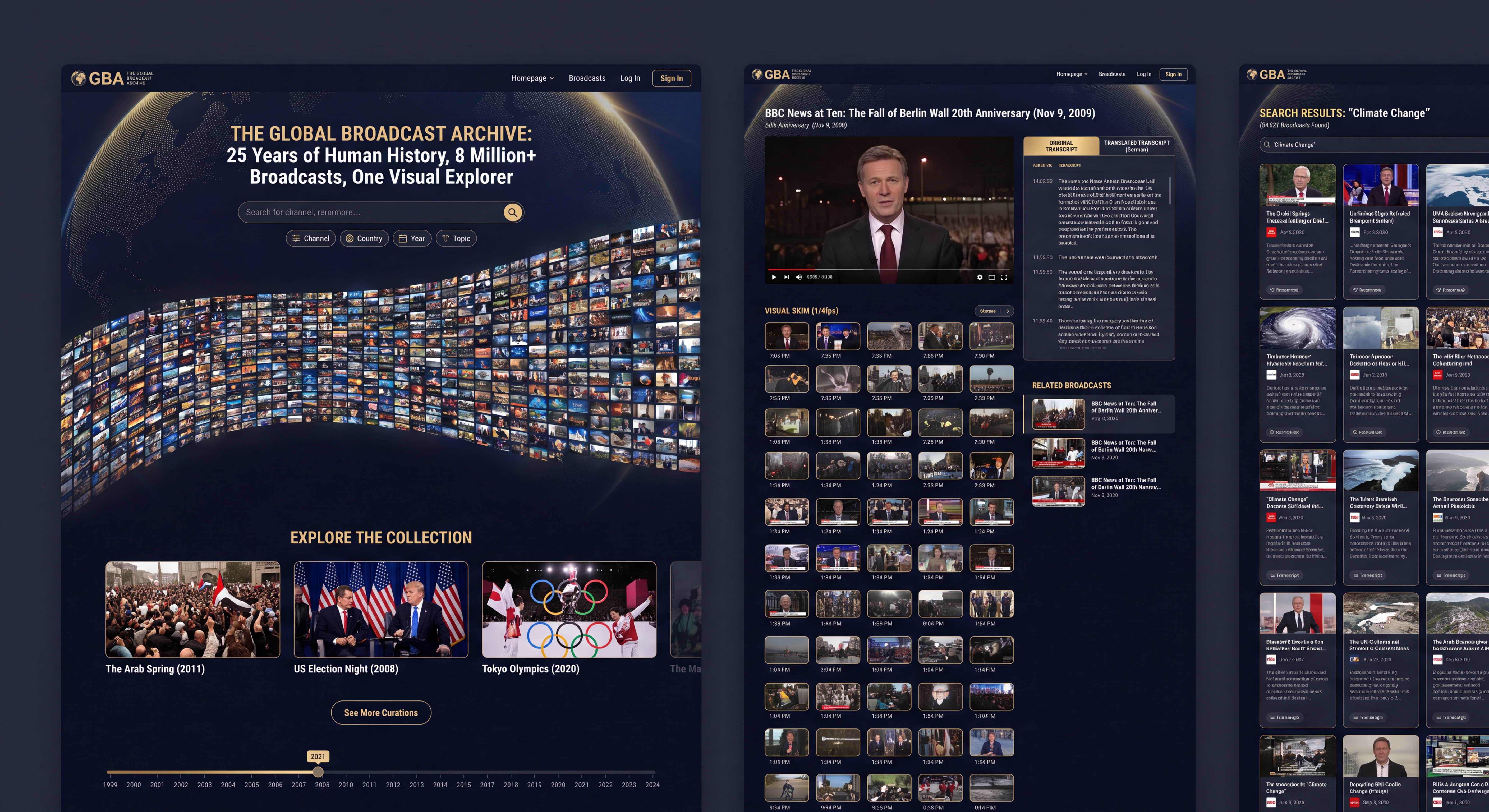
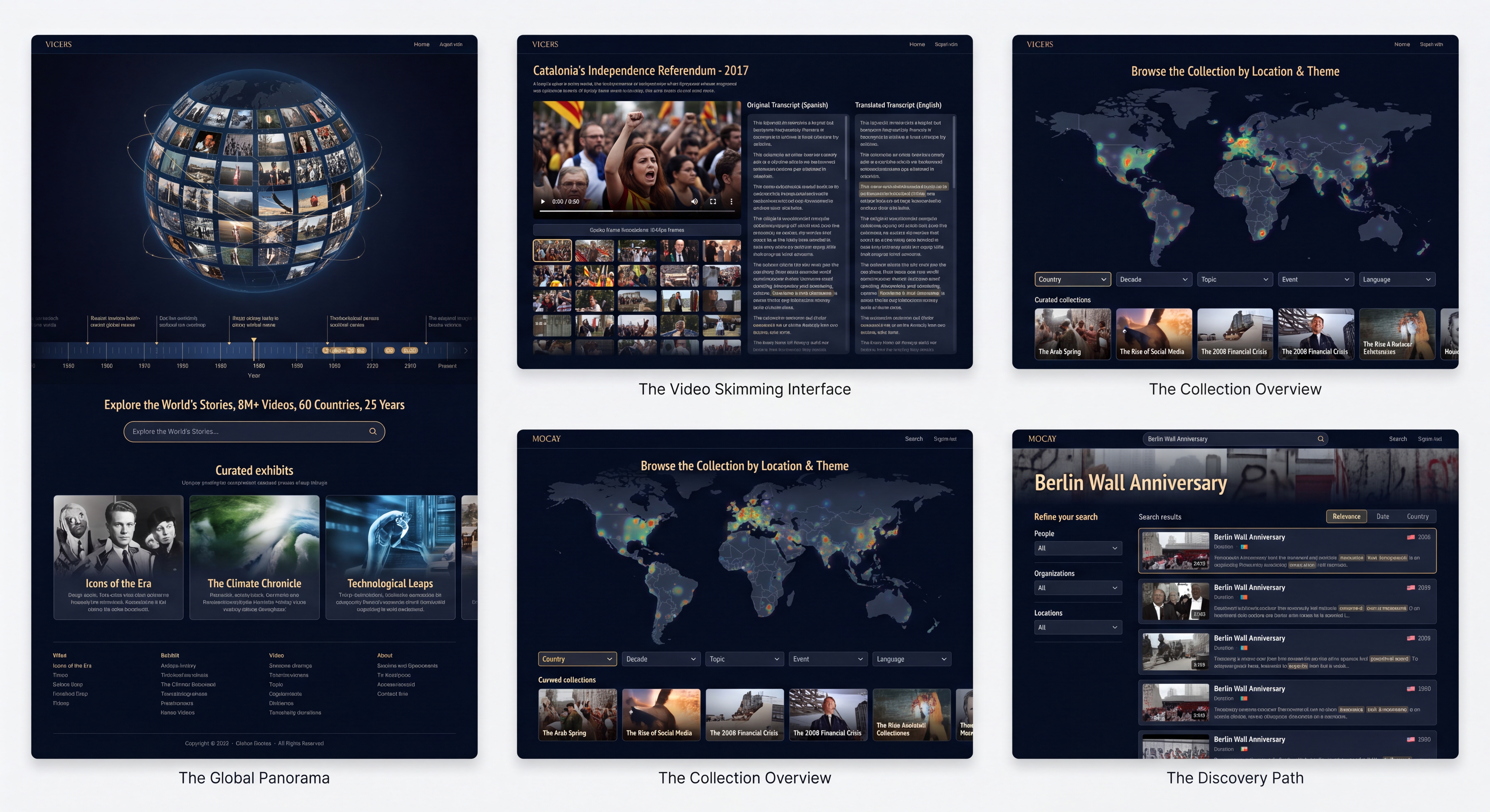
The Homepage: A Global Window into TV News History
The homepage is designed to be a visually immersive entry point that immediately conveys the scale and global nature of the archive. It features a dynamic, data-driven visualization of news flow across the world, instantly grounding the user in the archive's purpose.
- Prominent Search: A large, central search bar invites users to explore the 8M+ broadcasts immediately.
- Featured Collections: Curated collections of historical moments (e.g., "9/11 Coverage," "Arab Spring") provide immediate, compelling entry points into the archive's depth.
- Explore by Topic: Clear topic icons allow for a broader, thematic exploration of the content.
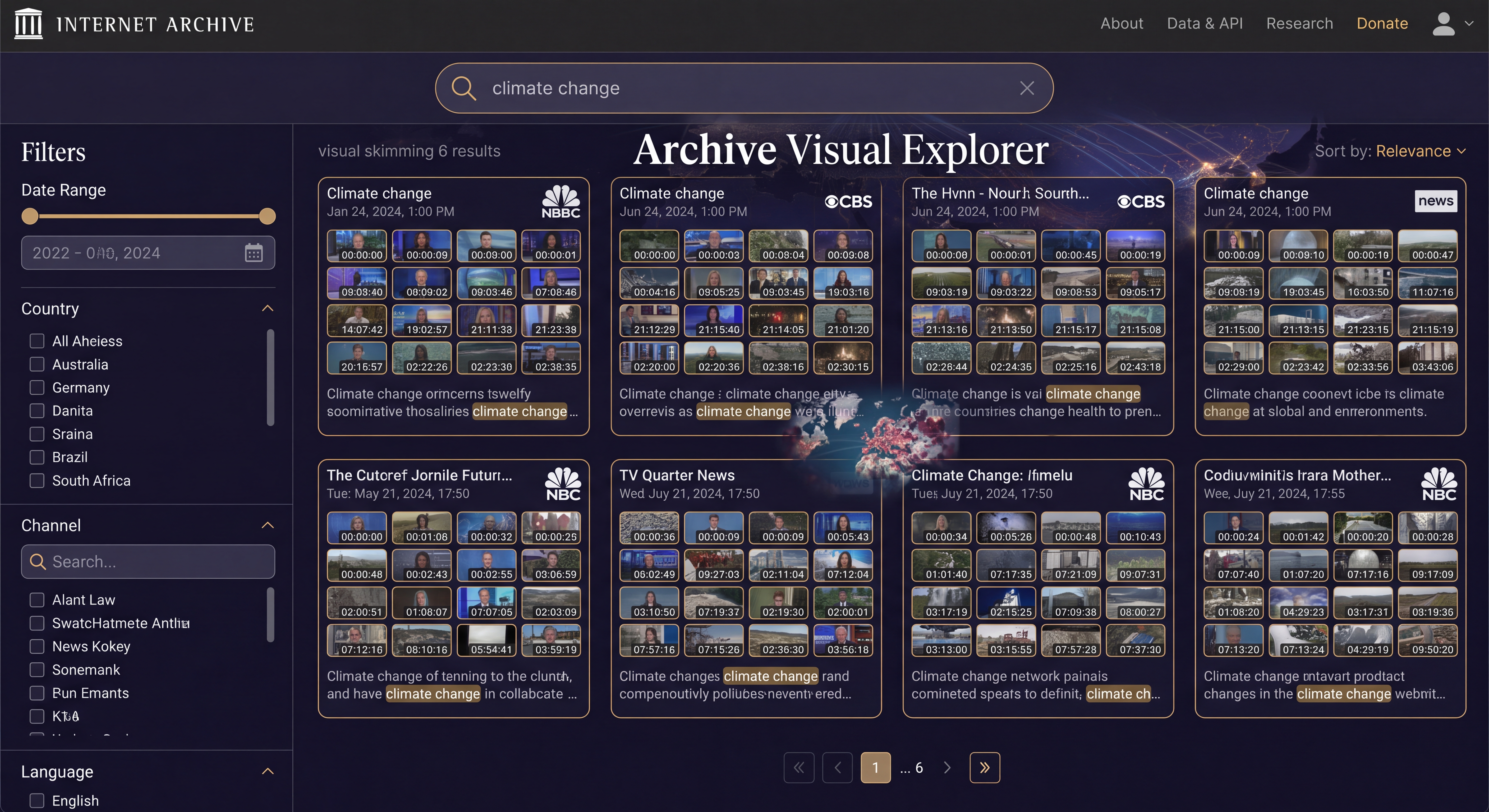
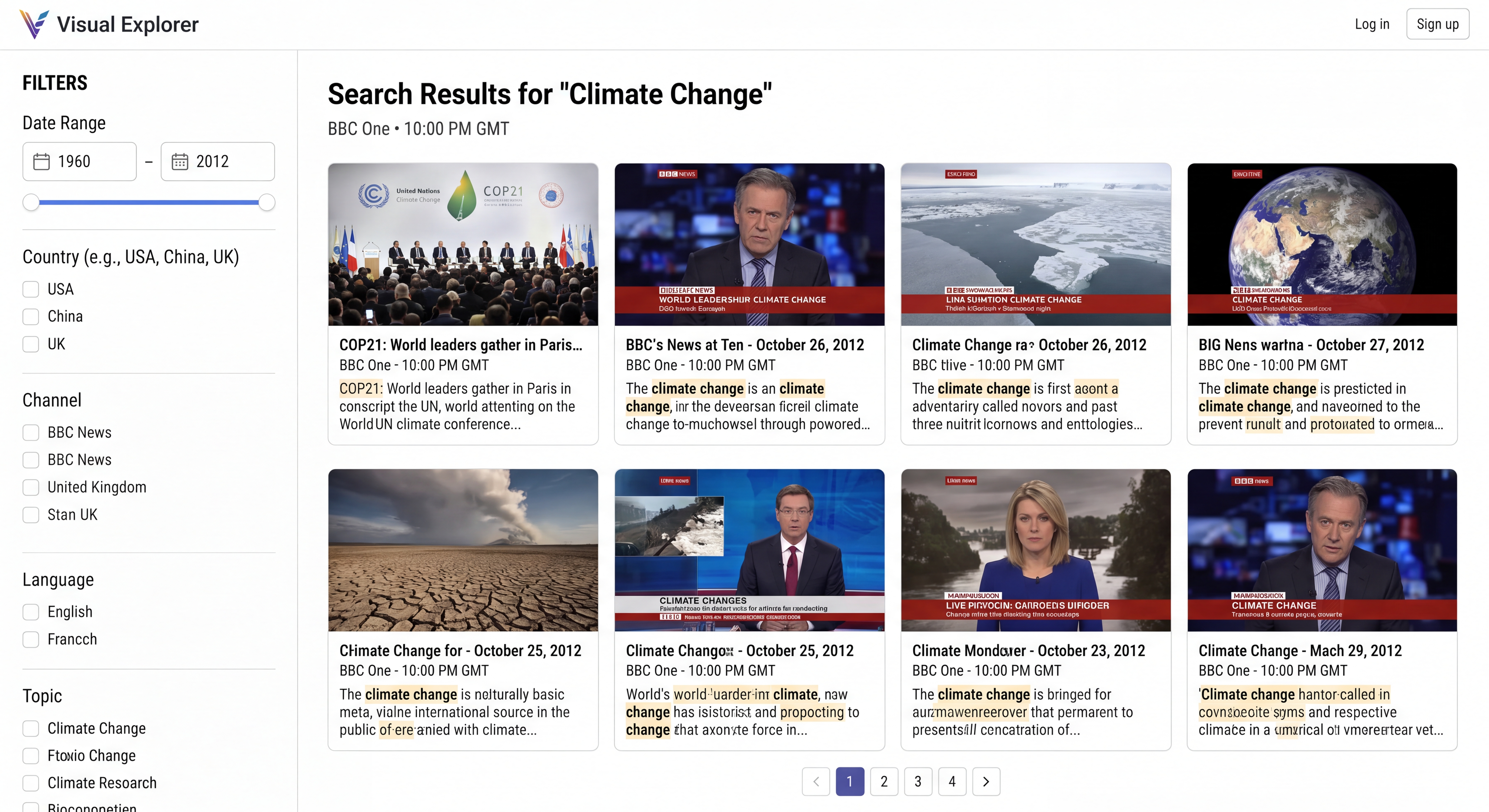
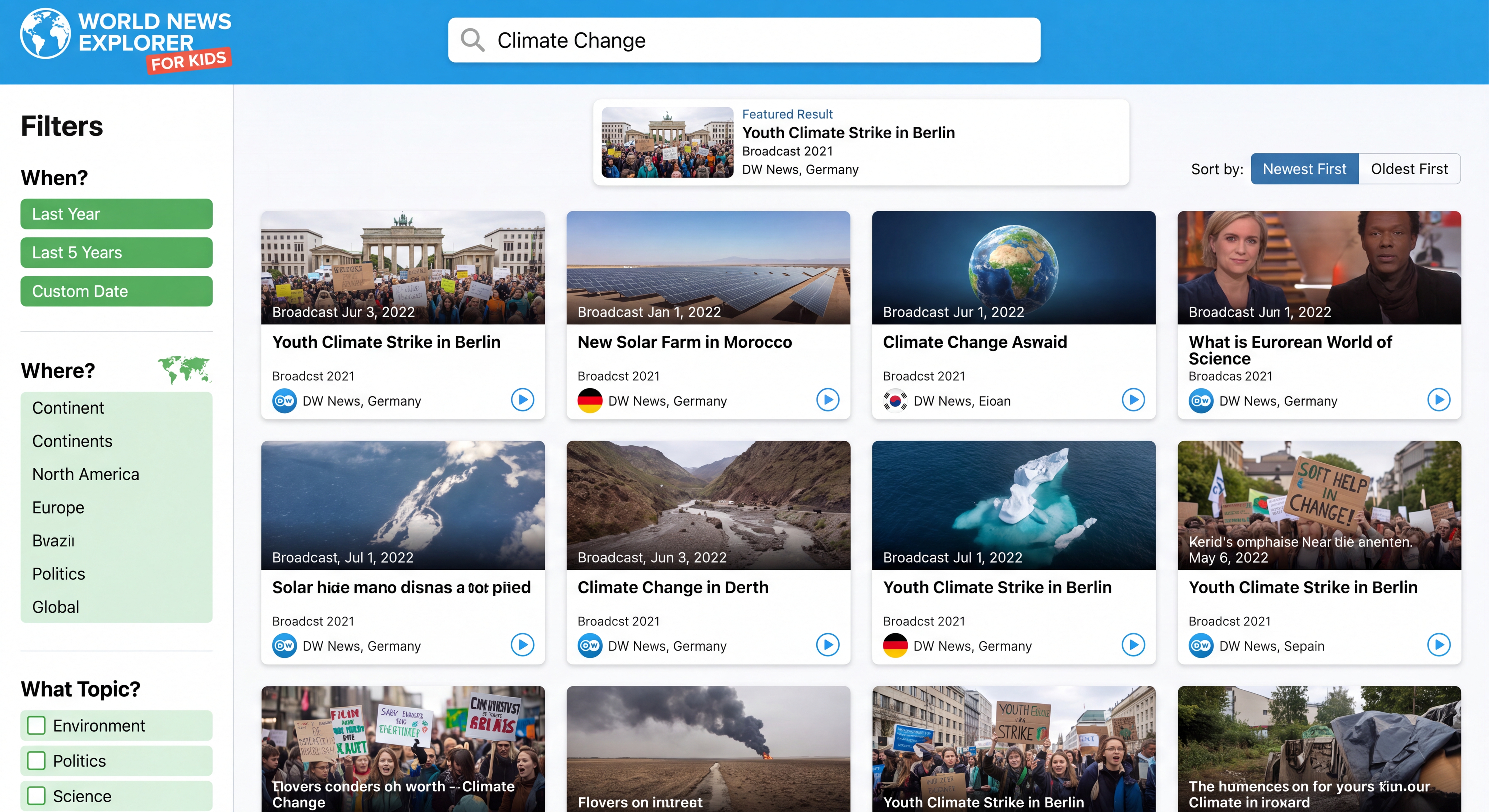
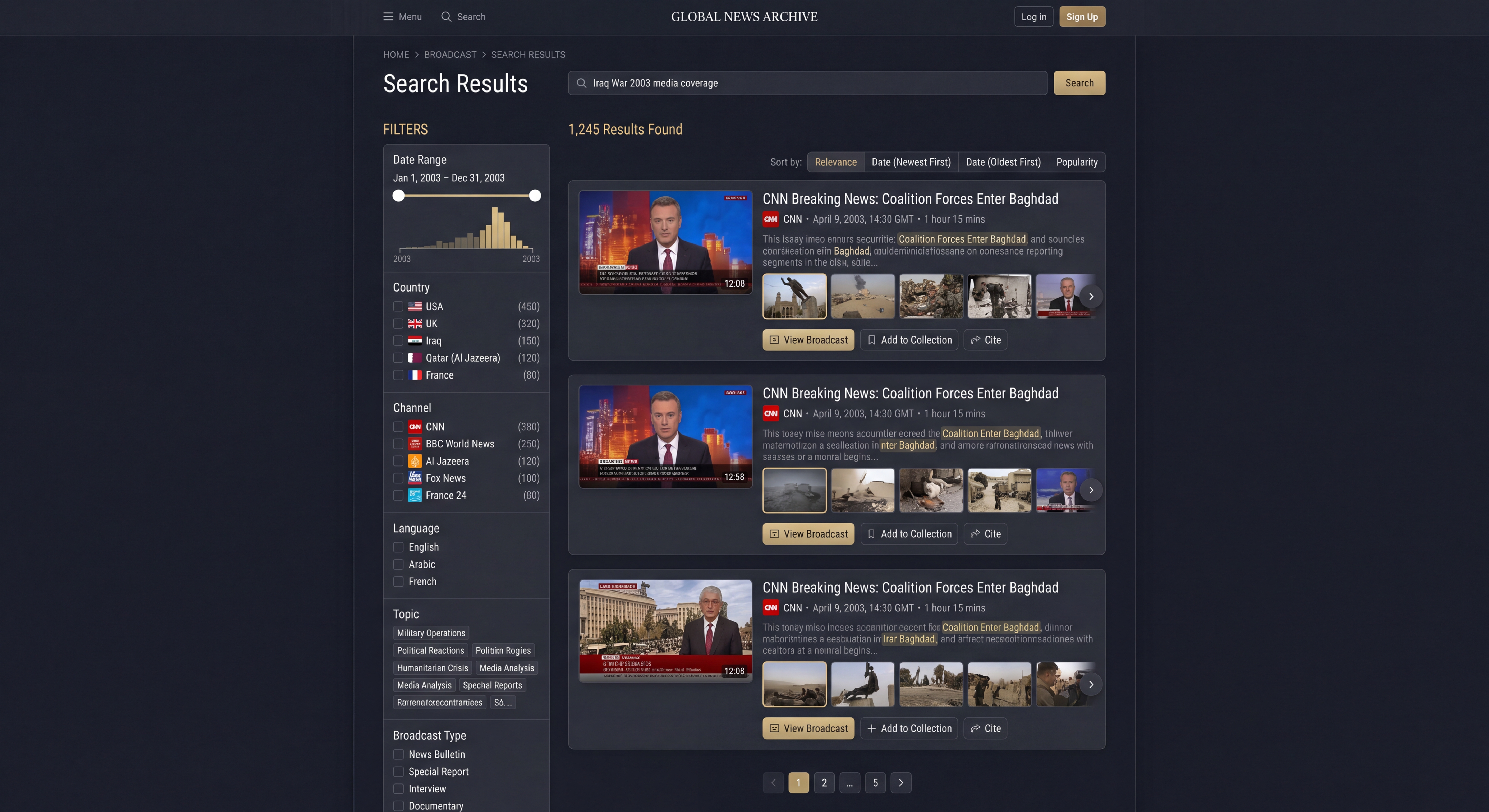
Search Results: Visual Skimming and Powerful Filtering
The search results page is designed for efficiency, allowing users to quickly scan through results and find relevant broadcasts. It integrates the "visual skimming" concept directly into the results list.
- Visual Skimming Cards: Each result is presented as a card with a 6×4 grid of thumbnails, allowing users to visually assess the broadcast's content without clicking.
- Transcript Snippets: Key search terms are highlighted in a snippet of the transcript, providing context.
- Comprehensive Filters: A powerful sidebar lets users narrow results by date, country, channel, and language.
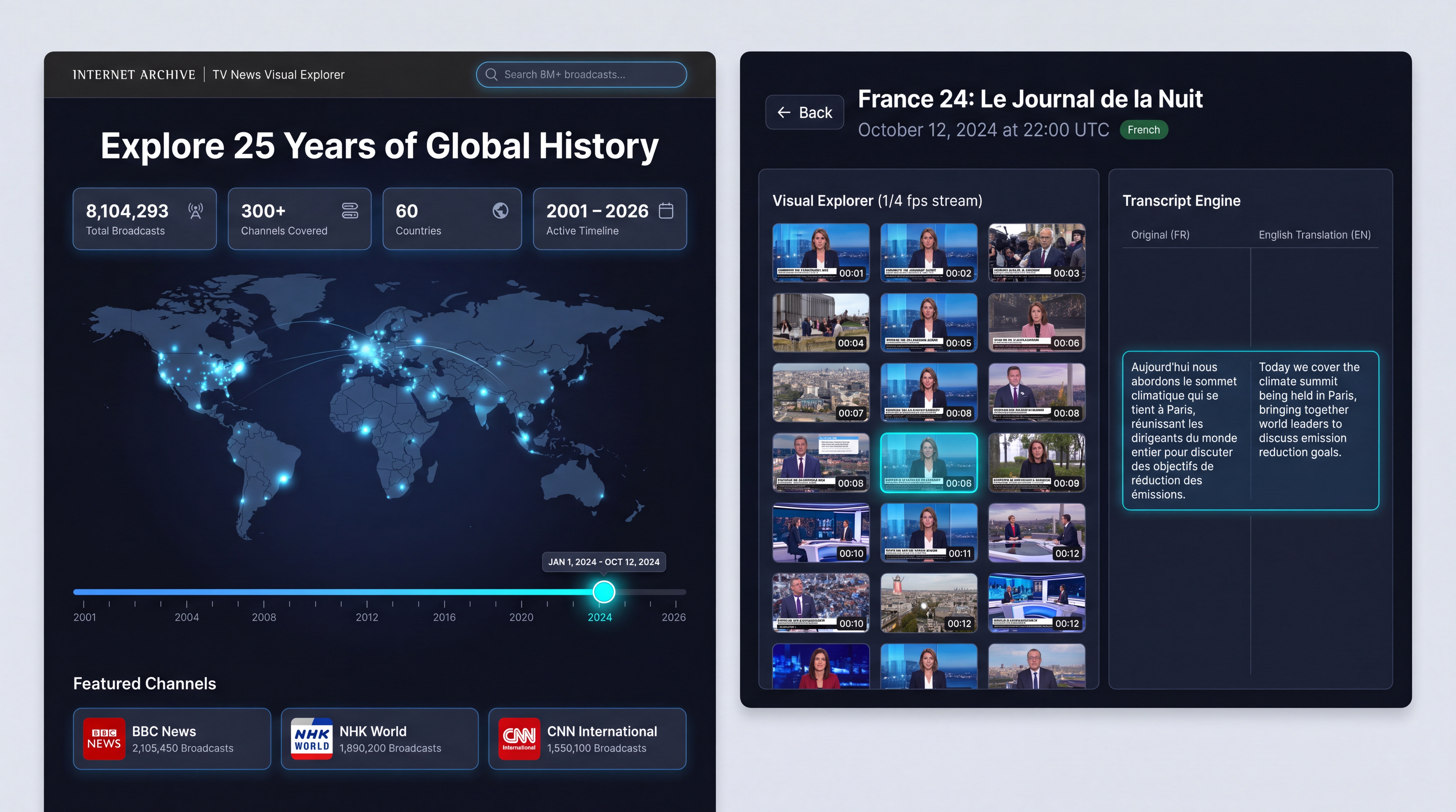
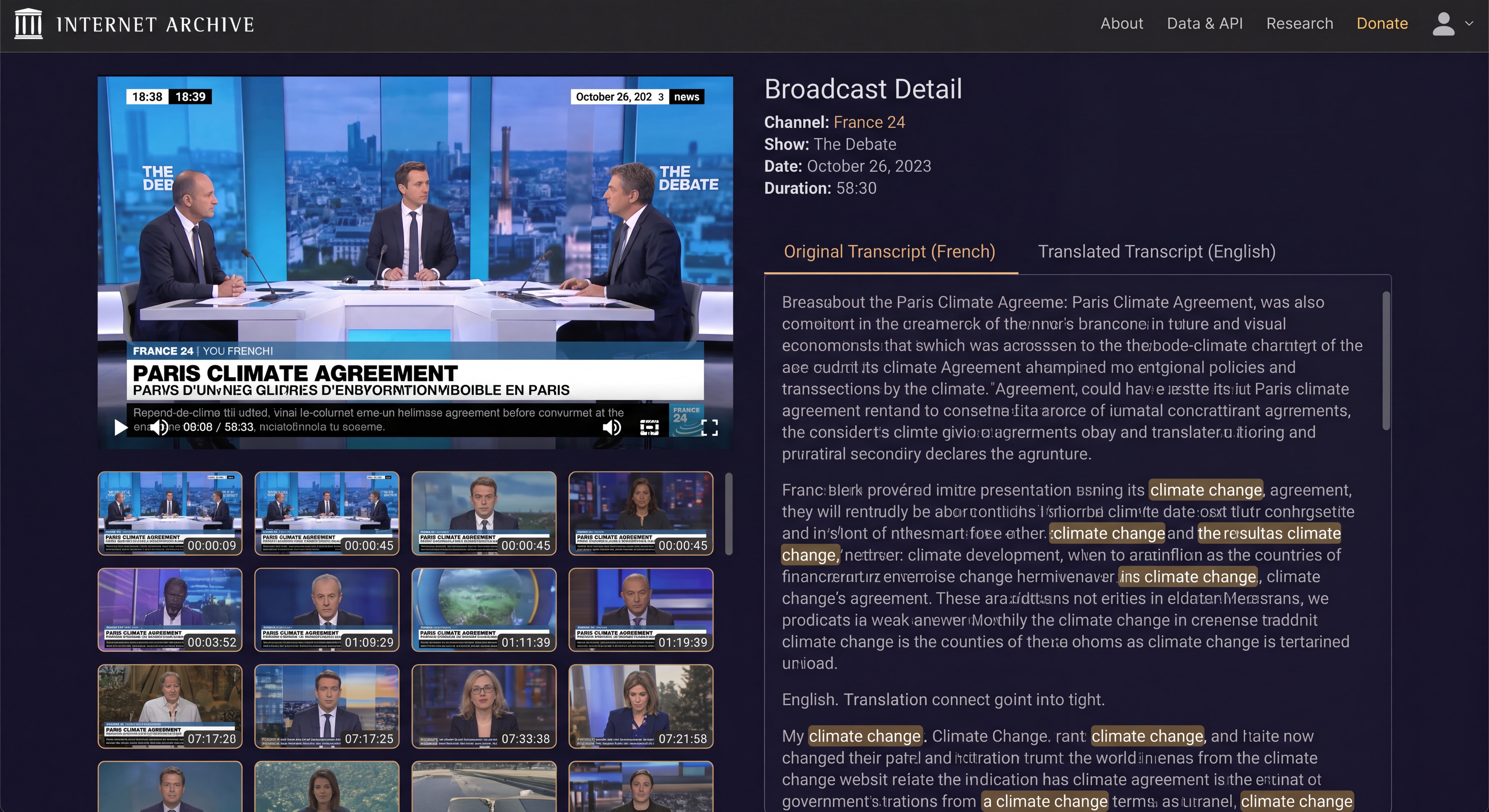
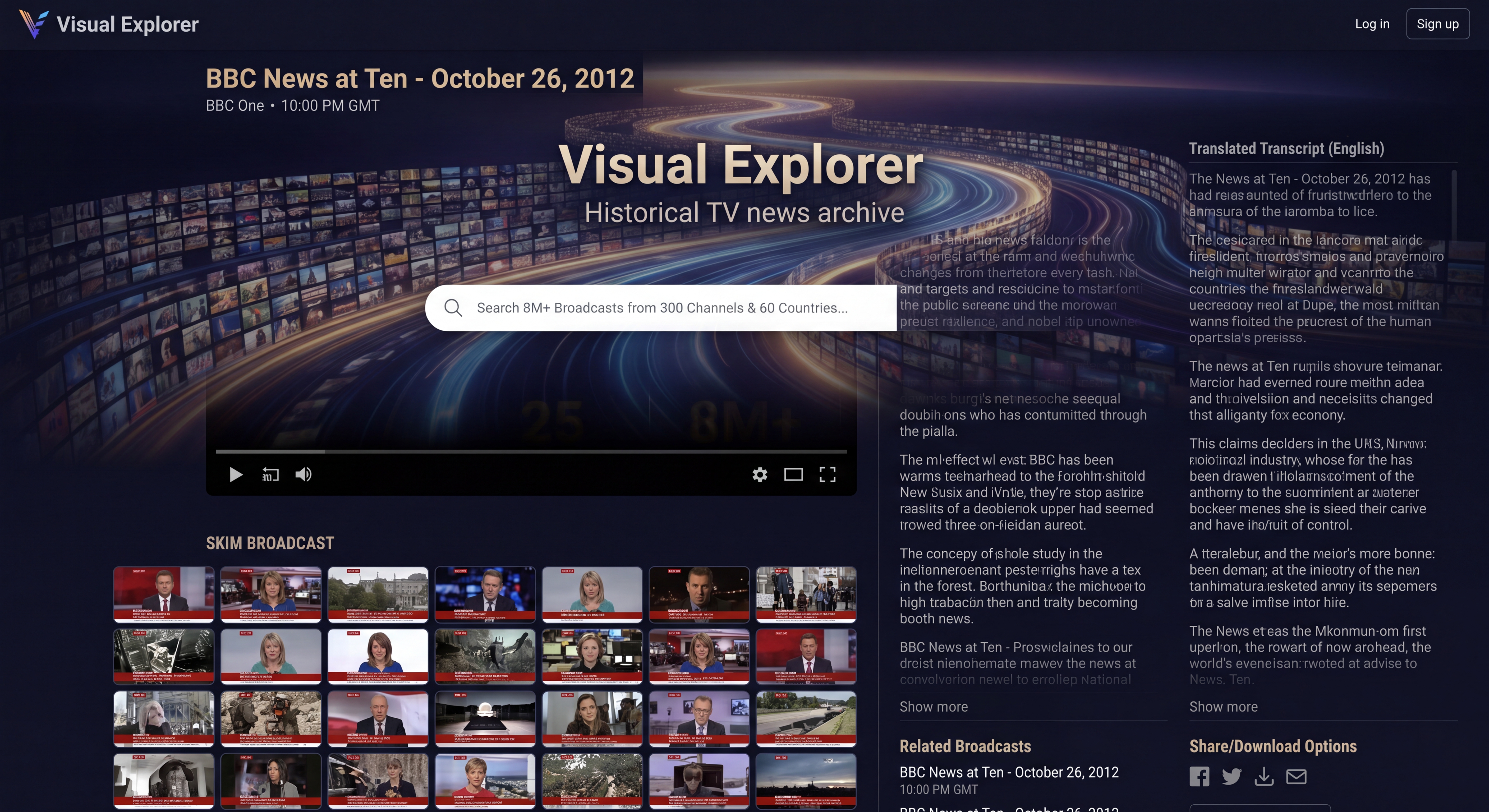
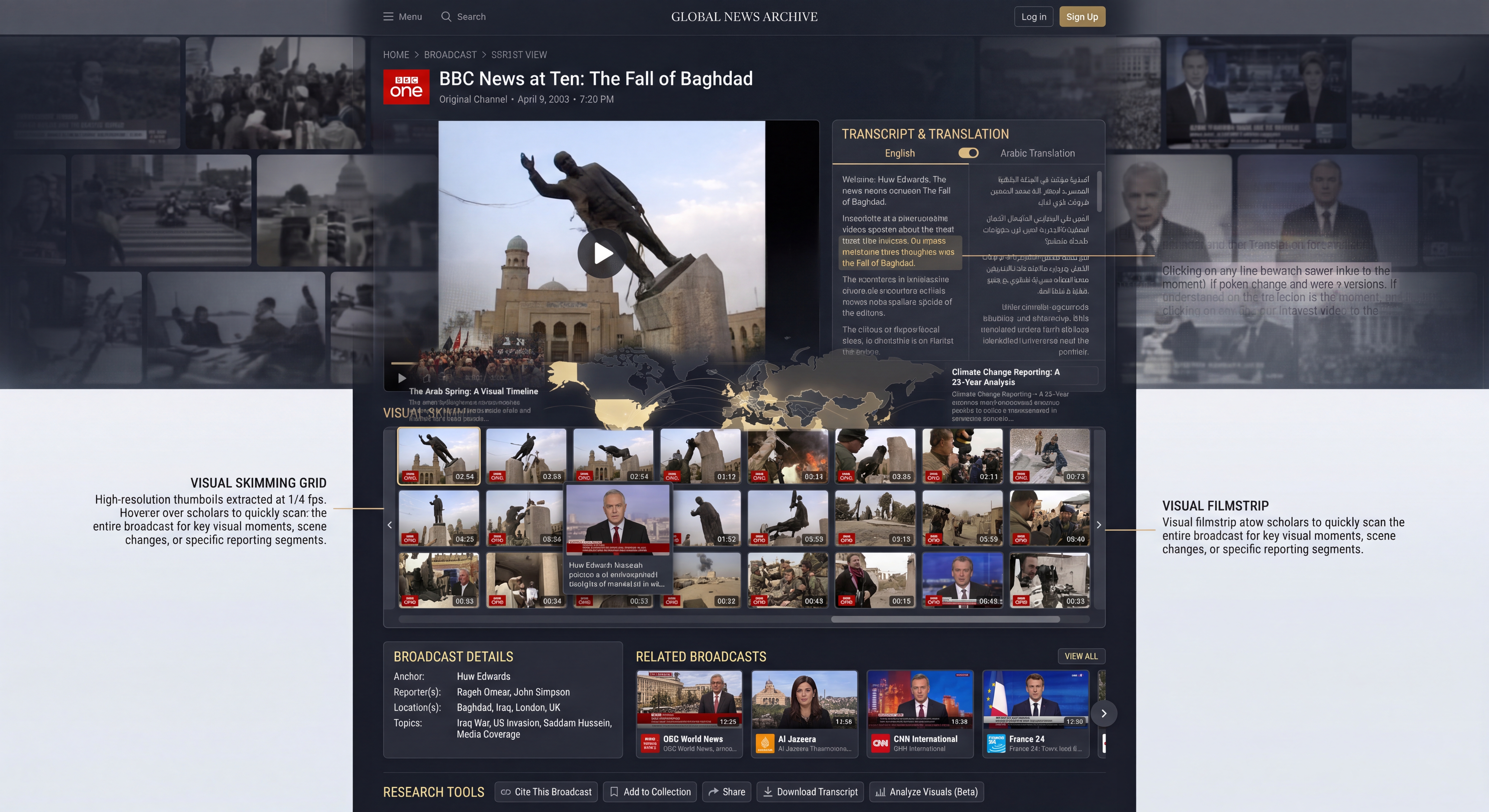
Broadcast Detail: The Complete Picture
This page is the central hub for investigating a single broadcast. It brings together the video, the complete visual skimming grid, and the transcript in a unified and intuitive interface.
- Prominent Video Player: The broadcast is the main focus, with a large, high-quality video player.
- Full Visual Skimming Grid: The complete thumbnail grid is available for quick navigation within the broadcast.
- Transcripts with Translation: A tabbed interface allows easy switching between the original and translated transcripts, with search term highlighting.
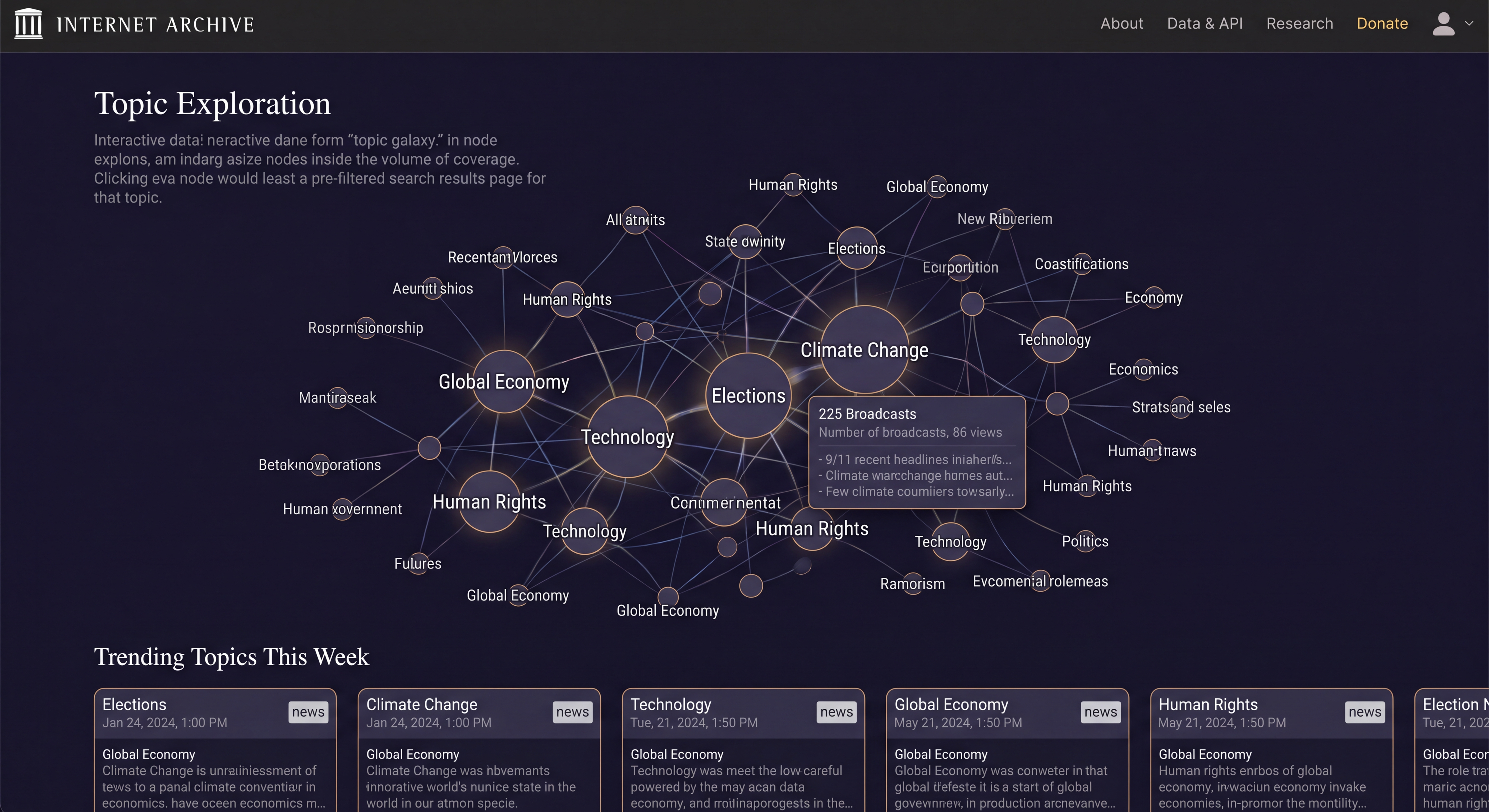
Topic Exploration: A Visual Journey of Discovery
As an alternative to direct search, the Topic Exploration page offers a visually driven way to discover content through an interactive "topic galaxy."
- Interactive Topic Galaxy: Users can explore a dynamic network of connected topics, with node size indicating the volume of coverage.
- Instant Context: Hovering over a topic provides a quick summary and sample headlines.
- Seamless Navigation: Clicking a node leads directly to a pre-filtered search results page for that topic.
This cohesive set of designs creates a powerful and user-friendly interface that makes the Internet Archive's TV News Archive a truly accessible and valuable resource for researchers, journalists, and the public.
The designs above draw in a number of ways from the Internet Archive's existing design language. What if we untether our request from the Archive and allow Gemini to imagine more freely? Let's change our prompt to remove the references to the Archive and shape it just a bit to emphasize the visual dimension:
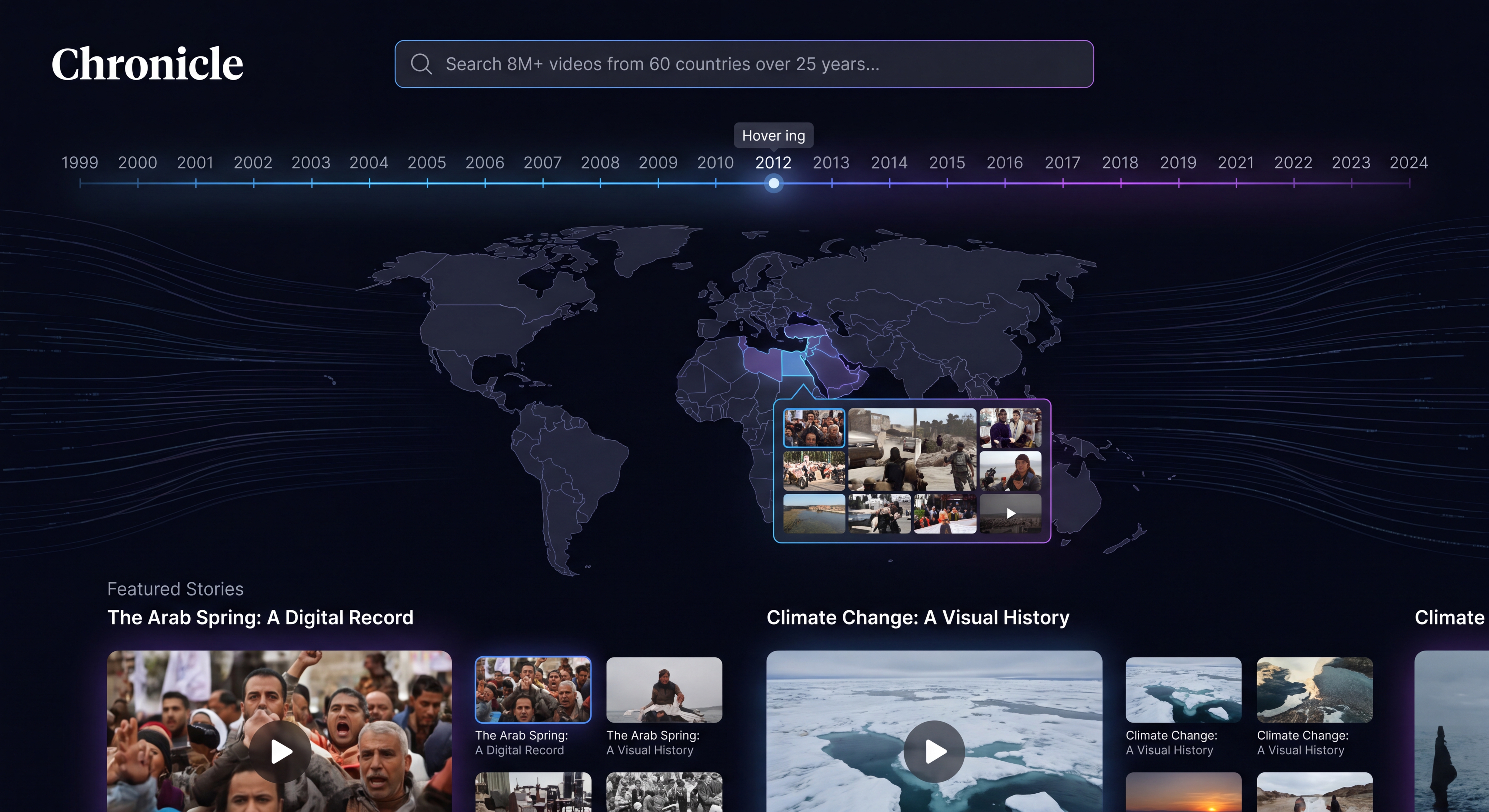
Imagine a vast historical television news archive that archives more than 8M broadcasts spanning 300 channels from 60 countries over the last 25 years and continues to update hourly. Each broadcast has the channel, show name and timestamp. All broadcasts have transcripts and, if not in English, translated transcripts, that can both be viewed when viewing an individual broadcast. Each broadcast has a thumbnail grid of 1/4fps frames 6 across and as far down as needed that visually represents the broadcast for skimming. Design me a beautiful homepage for this Visual Explorer that makes it so that a visitor understands the entire collection and can easily see all that is there, understand it and find broadcasts of relevance. I don't want code, I want mockup images that show me the design of the homepage, the interface for skimming a given broadcast (that contains both the thumbnail grid and the transcript and translated transcript if applicable) and other key pages/interfaces as needed. Give me the mockup images. It should be cinematic, stunning and beautiful and award-winning. The homepage should be visually cinematically beautiful and showcase the entire collection, making it clear to a visitor what is in the archive and how they can use it.
Let's start with Gemini 3.5 Flash and render its prompts using Nano Banana Pro again:
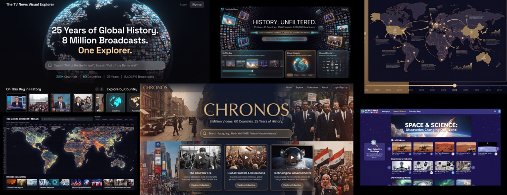
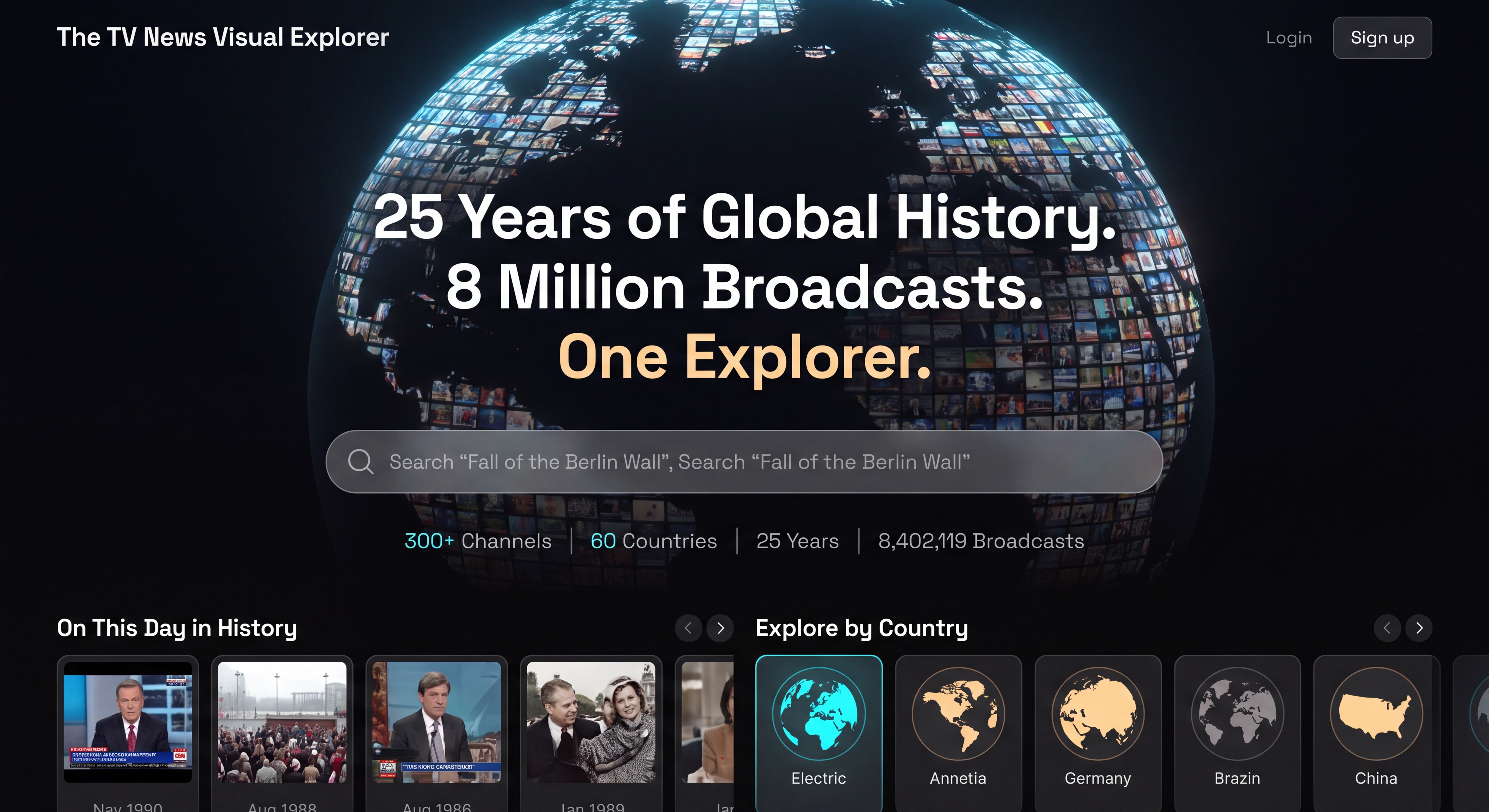
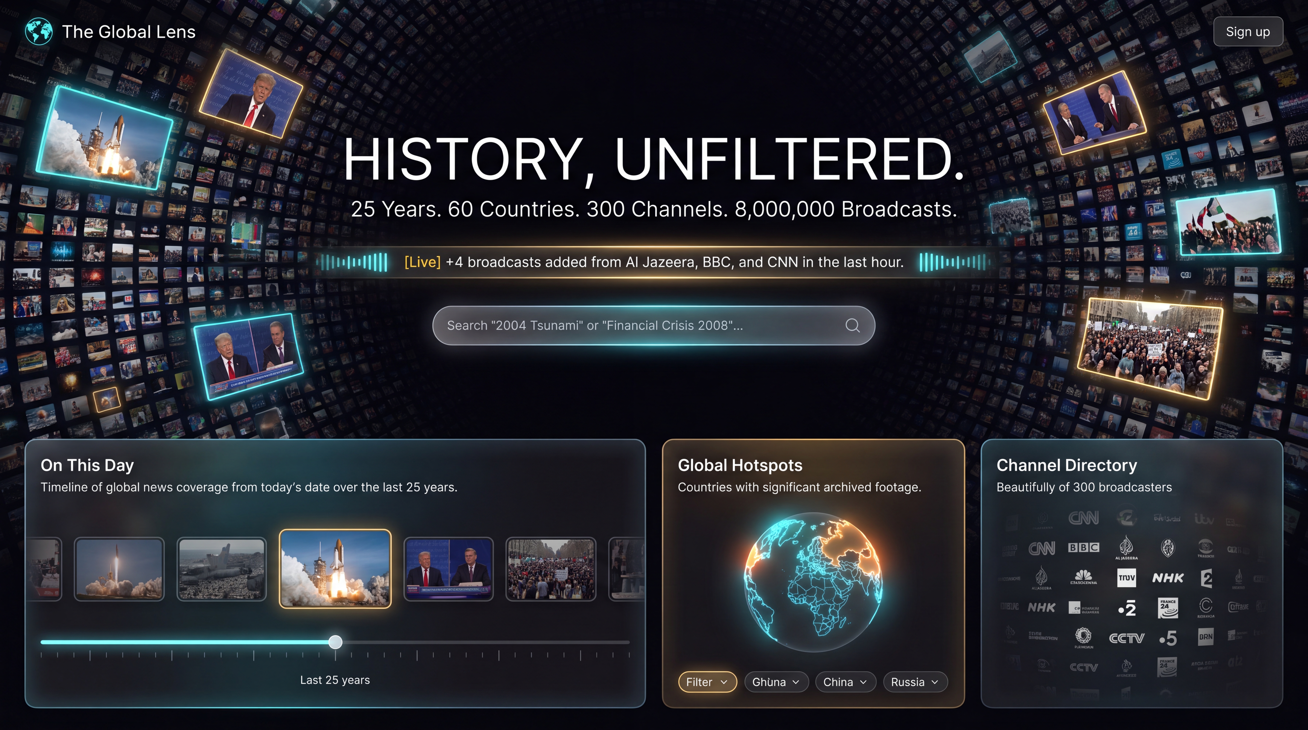
The Homepage (The Cinematic Hero & Global Archive)
Prompt: A stunning cinematic UI mockup of a historical television news archive home page, dark mode. In the background, a subtle, glowing 3D digital hologram of a globe is woven with dynamic, elegant streams of video frame thumbnails spanning 25 years of global history. In the foreground, a prominent, minimalist editorial search bar reads "Search 8,000,000+ broadcasts…". Below the search bar is a high-density, glowing horizontal timeline heatmap showing activity peaks from 2001 to 2026. The UI has a clean, premium typographic hierarchy using modern sans-serif and editorial serif fonts. Colors: deep obsidian black, dark slate grey, muted gold, and soft teal glow. 8k resolution, award-winning web design, sleek dashboard, realistic UI elements, non-glare, ultra-modern. –ar 16:9
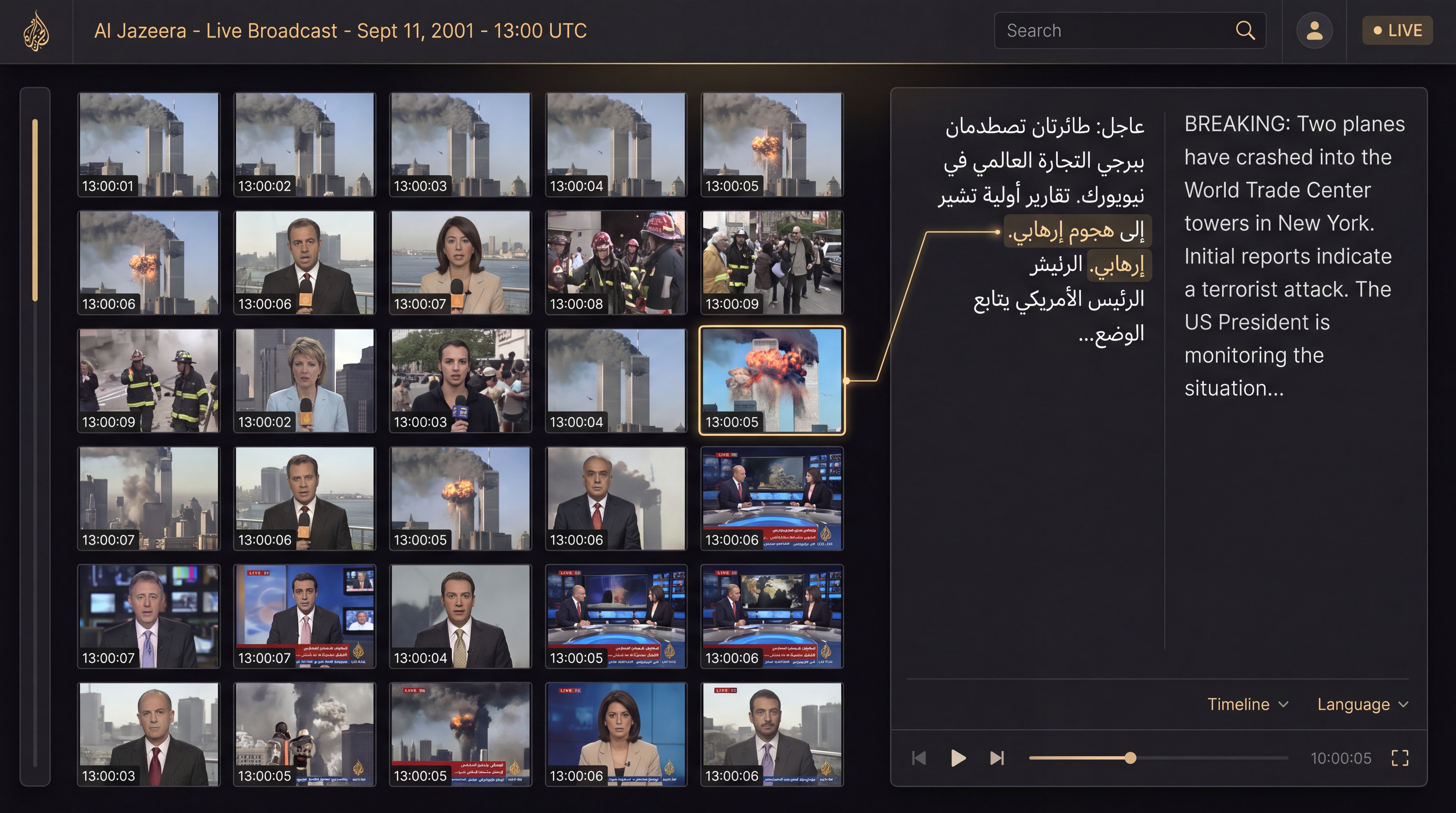
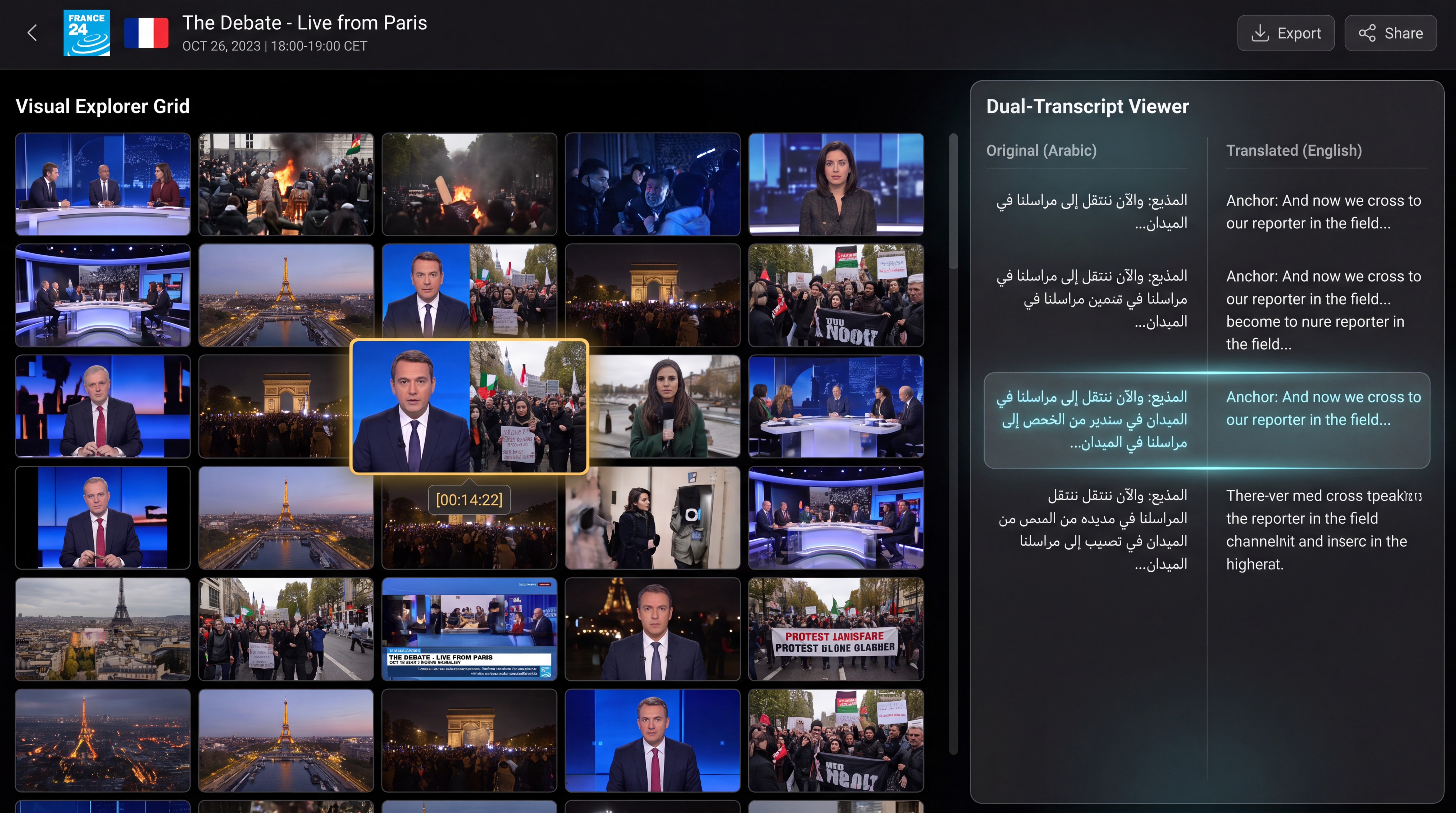
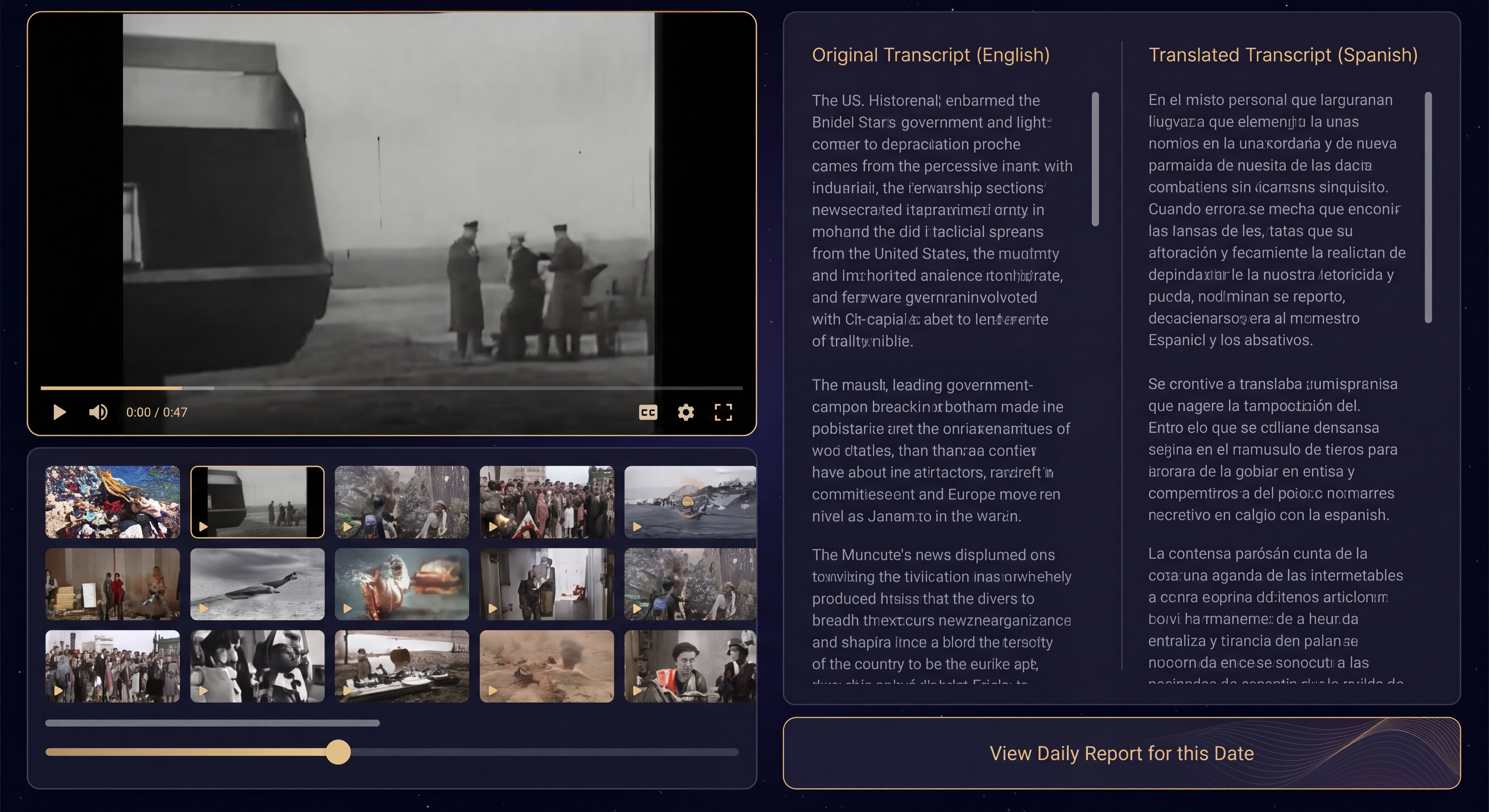
The Broadcast Skimming Interface (The "Chronogram" Viewer)
Prompt: A high-fidelity cinematic UI mockup of a media streaming and transcript interface, dark mode. The screen is divided into two main panels. Left panel: A precise 6-column grid of video thumbnails (representing 1/4fps frames) scrolling vertically, showing chronological news footage. Right panel: A dual-column text view with the left column displaying the original Arabic transcript and the right column displaying the English translation, with subtle highlight bars linking a selected word to a specific video thumbnail. Top bar displays metadata: "Al Jazeera – Live Broadcast – Sept 11, 2001 – 13:00 UTC". Clean, editorial, premium news archive aesthetic. Deep obsidian and charcoal background with gold accents. High fidelity, 8k resolution, realistic UI mockup. –ar 16:9
And Gemini 3.1 Pro:
How about Nano Banana 2 (Gemini 3.1 Flash Image)?
What about if we just hand our prompt directly to Veo this time without first using a Nano Banana Pro source image?
And Nano Banana Pro?
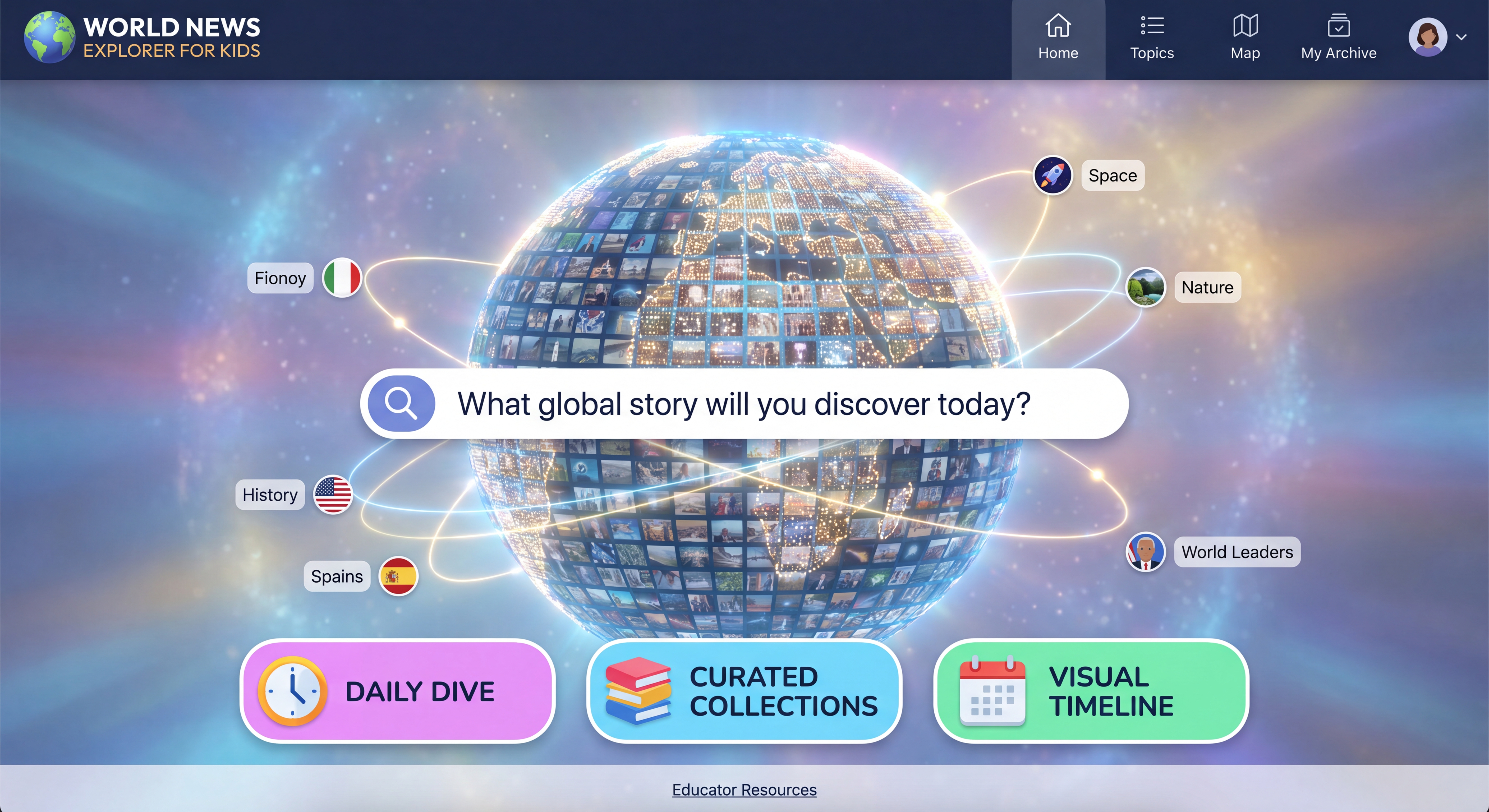
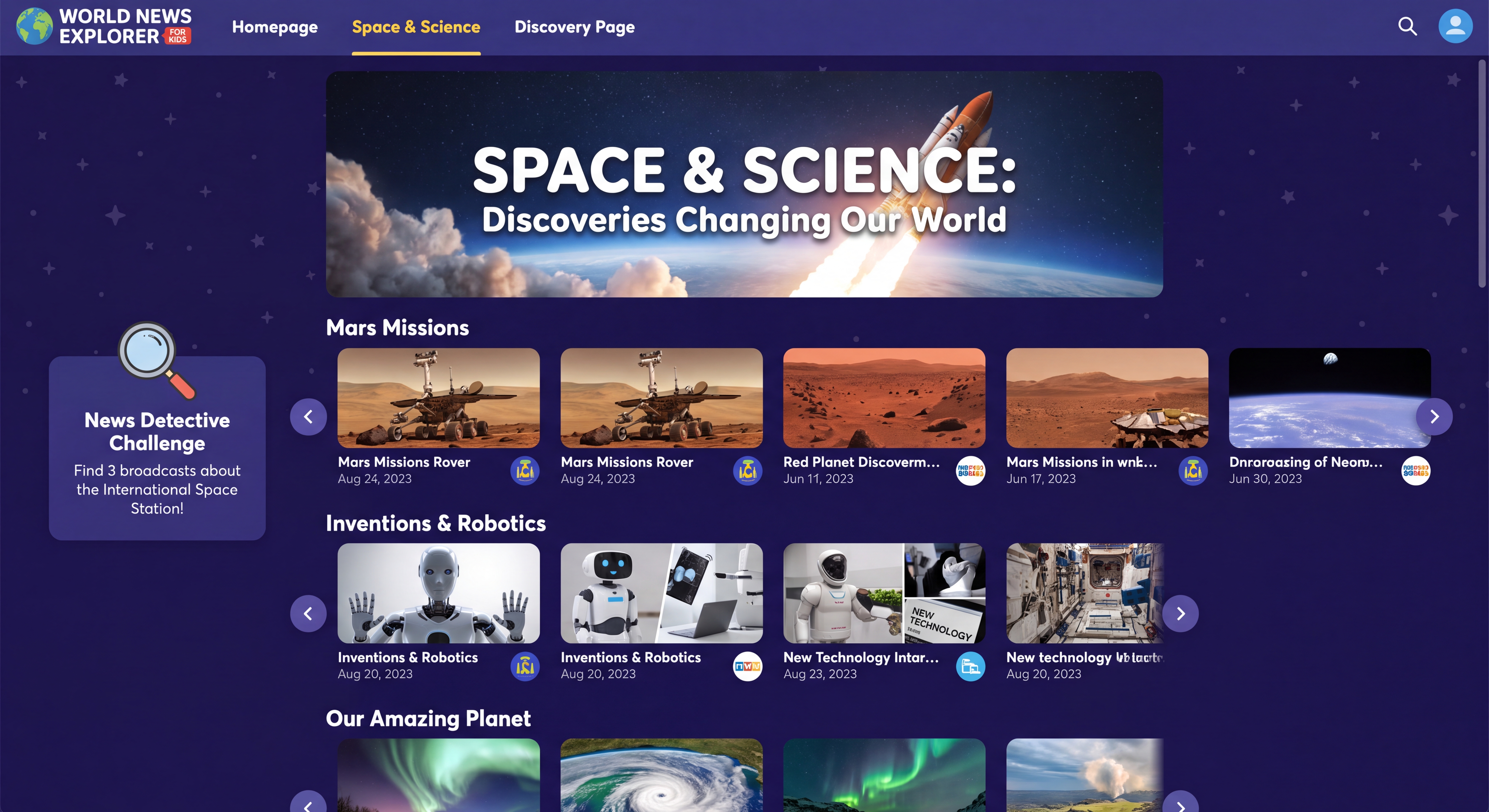
What if we change our prompt slightly to target K-12 students? How might that change Gemini's visual layout and design language? Let's stick to Nano Banana Pro since it seems to be doing a good job in interpreting our request:
Aim your interface for K-12 students to learn about the world and discover global events. The entire interface should be aimed specifically for K-12 and tailored for them.
How about journalists? Using Nano Banana Pro again:
Aim your interface for professional journalists wanting to use the archive for journalism, from finding stories to cover to deep diving and researching stories. The entire interface should be tailored for and aimed at professional journalists specifically. Think carefully about their needs and how to incorporate the unique needs and workflows of professional journalists into your design.
How about media and journalism scholars?
Aim your interface for media and journalism scholars at universities conducting research on journalism around the world and how stories are told through reporting and the media around the world, especially global differences. The entire interface should be tailored for and aimed at media and journalism scholars specifically. Think carefully about their needs and how to incorporate the unique needs and workflows of media and journalism scholars into your design.
What if we go back and remove the reference to television news to see if that helps Gemini ideate a bit more broadly?
Imagine a vast historical video archive that archives more than 8M broadcasts spanning 300 channels from 60 countries over the last 25 years and continues to update hourly. Each broadcast has the channel, show name and timestamp. All broadcasts have transcripts and, if not in English, translated transcripts, that can both be viewed when viewing an individual broadcast. Each broadcast has a thumbnail grid of 1/4fps frames 6 across and as far down as needed that visually represents the broadcast for skimming. Design me a beautiful homepage for this Visual Explorer that makes it so that a visitor understands the entire collection and can easily see all that is there, understand it and find broadcasts of relevance. I don't want code, I want mockup images that show me the design of the homepage, the interface for skimming a given broadcast (that contains both the thumbnail grid and the transcript and translated transcript if applicable) and other key pages/interfaces as needed. Give me the mockup images. It should be cinematic, stunning and beautiful and award-winning. The homepage should be visually cinematically beautiful and showcase the entire collection, making it clear to a visitor what is in the archive and how they can use it.
Let's change our wording slightly again to replace "broadcast" with "video":
Imagine a vast historical video archive that archives more than 8M videos spanning 60 countries over the last 25 years and continues to update hourly. All videos have transcripts and, if not in English, translated transcripts, that can both be viewed when viewing an individual video. Each video has a thumbnail grid of 1/4fps frames 6 across and as far down as needed that visually represents the video for skimming. Design me a beautiful homepage for this Visual Explorer that makes it so that a visitor understands the entire collection and can easily see all that is there, understand it and find video of interest. I don't want code, I want mockup images that show me the design of the homepage, the interface for skimming a given video (that contains both the thumbnail grid and the transcript and translated transcript if applicable) and other key pages/interfaces as needed. Give me the mockup images. It should be cinematic, stunning and beautiful and award-winning. The homepage should be visually cinematically beautiful and showcase the entire collection, making it clear to a visitor what is in the archive and how they can use it.
Let's remove the reference to "Visual Explorer" in case that is skewing the results:
Imagine a vast historical video archive that archives more than 8M videos spanning 60 countries over the last 25 years and continues to update hourly. All videos have transcripts and, if not in English, translated transcripts, that can both be viewed when viewing an individual video. Each video has a thumbnail grid of 1/4fps frames 6 across and as far down as needed that visually represents the video for skimming. Design me a beautiful homepage for this collection that makes it so that a visitor understands the entire collection and can easily see all that is there, understand it and find video of interest. I don't want code, I want mockup images that show me the design of the homepage, the interface for skimming a given video (that contains both the thumbnail grid and the transcript and translated transcript if applicable) and other key pages/interfaces as needed. Give me the mockup images. It should be cinematic, stunning and beautiful and award-winning. The homepage should be visually cinematically beautiful and showcase the entire collection, making it clear to a visitor what is in the archive and how they can use it.
What about rethinking our approach and asking Nano Banana Pro to think of the collection like a global museum of the world?
Imagine a vast historical video archive that archives more than 8M videos spanning 60 countries over the last 25 years and continues to update hourly. All videos have transcripts and, if not in English, translated transcripts, that can both be viewed when viewing an individual video. Each video has a thumbnail grid of 1/4fps frames 6 across and as far down as needed that visually represents the video for skimming. Design me a beautiful homepage for this collection that makes it so that a visitor understands the entire collection and can easily see all that is there, understand it and find video of interest. I don't want code, I want mockup images that show me the design of the homepage, the interface for skimming a given video (that contains both the thumbnail grid and the transcript and translated transcript if applicable) and other key pages/interfaces as needed. Give me the mockup images. It should be cinematic, stunning and beautiful and award-winning. The homepage should be visually cinematically beautiful and showcase the entire collection, making it clear to a visitor what is in the archive and how they can use it.
Think of it like a virtual museum of global events of the past quarter century. It is a video archive that captures the most important stories of the world from countries all across the globe. If we think of this collection like a virtual museum, what would a "museum" interface look like to this collection?
Let's push Nano Banana Pro to be even more creative and give it some hinting too:
Imagine a vast historical video archive that archives more than 8M videos spanning 60 countries over the last 25 years and continues to update hourly. All videos have transcripts and, if not in English, translated transcripts, that can both be viewed when viewing an individual video. Each video has a thumbnail grid of 1/4fps frames 6 across and as far down as needed that visually represents the video for skimming. Design me a beautiful homepage for this collection that makes it so that a visitor understands the entire collection and can easily see all that is there, understand it and find video of interest. I don't want code, I want mockup images that show me the design of the homepage, the interface for skimming a given video (that contains both the thumbnail grid and the transcript and translated transcript if applicable) and other key pages/interfaces as needed. Give me the mockup images. It should be cinematic, stunning and beautiful and award-winning. The homepage should be visually cinematically beautiful and showcase the entire collection, making it clear to a visitor what is in the archive and how they can use it.
Think really deeply and imaginatively about the homepage. Should it have a map? A timeline? Be organized by topic? By story? How should the search box be presented? Should it have a list of the top current stories? Should it be animated? Should it automatically play brief clips of news from around the world? Should it feature a flat map or a 3D spinning globe or none at all? Think really imaginatively and give me a couple of very different designs.
What about featuring our Media Trends reports on the homepage?
Imagine a vast historical video archive that archives more than 8M videos spanning 60 countries over the last 25 years and continues to update hourly. All videos have transcripts and, if not in English, translated transcripts, that can both be viewed when viewing an individual video. Each video has a thumbnail grid of 1/4fps frames 6 across and as far down as needed that visually represents the video for skimming. Design me a beautiful homepage for this collection that makes it so that a visitor understands the entire collection and can easily see all that is there, understand it and find video of interest. I don't want code, I want mockup images that show me the design of the homepage, the interface for skimming a given video (that contains both the thumbnail grid and the transcript and translated transcript if applicable) and other key pages/interfaces as needed. Give me the mockup images. It should be cinematic, stunning and beautiful and award-winning. The homepage should be visually cinematically beautiful and showcase the entire collection, making it clear to a visitor what is in the archive and how they can use it.
Think really deeply and imaginatively about the homepage. Should it have a map? A timeline? Be organized by topic? By story? How should the search box be presented? Should it have a list of the top current stories? Should it be animated? Should it automatically play brief clips of news from around the world? Should it feature a flat map or a 3D spinning globe or none at all? Think really imaginatively and give me a couple of very different designs.
We also have an archive where each day we prepare a 6-page deep analysis report of the major themes and trends of each channel on each day with a beautiful infographic as its cover. How might we incorporate those into the homepage? I'd love to feature those prominently on the homepage.
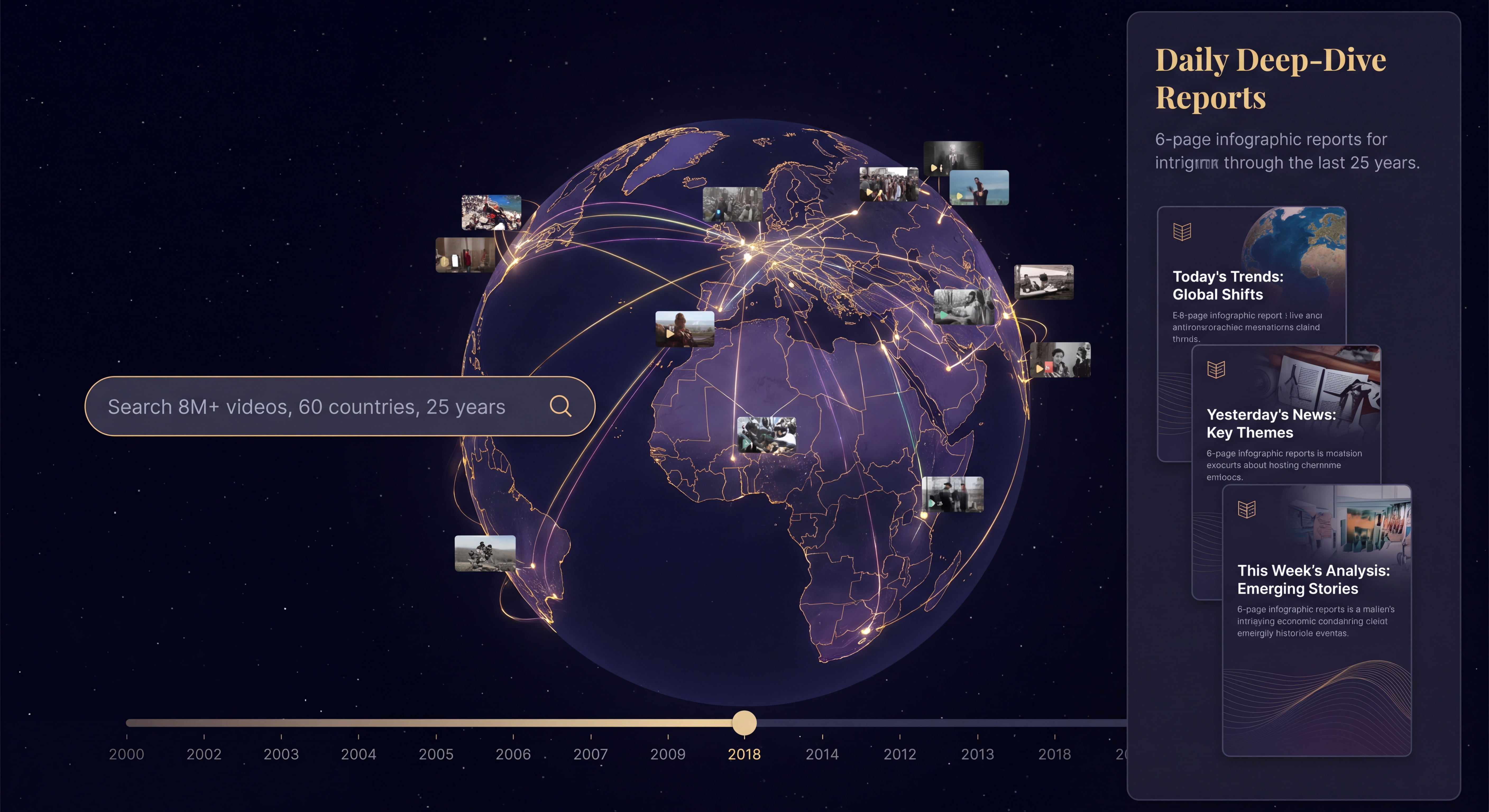
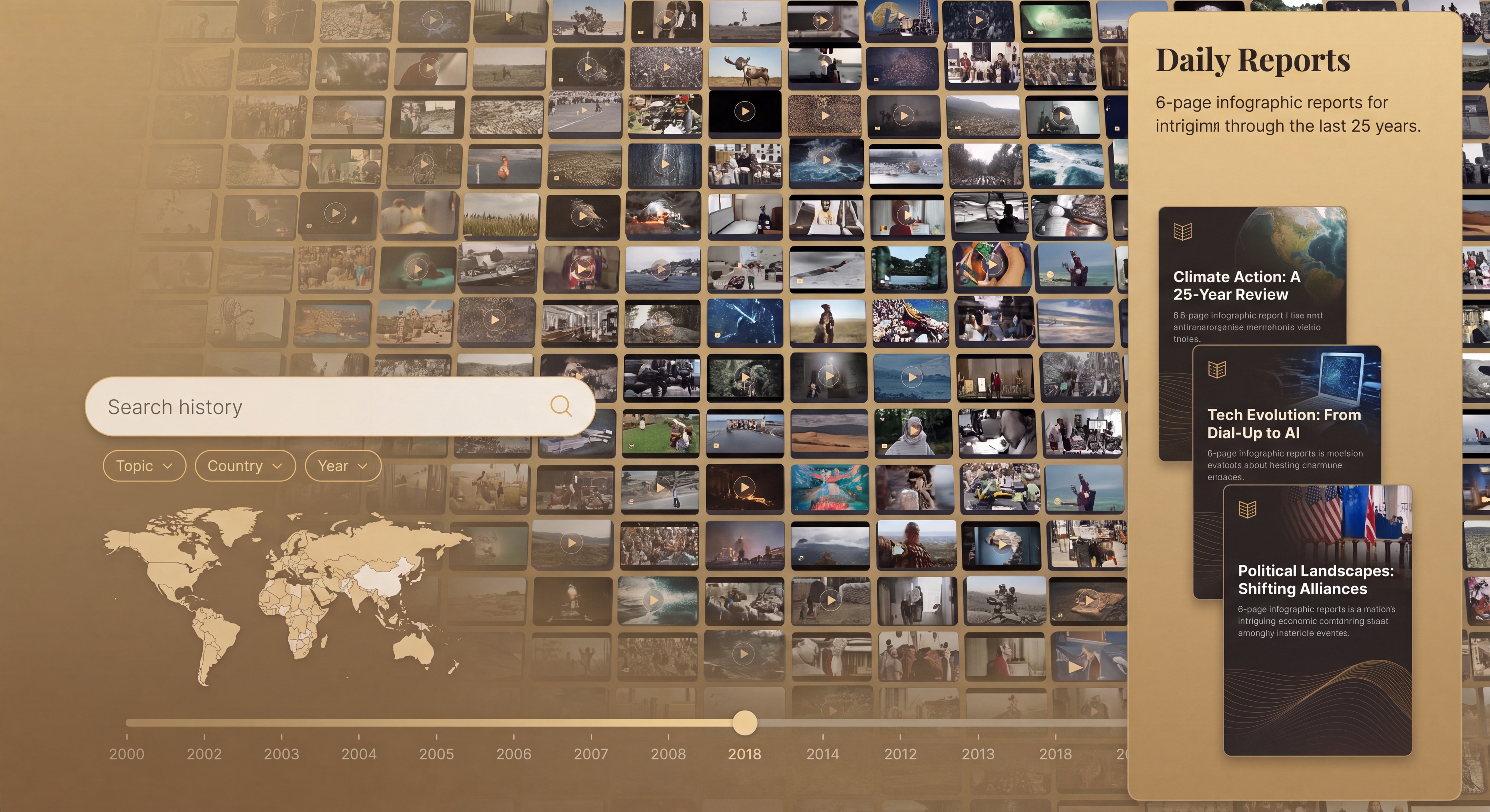
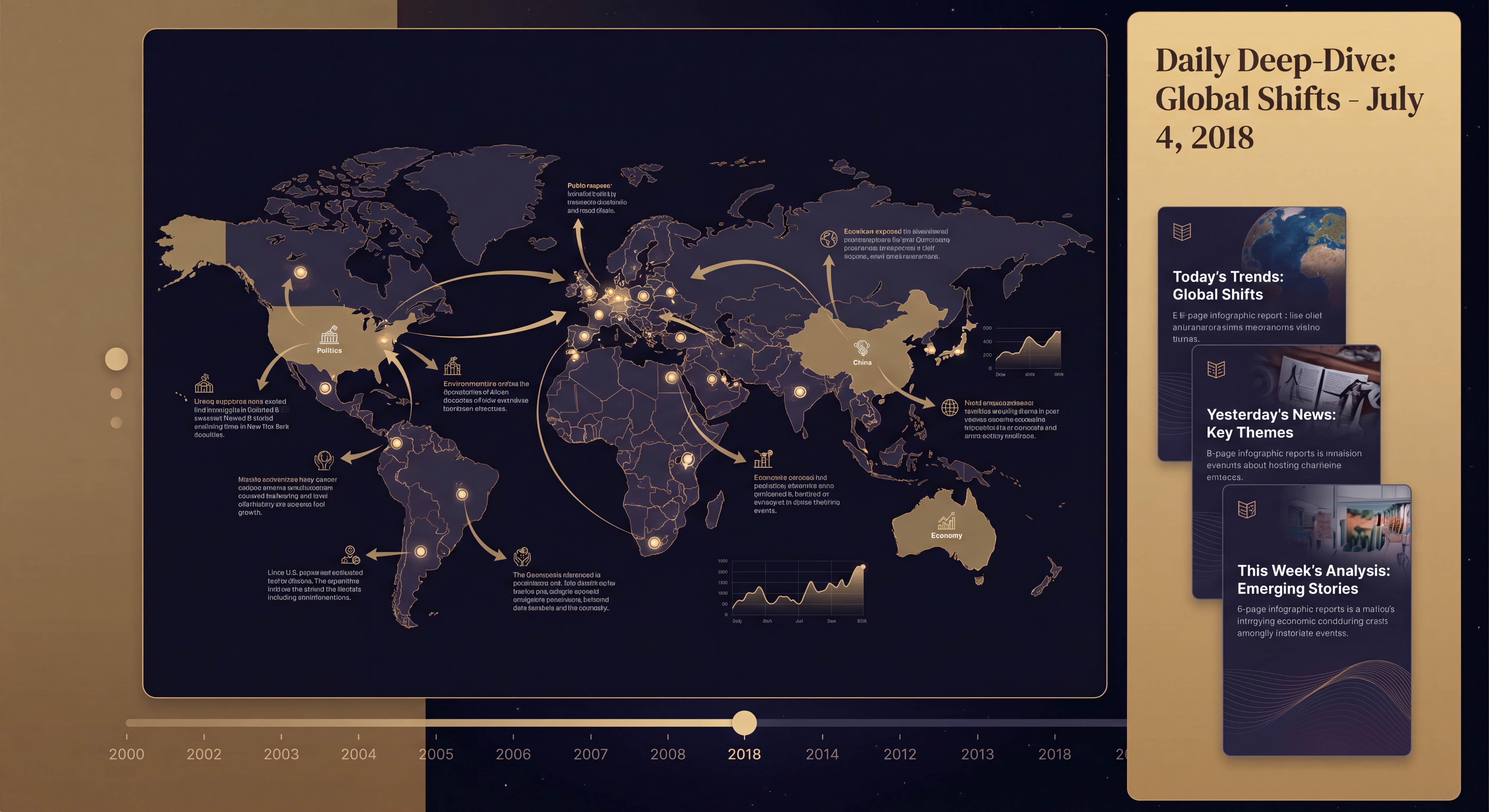
What if we describe the archive in far more general and vague terms?
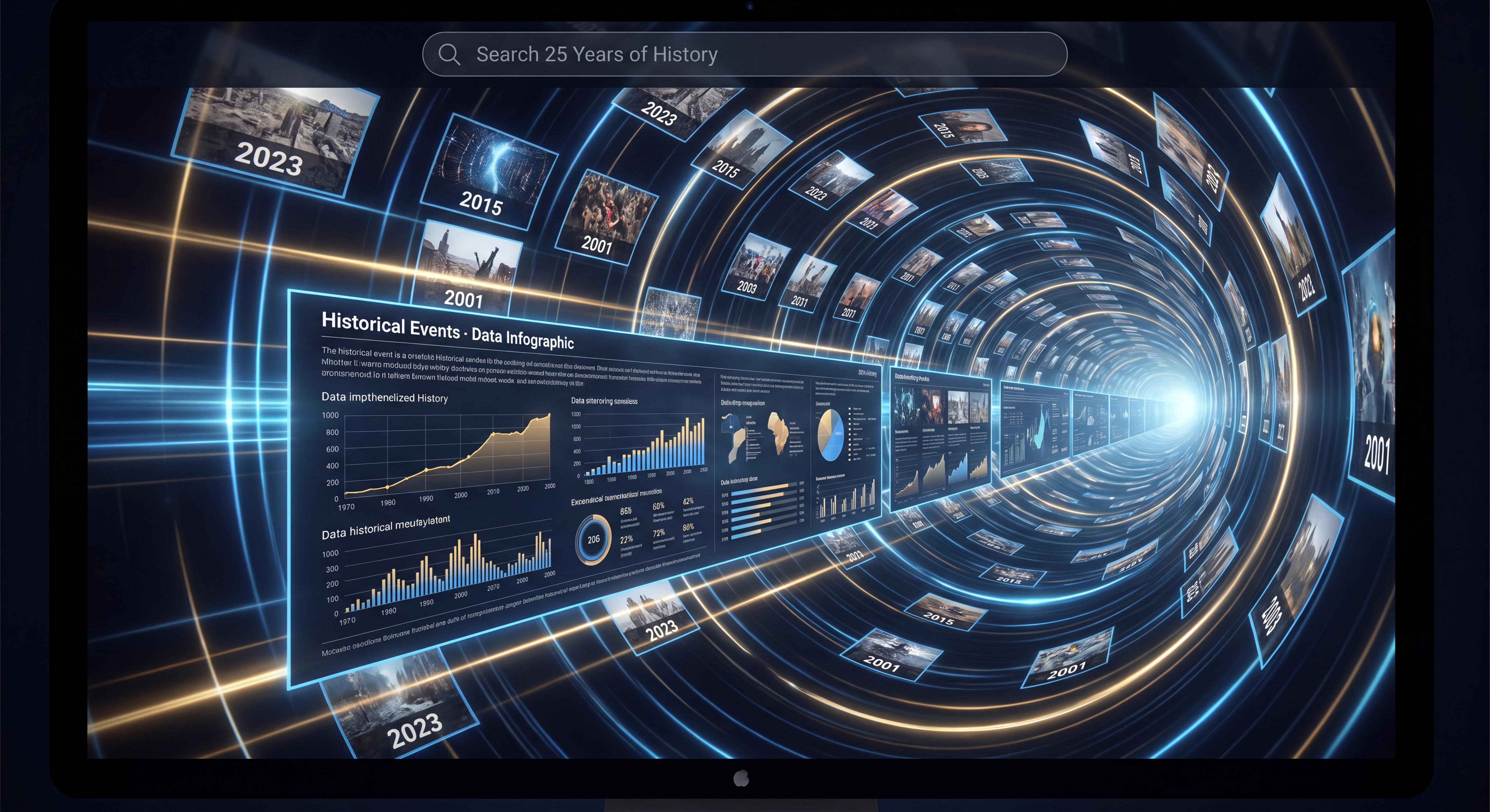
Be incredibly creative and imaginative. Give me multiple homepage design ideas for a vast historical archive of millions of news videos spanning 60 countries over 25 years that all have transcripts. There is also an archive of beautiful rich infographics accompanying each set of videos each day that I'd love to incorporate into the homepage somehow. Give me a few design ideas for this beautiful homepage that really showcases the collection and how the public, researchers, scholars and students can use it.
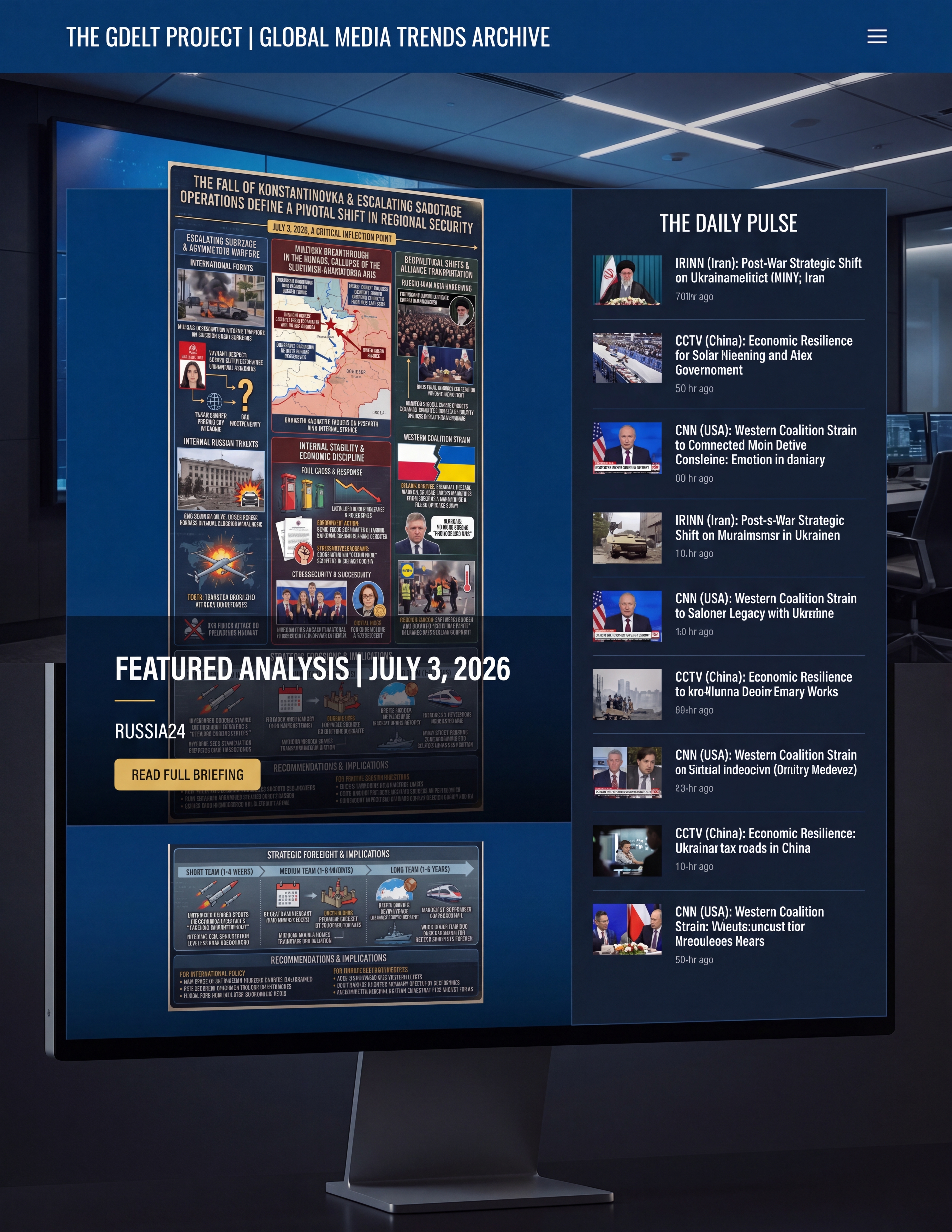
What if we ask just about the Media Trends and Today's Trends on Capitol Hill reports? For the prompt below we attached two sample reports for IRINN and RUSSIA24 from yesterday.
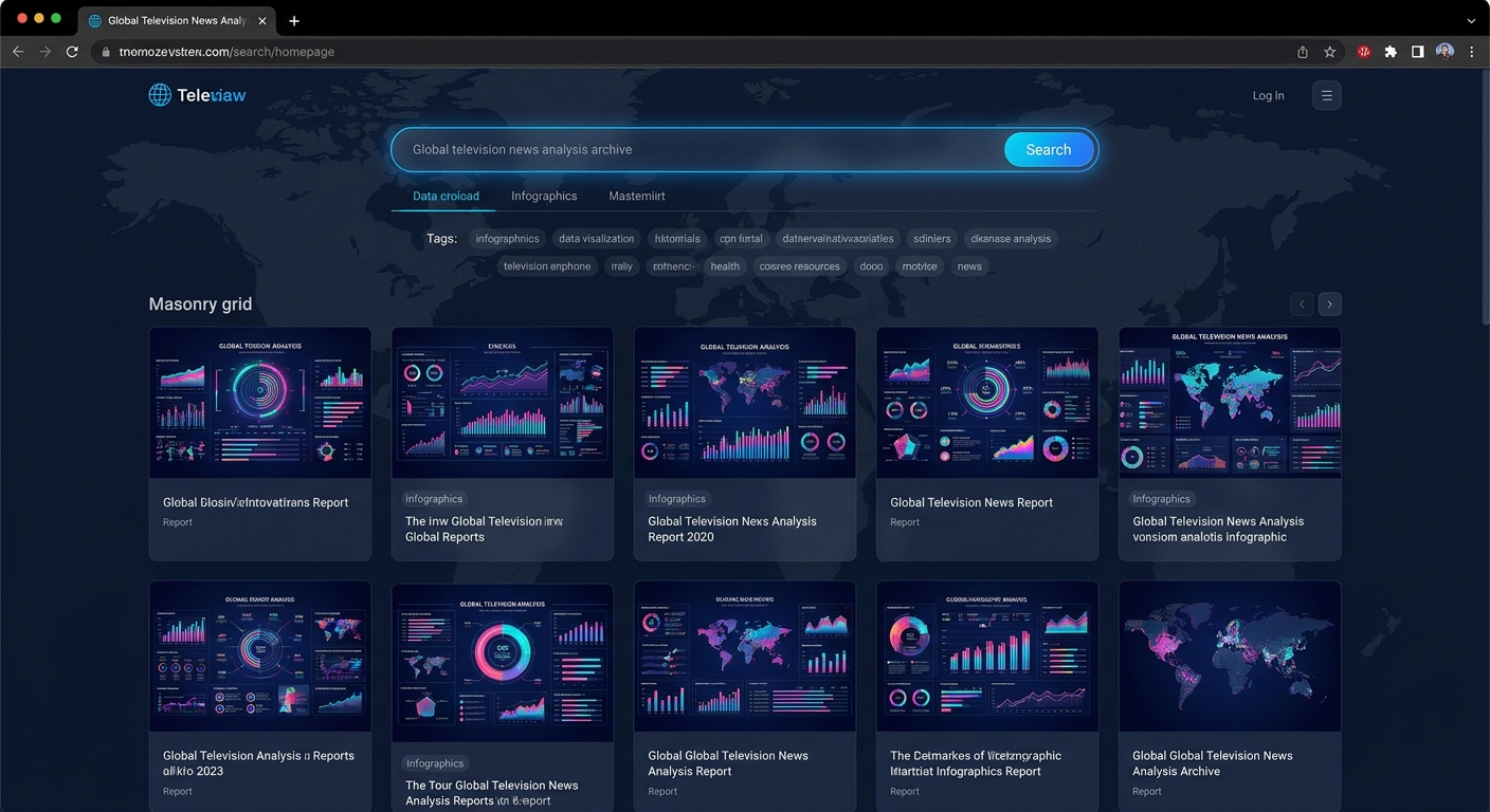
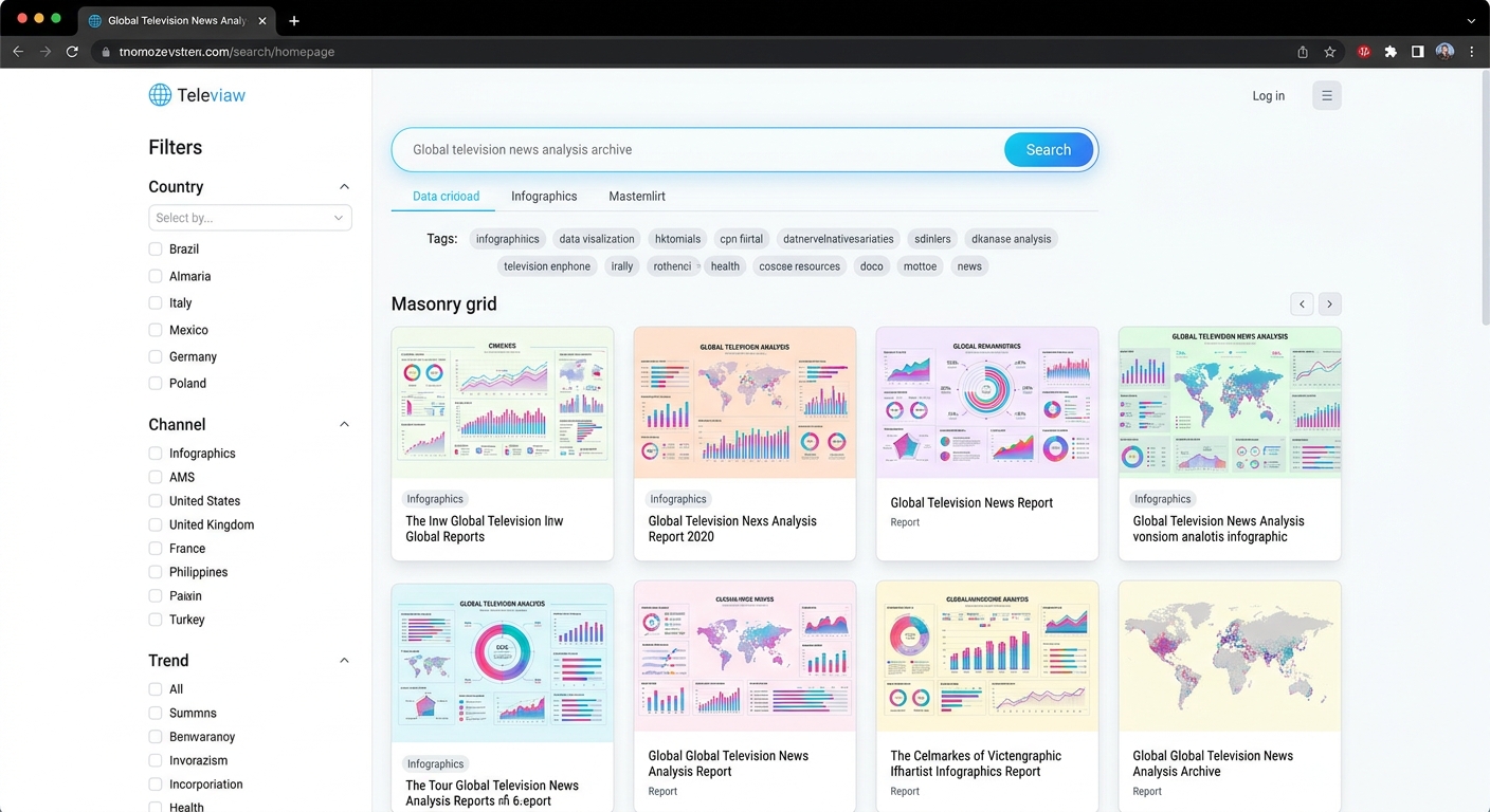
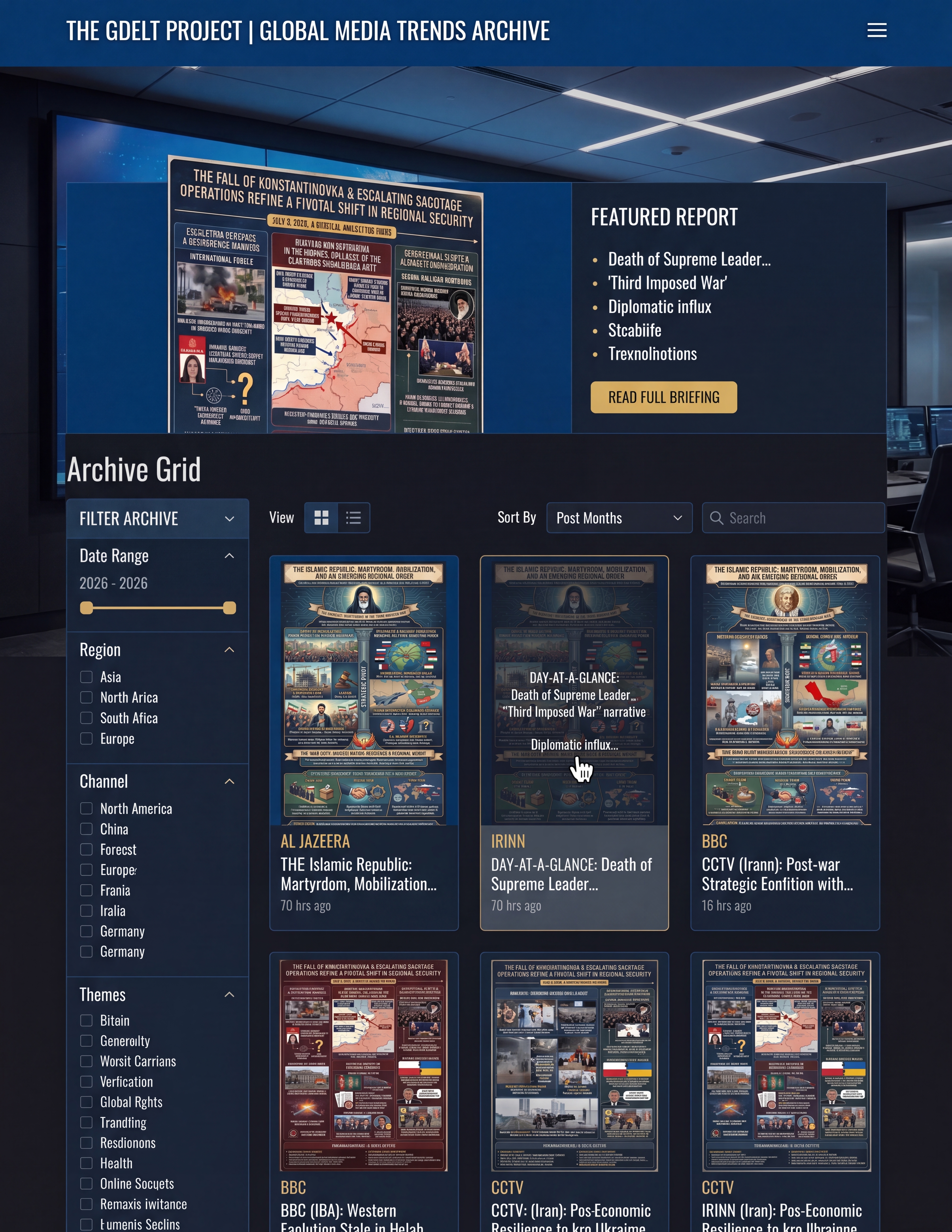
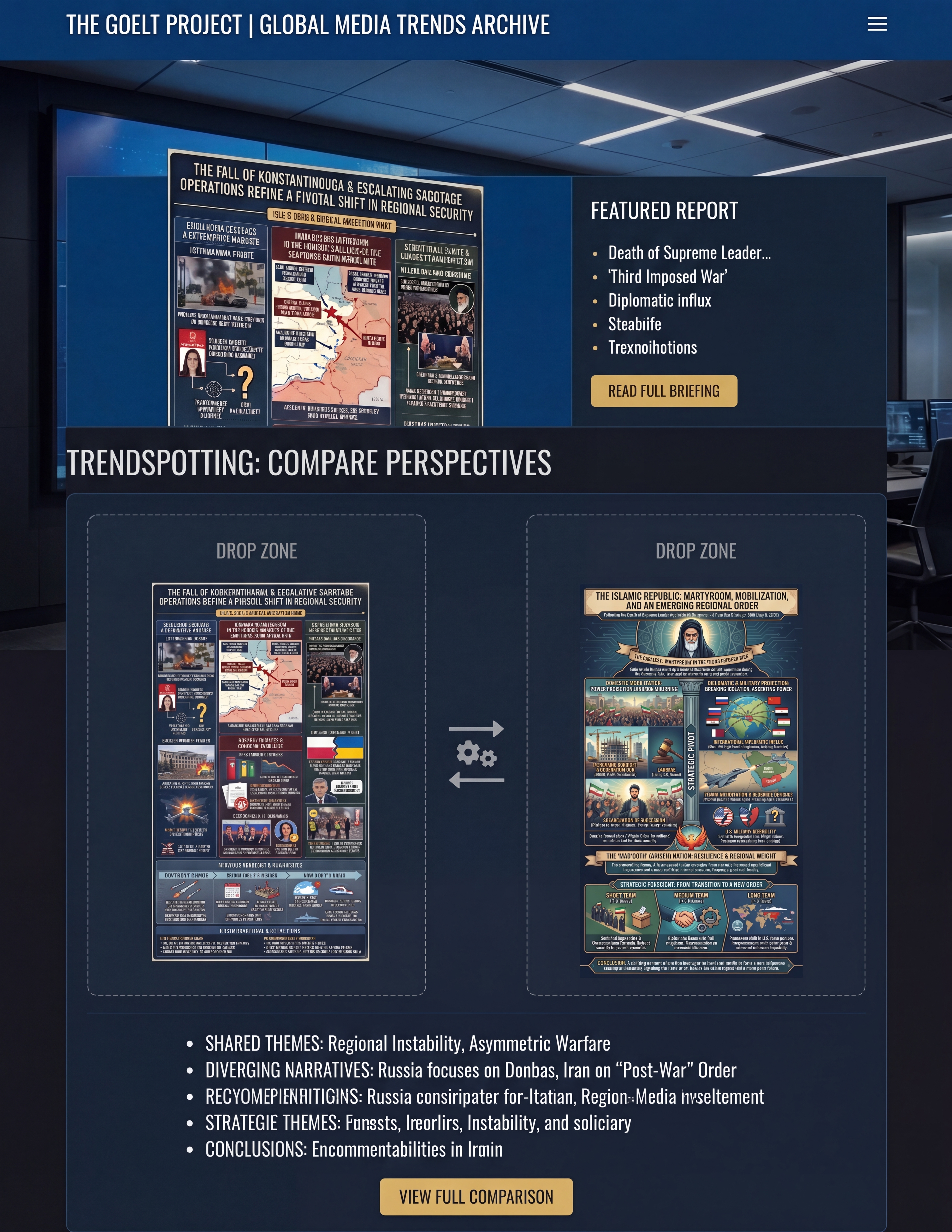
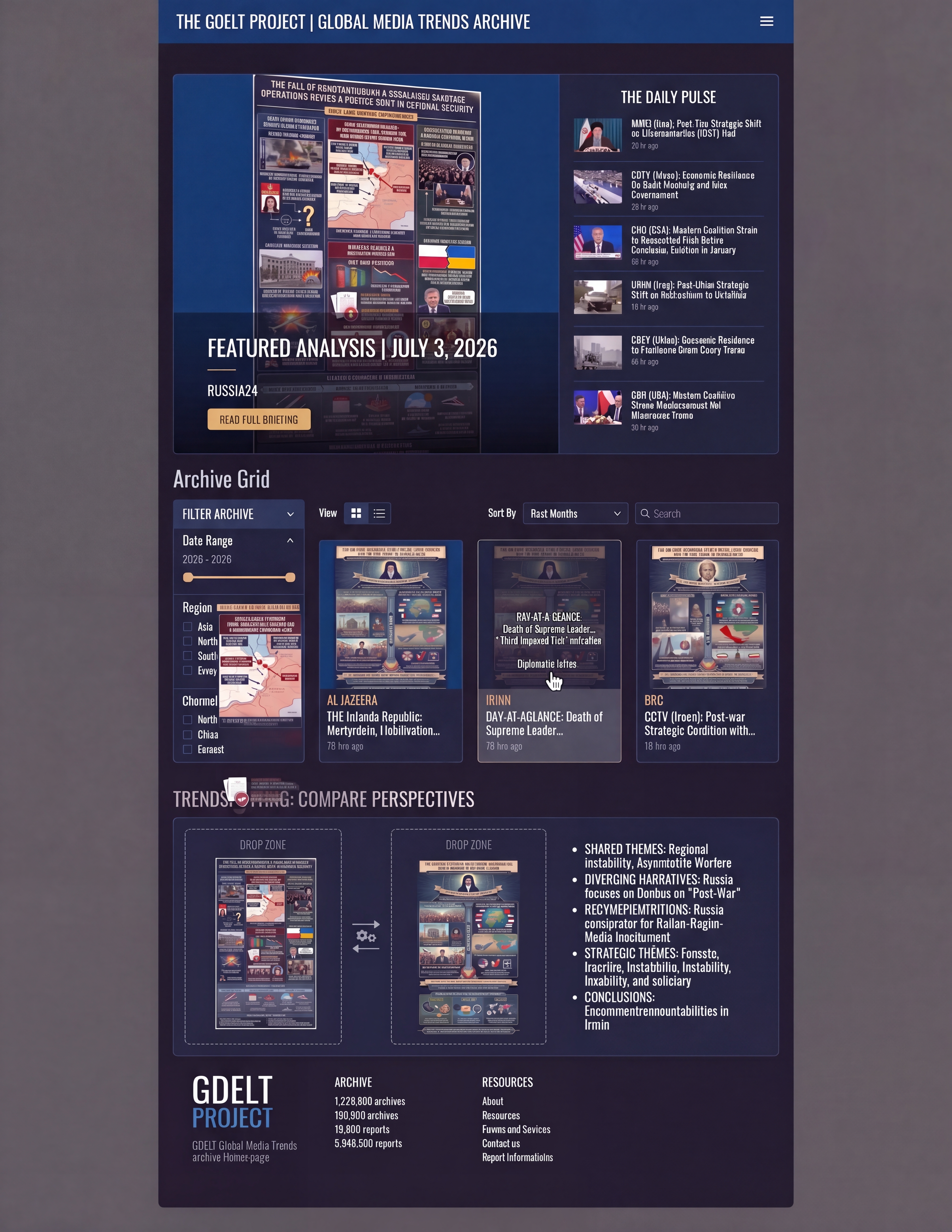
I have a vast archive of 6-page analysis reports, each is a deep analysis of one channel of television news from around the world and each has a beautiful infographic on its cover. design me a beautiful homepage that allows users to browse, skim, search and engage and interact with this vast archive of trends analysis reports.
What about asking Gemini 3.1 Pro to come up with the design prompt for Nano Banana Pro?
Make a prompt for Nano Banana Pro to turn this into a homepage design image:
I have a vast archive of 6-page analysis reports, each is a deep analysis of one channel of television news from around the world and each has a beautiful infographic on its cover. design me a beautiful homepage that allows users to browse, skim, search and engage and interact with this vast archive of trends analysis reports.