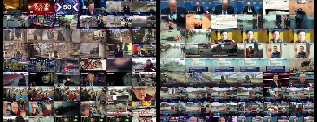
Continuing our series on algorithmic thumbnail selection for visual summarization of television news broadcasts, perhaps the most important question is why we are interested in revisiting thumbnail selection when our existing 1/4fps fixed sampling approach used by the Visual Explorer to create its thumbnail grids has worked so successfully? The reason is that we want to reimagine how we create the single-frame representative thumbnail images that are used on the Visual Explorer homepage to represent each broadcast. The existing approach of selecting a fixed frame at around the one minute mark for each broadcast yields an image that is simply too unrepresentative of most broadcasts and in worse cases, uniform across all broadcasts on a given channel. Could we use algorithmic thumbnail selection to create a better, more representative, image for each broadcast? Specifically, what if instead of selecting a single image to represent each broadcast, we created a montage thumbnail of 9, 12 or 16 frames?
The end result is that these montages are vastly more reflective of the underlying broadcasts. Moreover, while our fixed 1/4fps Visual Explorer sampling strategy is optimized for understanding the overall visual arc of the broadcast, algorithmic selection offers better results when selecting just a handful of frames to represent an entire broadcast in a single montage image.
Let's start with this circa-2010 evening news broadcast:
Square 9-image grid:
Rectangular 12-image grid:
Square 16-image grid:
Of course, in real life these grids would be displayed at thumbnail resolution. Here are the 200 and 100 pixel results from using a single keyframe thumbnails. These do a terrible job of capturing the overall broadcast's gist:
For the grids, let's start with their 200-pixel versions, which do a much better job of reflecting the overall arc of the broadcast:
And at 150 pixels to see how much the interpretability degrades as we reduce the size:
And at 100 pixels, which is the current resolution used on the Visual Explorer homepage:
How about this recent CNN broadcast? Here are the 200 and 100 pixel results from using a single keyframe thumbnails. Only a quarter of the broadcast centers on crowd shots, with the rest centering on in-studio discussions:
Here are the 200 pixel versions, which better reflect this overall mix:
And the 100 pixel versions:
Contrast with this MSNBC broadcast and the 200 and 100 pixel results from using a single keyframe thumbnails. Note how these center on a rally, which is not indicative of the overall broadcast:
And the montage 200 pixel versions, which do a much better job of capturing the overall in-studio discussion gist of the broadcast:
And the 100 pixel versions:
How about this Chinese broadcast? Here are the 200 and 100 pixel results from using a single keyframe thumbnails:
The 200 pixel images:
The 100 pixel images:
