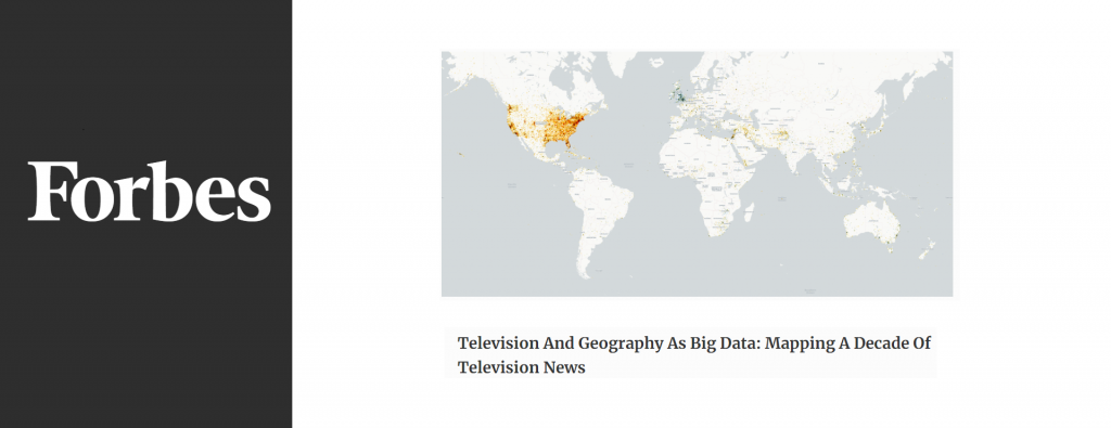
When we begin to think of television as data and geography as a lens through which to explore it, we are able to “see” the news in an entirely new light. What does it look like to visualize a decade of CNN, Fox News and MSNBC television news coverage and compare it to BBC News?
Television And Geography As Big Data: Mapping A Decade Of Television News