
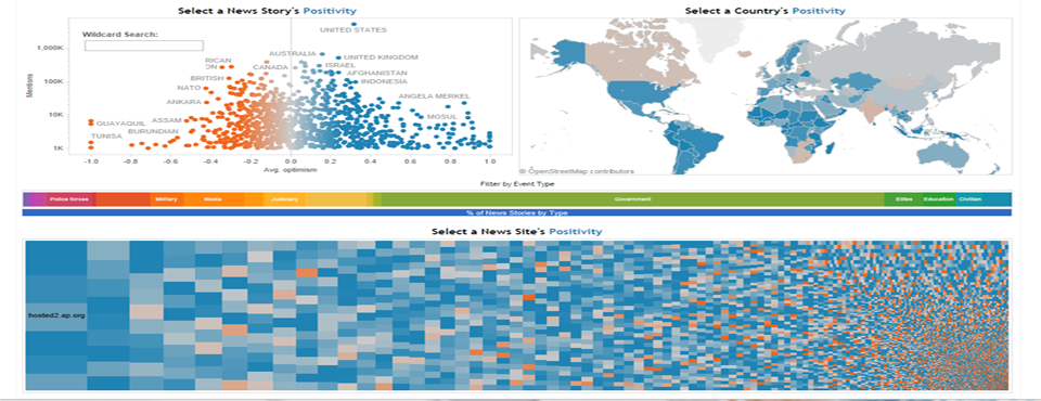
Another exciting entry is last week's Tableau 2015 Iron Viz Championship at the MGM Grand was a dashboard by Skyler Johnson that focused on the emotional dimension of events, allowing you to select an actor, country, news source, or combination therein to explore the world's events through the lens of how positive or negative they are. You can access the interactive dashboard yourself and experiment.
The main dashboard opens with a scatterplot of actors by number of mentions and average tone:
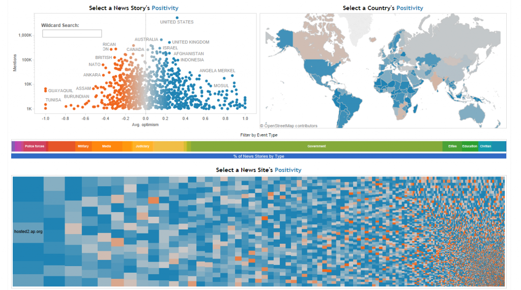

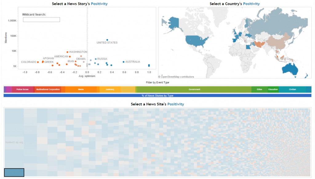
You can click on a given news outlet in the gridded heatmap at bottom to narrow the display to just those major actors and countries mentioned in coverage from that outlet, averaged by emotion. Here we see the Washington Post:

This dashboard offers a powerful lens to invert how we think about events to see them through their emotional framing and how different news outlets frame the world.