
The timeline below shows the number of seconds per hour by day on CNN over the course of this year in which it displayed its COVID-19 infections/death dashboard.
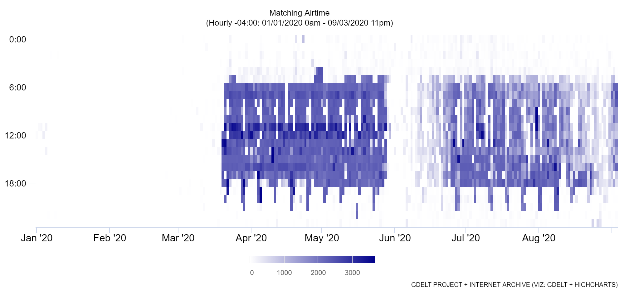
The timeline below shows the number of seconds per hour by day on CNN over the course of this year in which it displayed its COVID-19 infections/death dashboard.