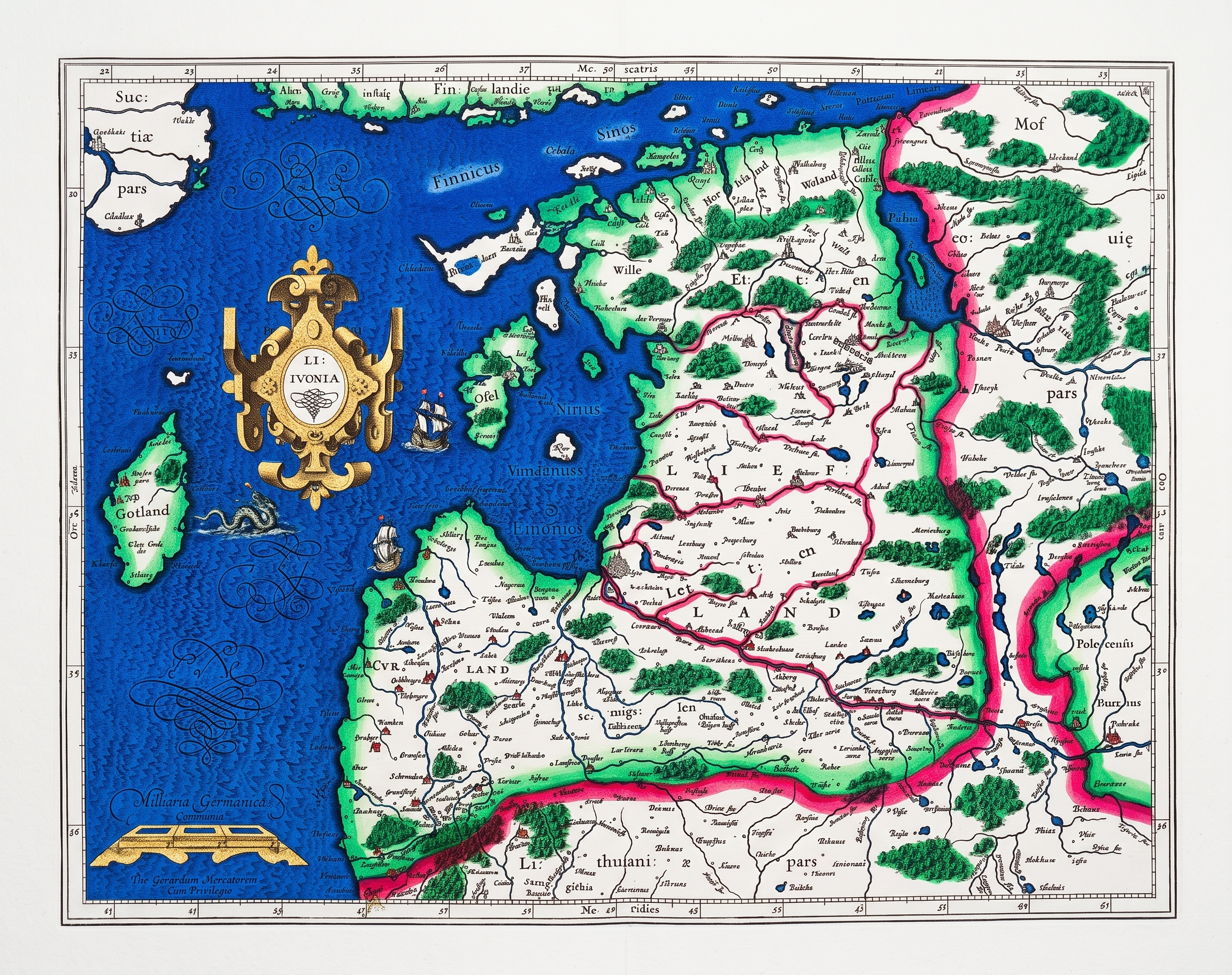
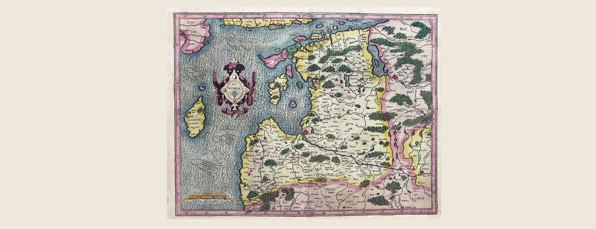
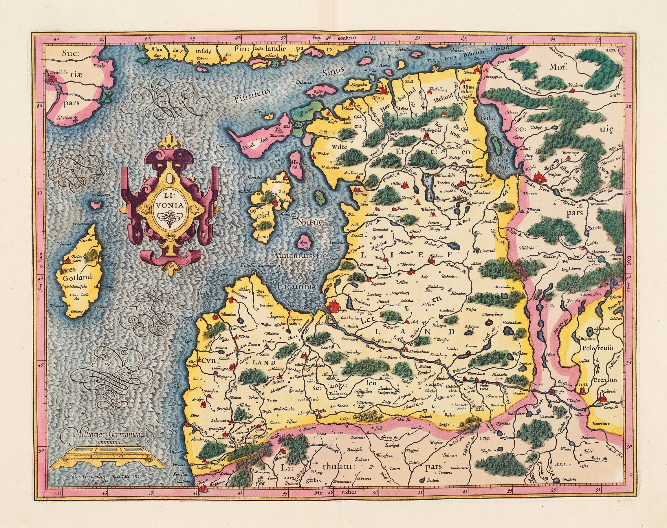
One of the signatures of The Collection's Estonian holdings is this exceptionally rare 1607 gilded Mercator map of Estonia, believed to be a royal presentation edition. As Gemini Deep Research's assessment of its contemporary hand coloring and gold heightening notes, the specific materials used to color Dutch maps of its era are known to fade over the centuries and thus the map seen today is almost certainly a faint shadow of its brilliantly vivid initial coloring. Can we use Gemini to estimate how each color and region of the map is most likely to have faded over the past 400 years and walk backwards to create a digital restoration that shows how it originally looked? Here we test Nano Banana Pro, Nano Banana 2, ChatGPT, Gemini 3.1 Pro + Nano Banana 2 and Gemini Deep Research + Nano Banana 2. The results below suggest that general purpose models aren't yet capable of this kind of autonomous arbitrary damage assessment and digital restoration, though the images below offer fascinating glimpses into how the map might have looked. Overall this suggests that specialized restoration models are still superior at this time.
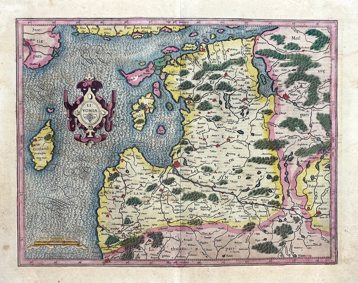
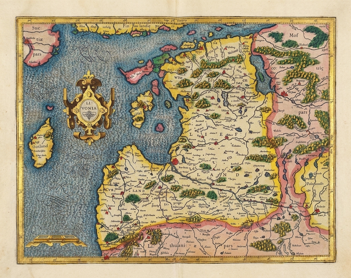
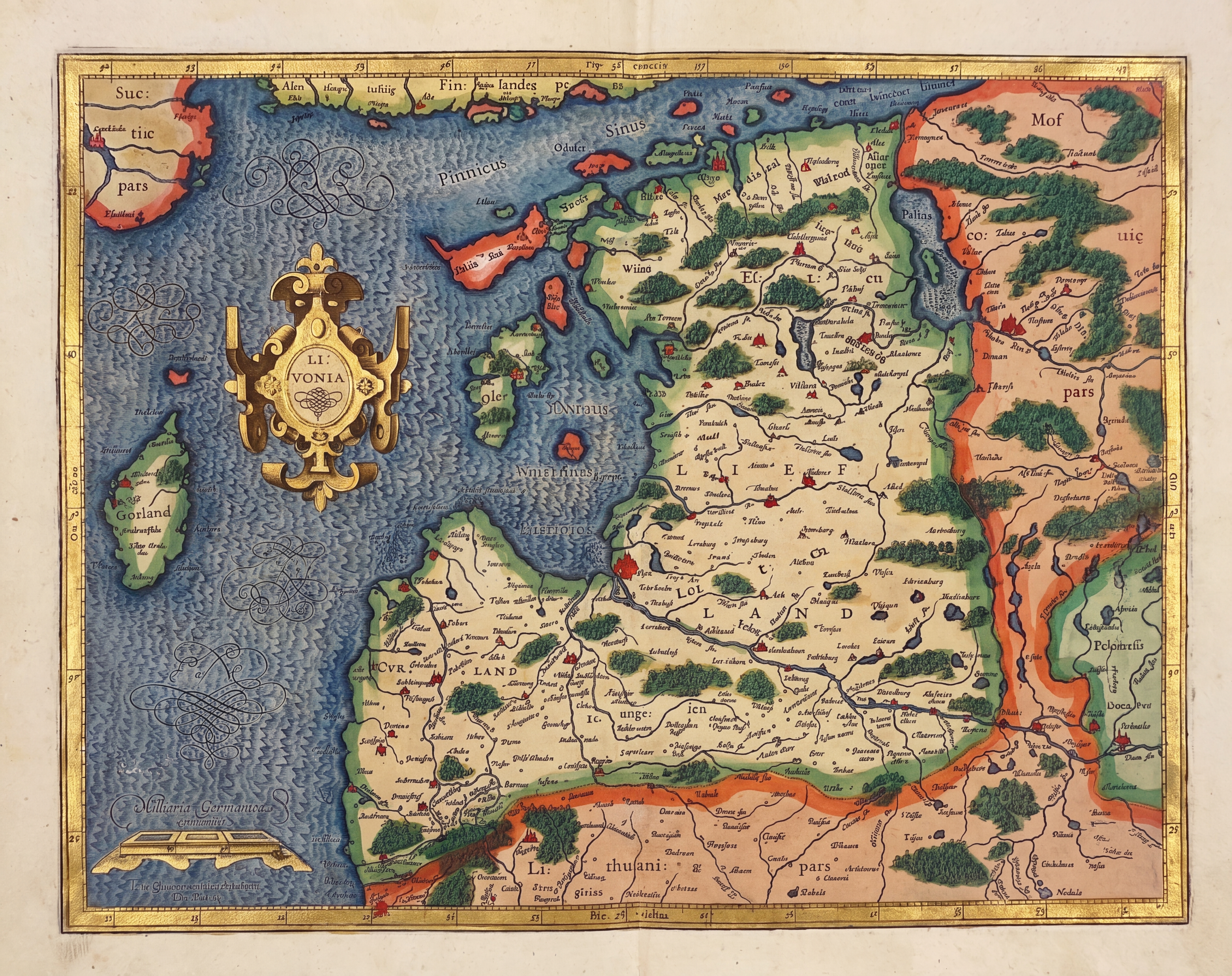
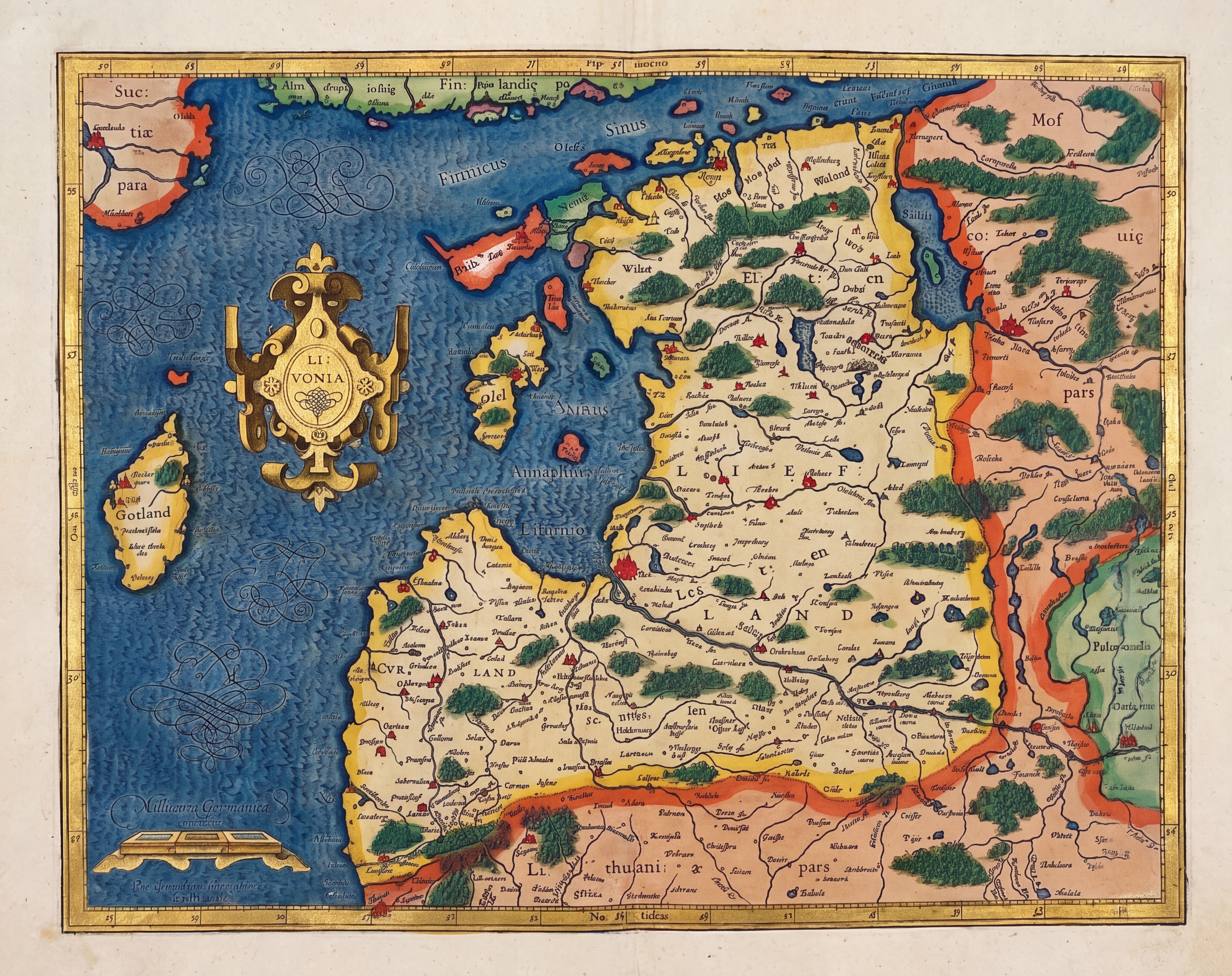
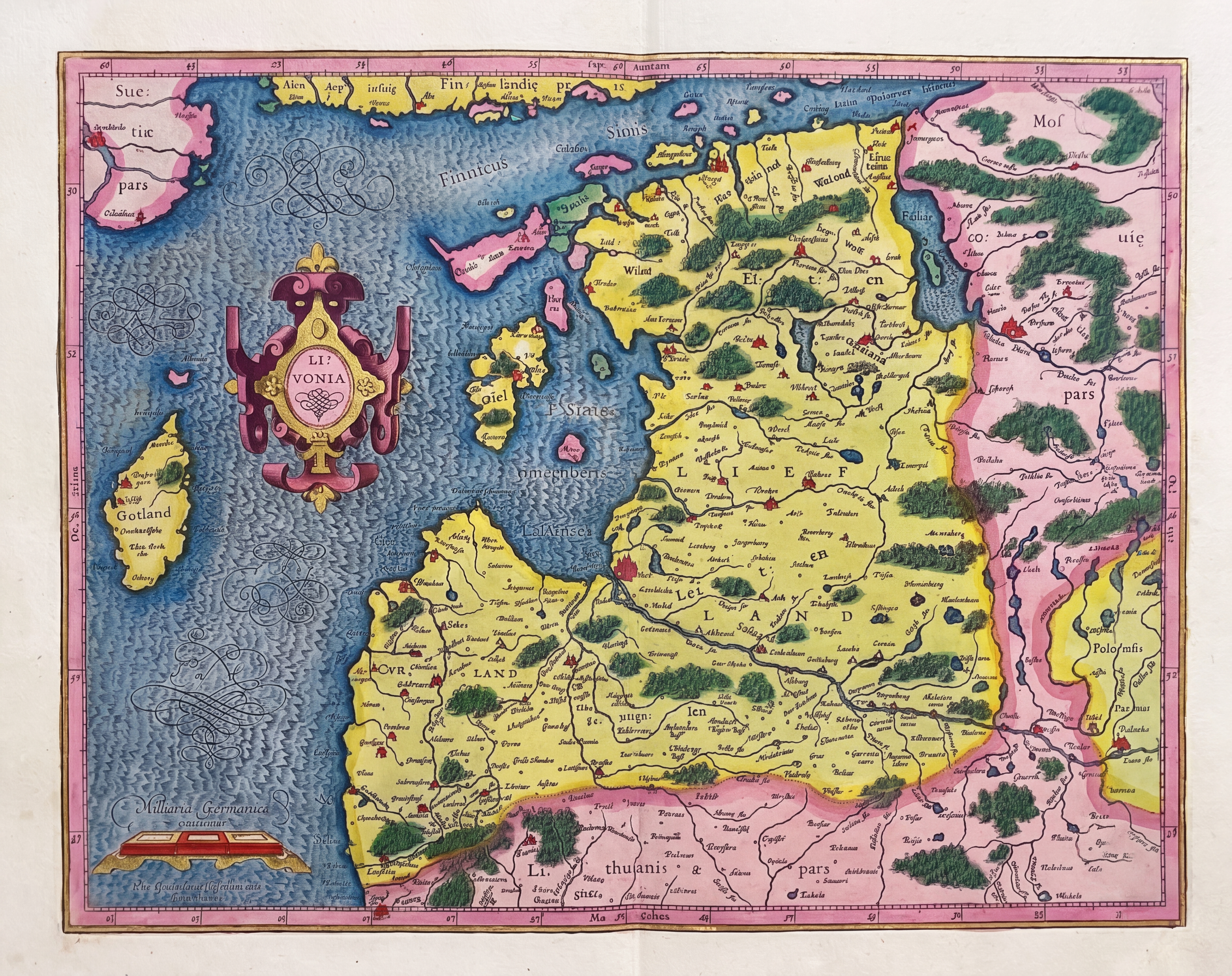
Let's start with a simply prompt telling Gemini what the map is and asking it to restore it to its original colors. Unfortunately, as seen below, Gemini largely maintains the faded look of the map and simply changes several of the colored areas like the border and cartouche into gold. Interestingly, when we run it multiple times (each in a separate fresh session), we can see how unstable Gemini's recoloring is, with the coloring changing considerably with each run.
This is a 1607 gilded Mercator map of Estonia that has faded over time. Using your knowledge of the techniques, paints and materials used to color Mercator maps of this era, restore this map to make it look like it originally did when it was first produced. Do not change the map in any way other than to restore it to how it looked when it was created.
How about just this?
Brighten and restore the faded colors on the 1600s map.
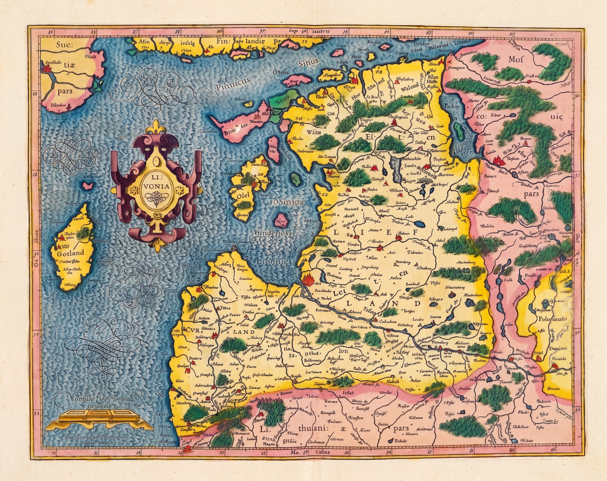
What about asking Gemini 3.1 Pro to write instructions for Nano Banana Pro?
This is a 1607 gilded Mercator map of Estonia that has faded over time. Using your knowledge of the techniques, paints and materials used to color Mercator maps of this era, give me the step-by-step precise instructions for an AI model to restore this map to make it look like it originally did when it was first produced.
Which resulted in this prompt:
Follow the instructions below to restore this map to its original state when it was created.

To restore this 1607 Mercator/Hondius map of Livonia (modern-day Estonia and Latvia) to its original, freshly produced appearance, an AI model needs instructions that reverse the specific chemical and environmental aging processes of 17th-century materials.
Maps from this era were printed using copperplate engraving on rag paper and hand-colored using specific historical pigments bound in gum arabic (watercolor).
Here is the step-by-step technical prompt guide to feed into an AI image-to-image or restoration model:
Phase 1: Substrate and Line Art Restoration
The goal is to fix the degradation of the paper and ink.
Step 1: Paper De-aging (Reverse Foxing and Oxidation)
AI Instruction: Isolate the unpainted background paper. Remove the uneven brownish-yellow mottling (foxing) and age spots. Shift the base color from oxidized brown to a pristine, warm off-white or pale cream, simulating freshly pressed 17th-century linen/cotton rag paper. Retain the subtle, fibrous texture of laid paper.
Step 2: Ink Re-blackening (Reverse Iron Gall Fading)
AI Instruction: Target all engraved line art, text, and cross-hatching. The current faded sepia/brown ink must be darkened to a rich, crisp, opaque carbon black or deep iron-gall black.
AI Instruction: Enhance the high-frequency details (micro-contrast) to replicate the sharp, embossed edges characteristic of fresh copperplate intaglio printing.
Phase 2: Pigment Re-saturation and Hue Correction
The goal is to reverse the fading and shifting of historical watercolors.
Step 3: Ocean and Water Bodies (Restore Azurite/Indigo)
Historical Context: Water was often washed with Azurite or diluted Indigo, which fades to a dull, dusty grey-blue over time.
AI Instruction: Mask the oceans and lakes. Shift the dull blue to a vibrant, translucent, slightly powdery Azurite blue (a rich mid-tone blue with a very slight greenish undertone). Ensure the color looks like a watercolor wash, with natural, slight pooling at the engraved borders of the coastlines.
Step 4: Topography and Forests (Restore Verdigris/Sap Green)
Historical Context: Greens were typically made from Verdigris (copper-based) or Sap Green. Verdigris browns over time, and sap green fades to pale yellow.
AI Instruction: Target the faded olive/yellowish trees and regional green borders. Shift these to a vibrant, saturated copper-green (emerald or malachite hue). Retain the watercolor transparency so the black engraved tree symbols underneath remain clearly visible.
Step 5: Borders and Territories (Restore Vermilion, Carmine, and Gamboge)
Historical Context: Reds (Carmine, Vermilion) fade to pale pink or brown. Yellows (Gamboge, Orpiment) lose their luster and become dusty ochres.
AI Instruction (Reds/Pinks): Isolate the pale pink regions (like the area labeled "Polo cenfis pars" on the right). Deepen this to a rich, vibrant Carmine rose or striking Vermilion (red-orange).
AI Instruction (Yellows): Isolate the dull yellow regions (like "Sue: pars" top left). Brighten to a luminous, warm golden-yellow (Gamboge), ensuring the wash looks even but hand-applied.
Phase 3: The Cartouche and Gilding
The goal is to restore the luxury "gilded" elements that define high-end Mercator atlases.
Step 6: Cartouche and Scale Bar Restoration
AI Instruction: Target the main title cartouche ("LIVONIA") and the distance scale at the bottom left ("Milliaria Germanica communia"). Clean up the contrasting jewel-tone colors (deep purples/reds) within the scrollwork.
Step 7: Simulate Gold Leaf (Gilding)
Historical Context: "Gilded" maps used actual shell gold (powdered gold mixed with binder) or gold leaf applied over a raised red clay base (bole), which gave it a metallic sheen.
AI Instruction: Apply metallic specular highlights to the yellow framing of the cartouche, the scale bar, and the compass points. Generate dynamic lighting reflections to simulate the metallic sheen of genuine 22-karat gold leaf. The gold should look solid, slightly raised, and luminous against the matte watercolor of the map.
Phase 4: Final Cohesion and Texture
Step 8: Hand-Painted Aesthetic Override
AI Instruction: Apply a global style pass to ensure the image does not look like a modern digital vector graphic. Maintain the aesthetic of human-applied 17th-century wash techniques—including slight color bleed over the engraved lines, minor brushstroke textures, and variations in pigment density (transparency) across large regions.
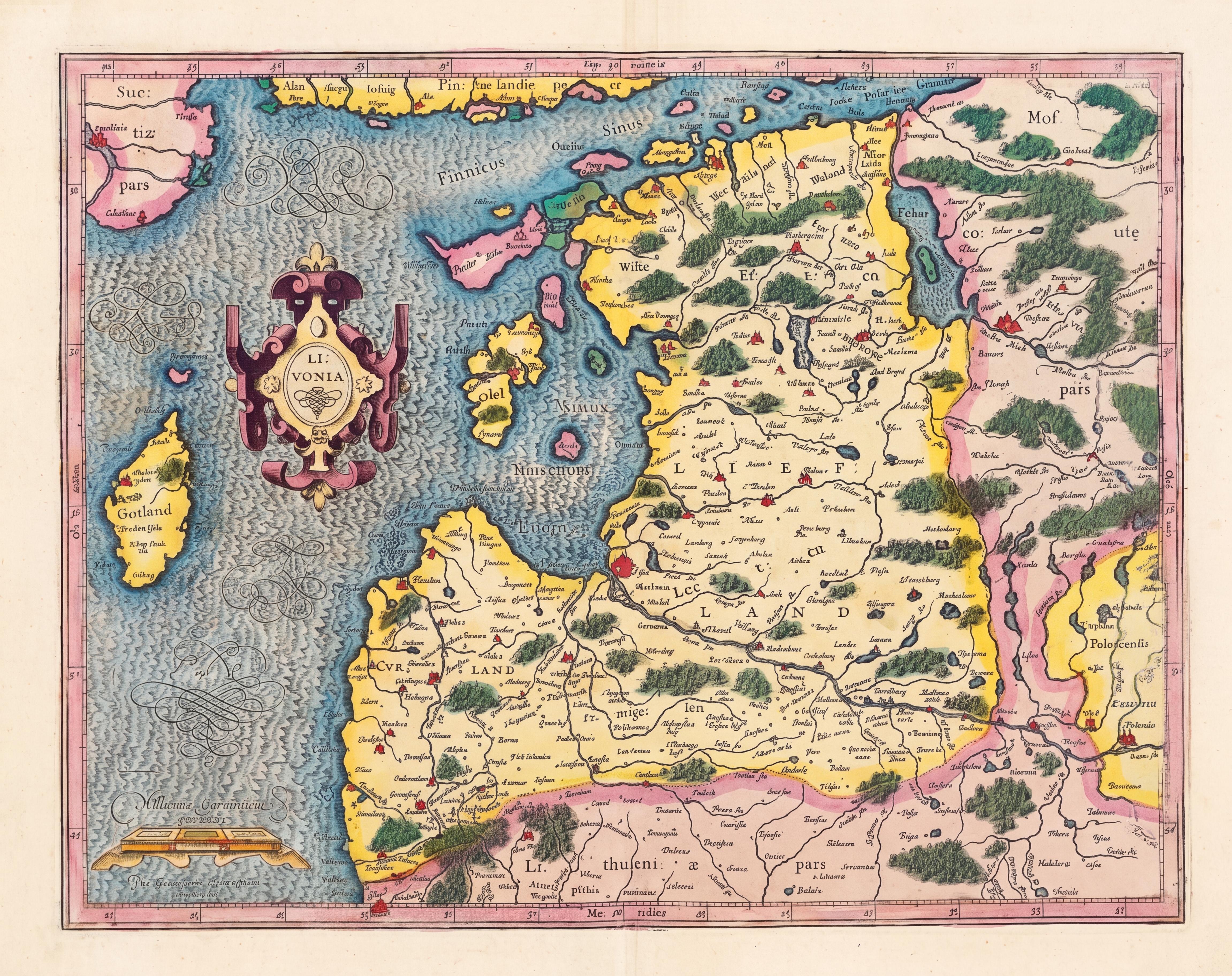
What if we switch to Nano Banana 2 and our original prompt? Unfortunately, this completely eliminates the famed rippling detail in the water and hallucinates from whole cloth an entirely new pattern in the water connecting the visible flourishes. In the yellow section at the lower right of the map, one whole area also appears to "melt".
This is a 1607 gilded Mercator map of Estonia that has faded over time. Using your knowledge of the techniques, paints and materials used to color Mercator maps of this era, restore this map to make it look like it originally did when it was first produced. Do not change the map in any way other than to restore it to how it looked when it was created.
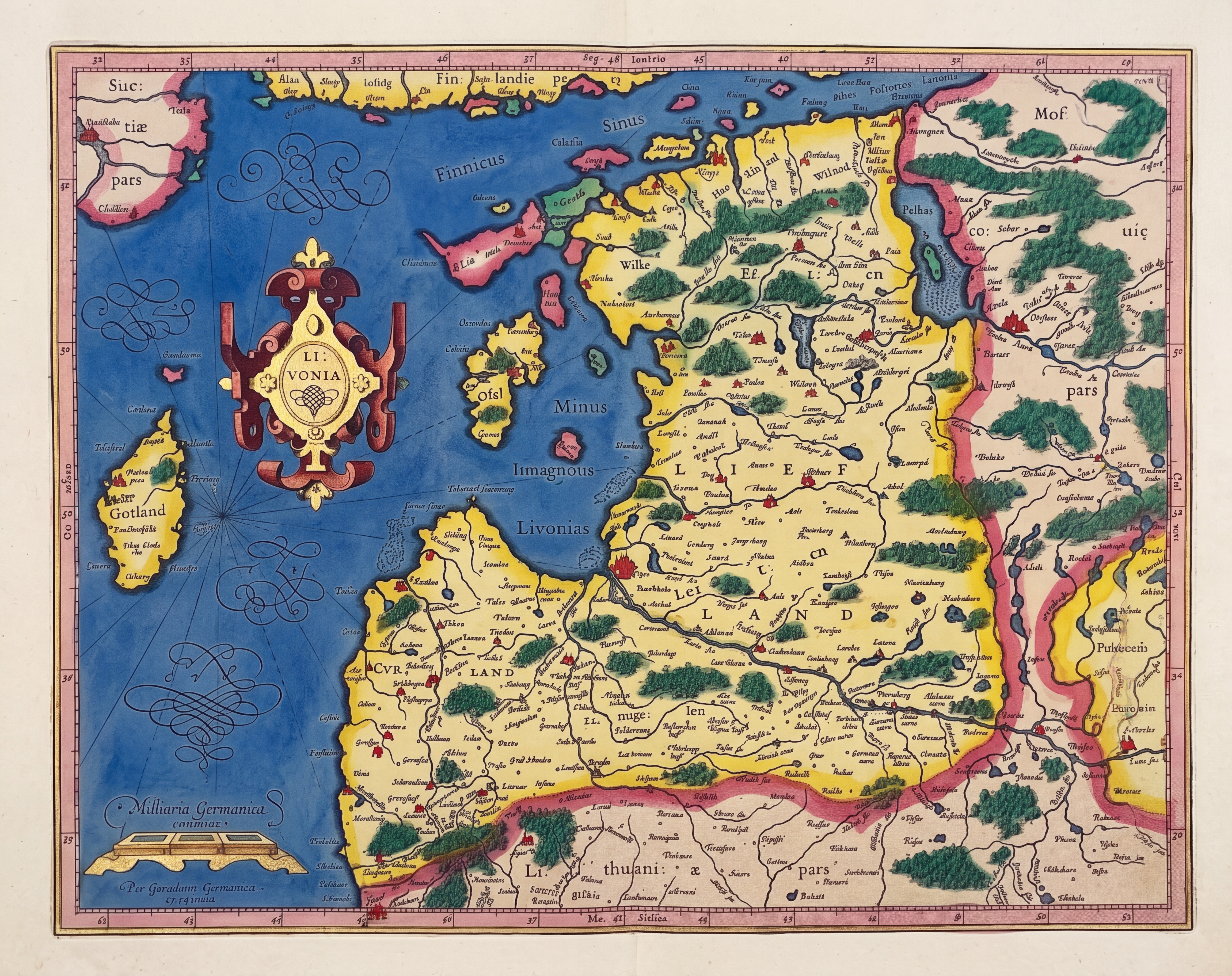
What if we add an extra instruction to tell Nano Banana 2 to make sure the lines are fully visible and not to change them? This time it preserves the line detail, but changes the coloring of the red area at right from pink to blue and separates the top quarter of the righthand side and even adds a wooden frame and melts the top right corner.
This is a 1607 gilded Mercator map of Estonia that has faded over time. Using your knowledge of the techniques, paints and materials used to color Mercator maps of this era, restore this map to make it look like it originally did when it was first produced. Do not change the map in any way other than to restore it to how it looked when it was created.

PRESERVE ALL OF THE ETCHING DETAIL, INCLUDING ALL OF THE TEXT AND THE LINES AND FLOURISHES AS-IS AND MAKE SURE THEY ARE FULLY VISIBLE ABOVE THE COLORING.
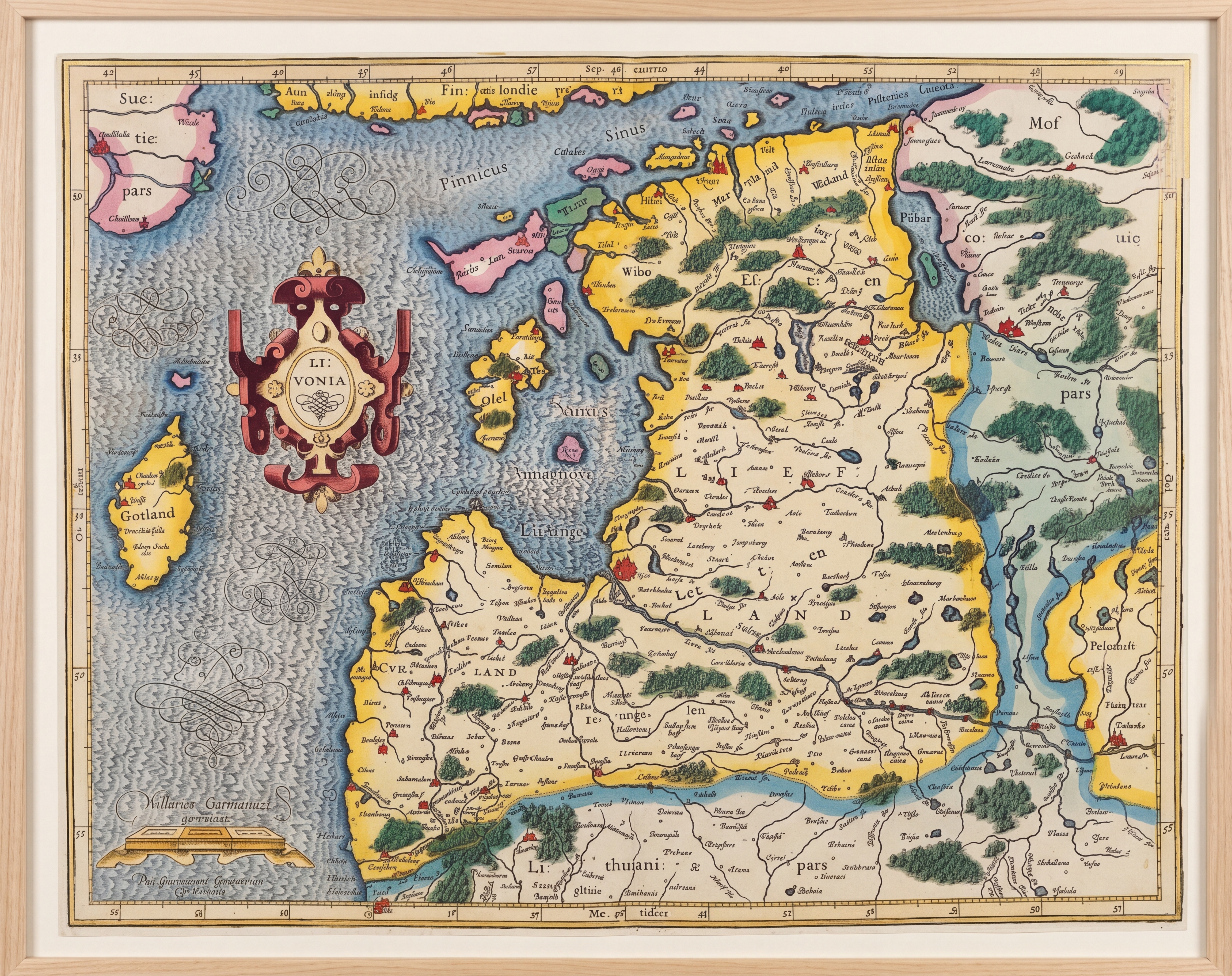
Run a second time, we get better results:
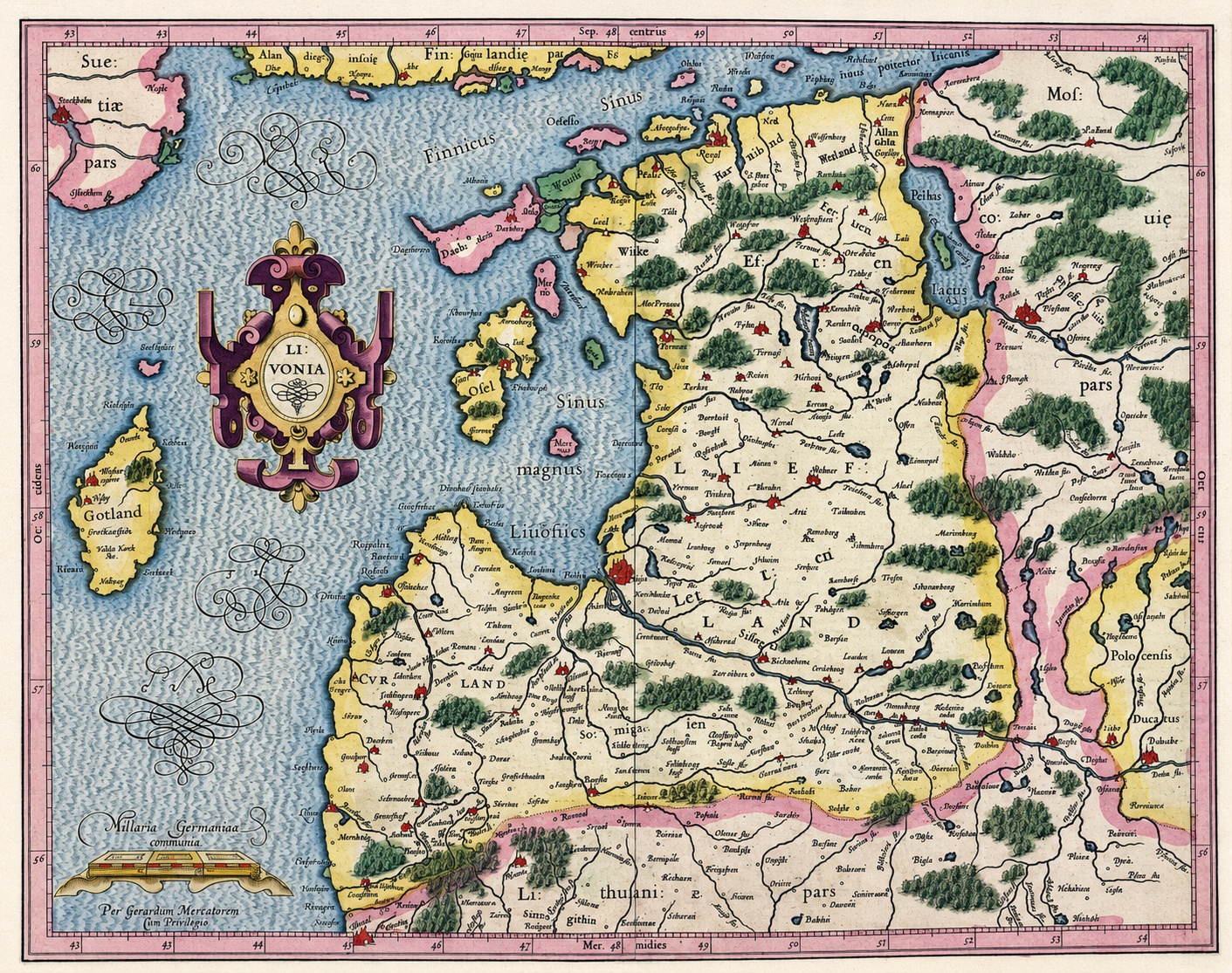
What about ChatGPT with our original prompt? Interestingly, while the colors are still a bit faded, ChatGPT did a far better job than Nano Banana Pro and 2 vat distinguishing the colored and gilded regions and maintaining the coloring of the original, though it incorrectly lightens the pink region interiors:
This is a 1607 gilded Mercator map of Estonia that has faded over time. Using your knowledge of the techniques, paints and materials used to color Mercator maps of this era, restore this map to make it look like it originally did when it was first produced. Do not change the map in any way other than to restore it to how it looked when it was created.
Finally, let's ask Gemini Deep Research to spend as much time as it needs to craft a Nano Banana 2 prompt to restore the image:
Deeply research this 1607 gilded Mercator map of Estonia and show me what it originally looked like when it was first published and colored 400 years ago, before any of the colors faded, etc. At the end of your analysis, provide me specific instructions for an AI image model to restore this map to its original vibrancy and show me yourself what the map originally looked like.
Which yields this report:
The report contains the requested prompt:
Subject: A photorealistic, perfectly preserved, pristine 1607 antique map of Livonia (encompassing Estonia and Latvia), originally created by Gerardus Mercator and Jodocus Hondius. This is NOT a faded antique; this is a reconstruction of the map on the exact day it was printed and hand-colored in 17th-century Amsterdam.

Canvas and Line Art: The map is printed on flawless, crisp, bright white cotton rag paper. There must be zero yellowing, zero brown spots, zero foxing, and zero sepia tones on the paper itself. The underlying map details (coastlines, forests, cities, rivers) are rendered in incredibly sharp, dense, pitch-black intaglio copperplate engraving ink.

Color Palette (Crucial - Override default "antique" colors):

The Oceans (Baltic Sea/Lakes): Must be painted in a deep, highly saturated, vibrant lapis lazuli / cobalt blue (representing fresh Smalt). Do NOT use faded gray or pale blue.

The Borders and Forests: Must be highlighted with a brilliant, highly translucent, glowing emerald green (representing fresh Verdigris). Do NOT use muddy brown, olive, or dark green. The black engraved lines of the trees must be visible through the green color.

Internal Territorial Lines: Must be traced with intense, eye-catching, vivid crimson red and magenta (representing fresh Cochineal and Brazilwood). Do NOT use pale pink or faded rust.

Illumination and Cartouches: In the upper left corner, there is a highly ornate, 17th-century shield-shaped title cartouche decorated with hanging fruit. In the bottom left, a scale bar wrapped around metal calipers. The structural strapwork of BOTH cartouches must be heavily gilded with sparkling, highly reflective, metallic solid gold leaf. The gold must look like real, polished metal catching a strong directional light.

Details: The oceans feature engraved sailing ships with tiny red and white flags, and mythical sea monsters. The map shows the islands of Saaremaa and Hiiumaa off the coast.

Style and Lighting: Photorealistic macro photography, 8k resolution, shot with a polarizing filter to eliminate glare on the paper but emphasize the brilliant metallic reflection of the gold leaf cartouche. Studio lighting, top-down view, flat lay. The aesthetic must communicate extreme luxury, high contrast, and day-one 1607 vibrancy, representing the masterpiece of a Dutch master colorist.
At the macro level this matches portions of Gemini's assessment of fading, but it completely strips the border coloring, incorrectly gilds the entire cartouche, strips all interior coloring and otherwise just completely changes the image.