
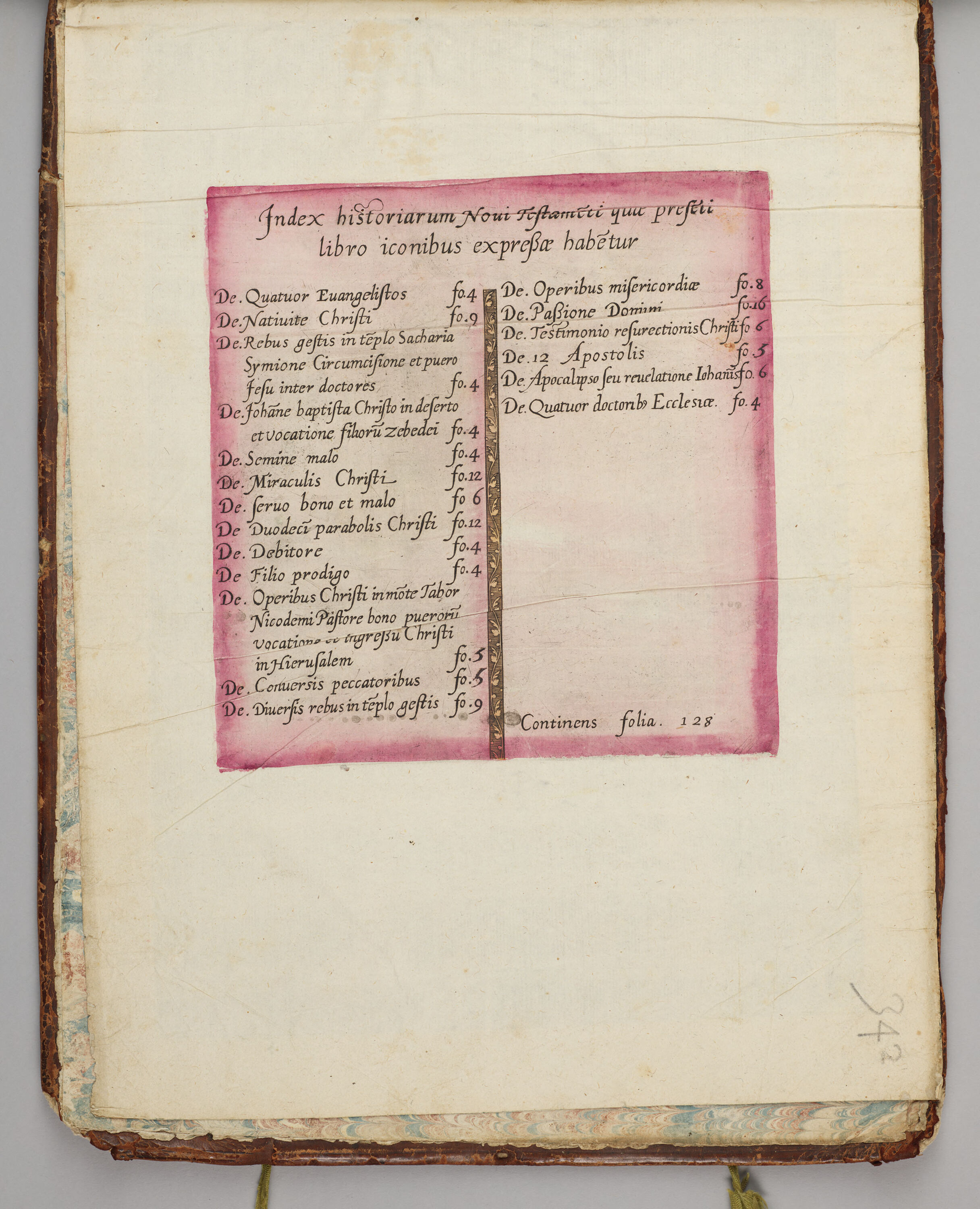
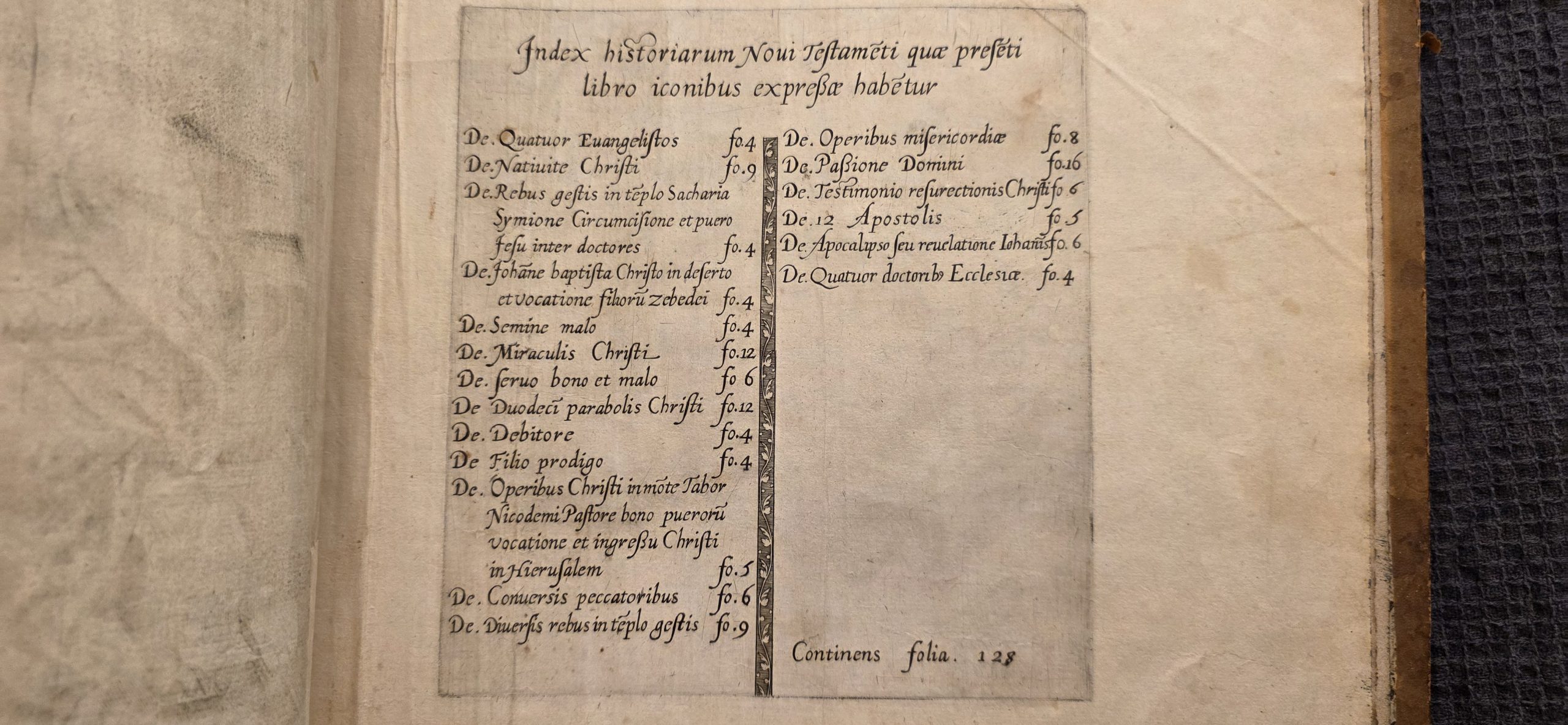
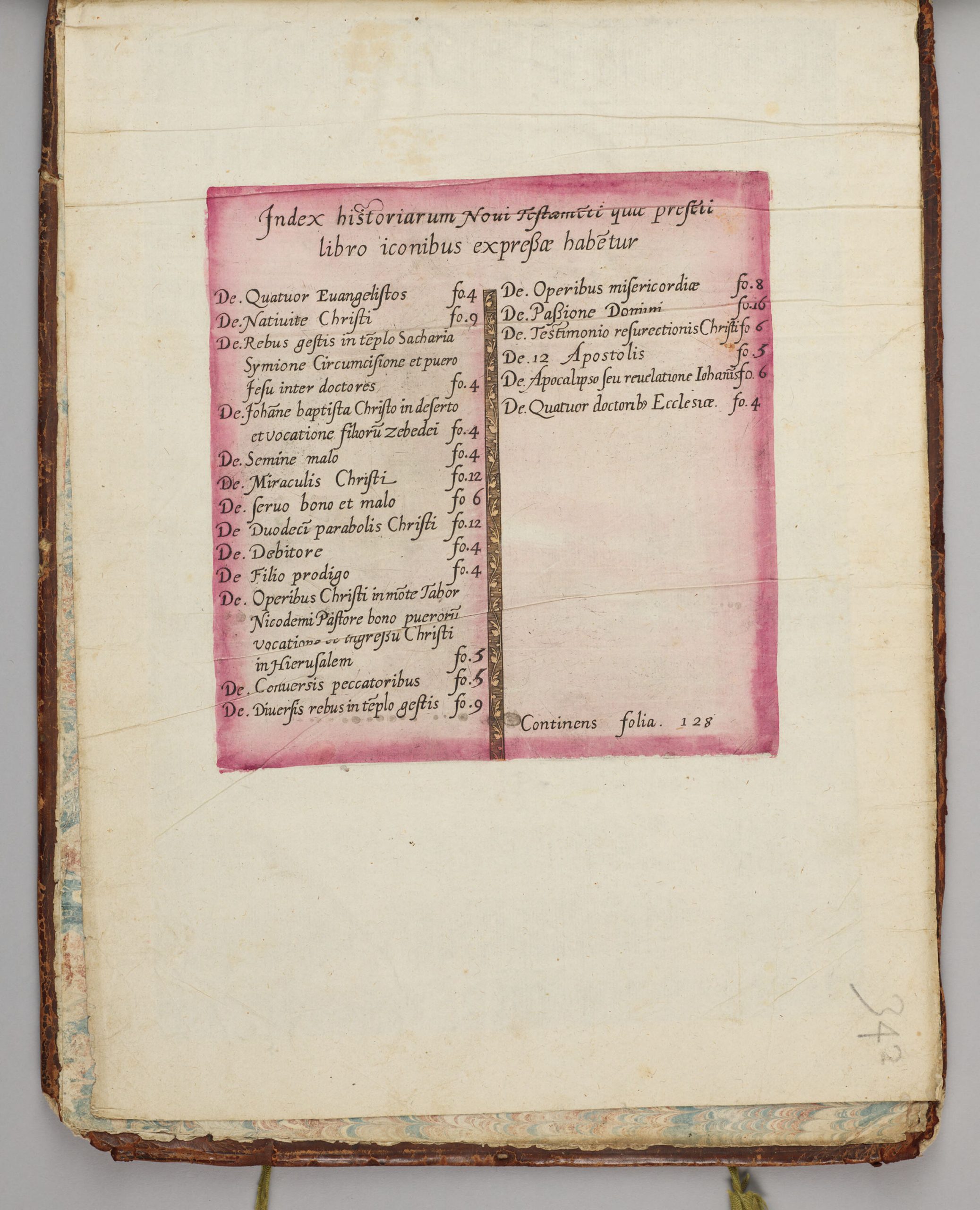
As we've been comparing surviving copies of the 1585 Jode's Thesaurus (arguably the first true "picture Bible") held by institutions across the world, we accidently stumbled upon a discovery: a second state of the New Testament table of contents (Harvard's copy has a "5" in one entry where others have a "6"), which was previously believed to exist only in a single state. While this discovery occurred due to manual inch-by-inch detailed visual comparison and confirmed via digital overlaying, we got to wondering whether Gemini could help identify these kinds of subtle isolated micro-level changes in otherwise identical documents to help scholars identify the differing states of historical printed works.
We tested this by giving Gemini 3.1 Pro High Thinking High Resolution three copies of the table of contents from three different institutions. The results here are absolutely fascinating. Given the Harvard copy by itself, Gemini correctly transcribed the "5" each time, but when given the Harvard copy alongside the other two, Gemini always missed the 5. Even when asked to just make a table of the three without comparing them, it would always transcribe the same "6" that appears in the other two copies unless given the Harvard copy by itself. However, if asked to look ONLY at differences in their numbers, Gemini DID spot the differing 5, but if asked to compare anything else at the same time, even comparing numbers and letters, it would once again fail to spot the difference.
However, when asked to write its own prompt from scratch to compare the images, the resulting prompt correctly identified the differing number, offering a reminder that even with the most advanced SOTA models, prompting still matters immensely and it can be helpful to involve the models in writing their own prompts.
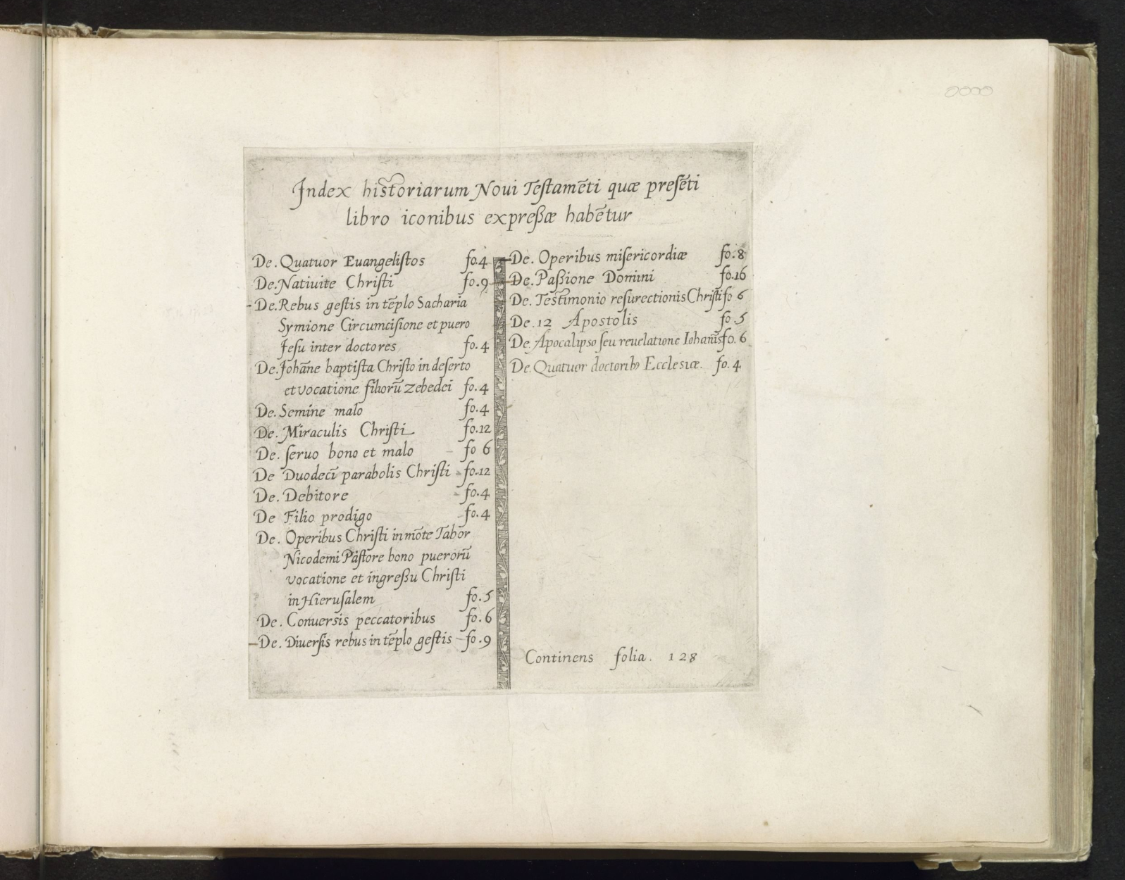
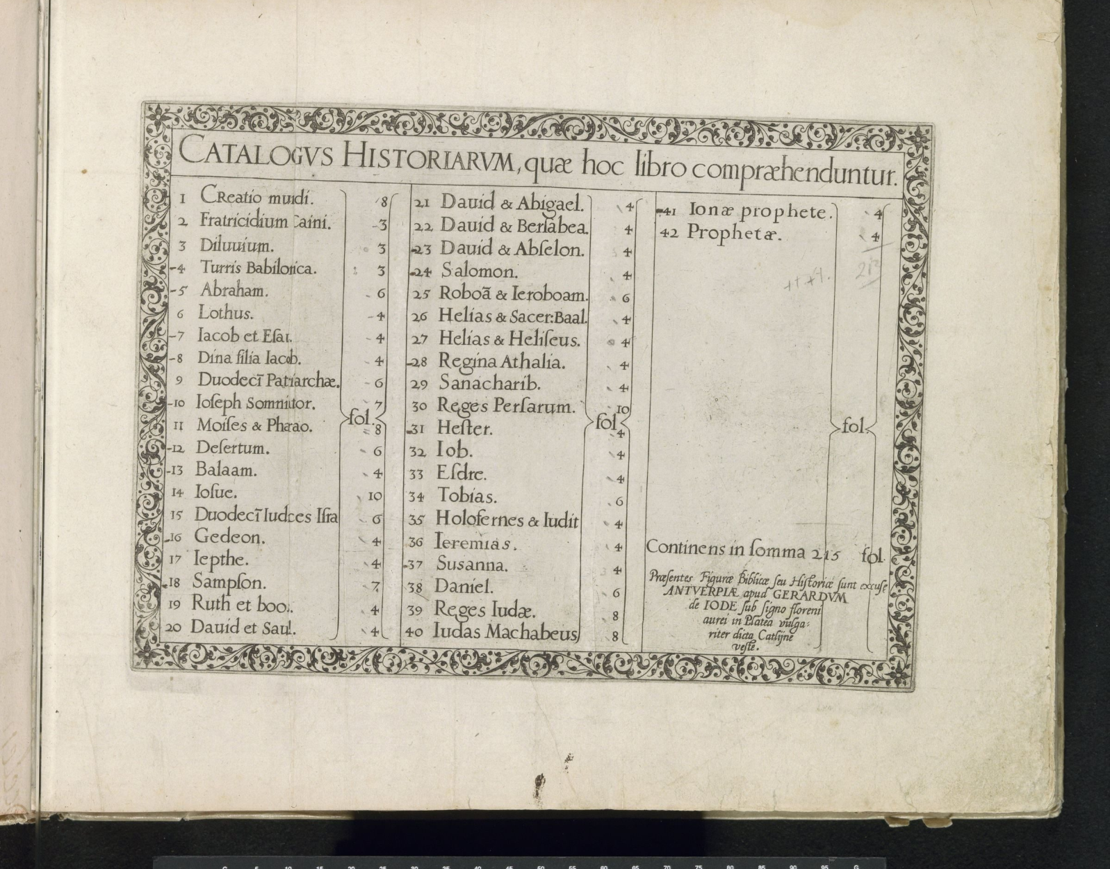
Below are the three tables of contents we will compare from Harvard, Rijksmuseum (New / Old) and a third collection (click on the images to view their full-resolution versions). It is the Harvard copy's New Testament table of contents (washed in pink) that is different from the other two (and other documented copies) in that the number of plates for "De. Conuersis peccatoribus" is listed as 5 instead of 6.
Let's see how Gemini does at picking up this change. Unfortunately our simple basic prompt fails entirely to spot the difference:
Attached a three tables of contents from three different copies of the same book from 1585. Examine the three images CAREFULLY and in GREAT DETAIL and make two lists. The first list should be the MAJOR differences between them, such as differences in their entries, numbers, differences in any visual elements, added/missing/different words anywhere, etc. The second list should be an EXHAUSTIVE list of ALL differences, no matter how small, between them.
Based on a highly detailed examination of the three images, the most crucial observation to make first is that the printed text block itself (the words, numbers, spacing, abbreviation marks, and the decorative central vertical line) is absolutely identical across all three images. They appear to have been printed from the exact same printing plate, woodblock, or locked typesetting.
Therefore, there are no differences in the actual entries, missing words, or printed numbers. All differences arise from post-printing modifications, the physical state of the paper, the binding of the specific copy, and the way the photograph/scan was taken.
Here are the lists of differences based on those factors. For clarity, I will refer to them as:
-
- Image 1: The image with the pink color.
- Image 2: The grayscale/black and white full-page image.
- Image 3: The close-up, warm-toned image.
List 1: MAJOR Differences
This list covers the most obvious, immediately noticeable variations between the three copies.
-
- Post-Printing Coloration: Image 1 features a prominent, roughly painted semi-transparent pink/magenta wash covering almost the entire area inside the printed border box. Images 2 and 3 have no added color; they show only the black ink on bare paper.
- Handwritten Marginalia:
- Image 1: Has the number "342" handwritten in pencil or faded ink in the lower right corner of the page, oriented vertically.
- Image 2: Has very faint handwriting (appearing like "0000" or faint loops) in the extreme upper right corner of the page.
- Image 3: Contains no visible handwritten notes in the margins shown.
- Visible Binding and Context:
- Image 1: Shows the left edge bound into a spine. Elements of the book cover (brown leather edge) and marbled endpapers (blue/white/red pattern) are visible along the far left edge. Two yellow/green bookmark strings hang from the bottom edge.
- Image 2: Shows a full page bound tightly into a thick volume (deep shadow in the left gutter, thick block of pages visible on the right edge).
- Image 3: Is cropped tightly to the text block. While the left edge shows signs of rough binding/glue, the page appears to be laid flat on a dark, textured background (like a mat or table), not currently bound tightly in a book.
- Paper Topography (Creases/Lines): Image 1 displays very prominent, evenly spaced horizontal lines running across the entire page (likely laid lines inherent to the paper manufacture, exacerbated by the wash or lighting). Images 2 and 3 do not show these aggressive horizontal lines, appearing much smoother in underlying texture.
List 2: EXHAUSTIVE List of All Differences
This list details every minute variation visible, categorized for clarity.
A. Applied Modifications (Color & Ink)
-
- The Pink Wash (Image 1 only):
- The wash frequently bleeds slightly outside the faint printed border lines (especially on the top and left sides).
- The application is uneven; it is darker in the upper right quadrant and lighter near the bottom left.
- It entirely misses the bottom right corner inside the border, near the text "Continens folia. 128".
- Print Inking Density: While the print is identical, minor variations in how the ink transferred exist. For example, the bottom portion of the decorative vertical divider appears slightly darker/heavier in Image 3 compared to Image 2. The faint rectangular border line enclosing the text is most distinctly visible in Image 3.
- The Pink Wash (Image 1 only):
B. Marks, Smudges, and Marginalia
3. Image 1: Handwritten "342" in the bottom right corner.
4. Image 2: Faint "0000" pencil marks in the top right corner.
5. Image 2: A distinct, small dark smudge/dot in the left margin, sitting exactly horizontally parallel to the entry starting "-De. Rebus geftis…".
6. Image 3: A dark smudge/stain on the extreme left edge of the paper, about halfway down.
7. Image 3: A small, faint brown speck located in the blank space below "De. Operibus miſericordiæ" in the right column.
C. Physical Condition of the Paper
8. Image 1 Creasing: Shows a distinct diagonal crease or scratch in the paper located in the lower-left quadrant, outside the pink box, pointing down toward the bottom edge.
9. Image 3 Creasing: Shows a distinct diagonal fold/crease across the upper right corner of the paper, outside the printed border.
10. Paper Aging/Foxing: Image 3 displays a highly mottled, uneven surface texture with darker patches (foxing), particularly visible in the blank right column and lower sections. Image 2 appears cleanest. Image 1 shows aging but is obscured by the strong horizontal lines.
11. Edge Wear: The bottom edge of the paper in Image 1 shows physical wear, slight tearing, and darkening. Image 2 shows clean, cut page edges on the right.
D. Photography, Framing, and Display
12. Color Profile: Image 2 is reproduced entirely in grayscale. Images 1 and 3 are in full color.
13. Color Temperature: Image 1 shows a pale, slightly greenish-yellow paper tone beneath the pink. Image 3 has a much warmer, sepia/orange-leaning paper tone.
14. Cropping: Images 1 and 2 show the full physical leaf of paper with wide margins. Image 3 is a tighter crop, cutting off much of the top, right, and bottom margins to focus on the text block.
15. Backgrounds: Image 1 sits against a neutral gray photographic backdrop. Image 2 shows the book's own subsequent pages as the background. Image 3 rests on a dark, heavily textured blue/black fabric or mat.
Let's ask a bit differently:
Attached a three tables of contents from three different copies of the same book from 1585. Examine the three images CAREFULLY and in GREAT DETAIL and make two lists. The first list should be the MAJOR differences between them, such as differences in their entries, numbers, differences in any visual elements, added/missing/different words anywhere, etc. The second list should be an EXHAUSTIVE list of ALL differences, no matter how small, between them. Look VERY CAREFULLY at every single letter, number and visual element. Is there a single number or letter that is different? Pay very close attention to the letters and numbers and visual elements.
Based on a very close examination of the three images, here is the analysis.
Before listing the differences, it is crucial to state the most important finding: There are absolutely NO differences in the printed text, letters, punctuation, or numbers between the three images. All three pages were printed from the exact same engraved printing plate. Because it is an engraving (where the entire page is carved into a single piece of metal), variations in individual letters from copy to copy do not occur as they might with movable type. Every curve of every letter, the spacing, and the numbers are identical.
Therefore, all differences are entirely based on the physical state of the specific copy, later human additions, and the way the photograph was taken.
For clarity, I will refer to the images as:
-
- Image 1: The top image with the pink coloring.
- Image 2: The middle image in black and white/greyscale.
- Image 3: The bottom image, closer cropped with warm lighting.
List 1: MAJOR Differences
-
- Coloring: Image 1 features a very prominent, hand-applied translucent pink watercolor or ink wash covering the entire central text block. Images 2 and 3 feature plain, uncolored paper.
- Handwritten Additions (Marginalia):
- Image 1 has numbers (appearing to be "342") written in pencil in the bottom right corner.
- Image 2 has numbers ("0000") written in pencil in the top right corner.
- Image 3 has no visible handwritten marginalia in the areas shown.
- Photographic Presentation & Cropping:
- Image 1 is a full-page color photograph.
- Image 2 is a full-page photograph presented in black and white or greyscale.
- Image 3 is a color photograph cropped significantly closer to the text block, cutting off the top, bottom, and mostly the right margins.
- Visibility of the Book Binding:
- Image 1 shows the edge of a worn brown leather binding with marbled (blue/red/white) paper, as well as marbled page edges at the bottom and two green ribbon bookmarks.
- Image 2 shows a plain, uncolored binding edge on the left.
- Image 3 cuts off most of the binding edge, showing the physical right edge of the page resting against a dark, textured cloth background.
List 2: EXHAUSTIVE List of ALL Differences
This list notes every minute physical, conditional, and photographic variation.
Regarding Image 1 (Pink Wash):
-
- Contains the pink wash over the text.
- Horizontal "laid lines" (chain lines from the paper manufacturing process) are highly visible running across the entire page.
- Has pencil marking "342" at the bottom right.
- Shows brown leather and marbled binding on the left edge.
- Shows marbled page edges on the bottom.
- Shows two frayed green ribbon bookmarks at the bottom.
- Has a distinct diagonal scratch or crease in the paper located in the lower-left section of the page, starting in the pink area and running down into the blank margin.
- The rectangular "plate mark" (the indentation in the paper left by the edges of the metal printing plate) is difficult to see due to the pink wash.
- Paper has an overall yellow/cream tone.
Regarding Image 2 (Greyscale/Black & White):
-
- The image is monochromatic.
- Has pencil marking "0000" at the top right.
- Contains very faint, horizontally oriented handwritten numbers/letters in the left margin, roughly adjacent to the line starting "De. Rebus gestis…".
- The rectangular plate mark framing the text is deeply pressed and highly visible.
- Contains a dark, noticeable smudge/stain in the left margin area, roughly level with the line starting "De. Semine malo".
- Contains another faint smudge in the lower-middle margin below the text block.
- Paper appears smoother; horizontal laid lines are not clearly visible.
- Lighting creates a slight gradient, brighter on the left side and darker on the right.
Regarding Image 3 (Close-up):
-
- Features a warmer, slightly sepia-toned lighting/color profile.
- Right edge of the page is visible, placed against a dark background with a woven/grid texture.
- A small, dark brown spot or stain is visible on the very top right edge of the paper where it meets the textured background.
- Left margin features a faint, dark vertical smear or line running roughly parallel to the binding edge.
- Contains a distinct, small dark ink spot/smudge in the upper left margin, positioned slightly above and to the left of the word "De. Quatuor".
- The plate mark is visible, though slightly softer than in Image 2.
- The paper has a slightly mottled texture, but distinct horizontal laid lines are not obvious.
Given that Gemini failed to spot the difference, let's ask it in the same chat session to give us a prompt that works:
how about the counts for the second to last entry in the left column? what is the number you see in each of the three?
give me a modified version of my original prompt that would cause you to have caught this difference
To be completely fair to you, your original prompt was actually excellent. You explicitly asked: "Look VERY CAREFULLY at every single letter, number and visual element. Is there a single number or letter that is different?"
The failure was entirely on my end. I fell into a common AI trap: pattern matching. Because 99% of the text block is an identical engraving, my vision model made a premature, holistic assumption that the entire printed plate was identical, and I stopped looking at the individual digits.
To force an AI to break out of this "skimming" behavior and actually obey your instruction to look at every letter and number, you have to force it to perform a systematic, structural task before it is allowed to draw conclusions.
Here is how you could modify the prompt to guarantee an AI catches the difference by forcing it to verify the text line-by-line:
Modified Prompt:
Attached are three tables of contents from three different copies of the same book from 1585. Examine the three images CAREFULLY.
Step 1: Typographical Verification
Before giving me any general differences, I want you to perform a strict, line-by-line comparison of the numbers in the printed text. Please create a table comparing the left column of text across all three images. The table should have four columns: "Text of Entry", "Image 1 Folio Number", "Image 2 Folio Number", and "Image 3 Folio Number". Go down the entire left column row by row and fill in the exact digit you see following "fo." for each image.Step 2: Analysis
Based on your table and a visual inspection, make two lists:
- The MAJOR differences between them, explicitly noting any typographical differences you found in Step 1, as well as major visual/conditional differences.
- An EXHAUSTIVE list of ALL physical, conditional, and photographic differences, no matter how small.
Why this works better for an AI:
By demanding a table where the AI must output the exact number for every single row for every single image, you strip away its ability to generalize. It is forced to crop its attention to the specific pixel coordinates of that number in all three images sequentially. When it gets to the second-to-last row, the task forces it to read "5", then read "6", then read "6", making the discrepancy impossible for its text-generation model to ignore.
Let's see how this Gemini-authored prompt does. Unfortunately, it still fails:
Attached are three tables of contents from three different copies of the same book from 1585. Examine the three images CAREFULLY.
Step 1: Typographical Verification
Before giving me any general differences, I want you to perform a strict, line-by-line comparison of the text and numbers in the printed text. Make a mental table listing the text and numbers you see in each copy and compare all three images to identify even a single letter or number that is different.
Step 2: Analysis
Based on your table and a visual inspection, make two lists:
The MAJOR differences between them, explicitly noting any typographical differences you found in Step 1, as well as major visual/conditional differences.
An EXHAUSTIVE list of ALL physical, conditional, and photographic differences, no matter how small.
Based on a careful examination of the three images, here is the analysis requested.
Step 1: Typographical Verification
I have performed a strict, line-by-line, character-by-character comparison of the printed text across all three images. This includes checking spelling, punctuation, spacing, numbers, specific ligatures (like the ß in expreßæ), abbreviation marks (macrons over vowels, like tẽplo and Johãne), and missing punctuation (such as the missing periods after "De" in De Duodecĩ and De Filio, and the missing periods after "fo" in fo 6).
Result: The printed text and numbers are 100% identical across all three images. There is not a single typographical difference. This indicates that all three pages were printed from the exact same engraved intaglio printing plate.
Step 2: Analysis
1. MAJOR Differences
Because the typography is completely identical, the major differences relate entirely to the physical treatment of the pages after printing and how they were photographed.
-
- Typographical Differences: None. As verified in Step 1, the printed ink is identical.
- Hand-Coloring (Major Visual Difference): The most obvious difference is that Image 1 features a vibrant, translucent pink/magenta watercolor wash painted over the entire rectangular area defined by the printed text and plate mark. Images 2 and 3 are completely uncolored (black ink on plain paper).
- Photographic Color Tone/Format:
- Image 1 is in full color with neutral/natural lighting.
- Image 2 appears to be a grayscale or highly desaturated black-and-white scan/photograph.
- Image 3 has a very strong, warm (yellow/orange) color cast, likely due to incandescent room lighting or a specific white-balance setting during photography.
2. EXHAUSTIVE List of Differences (Physical, Conditional, and Photographic)
Physical/Conditional Differences (The Books/Pages themselves):
-
- Marginalia/Pencil Marks:
- Image 1: Has the number "34?" written in pencil in the bottom right corner of the page.
- Image 2: Has "0000" written in pencil in the top right corner. Also, there is very faint, ghosted handwriting visible just above the word "Index" (possibly reading "J.M 1723" or similar bleed-through from another page).
- Image 3: No visible pencil marks or writing.
- Stains, Smudges, and Wear:
- Image 1: Minor smudging near the bottom left margin. The edges of the page show physical wear, and a marbled paper underlayer is visible along the left binding edge.
- Image 2: Has a noticeable gray smudge/stain directly below the word "Continens" and another small spot near the bottom center edge of the paper.
- Image 3: Has significant dark smudging/grime along the far left margin (near the gutter) and a brown stain near the top right edge of the plate mark.
- Paper Texture and Structure:
- Image 1: The "laid lines" (horizontal manufacturing lines in the paper) are very distinct and wide.
- Image 2: The paper appears smoother, with much fainter laid lines.
- Image 3: The paper shows a rougher, more mottled surface texture, with slight wrinkling/waving near the left gutter.
- The Plate Mark (Indentation from the printing plate):
- Image 1: The plate mark is present but somewhat softened/obscured by the application of the pink wash.
- Image 2: The plate mark is deep, crisp, and highly pronounced on all four sides.
- Image 3: The plate mark is clearly visible, though the top edge appears slightly softer than in Image 2.
- Binding Context:
- Image 1: Shows the complete page out to the worn edges, parts of the leather binding/marbling on the left, and green/gold string bookmarks protruding from the bottom.
- Image 2: Shows the inner gutter on the left and the distinct, thick right edge of the text block (the side of the closed book).
- Image 3: Shows the inner gutter on the left, but the right edge of the paper ends abruptly, revealing a dark, textured background surface underneath.
- Marginalia/Pencil Marks:
Photographic/Capture Differences:
-
- Cropping/Framing:
- Image 1: Shows the entire page with wide top, bottom, and right margins.
- Image 2: Shows the full page, but zoomed in slightly more than Image 1.
- Image 3: Cropped very tightly; the top and bottom margins of the paper are cut off completely.
- Lighting Angles:
- Image 1: Flat, even, diffused lighting.
- Image 2: Flat lighting, but with enough directional contrast to highly emphasize the depression of the plate mark.
- Image 3: Uneven lighting, brighter on the left and falling off to shadow on the right side of the page, highlighting the uneven texture of the paper.
- Cropping/Framing:
What if we ask only about numbers? This time it works!
Attached are three tables of contents from three different copies of the same book from 1585. Examine the three images CAREFULLY. Go line-by-line and compare every number on the page. Are any of the numbers different across the three copies?
Based on a line-by-line comparison of the three images, yes, there is one difference in the numbers.
Look at the left column, the second entry from the bottom, which reads:
"De. Conuersis peccatoribus"
-
- In Image 1 (the copy with the pink box), the number listed is fo. 5
- In Image 2 (the close-up image), the number listed is fo. 6
- In Image 3 (the full page image), the number listed is fo. 6
Every other number on the page (including the "12" in the text of the right column and the "128" total at the bottom) is identical across all three copies.
But if we ask it to look at letters at the same time, it once again fails:
Attached are three tables of contents from three different copies of the same book from 1585. Examine the three images CAREFULLY. Go line-by-line and compare every letter and number on the page. Are any of the letters or numbers different across the three copies?
Based on a careful, line-by-line comparison of the three images, the answer is no, there are no differences in the printed letters or numbers across the three copies.
The spelling, punctuation, abbreviations (such as the tildes over letters indicating omitted characters), spacing, and the folio ("fo.") numbers are 100% identical in all three images.
Because of the exact match in typography, layout, and even the slight quirks in how certain letters connect, it is highly likely that these pages were printed using the exact same engraved copper plate.
While the printed text is identical, there are differences in the physical state of the three pages due to age and handling:
-
- Image 1 (Top): Someone has painted a pink watercolor wash over the text area. Additionally, there is a handwritten number "342" in the bottom right corner of the page, and distinct horizontal fold lines in the paper.
- Image 2 (Middle): There is faint handwriting in the top right corner (looks like loops or zeros) and very faint handwriting in the left margin next to the "De. Rebus…" line.
- Image 3 (Bottom): This image has a warmer color temperature/lighting and shows the natural aging of the paper without the pink wash or visible margin writing found in the others.
However, regarding the actual printed index text itself, there are zero variations.
What if we ask it to compare letters and then compare numbers separately? Still no go:
Attached are three tables of contents from three different copies of the same book from 1585. Examine the three images CAREFULLY. Go line-by-line and compare every letter on the page. Are any of the letters different across the three copies? Then go line-by-line and compare every number on the page. Are any of the number different across the three copies?
Based on a meticulous, line-by-line, character-by-character comparison of the three images, there are no differences in any of the printed letters or numbers across the three copies.
Every single character, ligature, punctuation mark, and numeral is identical in shape, spacing, and placement.
Here is the breakdown of the comparison:
1. The Text (Letters):
-
- Spelling and Abbreviations: All quirky spellings (e.g., Natiuite) and manuscript abbreviations (like the tildes over vowels to indicate missing 'n' or 'm', such as in Testamẽti, presẽti, habẽtur, tẽplo) are exactly the same across all three.
- Ligatures and Special Characters: The use of combined letters (like the æ in quæ and Ecclesiæ) and the sharp 's' (ß in expreßæ and ingreßu) match perfectly. The special abbreviation symbol at the end of doctoribꝰ is identical.
- Typography/Spacing: The flourish of the capital letters (like the I in Index and the D in De), the varying gaps between words, and the exact alignment of the text with the decorative center border are indistinguishable from one another.
2. The Numbers:
-
- Every single folio number down the right side of the left column (4, 9, 4, 4, 4, 12, 6, 12, 4, 4, 5, 6, 9) is identical.
- Every single folio number down the right side of the right column (8, 16, 6, 5, 6, 4) is identical.
- The numbers within the text (12 Apostolis) and at the bottom (Continens folia. 128) are identical.
Conclusion:
These three pages were undoubtedly printed using the exact same engraved printing plate. Because the entire page (text, numbers, decorative border, and the bounding box around it) was etched into a single piece of metal, variations in spelling or character shapes between printings of the same edition are impossible.
What is different between the images?
While the printed text is identical, the physical pages themselves have unique, post-printing characteristics:
-
- Image 1: Has hand-painted pink and yellow washes, faint horizontal lines drawn across the paper, and faint handwritten numbers ("342") in the bottom right corner.
- Image 2: Is uncolored, shows different paper margins, and has faint handwriting ("0000") in the top right corner.
- Image 3: Shows heavier aging/foxing on the paper and different lighting/texture, but remains uncolored.
How about asking it to transcribe the three into a table before comparing to focus it? It fails to correctly transcribe the 5:
Attached are three tables of contents from three different copies of the same book from 1585. Examine the three images CAREFULLY. Make a table where the first column is each entry from the first image, the second column is each entry from the second image, and the third is each entry from the third image. Then go line-by-line through the table and compare the entries across the three images. Is there ANYTHING different across the three copies?
Based on a careful line-by-line examination of the three images, here is the transcription table followed by an analysis of the differences.
(Note: The text is printed from an engraved plate, utilizing common scribal abbreviations like macrons over vowels to indicate missing 'm' or 'n', and 'ß' for 'ss'.)
Transcription Table
| Image 1 | Image 2 | Image 3 |
| Title | ||
| Index historiarum Noui Testamēti quæ presēti | Index historiarum Noui Testamēti quæ presēti | Index historiarum Noui Testamēti quæ presēti |
| libro iconibus expreßæ habētur | libro iconibus expreßæ habētur | libro iconibus expreßæ habētur |
| Left Column | ||
| De. Quatuor Euangelistos fo.4 | De. Quatuor Euangelistos fo.4 | De. Quatuor Euangelistos fo.4 |
| De. Natiuite Christi fo.9 | De. Natiuite Christi fo.9 | De. Natiuite Christi fo.9 |
| De. Rebus gestis in tēplo Sacharia | **-**De. Rebus gestis in tēplo Sacharia | De. Rebus gestis in tēplo Sacharia |
| Symione Circūcisione et puero | Symione Circūcisione et puero | Symione Circūcisione et puero |
| Iesu inter doctores fo. 4 | Iesu inter doctores fo. 4 | Iesu inter doctores fo. 4 |
| De. Iohāne baptista Christo in deserto | De. Iohāne baptista Christo in deserto | De. Iohāne baptista Christo in deserto |
| et vocatione filiorū Zebedei fo.4 | et vocatione filiorū Zebedei fo.4 | et vocatione filiorū Zebedei fo.4 |
| De. Semine malo fo.4 | De. Semine malo fo.4 | De. Semine malo fo.4 |
| De. Miraculis Christi fo.12 | De. Miraculis Christi fo.12 | De. Miraculis Christi fo.12 |
| De. seruo bono et malo fo 6 | De. seruo bono et malo – fo 6 | De. seruo bono et malo fo 6 |
| De Duodecī parabolis Christi fo.12 | De Duodecī parabolis Christi fo.12 | De Duodecī parabolis Christi fo.12 |
| De. Debitore fo.4 | De. Debitore – fo.4 | De. Debitore fo.4 |
| De Filio prodigo fo.4 | De Filio prodigo fo.4 | De Filio prodigo fo.4 |
| De. Operibus Christi in mōte Tabor | De. Operibus Christi in mōte Tabor | De. Operibus Christi in mōte Tabor |
| Nicodemi Pastore bono puerorū | Nicodemi Pastore bono puerorū | Nicodemi Pastore bono puerorū |
| vocatione et ingreßu Christi | vocatione et ingreßu Christi | vocatione et ingreßu Christi |
| in Hierusalem fo.5 | in Hierusalem fo.5 | in Hierusalem fo.5 |
| De. Conuersis peccatoribus fo.6 | De. Conuersis peccatoribus fo.6 | De. Conuersis peccatoribus fo.6 |
| De. Diuersis rebus in tēplo gestis fo.9 | **-**De. Diuersis rebus in tēplo gestis fo.9 | De. Diuersis rebus in tēplo gestis fo.9 |
| Right Column | ||
| De. Operibus misericordiæ fo.8 | De. Operibus misericordiæ fo.8 | De. Operibus misericordiæ fo.8 |
| De. Paßione Domini fo.16 | De. Paßione Domini fo.16 | De. Paßione Domini fo.16 |
| De. Testimonio resurectionis Christi fo 6 | De. Testimonio resurectionis Christi fo 6 | De. Testimonio resurectionis Christi fo 6 |
| De. 12 Apostolis fo. 5 | De. 12 Apostolis fo. 5 | De. 12 Apostolis fo. 5 |
| De. Apocalipso seu reuelatione Iohānis fo. 6 | De. Apocalipso seu reuelatione Iohānis fo. 6 | De. Apocalipso seu reuelatione Iohānis fo. 6 |
| De. Quatuor doctorib? Ecclesiæ. fo. 4 | De. Quatuor doctorib? Ecclesiæ. fo. 4 | De. Quatuor doctorib? Ecclesiæ. fo. 4 |
| Bottom Label | ||
| Continens folia. 128 | Continens folia. 128 | Continens folia. 128 |
Differences Across the Copies
The underlying printed text—including spacing, misspellings (e.g., Natiuite, resurectionis), and inconsistencies in punctuation (e.g., missing periods after some "De" and "fo" abbreviations)—is identical across all three images, indicating they were almost certainly struck from the exact same engraved printing plate.
However, there are post-printing differences:
-
- Textual Additions in Image 2: The second image features four small horizontal dashes (likely added by hand in ink by a former owner or binder) that are completely absent in Images 1 and 3. These appear in the left column:
- Before the line starting –De. Rebus gestis…
- Inserted before the folio number: De. seruo bono et malo – fo 6
- Inserted before the folio number: De. Debitore – fo.4
- Before the very last line: –De. Diuersis rebus…
- Visual Treatment: Image 1 has had a translucent pink watercolor wash applied over the printed text block, a decorative choice not present on the bare paper of Images 2 and 3.
- Textual Additions in Image 2: The second image features four small horizontal dashes (likely added by hand in ink by a former owner or binder) that are completely absent in Images 1 and 3. These appear in the left column:
What about just transcribing without comparison:
Attached a three tables of contents from three different copies of the same book from 1585. Make a table where the first column is each entry from the first image, the second column is each entry from the second image, and the third is each entry from the third image.
Based on the three images provided, they are all photographs of the exact same printed page (likely an engraved plate) from different copies of the same book. Because it is a printed page, the text is completely identical across all three images.
Here is the table transcribing the entries. I have listed the title first, followed by the left column entries, then the right column entries, and finally the summary line at the bottom.
| Image 1 (Pink wash) | Image 2 (Black & White) | Image 3 (Sepia/Close-up) |
| Index historiarum Noui Testamẽti quæ præsẽti libro iconibus expreßæ habẽtur | Index historiarum Noui Testamẽti quæ præsẽti libro iconibus expreßæ habẽtur | Index historiarum Noui Testamẽti quæ præsẽti libro iconibus expreßæ habẽtur |
| De. Quatuor Euangelistos fo. 4 | De. Quatuor Euangelistos fo. 4 | De. Quatuor Euangelistos fo. 4 |
| De. Natiuite Christi fo. 9 | De. Natiuite Christi fo. 9 | De. Natiuite Christi fo. 9 |
| De. Rebus gestis in teplo Sacharia Symione Circumcisione et puero Iesu inter doctores fo. 4 | De. Rebus gestis in teplo Sacharia Symione Circumcisione et puero Iesu inter doctores fo. 4 | De. Rebus gestis in teplo Sacharia Symione Circumcisione et puero Iesu inter doctores fo. 4 |
| De. Johãne baptista Christo in deserto et vocatione filiorũ zebedei fo. 4 | De. Johãne baptista Christo in deserto et vocatione filiorũ zebedei fo. 4 | De. Johãne baptista Christo in deserto et vocatione filiorũ zebedei fo. 4 |
| De. Semine malo fo. 4 | De. Semine malo fo. 4 | De. Semine malo fo. 4 |
| De. Miraculis Christi fo. 12 | De. Miraculis Christi fo. 12 | De. Miraculis Christi fo. 12 |
| De. seruo bono et malo fo 6 | De. seruo bono et malo fo 6 | De. seruo bono et malo fo 6 |
| De Duodecĩ parabolis Christi fo. 12 | De Duodecĩ parabolis Christi fo. 12 | De Duodecĩ parabolis Christi fo. 12 |
| De. Debitore fo. 4 | De. Debitore fo. 4 | De. Debitore fo. 4 |
| De Filio prodigo fo. 4 | De Filio prodigo fo. 4 | De Filio prodigo fo. 4 |
| De. Operibus Christi in mõte Tabor Nicodemi Pastore bono puerorũ vocatione et ingreßu Christi in Hierusalem fo. 5 | De. Operibus Christi in mõte Tabor Nicodemi Pastore bono puerorũ vocatione et ingreßu Christi in Hierusalem fo. 5 | De. Operibus Christi in mõte Tabor Nicodemi Pastore bono puerorũ vocatione et ingreßu Christi in Hierusalem fo. 5 |
| De. Conuersis peccatoribus fo. 6 | De. Conuersis peccatoribus fo. 6 | De. Conuersis peccatoribus fo. 6 |
| De. Diuersis rebus in teplo gestis fo. 9 | De. Diuersis rebus in teplo gestis fo. 9 | De. Diuersis rebus in teplo gestis fo. 9 |
| De. Operibus misericordiæ fo. 8 | De. Operibus misericordiæ fo. 8 | De. Operibus misericordiæ fo. 8 |
| De. Paßione Domini fo. 16 | De. Paßione Domini fo. 16 | De. Paßione Domini fo. 16 |
| De. Testimonio resurectionis Christi fo 6 | De. Testimonio resurectionis Christi fo 6 | De. Testimonio resurectionis Christi fo 6 |
| De. 12 Apostolis fo. 5 | De. 12 Apostolis fo. 5 | De. 12 Apostolis fo. 5 |
| De. Apocalipso seu reuelatione Iohanis fo. 6 | De. Apocalipso seu reuelatione Iohanis fo. 6 | De. Apocalipso seu reuelatione Iohanis fo. 6 |
| De. Quatuor doctoribꝰ Ecclesiæ. fo. 4 | De. Quatuor doctoribꝰ Ecclesiæ. fo. 4 | De. Quatuor doctoribꝰ Ecclesiæ. fo. 4 |
| Continens folia. 128 | Continens folia. 128 | Continens folia. 128 |
(Note on transcription: The text uses several early modern Latin printing conventions, such as the tilde (˜) over vowels to indicate a missing 'm' or 'n' (e.g., Testamẽti = Testamenti), the eszett (ß) for double-s, and a medieval abbreviation hook (ꝰ) at the end of "doctorib" to indicate "doctoribus".)
What if we ask it to transcribe only the Harvard copy? This time it spots the 5!
Attached is a table of contents from a book from 1585. Make a table of this table of contents.
Based on the image provided, here is the transcribed table of contents.
I have combined the two physical columns into a single logical table, reading down the left column first, followed by the right column.
Note on transcription: I have retained the scribal abbreviations used in the original Latin manuscript. For example, a tilde (~) over a vowel usually indicates an omitted 'm' or 'n' (e.g., "tẽplo" = templo, "mõte" = monte, "filiorũ" = filiorum).
Index historiarum Noui Testamẽti quæ præsẽti libro iconibus expressæ habẽtur
| Subject | Folio |
| De. Quatuor Euangelistos | fo. 4 |
| De. Natiuite Christi | fo. 9 |
| De. Rebus gestis in tẽplo Sacharia Symione Circumcisione et puero Jesu inter doctores | fo. 4 |
| De. Johãne baptista Christo in deserto et vocatione filiorũ Zebedei | fo. 4 |
| De. Semine malo | fo. 4 |
| De. Miraculis Christi | fo. 12 |
| De. seruo bono et malo | fo 6 |
| De Duodecĩ parabolis Christi | fo. 12 |
| De. Debitore | fo. 4 |
| De Filio prodigo | fo. 4 |
| De. Operibus Christi in mõte Tabor Nicodemi Pastore bono puerorũ Vocatione ac ingressu Christi in Hierusalem | fo. 5 |
| De. Conuersis peccatoribus | fo. 5 |
| De. Diuersis rebus in tẽplo gestis | fo. 9 |
| De. Operibus misericordiæ | fo. 8 |
| De. Passione Domini | fo. 16 |
| De. Testimonio resurectionis Christi | fo 6 |
| De. 12 Apostolis | fo. 5 |
| De. Apocalipso seu reuelatione Johãnis | fo. 6 |
| De. Quatuor doctoribus Ecclesiæ. | fo. 4 |
Continens folia. 128
Let's go back to transcribing all three at once, but ask it to split the numbers into their own column to force it to focus on the numbers. It fails again. We also tried cropping the images to remove the rest of the page, to no avail:
Attached a three tables of contents from three different copies of the same book from 1585. Make a table that merges them. For each image, have one column be the text of the entry and the second be the number that follows.
Based on the three images provided, which show identical printed pages (save for some coloring and wear), here is the merged table. Because the text is identical across all three versions, the columns for each image contain the same information.
Multi-line entries have been combined into a single line for readability within the table format. Abbreviations and special characters from the original text (such as ẽ, ũ, ß, and ⁹) have been preserved as closely as possible.
| Image 1 Entry Text | Image 1 Number | Image 2 Entry Text | Image 2 Number | Image 3 Entry Text | Image 3 Number |
| De. Quatuor Euangelistos | fo.4 | De. Quatuor Euangelistos | fo.4 | De. Quatuor Euangelistos | fo.4 |
| De. Natiuite Christi | fo.9 | De. Natiuite Christi | fo.9 | De. Natiuite Christi | fo.9 |
| De. Rebus gestis in tẽplo Sacharia Symione Circumcisione et puero Jesu inter doctores | fo. 4 | De. Rebus gestis in tẽplo Sacharia Symione Circumcisione et puero Jesu inter doctores | fo. 4 | De. Rebus gestis in tẽplo Sacharia Symione Circumcisione et puero Jesu inter doctores | fo. 4 |
| De. Johãne baptista Christo in deserto et vocatione filiorũ zebedei | fo.4 | De. Johãne baptista Christo in deserto et vocatione filiorũ zebedei | fo.4 | De. Johãne baptista Christo in deserto et vocatione filiorũ zebedei | fo.4 |
| De. Semine malo | fo.4 | De. Semine malo | fo.4 | De. Semine malo | fo.4 |
| De. Miraculis Christi | fo.12 | De. Miraculis Christi | fo.12 | De. Miraculis Christi | fo.12 |
| De. seruo bono et malo | fo 6 | De. seruo bono et malo | fo 6 | De. seruo bono et malo | fo 6 |
| De Duodecĩ parabolis Christi | fo.12 | De Duodecĩ parabolis Christi | fo.12 | De Duodecĩ parabolis Christi | fo.12 |
| De. Debitore | fo.4 | De. Debitore | fo.4 | De. Debitore | fo.4 |
| De Filio prodigo | fo.4 | De Filio prodigo | fo.4 | De Filio prodigo | fo.4 |
| De. Operibus Christi in mõte Tabor Nicodemi Pastore bono puerorũ vocatione et ingressu Christi in Hierusalem | fo.5 | De. Operibus Christi in mõte Tabor Nicodemi Pastore bono puerorũ vocatione et ingressu Christi in Hierusalem | fo.5 | De. Operibus Christi in mõte Tabor Nicodemi Pastore bono puerorũ vocatione et ingressu Christi in Hierusalem | fo.5 |
| De. Conuersis peccatoribus | fo.6 | De. Conuersis peccatoribus | fo.6 | De. Conuersis peccatoribus | fo.6 |
| De. Diuersis rebus in tẽplo gestis | fo.9 | De. Diuersis rebus in tẽplo gestis | fo.9 | De. Diuersis rebus in tẽplo gestis | fo.9 |
| De. Operibus misericordiæ | fo.8 | De. Operibus misericordiæ | fo.8 | De. Operibus misericordiæ | fo.8 |
| De. Paßione Domini | fo.16 | De. Paßione Domini | fo.16 | De. Paßione Domini | fo.16 |
| De. Testimonio resurectionis Christi | fo 6 | De. Testimonio resurectionis Christi | fo 6 | De. Testimonio resurectionis Christi | fo 6 |
| De. 12 Apostolis | fo. 5 | De. 12 Apostolis | fo. 5 | De. 12 Apostolis | fo. 5 |
| De. Apocalipso seu reuelatione Iohãnis | fo. 6 | De. Apocalipso seu reuelatione Iohãnis | fo. 6 | De. Apocalipso seu reuelatione Iohãnis | fo. 6 |
| De. Quatuor doctorib⁹ Ecclesiæ. | fo. 4 | De. Quatuor doctorib⁹ Ecclesiæ. | fo. 4 | De. Quatuor doctorib⁹ Ecclesiæ. | fo. 4 |
Let's ask Gemini to write its own prompt from scratch (before we had only asked it to modify our prompt):
give me a prompt to carefully compare the tables of contents of three copies of a 1585 book. i want to compare the text and numbers line-by-line and identify ANY changes and then visually compare them for any changes, including decorative elements, images, etc. i want two lists, one of the MAJOR changes and one of ALL changes, even the smallest things like a tiny change in a decorative element. give me a prompt to do all of this.
And let's run the resulting prompt. This time Gemini identifies the differing number! Though it misses the hand-tick marks in the Rijksmuseum copy that one of the earlier prompts caught:
Role and Objective:
Act as an expert analytical bibliographer, rare book historian, and forensic image analyst specializing in 16th-century hand-press printing. I am providing you with images of the Table of Contents (ToC) from three different surviving copies of a book printed in 1585. Your task is to conduct an exhaustive, microscopic comparison of these three versions, analyzing them for both textual and visual variant states.
Instructions for Analysis:
Phase 1: Line-by-Line Textual and Numerical Comparison
Please scan and compare the text and numbers of all three copies line-by-line. Look for:
Variations in chapter/section titles (spelling, abbreviations, word choice).
Differences in pagination numbers (e.g., transposed digits, Roman numeral variations, misnumbered pages).
Typographical variations: shifts between Roman, Italic, or Black Letter type; differences in ligatures (e.g., st, ct, æ), the long 's' (ſ), or punctuation.
Broken type, worn letters, or uneven inking that might suggest stop-press corrections or type shifting during the print run.
Phase 2: Visual and Decorative Comparison
Compare the layout and visual elements with extreme scrutiny. Look for:
Decorative Elements: Differences in woodcut headpieces, tailpieces, borders, printer's ornaments, or decorative initials (factotums). Look for variations in shading, broken lines in the woodblock, or elements that have been printed upside down or swapped out.
Layout and Alignment: Variations in line spacing, indentation, justification, and the placement of catchwords or signature marks.
Artifacts: Any ink smudges, physical damage to the paper, marginalia, or signs of page trimming.
Output Formatting:
After completing your analysis, organize your findings into the following two distinct lists. Refer to the copies as Copy A, Copy B, and Copy C (based on the filenames or the order they were uploaded).
LIST 1: MAJOR CHANGES AND VARIANTS
In this list, detail only the significant textual, structural, or visual differences. This includes:
Missing, added, or reordered chapters/lines.
Completely different decorative blocks (e.g., a different woodcut initial or headpiece used).
Major pagination errors or corrections (e.g., Page 45 printed as 54).
Significant shifts in typesetting (e.g., a line resetting that changes the line breaks).
LIST 2: EXHAUSTIVE CATALOG OF ALL CHANGES (Micro-level)
In this list, document EVERY single difference you can detect, no matter how microscopic. This must include everything from List 1, plus:
A tiny chip missing from a woodcut border or decorative initial.
A single altered punctuation mark (e.g., a comma instead of a period).
Slight shifts in alignment (e.g., an ornament pushed slightly to the left in Copy B compared to A and C).
Differences in inking (e.g., a heavily over-inked letter in one copy).
Minor spelling variations or ligature differences (e.g., "v" vs "u" or "i" vs "j").
Please proceed methodically and take your time to examine every millimeter of the provided images.
As an analytical bibliographer and rare book historian, I must begin with a crucial observation that fundamentally shifts the technical framework of this analysis. While your prompt mentions "hand-press printing," "broken type," and "type shifting," a microscopic examination of these three leaves reveals that this Table of Contents is not a product of letterpress printing (movable type), but rather an intaglio copperplate engraving.
The evidence for this is absolute:
-
- The Plate Mark: There is a distinct, continuous rectangular indentation (the plate mark) surrounding the text block in all three copies, caused by the pressure of the edges of the copper plate passing through a rolling press.
- Letterforms: The text exhibits the fluid, connected strokes, variable swelling of lines, and specialized ligatures characteristic of a burin or etching needle, impossible to achieve with rigid lead type in 1585.
- The Center "Border": The vertical strip of ornaments dividing the columns is not composed of individual stacked type-ornaments (printers' flowers), but was engraved into the plate as a single, continuous pictorial column.
Therefore, our search for variants is not a search for "stop-press resetting" or "loose type," but rather a search for "states"—physical alterations made to the copper plate itself by burnishing out (erasing) mistakes and re-engraving them.
Here is the exhaustive forensic analysis of Copy A (Color, Pink Wash), Copy B (Grayscale Scan), and Copy C (Color, Natural Paper).
LIST 1: MAJOR CHANGES AND VARIANTS (Plate States & Major Interventions)
1. A Definitive Plate State Change (Correction of Pagination)
There is one major textual variant that proves the copper plate was altered during its lifespan, resulting in two distinct bibliographical "states":
-
- Copy A (State 1): In the left column, the 18th line of text reads: De. Conuersis peccatoribus fo.5. The numeral "5" is identical in shape and alignment to the "5" directly above it.
- Copy B & Copy C (State 2): In the same location, the text reads: De. Conuersis peccatoribus fo.6. The engraver realized the pagination error, burnished out the "5", and engraved a "6" in its place. Microscopic examination of Copy C reveals the new "6" leans slightly more than the surrounding numerals, a common artifact of spot-corrections on copper plates.
2. Major Copy-Specific Physical Alteration (Hand-Coloring)
-
- Copy A: The entire area within the engraved plate mark has been hand-colored with a semi-transparent pink/magenta wash (likely a watercolor). This was done post-printing, a common practice for luxury or personalized bindings in the 16th century, though unusual for a Table of Contents. Copies B and C remain unwashed.
3. Major Structural/Binding Difference (Recto vs. Verso mounting)
Because engraved plates were printed individually on a rolling press rather than a standard letterpress, they had to be bound into the text block later.
-
- Copy A has binding remnants, thread, and marbled paper visible on its left edge, indicating it was bound as a recto (a right-hand page).
- Copy C has heavy binding glue, thread, and page curvature visible on its right edge, indicating it was bound as a verso (a left-hand page).
LIST 2: EXHAUSTIVE CATALOG OF ALL CHANGES (Micro-level & Artifactual)
A. Engraved Plate Differences (State Changes)
-
- Line 18, Left Column: Copy A reads fo.5. Copies B and C read fo.6.
B. Copy-Specific Physical Artifacts and Marginalia
-
- Copy A:
- Features the aforementioned overall pink/magenta wash.
- Pencil marginalia: The number "343" is written vertically in the bottom right corner of the leaf.
- Paper substrate: Heavy laid paper with highly visible horizontal wire lines (chain lines) traversing the sheet.
- Wear: Slight paper discoloration and handling grime along the bottom edge below the plate mark.
- Copy B:
- Reproduction artifacts: This is a high-contrast black-and-white scan or photocopy. The plate mark appears unnaturally dark and thick (especially on the top and left) due to directional scanner light catching the indentation shadow.
- Pencil marginalia: The number "0000" is written very lightly in the top right corner.
- Foxing/Dirt: A tiny dark speck (likely foxing or a stray ink droplet) sits just above the "n" in the word "Continens" at the bottom center.
- Copy C:
- Paper substrate: Natural, aged 16th-century paper tone. Laid lines are visible but less pronounced than in Copy A.
- Damage: A distinct vertical crease or paper flaw runs the entire length of the left margin, approximately 1-2 cm outside the left plate mark.
- Foxing: Minor, scattered brown foxing spots in the right margin outside the plate mark.
- Dirt: A microscopic speck of dirt or ink sits exactly above the "p" in the word "Apostolis" (Line 4, Right Column).
- Copy A:
C. Consistent Engraving Anomalies (Present in ALL Copies)
To prove the exhaustive nature of this analysis, the following are deliberate idiosyncrasies, irregular spacings, and missing punctuation cut into the original copper plate that remain identical across Copies A, B, and C:
-
- Missing Periods after "De": Left column, line 11 (De Duodecĩ); Left column, line 13 (De Filio).
- Missing Periods before folios: Left column, line 10 (fo 6); Right column, line 3 (fo 6).
- Anomalous Spacing: Left column, line 5 (fo. 4 features a distinct gap between the period and the numeral). Right column, line 6 (Ecclesiæ. fo. 4 also features a wide gap). All other folio numbers are tightly kerned (e.g., fo.4).
- Spelling Anomaly: Left column, line 2 uses the spelling Natiuite instead of the expected Latin Natiuitate.
- Missing Tittle (dot): Right column, line 5, the word Apocalipſo appears to be engraved without the dot over the 'i' (Apocalıpſo).
- Engraved Plate Boundaries: The top-left corner of the engraved bounding box is slightly rounded/imperfect, and the bottom-left corner of the bounding box has a microscopic gap/weakness where the horizontal and vertical lines fail to perfectly intersect. This matches perfectly across all three images, confirming they were pulled from the exact same physical piece of copper.
Interestingly, if we just modify our original prompt by adding in role information and the language about book states, it still fails, suggesting the success of Gemini's prompt above is more complex:
you are a rare books expert and forensic image analyst specializing in 16th century books.
carefully compare these three tables of contents from three copies of a 1585 book. they may be from the same state or they may represent different states of the book with subtle or major differences. carefully compare them visually and compare the text and numbering of the tables of contents. report two lists: one of major differences and one that reports ALL differences. carefully examine every number and word to find even the smallest of differences.
As a rare books expert and forensic image analyst, I have conducted a meticulous, line-by-line, and character-by-character comparative analysis of the three provided images of the Index historiarum page.
Forensic Conclusion regarding "State":
Based on the exact placement of every letter, abbreviation mark (macrons, ligatures like expreßæ, and the us abbreviation ꝰ in doctoribꝰ), numbering, missing punctuation (e.g., the missing periods after "De" in lines 11 and 13 of the left column, and the missing periods after "fo" in fo 6 in both columns), and the identical alignment of the text relative to the central decorative border and the outer framing lines, these three images represent impressions pulled from the exact same engraved/etched plate in the exact same state.
There have been no additions, corrections, or alterations made to the copper plate itself between these printings. All differences observed are post-printing, physical, or photographic variations.
Here is the detailed breakdown of the differences found across the three copies.
1. Major Differences
These are the primary visual discrepancies that immediately distinguish the individual copies from one another. Because the printed state is identical, these differences are entirely the result of post-printing interventions, paper condition, or photography.
-
- Hand-Coloring (Illumination):
- Image 1 features a prominent, heavy pink/magenta watercolor wash applied in a block surrounding the printed text and decorative border.
- Images 2 and 3 are entirely uncolored (plain black ink on paper).
- Manuscript Marginalia (Additions by previous owners):
- Image 1 has the number "342" written in pencil or faded ink in the bottom right corner, rotated 90 degrees.
- Image 3 has faint, small pencil markings in the extreme upper right corner (appearing to read "0000" or a similar scrawl). There are also faint, erased, or rubbed pencil marks in the left margin next to the text block.
- Image 2 shows no visible manuscript marginalia in the cropped area provided.
- Image Cropping and Presentation:
- Image 2 is a closely cropped photograph focusing primarily on the plate mark and text block.
- Images 1 and 3 show the full leaf, including wide margins, the physical edges of the paper, and the gutter/binding on the left side.
- Hand-Coloring (Illumination):
2. Exhaustive List of ALL Differences
This list catalogs every discernible variation, however minor, including paper condition, printing artifacts (inking variations), and environmental wear.
Textual / Typographical Differences:
-
- None. There are exactly zero differences in spelling, spacing, punctuation, numbering, or alignment. Every typographical anomaly (e.g., missing periods) is perfectly replicated across all three images.
Color and Illumination:
-
- Image 1: Contains a pink/magenta wash over the text area.
- Image 2: Uncolored.
- Image 3: Uncolored.
Manuscript Additions / Marginalia:
-
- Image 1: "342" written bottom right.
- Image 2: None visible.
- Image 3: Faint "0000" (or similar) top right; faint pencil smudges/lines in the left outer margin.
Paper Condition, Texture, and Wear:
-
- Image 1: Paper shows heavy horizontal creasing/wrinkling, particularly visible spanning across the center right. Prominent, wide-set horizontal chain lines (laid paper structure) are highly visible, likely accentuated by the application of the wet watercolor wash.
- Image 2: Paper appears relatively flat and smooth. Chain lines are visible but less pronounced than in Image 1. There are minor, dark smudge marks in the left margin outside the plate frame. The lighting gives the paper a distinctly warmer/yellower tone than the others.
- Image 3: Paper shows typical age toning and minor foxing (e.g., a distinct small brown spot below and slightly to the left of the number "128"). The paper lies flat. Faint vertical lines are visible in the left margin area (likely offset from an opposing page or slight blanket pressure from the printing press).
Binding and Edges (Where visible):
-
- Image 1: Shows the inner gutter binding on the left. The bottom edge of the text block is visible, showing decorative marbling/coloring on the page edges (blue/red/white pattern). A green silk ribbon or thread is visible hanging from the bottom binding edge.
- Image 2: Binding edge is cropped closely on the left, but fragments of dark thread/glue are visible. No outer edges are shown.
- Image 3: Gutter binding visible on the left edge. The bottom right corner of the page is distinctly folded/creased upward.
Photographic/Lighting Differences:
-
- Image 1 is lit evenly but highlights the wavy texture of the wetted paper.
- Image 2 has warmer, direct lighting that flattens the paper texture.
- Image 3 is evenly lit, showing the true, somewhat grey/cream tone of the aged laid paper.
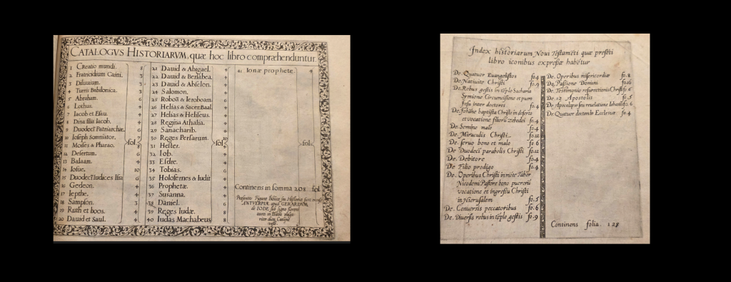
In contrast, Gemini does a great job out of the box comparing the Old Testament tables of contents even with our original prompt:
Attached a three tables of contents from three different copies of the same book from 1585. Examine the three images CAREFULLY and in GREAT DETAIL and make two lists. The first list should be the MAJOR differences between them, such as differences in their entries, numbers, differences in any visual elements, added/missing/different words anywhere, etc. The second list should be an EXHAUSTIVE list of ALL differences, no matter how small, between them.
Based on a close examination of the three provided images of the 1585 table of contents, here are the requested lists. For clarity, I will refer to them as Image 1 (colored), Image 2 (black and white, no ghosting), and Image 3 (black and white, with ghosting/bleed-through from the previous page).
1. MAJOR Differences
This list covers significant variations in the printed content (typesetting, numbers, text) and intended presentation.
-
-
Total Folio Count (Bottom Right Text):
-
Image 1 reads: "Continens in ſomma 211 fol."
-
Image 2 reads: "Continens in ſomma 215 fol."
-
Image 3 reads: "Continens in ſomma 208 fol."
-
-
Presence of Entry 42:
-
Image 1 and Image 2 contain entry "42 Prophetæ."
-
Image 3 lacks entry 42 entirely; the column is blank under entry 41.
-
-
Name of Entry 36:
-
Image 1 and Image 2 list entry 36 as "Ieremias."
-
Image 3 lists entry 36 as "Prophetæ."
-
-
Folio Number for Entry 18 (Sampſon):
-
Image 1 and Image 2 assign it 7 folios.
-
Image 3 assigns it 3 folios.
-
-
Folio Number for Entry 24 (Salomon):
-
Image 1 and Image 2 assign it 3 folios.
-
Image 3 assigns it 4 folios.
-
-
Folio Number for Entry 40 (Iudas Machabeus):
-
Image 1 assigns it 7 folios.
-
Image 2 and Image 3 assign it 8 folios.
-
-
Folio Number for Entry 42 (Prophetæ):
-
Image 1 assigns it 3 folios.
-
Image 2 assigns it 4 folios.
-
(Image 3 does not have this entry).
-
-
Visual Presentation (Coloring):
-
Image 1 has been hand-colored with a pink wash inside the main text box, a yellow wash over the decorative borders, and a red initial "C" for "CATALOGVS".
-
Images 2 and 3 are uncolored (black ink on paper).
-
-
2. EXHAUSTIVE List of ALL Differences
This list includes all items from the first list, plus every minor, copy-specific mark, physical condition, and photographic artifact.
Printed Text/Number Variations:
-
-
Total count text: Image 1 is "211", Image 2 is "215", Image 3 is "208".
-
Entry 18 folio count: Images 1 & 2 read "7", Image 3 reads "3".
-
Entry 24 folio count: Images 1 & 2 read "3", Image 3 reads "4".
-
Entry 36 text: Images 1 & 2 read "Ieremias.", Image 3 reads "Prophetæ."
-
Entry 40 folio count: Image 1 reads "7", Images 2 & 3 read "8".
-
Entry 42 existence: Present in Images 1 & 2, completely missing in Image 3.
-
Entry 42 folio count: Image 1 reads "3", Image 2 reads "4".
-
Handwritten Additions & Marks:
-
-
Image 1: Has the number "210" written by hand (likely in pencil) in the top right corner outside the printed border.
-
Image 2:
-
Features faint handwritten script/math in the empty space of the third column reading roughly "+1 +4. 219" (or similar).
-
Contains numerous small, manually added ink dashes/ticks next to almost all the entry numbers in columns 1 and 2 (e.g., "-4", "-5", "-26").
-
Contains small ink marks/ticks next to the folio counts (the numbers on the right side of the columns) for almost all entries.
-
-
Image 3: Contains no added handwriting or margin notes visible on the right page.
-
Physical Condition & Paper Attributes:
-
-
Coloring: Image 1 is painted (pink and yellow washes, red initial letter). Images 2 and 3 are bare.
-
Ghosting/Bleed-through: Image 3 features heavy, highly visible ghosting of an engraving (showing a robed figure) bleeding through from the opposite side (verso) of the page. Images 1 and 2 show very little to no ghosting.
-
Paper Texture/Color: Image 1 appears slightly cream-colored; Image 2 appears slightly whiter/cooler; Image 3 appears more yellowed/aged, though this may be a result of differing lighting conditions during photography.
-
Smudges: Image 2 has a distinct dark smudge or speck near the bottom center, just below the printed border. Image 1 has minor discoloration spots near the right edge of the pink box.
-
Photographic/Cropping Differences:
-
-
Image 1: Shows the physical edge of the book pages on the right, the top edge, and parts of a green fabric tie or bookmark extending off the right side. The binding curve is visible on the left.
-
Image 2: Placed on a black background. Contains a digital/physical measurement scale visible at the very bottom edge of the frame. Shows the full page margins cleanly.
-
Image 3: Cropped much tighter to the left edge, showing the deep curve and shadowing of the book's gutter/binding on the right side. The top and bottom margins are cut off in the photograph.
-