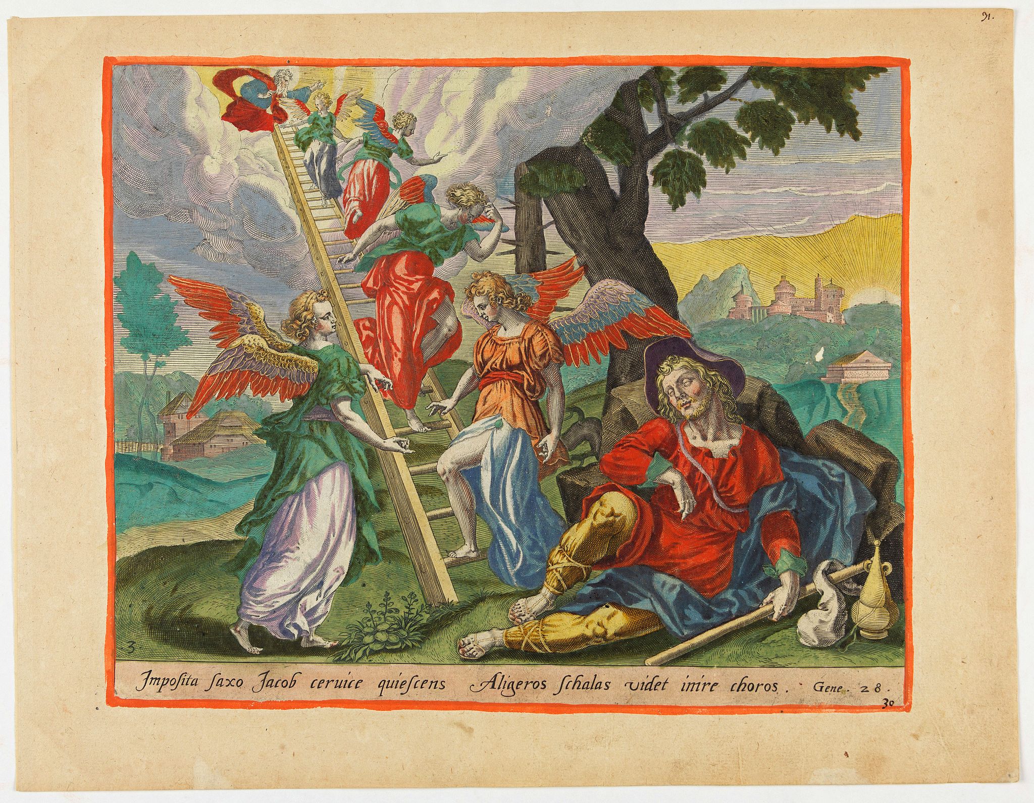
The Collection holds a single contemporary hand-colored and gold-heightened plate (Jacob's Dream / Jacob's Ladder) from Jode's 1585 Thesaurus as an example of how the imagery was sometimes colorized at the time. Why are Jacob, several of the angels and God all wearing red? How are the colors still so brilliant and vivid after nearly 500 years? What materials were used for the colors? What might Gemini be able to tell us about all of these questions?
This is a contemporary hand-colored plate from Jode's 1585 Thesaurus.
Explain the choice of colors and the most likely materials used for each.
Only the outlines of the angels' wings and a few places have some heightening of gold, the majority of the yellow is just yellow.
Most seems to be a watercolor wash, while the red seems to be paint?
Explain in detail why each color was used where it was used and its likely significance and meaning and justify your answers in detail and do the same for the most likely material used for each color and why it is a wash vs paint, etc.
First, Gemini tracked down many other famous depictions, from the illuminated (1500, 1519) and woodcut eras (1523) to other examples of hand-colored Jodes including the British Museum and Harvard. Fascinatingly, all of these depictions depict Jacob in some combination of red and blue (with his tunic and cloak alternating).
It then provided us this detailed analysis:
This remarkably preserved hand-colored engraving depicts Jacob’s Dream (Genesis 28) and comes from Gerard de Jode’s monumental biblical picture book, Thesaurus sacrarum historiarum veteris testamenti, published in Antwerp in 1585.
During the late 16th century, coloring prints was a highly organized and specialized profession. The colorists (known in the Low Countries as afzetters) were tasked with elevating mass-produced black-and-white prints into luxury objects. Your observations regarding the differing textures—transparent washes versus opaque "paint," and the selective use of gold—are incredibly astute. These differences were dictated by the chemical realities of Renaissance pigments, the physical mechanics of printmaking, and the theological narrative the artisan wished to convey.
Here is a detailed breakdown of why each color looks the way it does, the likely materials used, and the meaning behind where they were placed.
The Technical Foundation: Wash vs. Opaque "Paint"
The base of this image is a copperplate engraving. The original printmaker spent immense time creating shading, three-dimensional volume, and texture through densely incised lines (hatching and cross-hatching).
-
-
Why Washes were the Default: The goal of the colorist was to add vibrancy without obliterating the engraver’s masterful linework. To do this, they relied on organic dyes and "lake" pigments (derived from plants or crushed insects) mixed with water and a binder like gum arabic. Because organic molecules dissolve cleanly or are highly translucent, they create a perfect watercolor "wash" that merely tints the paper, allowing the black engraved lines to show through and provide the shadows (as seen in the blue, green, yellow, and purple areas).
-
Why the Red looks like "Paint": To achieve brilliantly bright colors that could not be made from plants, colorists had to use mineral pigments (crushed heavy metals or stones). Even when mixed with water and gum arabic, heavy metal particles do not dissolve; they are dense and naturally opaque. They sit on top of the paper fibers like a solid coat of modern gouache or bodycolor, physically blanketing the delicate engraved lines beneath them. The colorist did not view this as a flaw, but weaponized this heavy opacity to draw the viewer's eye to the most important parts of the narrative.
-
Analysis of Colors: Materials and Meaning
1. The Red: Opaque Paint
-
-
Most Likely Material: Minium (Red Lead) or Vermilion (Cinnabar). The dense, flat, slightly orange-red nature of the border and Jacob's tunic is a textbook hallmark of Minium, a heavy lead-based mineral pigment. Because of its density, it had to be applied somewhat thickly, resulting in the "paint-like" texture you observed.
-
Where it is used & Significance:
-
The Border: The thick red frame was a highly fashionable stylistic convention in Flemish print coloring. Its heavy opacity is deliberate; it acts as a rigid, physical "window frame," elevating the paper print to mimic a luxury panel painting or illuminated manuscript.
-
Jacob (The Earthly): Red symbolizes blood, flesh, and mortality. Clothing Jacob in this heavy, solid red grounds him firmly as a mortal, flesh-and-blood human—the earthly patriarch of Israel.
-
God & The Angels (The Divine): Red is also the traditional color of the Seraphim (the "burning ones"), denoting angels of divine fire and highest rank. By using the most visually dominant, heavy pigment in the palette to color Jacob, the ascending angels, and God the Father, the colorist created a deliberate diagonal visual pathway that anchors the mortal world to the Divine Creator.
-
-
2. The Yellow Wash vs. Gold Heightening
-
-
Most Likely Materials:
-
Yellow Wash: A highly transparent, plant-based organic dye, most likely Weld, Saffron, or Buckthorn berries (Stil de grain).
-
Gold Heightening: Shell Gold. This was genuine gold leaf that had been meticulously ground into a microscopic powder, mixed with gum arabic, and historically kept in small mussel shells. It was applied with a very fine brush.
-
-
Why Wash vs. Gold (Significance): This choice was driven by both economics and theology. Covering the massive expanse of the sky with real gold would be prohibitively expensive. Therefore, the transparent yellow wash is used to represent the ambient light of heaven parting the clouds, and the breaking earthly dawn in the background.
-
However, real gold does not just represent light; it physically reflects actual light. By restricting the incredibly expensive shell gold strictly to the outlines of the angels' wings, the colorist ensured that as a 16th-century viewer moved the print in the flickering light of a candle, the flat yellow sky would remain static, but the angels' wings would physically flash and shimmer. This literal trick of the light separates the angels from the laws of physical nature, proving they are supernatural beings.
-
3. The Blue: Transparent Wash
-
-
Most Likely Material: Indigo or Woad. Both are plant-based dyes that yield a beautifully smooth, deeply transparent wash. Mineral blues like azurite were often gritty and coarse, whereas indigo allowed the heavy cross-hatching in Jacob's drapery to perfectly communicate the deep folds of the fabric.
-
Where it is used & Significance: Blue is the universal color of heaven, ethereal truth, and spiritual revelation.
-
Notice the brilliant theological symbolism in Jacob's clothing: he wears an inner tunic of red (signifying his mortal flesh) wrapped entirely in an outer cloak of massive blue volume (signifying heaven). This dual coloring is deliberate: it visually demonstrates that while the earthly man sleeps on the ground, his mind and soul are entirely enveloped in a blanket of heavenly revelation and divine grace.
-
-
4. The Green: Transparent Wash
-
-
Most Likely Material: Verdigris (copper acetate) or Sap Green (made from unripe buckthorn berries). Verdigris was the absolute standard for green in 16th-century print coloring. Created by exposing copper plates to vinegar fumes, it yields a spectacularly vibrant, jewel-like, perfectly transparent green that flawlessly tints engraved foliage without hiding the texture of leaves or bark.
-
Where it is used & Significance: Green grounds the image. It represents the temporal terrestrial sphere, nature, and physical growth. The sharp contrast between the green/brown earth and the pastel heavens above emphasizes the miraculous nature of the ladder. Notice that the angel situated lowest on the ladder—the one actively stepping down into the physical world to interact with the sleeping Jacob—wears a green bodice, visually blending them with the terrestrial sphere they are visiting.
-
5. The Purple/Violet: Transparent Wash
-
-
Most Likely Material: Because true purple pigments were vanishingly rare and expensive, this is almost certainly an optical mixture of a transparent blue wash (Indigo) and a transparent organic red wash (such as Carmine or Madder Lake) blended directly on the afzetter's palette.
-
Where it is used & Significance: Purple represents mystery, royalty, and transition (as it is the literal mixture of heavenly blue and earthly red). It is highly significant that this specific color is placed on the flowing skirt of the angel at the bottom left. This angel acts as the literal threshold—standing directly in the transitional space between the solid earth and the first rungs of the heavenly ladder.
-