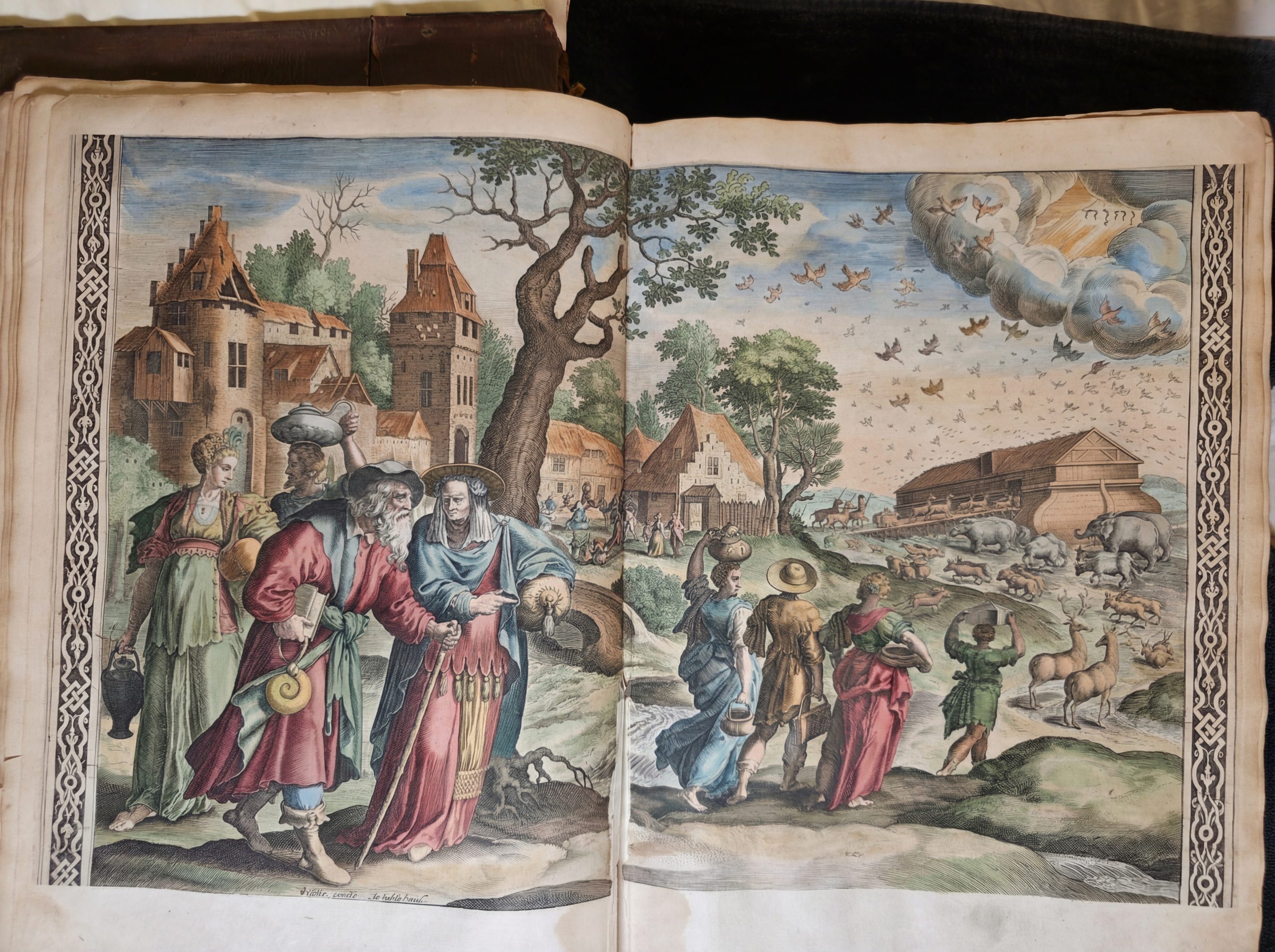
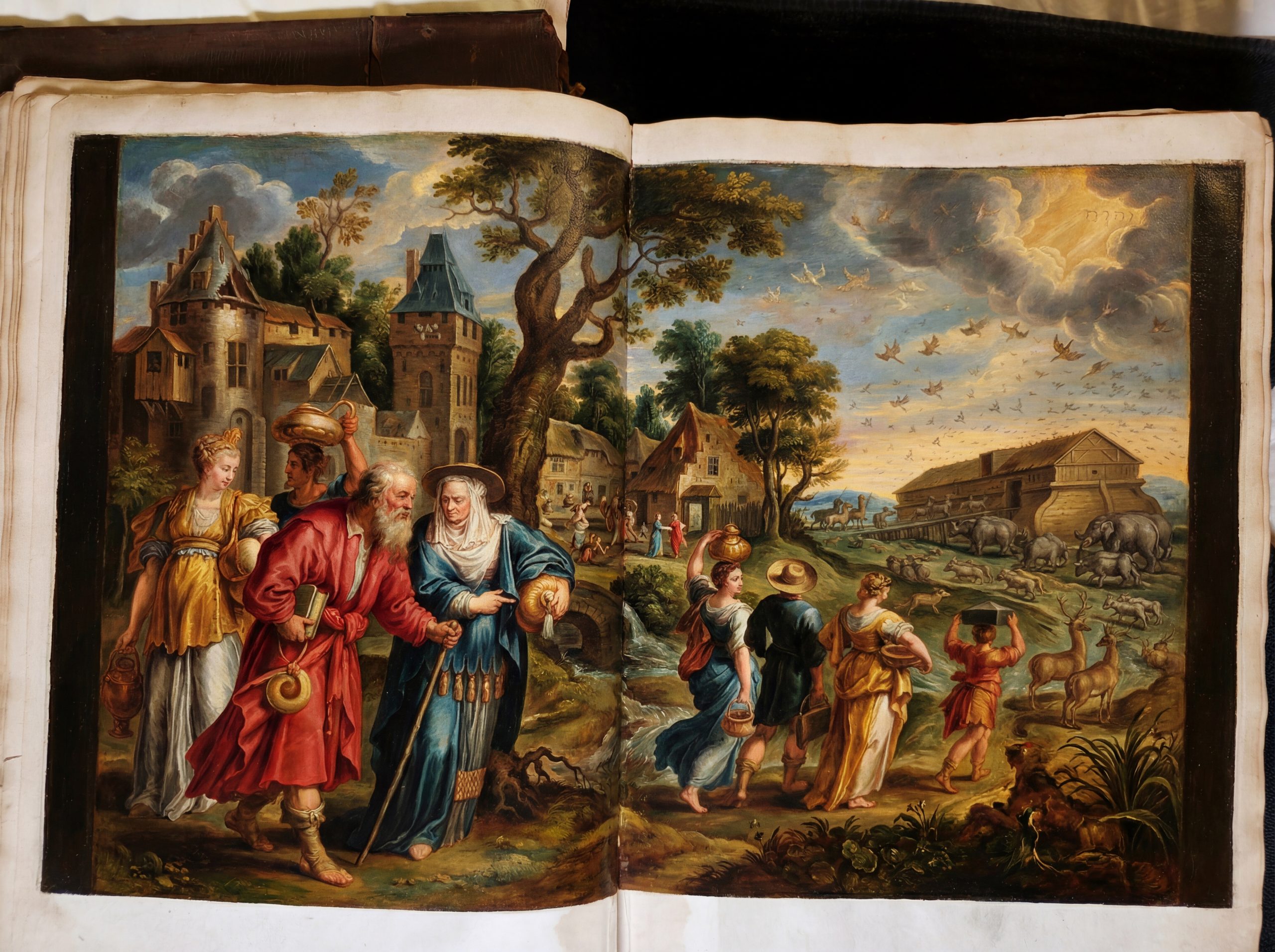
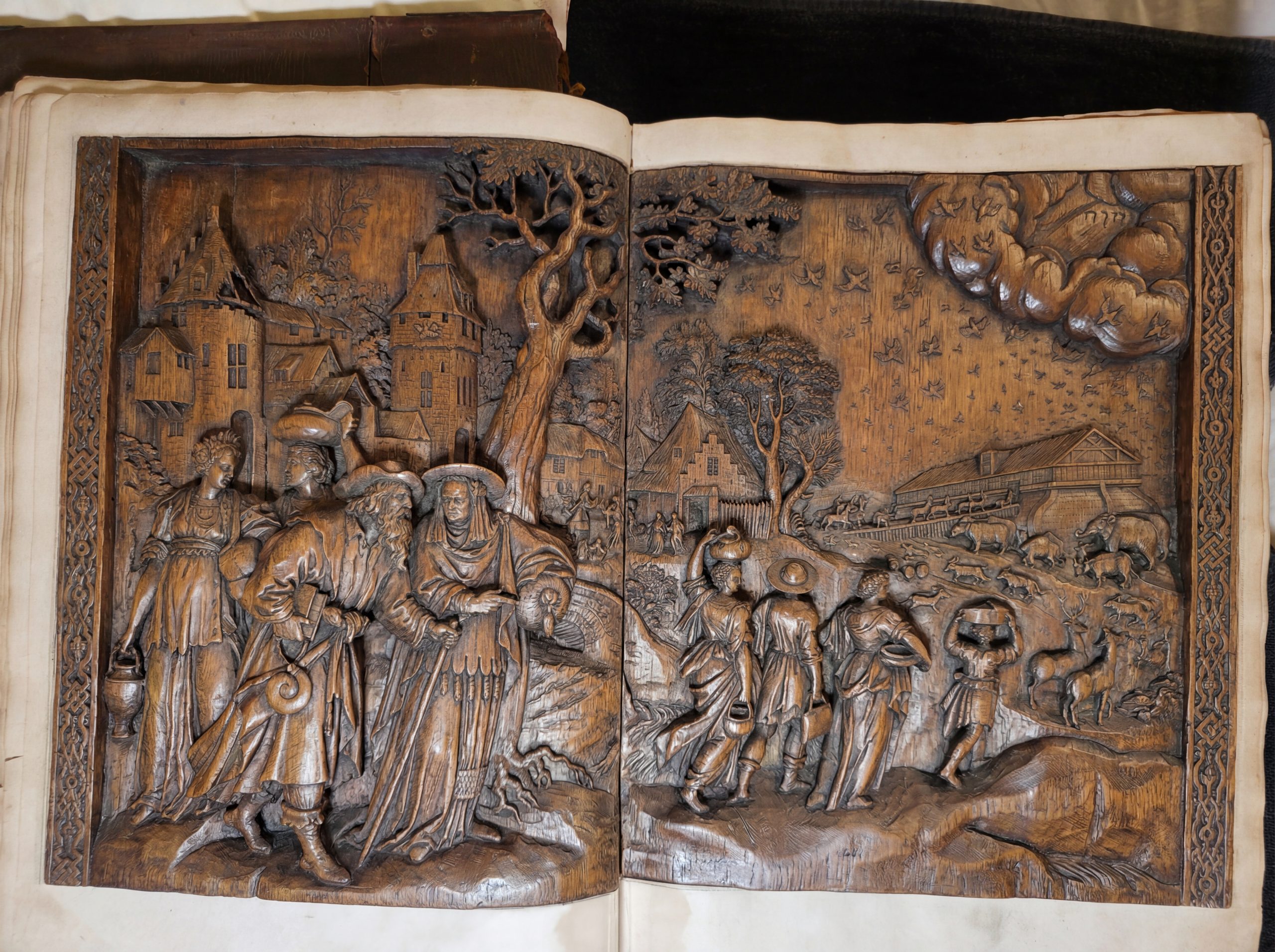
How might Gemini 3.1 and Nano Banana Pro help us better understand and experiment with this two-page engraving from a 1672 copy of the Visscher Royal picture Bible we examined yesterday? We'll ask Gemini 3.1 Pro to describe the engraving's artistic elements, identify its sculptor and publisher from the signatures and identify the likely original artist. and then use Nano Banana Pro to perform various kinds of rerenderings of the engraving, including period-appropriate coloring, making it into an oil painting, relief and marble sculpture group, redraw and paint it in the style of different artists, etc. Together, the experiments here demonstrate the tremendous power of these new tools to help casual and "citizen artists" reimagine and be inspired by historical masterpieces.
Describe the artistry and style of this engraving in detail.
Ignore the content it depicts and focus exclusively on the artistry, the techniques like crosshatching, etc.
Write like an art scholar and use technical art language.
This image presents a masterful example of intaglio printmaking, specifically a copperplate engraving, executed with a high degree of technical virtuosity characteristic of Northern European graphic arts during the late sixteenth to early seventeenth century. The composition demonstrates a rigorous and highly disciplined approach to the medium, utilizing an intricate vocabulary of line to construct volume, differentiate texture, and establish profound spatial recession.
The fundamental architecture of the image relies on a highly sophisticated manipulation of the burin. The engraver does not merely outline forms; rather, they model them through varying densities and directions of line. The primary tool employed is crosshatching, executed with remarkable precision. In the foreground figures, particularly in the voluminous drapery, one can observe deep, aggressive crosshatching in the recesses of the folds, creating areas of dense, nearly opaque black. As these lines emerge toward the illuminated crests of the fabric, the engraver utilizes swelling and tapering lines—achieved by varying the pressure on the burin—to ease the transition from deep shadow to stark, un-inked paper, establishing dramatic chiaroscuro and a strong sense of three-dimensional relief.
The artist’s ability to render diverse surface textures using a strictly monochrome linear matrix is particularly notable:
-
- Architecture: The structures on the left are defined by rigid, rectilinear parallel hatching. The lines are strictly organized, emphasizing the hard, unyielding planes of stone and masonry. Subtle stippling and interrupted lines suggest weathering and the irregularity of the building materials.
- Organic Matter: In stark contrast to the architecture, the prominent tree in the foreground is rendered with chaotic, organic crosshatching. The lines follow the rough, cylindrical contours of the trunk, intersecting at varied angles to mimic the rugged texture of bark. The foliage is treated with tightly clustered, looping, and staccato strokes, creating an impression of dense, vibrating mass rather than individual leaves.
- Atmosphere and Sky: The sky features sweeping, undulating parallel lines. In the heavy, billowing forms in the upper right, the engraver uses curved contour lines combined with subtle, angled hatching to give the atmospheric phenomena a heavy, volumetric presence, almost sculpted in appearance.
Furthermore, the engraving is a study in monochromatic atmospheric perspective. To create the illusion of deep spatial recession, the artist systematically alters the weight and contrast of the lines. The foreground is defined by high-contrast tonal extremes—thick, deeply incised lines resulting in rich blacks against brilliant whites. As the eye moves into the mid-ground and far background, the lines become progressively thinner, lighter, and more widely spaced. The distant topography fades into a delicate, silvery gray network of fine lines, successfully mimicking the optical effect of looking through miles of atmosphere.
Finally, the graphic space is rigidly contained by a formal, decorative border featuring an intricate interlace or knotwork pattern. This border serves not only as a framing device but also emphasizes the flat, two-dimensional nature of the paper, contrasting sharply with the illusionistic, deep space achieved within the primary composition.
Let's see if it can extract the engraver and publisher info from the engraving itself and estimate the source material:
Estimate the engraver and the original painting or source it is a copy of.
Based on the visual evidence, specific inscriptions found within the print, and art historical context, here is the estimation of the artists involved:
The Engraver:
The identity of the engraver is definitively provided by the text located at the bottom center-left edge of the image. It reads: "Jan Sadeler scul."
-
- Jan Sadeler I (1550–1600) was a highly prominent Flemish Renaissance engraver, publisher, and printseller.
- The abbreviation "scul." stands for sculpsit, Latin for "he engraved it."
The Publisher:
Right next to the engraver's name, the inscription reads: "Visscher excudit".
-
- "Excudit" (or exc.) is Latin for "he published [or struck] it."
- This refers to the Visscher family, a very famous dynasty of Dutch mapmakers, engravers, and publishers based in Amsterdam during the 17th century (most likely Claes Jansz Visscher). This indicates that the image you are looking at is likely a later 17th-century publication or re-issue utilizing the original plate created by Sadeler decades earlier.
The Original Designer/Source:
While the specific artist who designed the image (the inventor) is not visibly inscribed in this particular cropping (often marked with inv. or invent.), strong stylistic evidence points directly to Maarten de Vos (1532–1603).
-
- Stylistic Evidence: The muscular, somewhat elongated figures, the intricate and voluminous drapery, and the specific facial types (especially the bearded patriarchs) are hallmark characteristics of late 16th-century Antwerp Mannerism, of which Maarten de Vos was the leading figure. The sweeping, panoramic landscape combined with foreground action is also typical of his compositions.
- Historical Context: Maarten de Vos was one of the most prolific designers of prints in the 16th century. He rarely engraved his own work; instead, he produced hundreds of highly detailed drawings specifically meant to be translated into prints. Jan Sadeler I, along with his brothers, was one of the primary engravers who worked directly with De Vos, translating his drawings into copperplates.
Conclusion:
This is an engraving by Jan Sadeler I, published later by Visscher, and it is almost certainly based on an original drawing specifically designed for this print by Maarten de Vos.
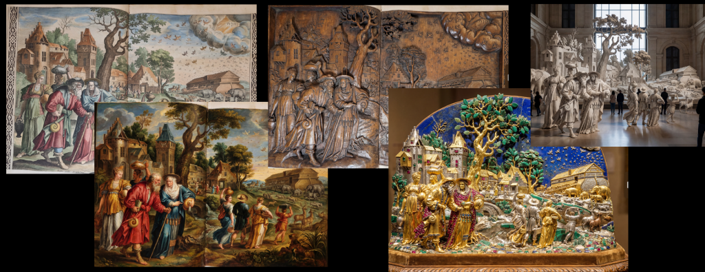
Can Nano Banana Pro colorize it for us to look like contemporary colorization?
Colorize this late-1600's Bible engraving using period-appropriate colors and artistic style.
Make it look like it was hand-colored at the time period.
How about conversion to a period oil painting?
Turn it into a beautiful period-looking oil painting.
Keep the same subject matter and make it look like a different artist:
Go back to the original uncolored engraving and rework it to look like the style of Peter Paul Rubens.
How about a different artist?
Go back to the original uncolored engraving and rework it to look like the style of Leonardo da Vinci.
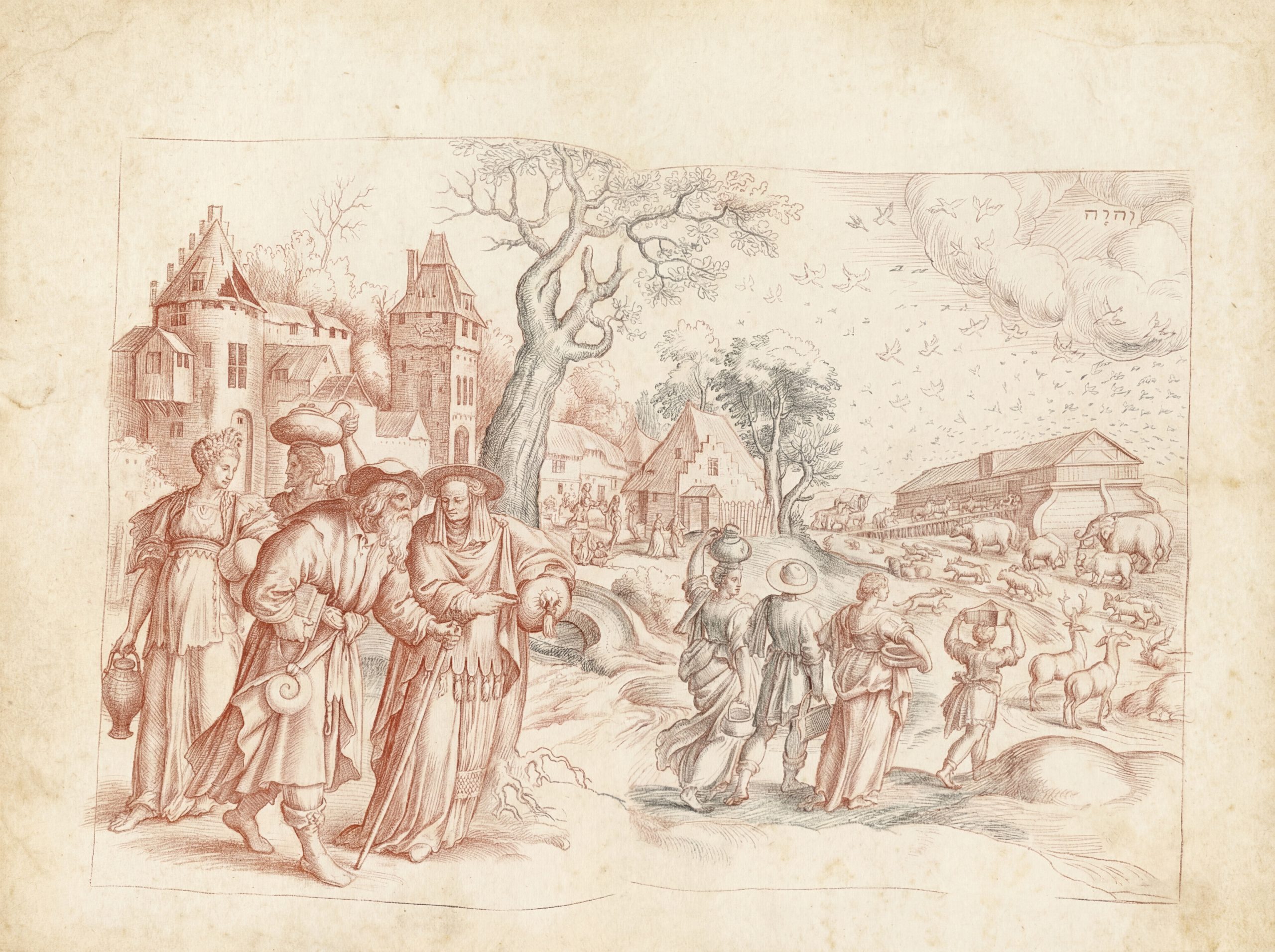
How about a medium transfer?
Go back to the original uncolored engraving and rework it as a charcoal sketch.
And a different kind of colorization?
Go back to the original uncolored engraving and colorize it using vibrant beautiful watercolors.
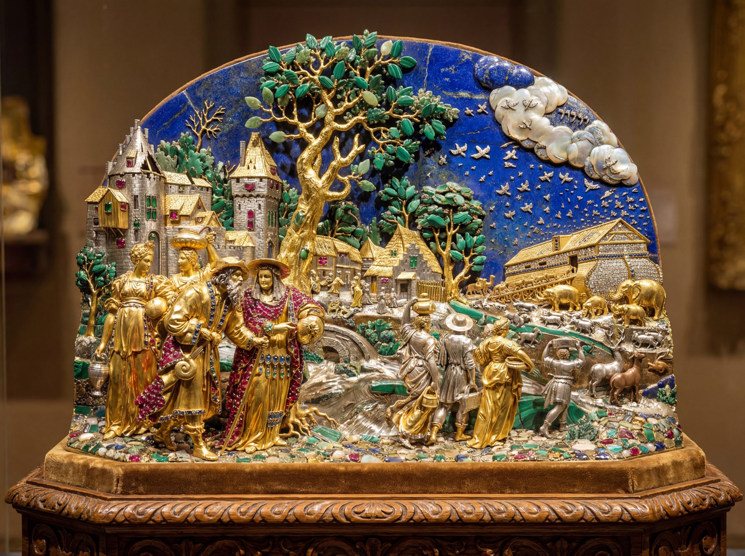
And a transfer from 2D engraving to 3D sculpture?
Go back to the original uncolored engraving and rework it as a period-appropriate 3D sculpture as if it had been made as a sculpture originally instead of an engraving.
Let's force it to remove it from book format:
Go back to the original uncolored engraving and rework it as a period-appropriate standalone 3D sculpture as if it had been made as a sculpture originally instead of an engraving. Make sure it is a standalone sculpture, not a relief or in a book. Perhaps out of gold, gems or other precious materials? Essentially like a diorama.
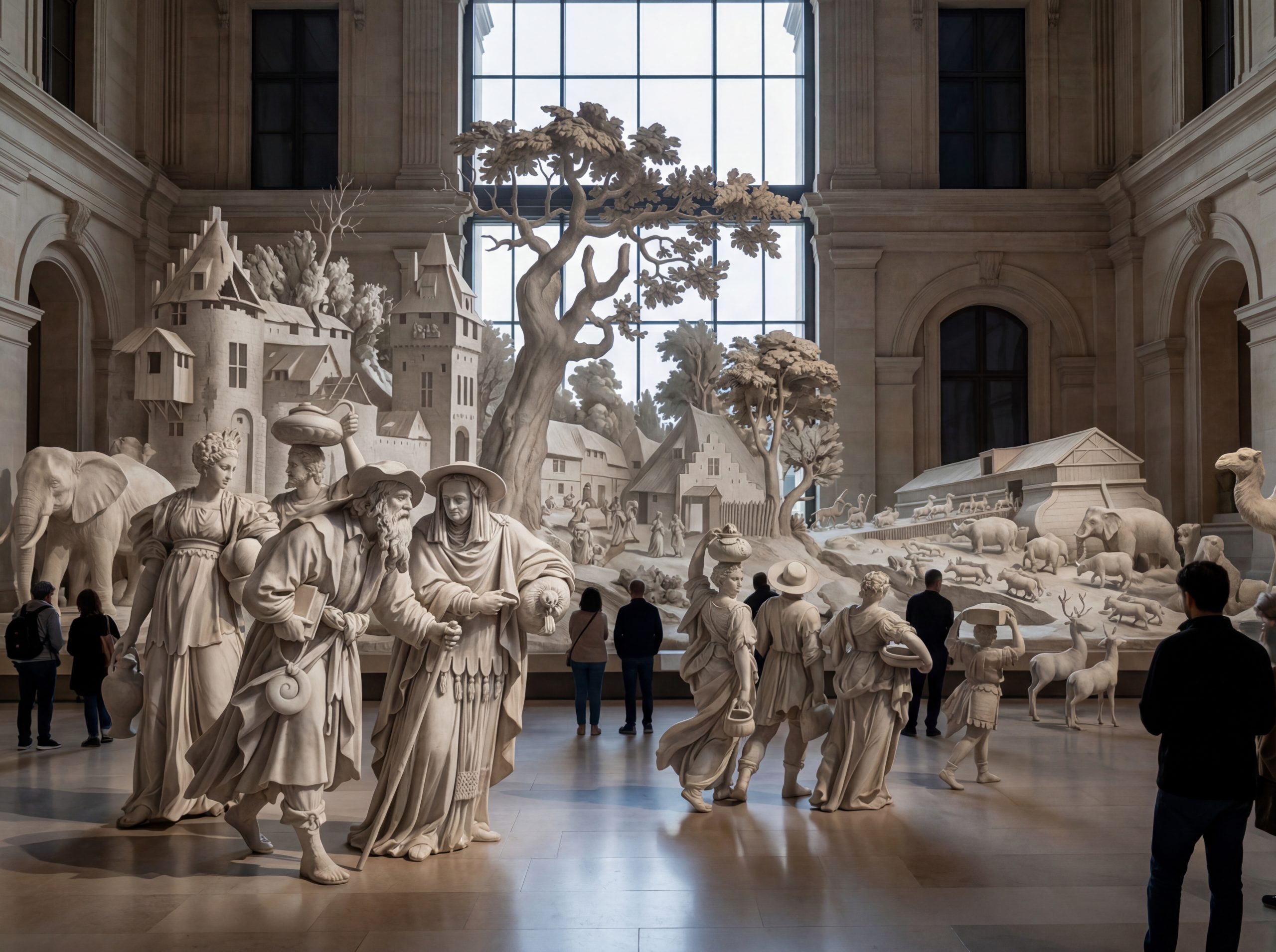
And finally:
Go back to the original uncolored engraving and rework it as a room-sized sculpture group out of white marble. Situated in a museum.