
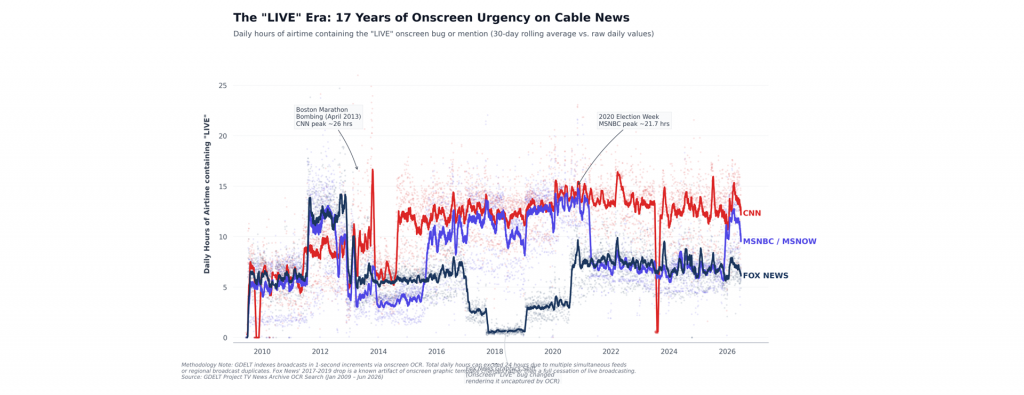
When American television news channels cover live breaking events, they typically display the word "LIVE" somewhere in the onscreen text to distinguish it from the more common prerecorded footage that dominates news coverage. What would it look like to visualize the total hours per day across CNN, MSNBC/MSNOW and Fox News from 2009-present that contained the word "LIVE" somewhere in the onscreen text using the Internet Archive's TV News Archive? The timeline below shows these final results. No data was used to train or tune any model. Overall we can see that the density and use of live footage tends to be fairly consistent but different across each of the three channels, increasing briefly during major breaking news events and returning to channel-specific baselines.
Interestingly, the step changes below capture changes not in the use of live footage, but rather in how the channels visually denote that use of live footage. For example, the sharp decrease in the onscreen appearance of "LIVE" on Fox News from late 2017-2019 turns out to reflect a major onscreen template redesign the channel launched in September 2017 that included no longer displaying the "LIVE" banner as a fixed text element and instead rotating it in and out dynamically. Incredibly, in the past a graph like this would have taken us hours of research to track down this strange trend, whereas here when we asked Gemini to turn the CSV timeline into a visualization, it autonomously spotted the anomaly and ran its own Google web searches to track down the cause, linking to reference articles documenting those onscreen template changes and other events when presenting the final graph, providing the context behind the graph's major trends. Moreover, Gemini assessed that the timeline was too noisy and variable day-to-day to use a traditional plain unsmoothed chart, so it combined a semi-transparent dot plot with a smoothed overlay to make the graph intuitive and understandable, demonstrating the immense power of Gemini-powered data visualization. No data was used to train or tune any model and Gemini was used only to visualize the final CSV timeline.
Gemini also produced this analysis of the timeline entirely on its own:
Key Historical & Structural Phases
1. The Baseline Era (2009–2011)
During the early years of the TV Archive, all three networks maintained a relatively balanced and structured broadcasting format. Daily "LIVE" airtime averaged between 5 to 7 hours across all networks. Programs were highly structured, and weekends featured significant blocks of pre-recorded documentaries, travel shows, or packaged program repeats, which rarely displayed the "LIVE" bug.
2. The 2012 Election Spike & Strategic Divergence (2012–2014)
The 2012 US Presidential Election marked a turning point. Networks pushed live coverage to unprecedented heights, with Fox News peaking at an annual average of 11.7 hours per day and MSNBC at 9.9 hours per day.
-
- The CNN Structural Pivot: Following the post-election cool-down in 2013, a fascinating divergence occurred. While MSNBC and Fox News dialed back their live footprints (MSNBC dropping to a historic low of 3.5 hours per day in 2014), CNN made a permanent structural shift. CNN institutionalized a near-continuous "LIVE" posture, with its 30-day moving average permanently climbing to 12+ hours per day.
3. The Trump Campaign & Pandemic Surge (2015–2020)
The non-stop news cycle that characterized the 2016 presidential campaign and the subsequent administration created a massive, sustained rise in onscreen urgency.
-
- By 2020, the height of the COVID-19 pandemic and a highly contested election pushed live postures to their absolute limits. CNN led with a staggering 14.3 hours of live airtime per day, closely followed by MSNBC/MSNOW at 13.3 hours per day and Fox News at 5.2 hours per day (excluding the graphics limitation described below).
4. The Normalized Plateau (2021–2026)
Over the last five years, cable news has maintained a highly saturated live environment. CNN continues to lead the pack, averaging roughly 12.5 to 13.5 hours of live onscreen presentation per day. MSNBC has settled into a steady 7 to 8 hours per day, with Fox News matching it at roughly 7 hours per day. The distinction between traditional daytime reporting and heavily pre-produced primetime blocks has increasingly blurred, with the visual graphics of "breaking" and "live" news remaining onscreen almost continuously.