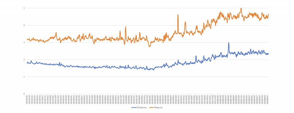
How does in-group and out-group language use on Twitter compare with the strong trends found on television news? The timeline below shows the percentage of all English-language tweets (determined using CLD2) in the Twitter 1% stream, which we showed in March is a perfect representative 1% sample of the full firehose.
The timeline below shows the percentage of those English tweets that contained "ingroup" pronouns ("us", "we", "our" and "ours") versus "outgroup" pronouns ("they", "them", "their" and "theirs") January 2012 through September 2019:
The timeline below shows the difference between the two (ingroup – outgroup) using a 7-day rolling average to smooth the results.
This graph includes retweets, so the timeline below shows the same graph with retweets excluded:
This yields a very different graph, suggesting that retweets favor tweets composed of ourside language, which is an interesting finding.
