
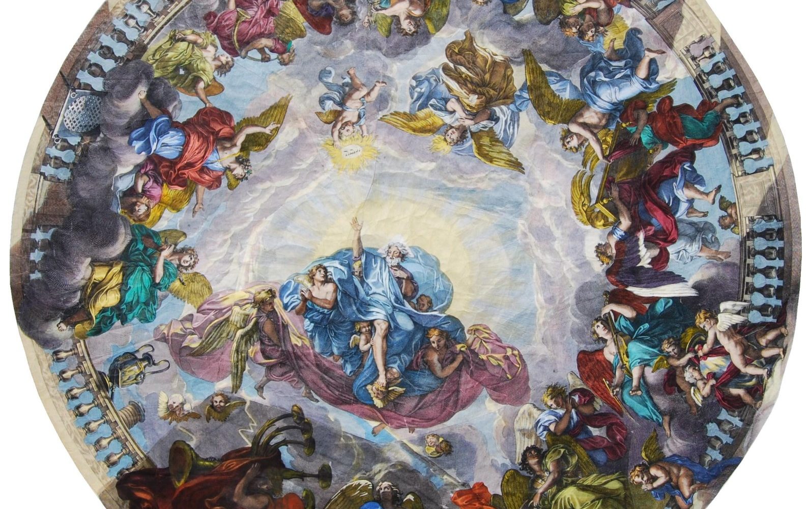
Earlier this week we unveiled how Gemini had discovered that an centuries-old monumental engraving we recently accessioned was actually something far rarer than originally believed. In short, what was originally believed to be a Gerard Audran engraving of Charles Le Brun's now-lost ceiling fresco of the Chapel at the Château de Sceaux turned out to be a much rarer Kleinschmidt/Wolff Augsburg copy. Thus far we've only been able to locate a single other complete institutional holding of the full-size Kleinschmidt engraving, but it appears to be on standard thick laid paper versus ours is on laid tissue paper, suggesting our copy is even rarer. Can Gemini help us confirm what paper they are both printed on? It turns out that Gemini, looking at a single photograph of each print, gets them both exactly right, identifying the exact visual cues that a professional conservator looks for.
Let's start with our engraving. You don't have to be a professional conservator or paper expert to recognize from the massive crinkling and the way the paper interacts with light that it is printed on an extremely thin tissue-like paper. Indeed, it is actually printed on extremely thin laid paper, essentially laid tissue paper, designed originally to be wetted and traced onto a surface as a template. Can Gemini correctly identify this paper from this photo?
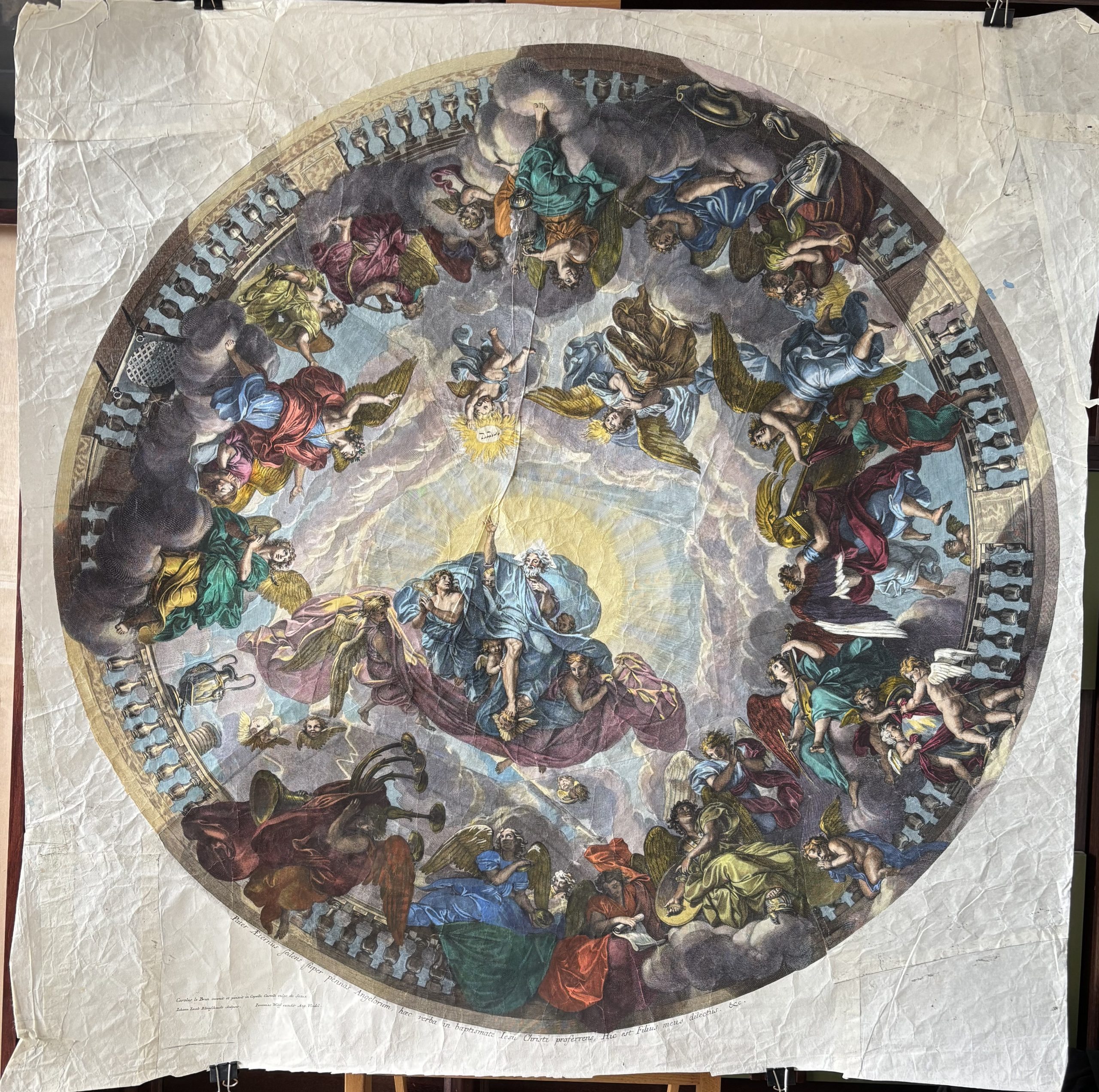
Let's ask Gemini to identify it:
Look extremely carefully and estimate the kind of paper this engraving was printed on.
Look at all of the details to determine.
The entire engraving is on the same paper, there is no separate backing paper.
It has undergone conservation.
Explain your determination in considerable detail.
This monumental circular engraving—a sotto in su (illusionistic ceiling view) composition—is printed on an ultra-thin, lightweight, long-fibered handmade laid rag paper (historically categorized in European papermaking as carta sottile or tissue-weight laid paper, with physical characteristics closely overlapping with fine bast/kozo conservation tissues).
A close visual examination of the recto, verso, and transmitted-light macro details reveals several diagnostic characteristics that define the exact nature, manufacture, and specialized function of this paper:
1. Mold Structure: Fine Laid & Chain Line Morphology
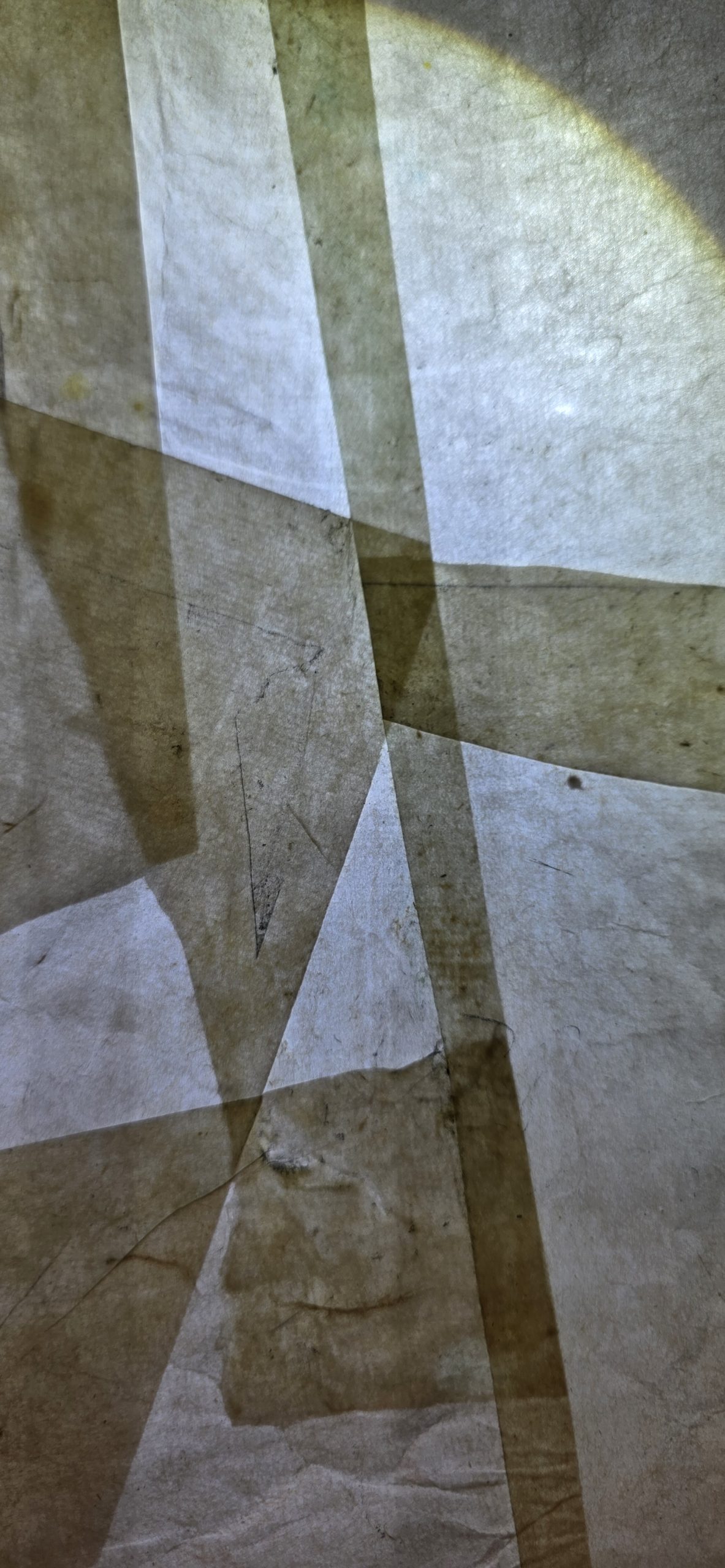
In the transmitted-light detail (Image 2), the internal structure of the hand-molded sheet is unmistakable:
-
Laid Lines (Vergelle): Running horizontally across the close-up are very fine, closely packed parallel ribs created by the sieve wires of a traditional laid papermaking mold. The tight spacing indicates a high-mesh mold specifically engineered to support a very dilute, watery pulp suspension without allowing the thin slurry to drain too abruptly.
-
Chain Lines (Filoni): Running vertically (perpendicular to the laid lines) at regular intervals are distinct chain lines where the binding wires held the laid wires together.
-
Fiber Distribution & Long-Fiber Inclusions: Zooming into the illuminated areas of Image 2 shows long, unmacerated bast or linen/hemp rag fibers dark against the light, swirling slightly within the sheet formation. In early modern European papermaking, producing a sheet as thin as tissue required beating high-grade linen or hemp rags via stampers to fibrillate the cellulose without cutting the fibers short. Those long, entangled fibers give the paper surprising tensile and wet strength despite its gossamer thickness.
2. Grammage, Translucency, and Optical Behavior
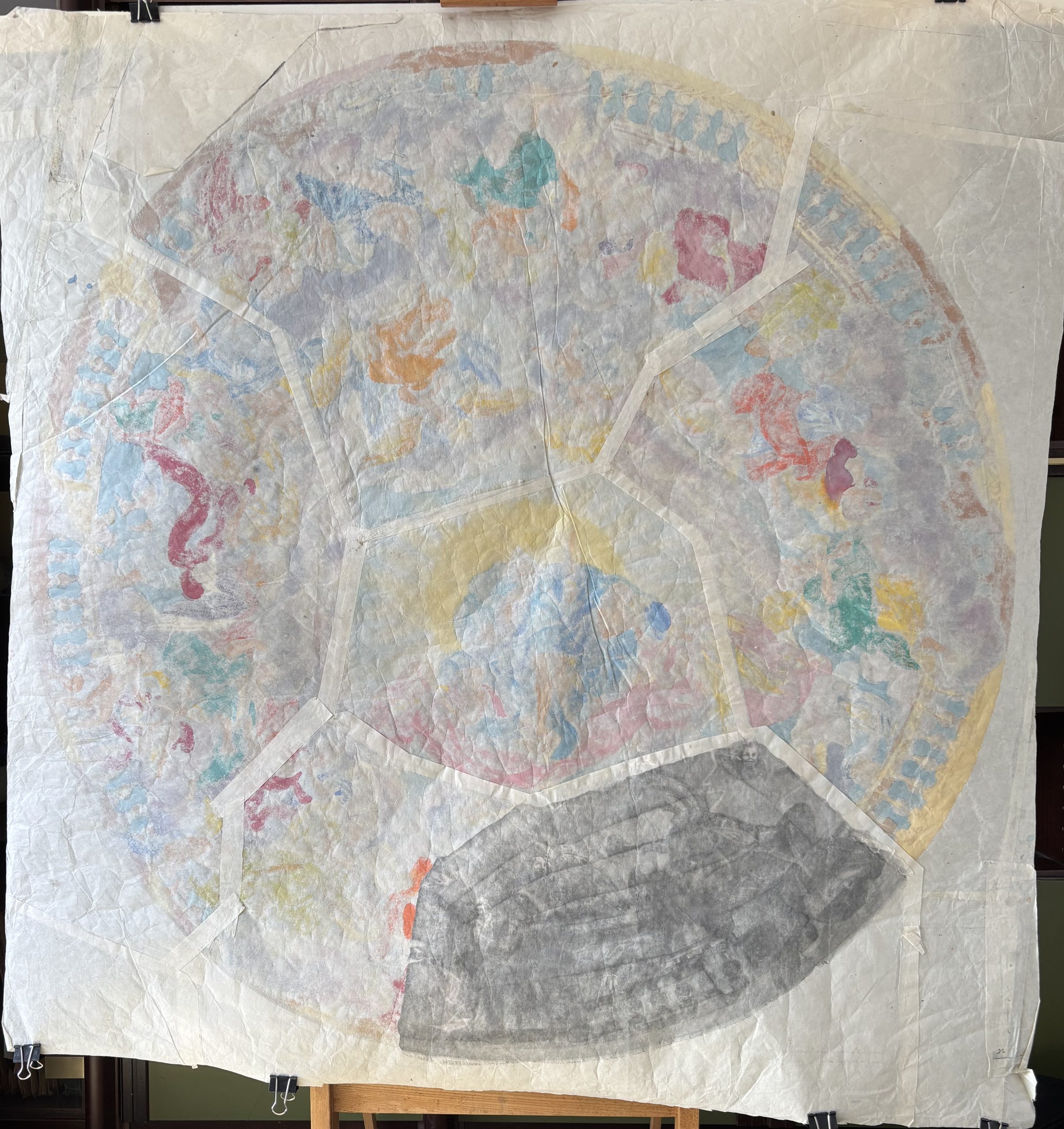
Comparing the recto (Image 3) and the verso (Image 1) demonstrates that the paper has an extraordinarily low basis weight—likely in the range of 15 to 30 gsm (grams per square meter), comparable to modern gossamer tissue or Oriental kozo/gampi papers, rather than standard 17th- or 18th-century copperplate printing paper (carta reale or imperiale, which typically weighed 120–180+ gsm).
-
Complete Strike-Through / Translucency: Looking at the verso (Image 1), the hand-applied gouache/watercolor pigments (blues, yellows, rose reds, and greens) and the intaglio ink are vividly visible right through the body of the sheet. Importantly, there is no lining or secondary backing sheet obscuring the reverse; we are looking directly at the back of the primary support.
- Surface Drape and Cockling: Because the paper is as thin as tissue, it reacts acutely to moisture and tension. Across the unprinted corner spandrels and throughout the circular image, the paper exhibits fine, tissue-like creasing, soft planar ripples, and radial tension lines rather than the stiff, brittle folding typical of heavy plate paper.
3. Multi-Sheet Assembly (Carta Composta) & Architectural Template Function
Large-scale ceiling and dome engravings of the late 17th and 18th centuries were printed from multiple separately etched and engraved copperplates—here arranged as a central pentagonal/polygonal hub surrounded by radial trapezoidal sectors (spicchi) that form the drum and cupola.
-
Overlapping Seams: Both the verso (Image 1) and the backlit macro view (Image 2) clearly show the overlapping joins where the individual radial sheets were pasted together to form the full tondo. In Image 2, the overlapping margins appear as darker bands where two or three layers of the translucent paper intersect.
-
Functional Design as a Working Cartoon / Transfer Template: Standard collector impressions were pulled on heavy, heavily sized rag sheets meant to be bound in atlases or framed. Printing a multi-plate architectural composition on tissue-thin laid paper served a specialized workshop purpose: an artist’s working template, cartoon, or spolvero/transfer pattern for wall, vault, or ceiling decoration.
-
Thin, supple paper can conform to curved architectural surfaces (such as a concave plaster vault, dome, or coved ceiling) without buckling as stiff paper would.
-
Its high translucency allows a studio assistant or decorative painter to see the design from both sides—crucial when reversing a motif, back-tracing with charcoal/chalk for transfer, or oiled/backlit tracing.
-
Furthermore, in certain decorative traditions (such as arte povera or lacca povera and architectural decoupage on ceilings/panels), ultra-thin laid prints were printed specifically so they could be applied directly to prepared surfaces or used as full-scale layout guides where minimal paper thickness was essential.
-
4. Conservation Evidence
The sheet shows careful structural stabilization suited to ultra-thin paper:
-
Seam Reinforcement and Bridging: Along the radial plate joins on the verso (Image 1), uniform pale strips of conservation tissue (likely lightweight Japanese kozo paper adhered with wheat starch paste or methylcellulose) reinforce the structural seams where the radial segments meet the central polygon.
-
Edge Extensions and Losses: The outer corners and margins outside the printed tondo have been pieced and stabilized with matching ultra-thin laid/tissue fills to square off the sheet, allowing it to be safely suspended by clips on an easel without placing tearing stress on the original circular perimeter.
-
Adhesive Ageing along Original Lap Joins: In the backlit view (Image 2), the slight warm, yellowish-brown toning inside the overlapping seams reflects oxidized historical animal glue or starch paste used when the radial plates were originally assembled into a single circular working sheet.
Gemini got this absolutely right: it is laid tissue paper designed as an artist's template with some limited conservation to reinforce the seams.
To date, we've been able to locate only a single other copy of this incredibly rare Kleinschmidt Audran copy, at the Herzog Anton Ulrich Museum, seen below.
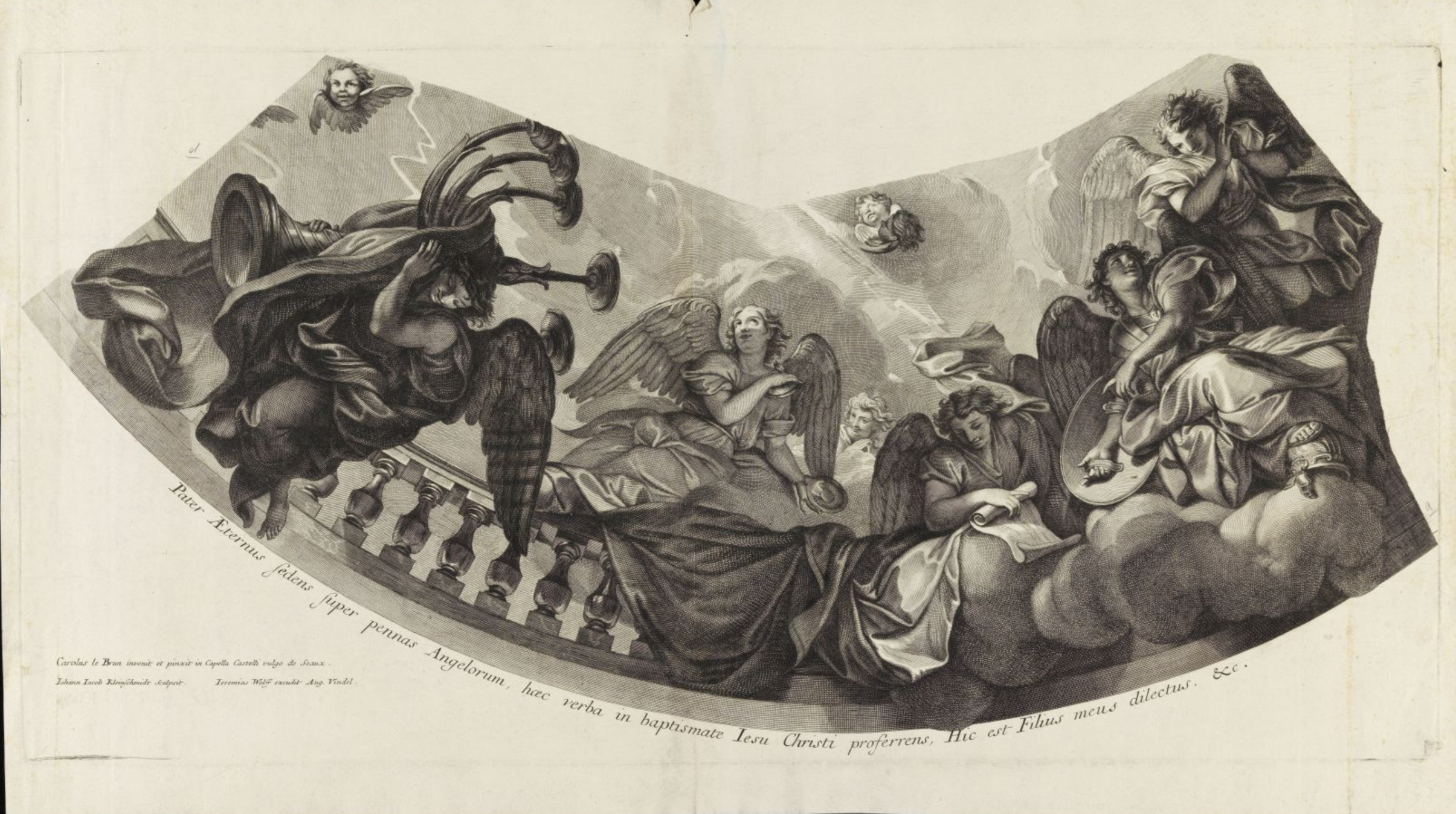
What can Gemini tell us about this paper? Gemini gets it absolutely correct: we have subsequently confirmed with the museum that it was printed on thick laid paper with strong platemarks.
Look extremely carefully and estimate the kind of paper this late 1600s engraving was printed on.
Look at all of the details to determine.
Do NOT use your knowledge about the engraving itself, ONLY the visual details you observe in the image, in case this is an unusual paper.
Explain your determination in considerable detail.
This engraving is printed on European handmade antique laid rag paper (linen/hemp cellulose pulp), arranged in a royal or imperial broadsheet format and previously bound as a bifolium (folded sheet) in an album or atlas.
Every visual detail on the sheet supports this classification:
1. Surface Texture: Laid and Chain Lines (Vergeures and Pontuseaux)
Looking closely at the unprinted margins—particularly the wide, open spaces in the upper-left, upper-center (above the dip of the curved border), and the lower-left and lower-right corners—you can see a subtle, rhythmic grid texture inherent to the paper's structure:
-
Chain Lines (Vertical): Faint, regularly spaced vertical lines run from the top to the bottom of the sheet, spaced roughly 2.5 to 3 cm apart. These were created by the heavier vertical wires (or wooden ribs beneath them) of the papermaking mould that held the fine screen together. Because thechain lines run vertically on this horizontal (oblong) print, the sheet is either a full broadsheet or a quarto folding, though the scale of the copperplate and the central fold confirm it is a large full sheet.
-
Laid Lines (Horizontal): Between the vertical chain lines is a tight, dense pattern of very fine horizontal lines running left to right. This texture eliminates wove paper (which was not invented until the 1750s and has a uniform, mesh-like smoothness) as well as non-paper supports like vellum/parchment (which exhibit hair follicles, translucent patches, and cockling rather than wire marks) or silk/satin (which shows a tight textile weave and characteristic ink bleeding along threads).
2. Fiber Composition and Color: Linen Rag Pulp
-
Warm Ivory/Buff Tone with High Chemical Stability: The sheet retains a remarkably bright, creamy off-white to light buff hue across both the margins and the unprinted highlights within the image (such as the bright light rays and the highlights on the drapery). Unlike later 19th-century wood-pulp papers, which turn brittle and uniformly dark brown from lignin oxidation, this sheet shows the classic aging profile of pure 17th-century linen/hemp rag paper sized with animal gelatin.
-
Localized Foxing and Handling Stains: In the far-left margin (just left of the platemark) and along the extreme outer edges, there are small, scattered pale-ochre spots (foxing) and faint surface grime from centuries of handling, while the interior of the sheet remains clean and supple.
3. The Platemark and Paper Compressibility (Intaglio Impression)
-
Deep Rectangular Embossing: A crisp, continuous rectangular platemark frames the entire composition, sitting just inside the outer edges of the sheet. You can see the indented bevel clearly along the top edge, down the left and right sides, and across the bottom below the Latin inscription.
-
Plate Tone (Wiping Marks): Inside the rectangular platemark, the blank paper surrounding the curved architectural fan shape has a slightly warmer, grayer cast than the paper outside the platemark (most noticeable at the very top margin and bottom corners). You can even see faint diagonal wiping scratches in the upper-right blank space inside the plate.
-
What this reveals about the paper: To pick up such crisp fine cross-hatching, delicate calligraphic lettering, and subtle plate tone without tearing along the sharp bevel of the copperplate, the paper had to be soft-sized (lightly sized with gelatin) and thoroughly dampened before being pulled through a high-pressure roller press. When dampened, long-fiber linen rag becomes pliable enough to mold into every engraved furrow of the metal plate, leaving the raised ridge of the platemark once dried.
4. Structural Clues: The Central Vertical Fold and Guarding
-
Central Crease: Running dead-center from the top edge to the bottom edge is a pronounced vertical fold line.
-
Binding Tear at the Top Center: At the very top of that central crease is a small, darkened V-shaped tear with slight staining—classic evidence of a sewing station, binding adhesive, or a paper guard (onglet). Large oblong architectural and ceiling prints of the late 1600s were folded down the middle and pasted onto stubs so they could be bound into upright folio volumes, opening out flat as double-page spreads.
-
Secondary Creases: In the lower-right corner, a faint diagonal crease crosses the platemark—typical "dog-ear" flexing caused by turning a heavy, oversized folio sheet over hundreds of years.