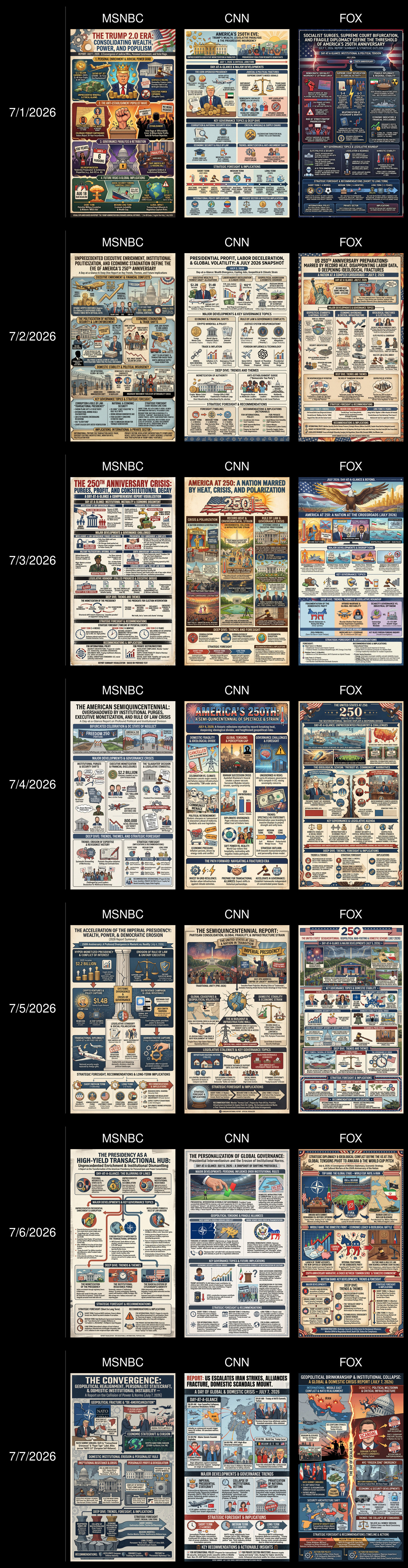
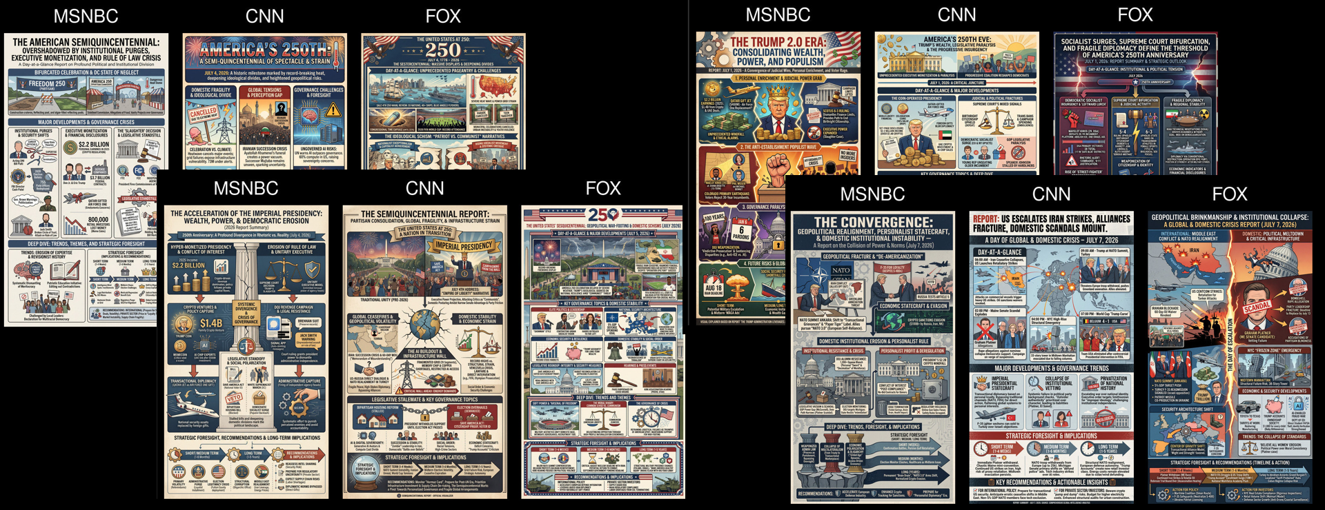
What would it look like to visualize the parallel visions of America presented on CNN, MSNOW and Fox News, to compare the stories, narratives and framings each channel presents to its viewers and how they differ? Below is a montage of infographics comparing the framing of the coverage on the three channels each day this month, as computed by Gemini and Nano Banana Pro, capturing quite vividly just how differently their story selections and framings are each day. No data was used to train or tune any model.