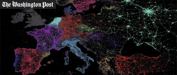
The Washington Post recently ran a special feature entitled "40 more maps that explain the world" in which it "searched far and wide for maps that can reveal and surprise and inform in ways that the daily headlines might not, with a careful eye for sourcing and detail." Featured at #25 on the list is a visualization from the Global Twitter Heartbeat study visualizing the world's linguistic tapestry through the eyes of Twitter.