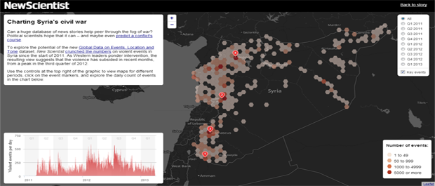
Peter Aldhous of New Scientist Magazine put together this impressive interactive map of the Syrian civil war that breaks the violence down by quarter to plot how the conflict has been evolving. This map is an interactive companion to an article by Douglas Heaven in the May 13, 2013 issue of the magazine titled "World's largest events database could predict conflict". The map demonstrates using hexagonal binning to cluster event records due to the high density and tight clustering of events around key cities. You can use the time box in the upper-right of the display to interactively move through the conflict quarter by quarter from 2011 to 2013 to see how the conflict has evolved spatially.