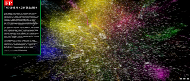
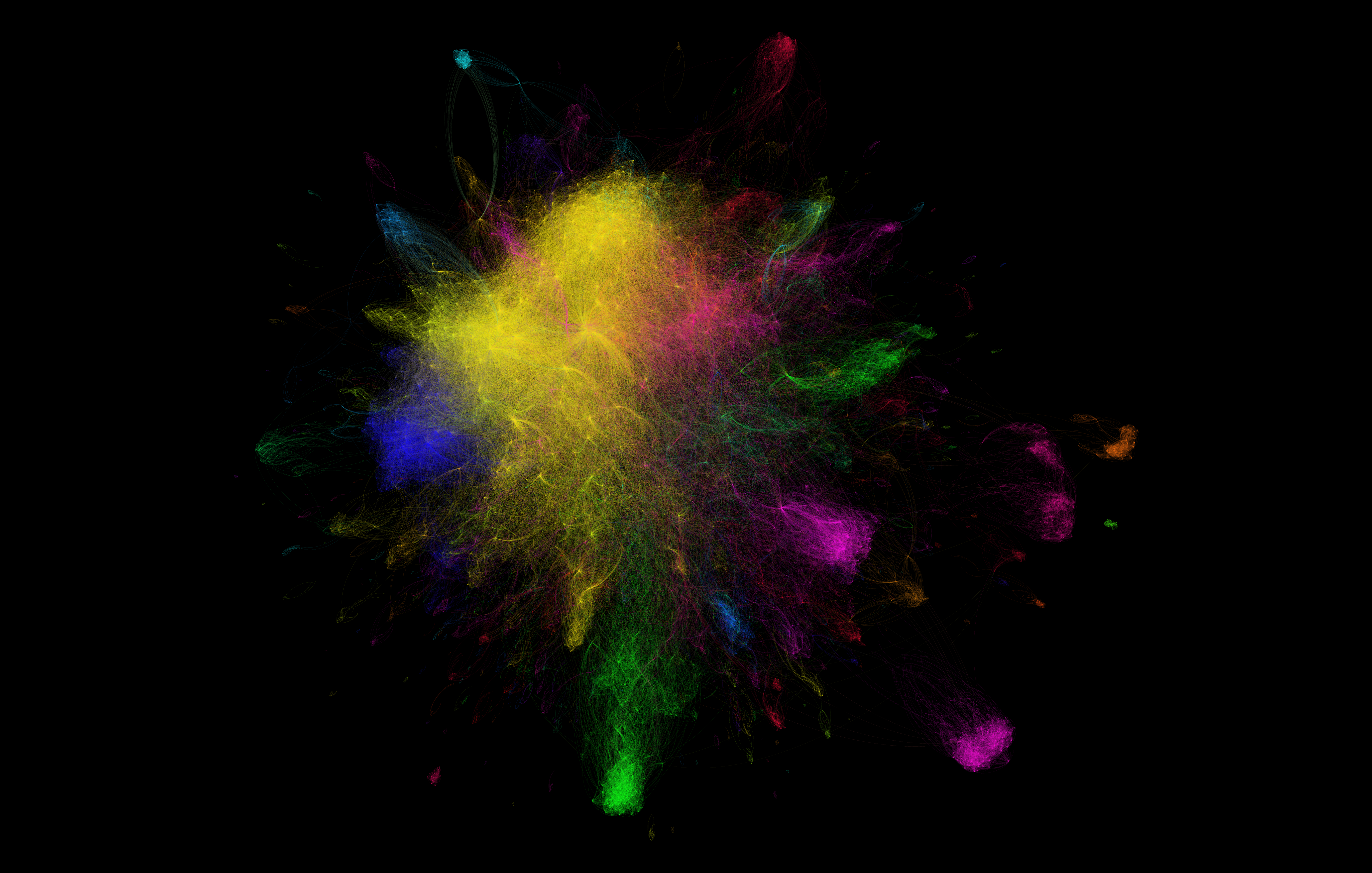
What happens when you take six months of news coverage from around the world and compile a list of every person mentioned and the people they were mentioned alongside? You get a network of 3 million nodes connected by 42 million links. Based on the GDELT Global Knowledge Graph — a massive compilation of the world's people, organizations, locations, themes, emotions, and events — this visualization highlights the 25,000 newsmakers mentioned most frequently from April to October 2013 and the 100,000 connections among them. This visualization is, in essence, a snapshot of the global conversation — not only whom we are talking about and how much, but how each separate discussion is connected to every other discussion and the greater whole. It's a new way of gauging what matters to us, and it's just one of the ways in which big data is changing the way we see the world. Featured in the Dec 2013 print edition of Foreign Policy Magazine.
Check out the interactive online visualization.
Download the full resolution image.